Randy Krum - Cool Infographics: Effective Communication with Data Visualization and Design
Here you can read online Randy Krum - Cool Infographics: Effective Communication with Data Visualization and Design full text of the book (entire story) in english for free. Download pdf and epub, get meaning, cover and reviews about this ebook. year: 2013, publisher: Wiley, genre: Computer. Description of the work, (preface) as well as reviews are available. Best literature library LitArk.com created for fans of good reading and offers a wide selection of genres:
Romance novel
Science fiction
Adventure
Detective
Science
History
Home and family
Prose
Art
Politics
Computer
Non-fiction
Religion
Business
Children
Humor
Choose a favorite category and find really read worthwhile books. Enjoy immersion in the world of imagination, feel the emotions of the characters or learn something new for yourself, make an fascinating discovery.

- Book:Cool Infographics: Effective Communication with Data Visualization and Design
- Author:
- Publisher:Wiley
- Genre:
- Year:2013
- Rating:3 / 5
- Favourites:Add to favourites
- Your mark:
Cool Infographics: Effective Communication with Data Visualization and Design: summary, description and annotation
We offer to read an annotation, description, summary or preface (depends on what the author of the book "Cool Infographics: Effective Communication with Data Visualization and Design" wrote himself). If you haven't found the necessary information about the book — write in the comments, we will try to find it.
Randy Krum: author's other books
Who wrote Cool Infographics: Effective Communication with Data Visualization and Design? Find out the surname, the name of the author of the book and a list of all author's works by series.

Cool Infographics: Effective Communication with Data Visualization and Design — read online for free the complete book (whole text) full work
Below is the text of the book, divided by pages. System saving the place of the last page read, allows you to conveniently read the book "Cool Infographics: Effective Communication with Data Visualization and Design" online for free, without having to search again every time where you left off. Put a bookmark, and you can go to the page where you finished reading at any time.
Font size:
Interval:
Bookmark:
Table of Contents
Vision trumps all other senses. We learn and remember best through pictures, not through written or spoken words.
John Medina, Brain Rules
Why do people love infographics?
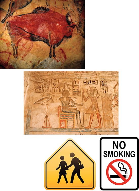
Humans have been drawing pictures to communicate with each other for thousands of yearsfrom pictograms on cave walls to Egyptian hieroglyphics to ideograms on modern signs (). People love using pictures to communicate and tell stories because its hardwired into the human brain.
Altamira bison cave painting, ancient Egyptian hieroglyphics, and modern signs.
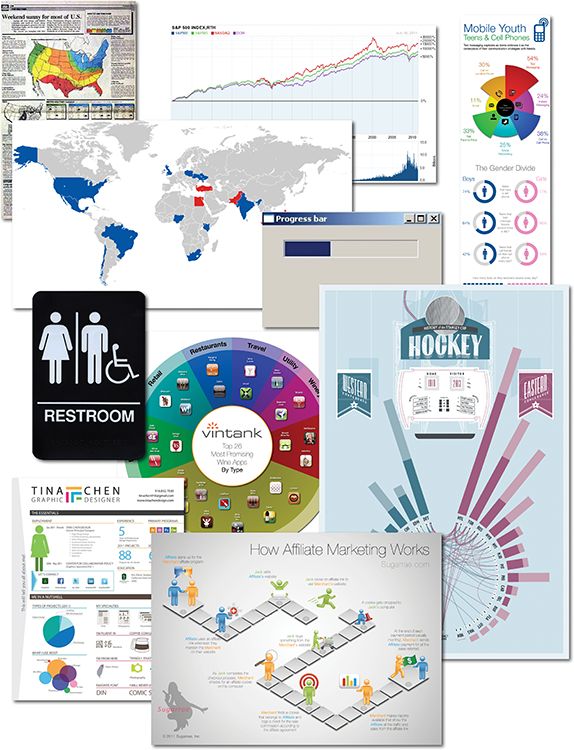
Infographics and data visualizations are all around us. We are surrounded by visual representations of informationcharts, maps, icons, progress bars, signs, posters, diagrams, and online visuals (). These are all examples of visual communication, but these are not all infographics.
Collage of infographics and data visualizations
The word infographic is used by people to mean many different things. In many cases infographics and data visualizations are considered synonymous, but in the world of an infographic designer they mean different things.
Data visualizations are the visual representations of numerical values. Charts and graphs are data visualizations and create a picture from a given set of data. shows the price chart of the S&P 500, the Nasdaq, and the Dow Jones Industrial Average since 1950. The reader can easily see the overall upward trend and the comparison between the three data sets. Including the volume chart beneath the price chart, this data visualization creates a picture using at least 80,000 data points.
Stock price chart
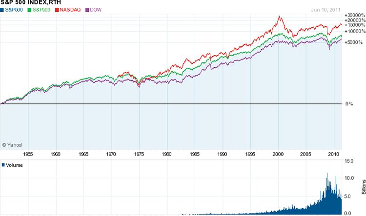
It takes us only seconds to understand the long-term trend, to see the close relationship between the three indices, and to see the significant spikes and falls in the stock market. This visualization easily fits on one piece of paper, a computer screen without scrolling, or a presentation slide. Seeing the entire data set on one page, we can understand the data quickly and with little effort.
This is an efficient way to communicate data. Data visualizations can be very space efficient by visualizing a large set of numbers in a small space. By designing a visualization that displays all of the data within the readers field of view, this enables us to see the entire data set with minimal eye movement without scrolling or flipping between pages.
If we looked at a spreadsheet with 80,000 values instead, how long would it take us to get a general understanding of the market?
In 2001, Dr. Edward R. Tufte, one of the pioneers of modern data visualization and professor emeritus of political science, statistics, and computer science from Yale University, clearly explained this phenomenon when he stated, Of all methods for analyzing and communicating statistical information, well-designed data graphics are usually the simplest and at the same time the most powerful. [1]
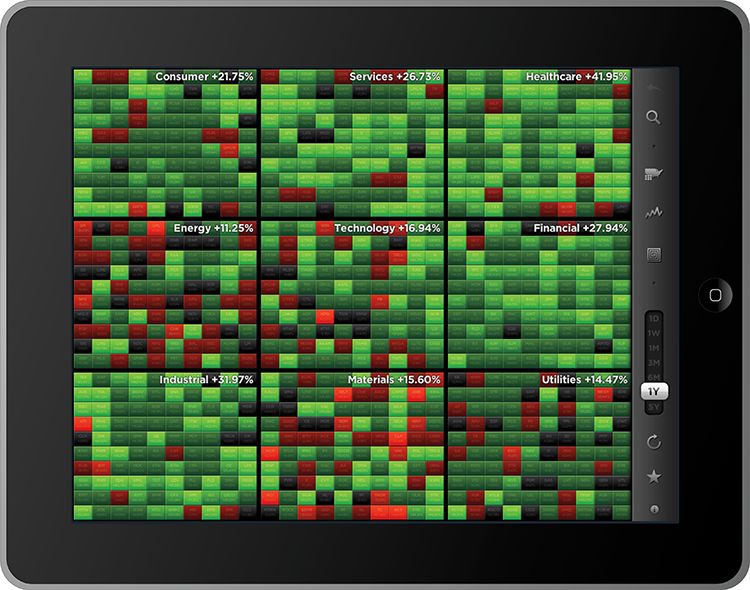
This screen shot () from the StockTouch app on an iPad is another example of a good data visualization design. The top 100 largest U.S. stocks are shown from nine different market sectors. In this view, the companies from each market segment are organized in a spiral pattern from largest (in the center) to smallest. Each stock is color coded based on its stock price performance over the prior 12 months, but the time period is adjustable with the slider on the right. The shades of green show stock prices that have increased, and shades of red show prices that have decreased.
Heatmap visualization of stock price changes
coolinfographics.com/Figure-1-4
Source: StockTouch iOS app, Visible Market, Inc.
Whether its a new definition or an additional definition of the term infographics , its use now implies much more than just a data visualization. Up until recently, a common definition for infographics was simply a visual representation of data; however, that definition is outdated and is more indicative of data visualizations. Originally derived from the phrase information graphics , infographics was a term used in the production of graphics for newspapers and magazines.
Today, the use of the word infographics has evolved to include a new definition that means a larger graphic design that combines data visualizations, illustrations, text, and images together into a format that tells a complete story. In this use of the word, data visualizations by themselves are no longer considered to be complete infographics but are a powerful tool that designers often use to help tell their story visually in an infographic.
This new definition of infographics is used consistently throughout this book. and data visualizations are meant as a separate design element used within the design of infographics. The art of data visualization is a huge topic about which many books have been written and is taught in many university classes. For the purposes of this book, they are not synonymous.
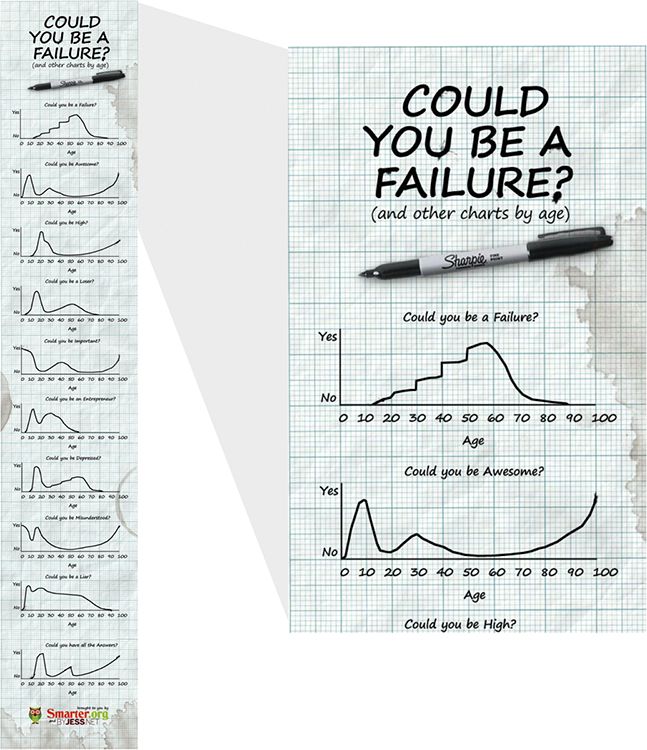
As shown in ), combined data visualizations (line charts), along with text, illustrations, and a photo of a Sharpie marker into this complete infographic design. The overall design is considered to be one infographic that uses many data visualizations in its design.
Infographic design made from 10 data visualizations
coolinfographics.com/Figure-1-5
Source: Could you be a Failure? from Jess.net and Smarter.org
However, the best infographics tell complete stories. Infographics have become more like articles or speeches than charts. Their purpose can be categorized into the same three objectives as public speaking: to inform, entertain, or persuade the audience. They have introductions to get readers attention, so the readers know why they should take the time to read the infographic. They end with conclusions and calls to action, so the readers have some indication of what they should do with the information they have just learned.
This is how many would-be designers end up designing bad infographics. Many designs simply put a bunch of data visualizations on the same page without a cohesive story. They include all the data available, instead of choosing only the data relevant to a central storyline. The process of good infographic design is about storytelling and not about just making your data visualization pretty or eye-catching.
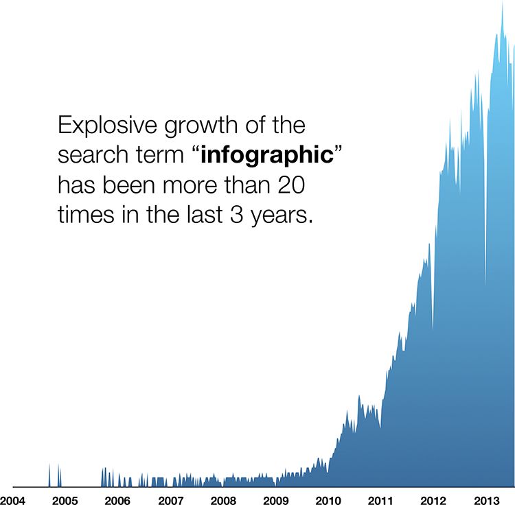
The term infographics is also becoming mainstream. Thirty years ago, the word was only used by art directors and print publications, but the Internet has changed that. (based on data from Google Insights for Search) shows that the last 3 years (20102012) has seen extraordinary growth in people searching for the term infographic . The Internet is turning infographics into a household word.
Growth of search for the term infographic
Font size:
Interval:
Bookmark:
Similar books «Cool Infographics: Effective Communication with Data Visualization and Design»
Look at similar books to Cool Infographics: Effective Communication with Data Visualization and Design. We have selected literature similar in name and meaning in the hope of providing readers with more options to find new, interesting, not yet read works.
Discussion, reviews of the book Cool Infographics: Effective Communication with Data Visualization and Design and just readers' own opinions. Leave your comments, write what you think about the work, its meaning or the main characters. Specify what exactly you liked and what you didn't like, and why you think so.