Practical Guide to Affinity Designer
Learn Affinity Designer through practical projects
By Dawid Tuminski
Contents
The Shape tools
Transformations: Reflecting
Transformations: Rotating
Strokes
Gradients
Pen Tool
Rounding corners
Dividing shapes
Point Transform tool
Isometric creation
Saving and exporting your files
Introduction
If you ever wanted to learn a piece of design software, but at the end of the learning process you were left with a thought in your head, like Ok, so what do I do now? , you might have just found a solution to that problem.
Because this book will help you in learning Affinity Designer and having something to show for it at the end of the learning process.
It was designed to be as practical as possible. Inside you will find
10 flat icon projects designed and created using solely Affinity Designer
The most important tools and options to get you started with the software as fast as possible
Tens of useful tricks and tips to speed up your design workflow
At the end of the book you will hopefully be able to use Affinity Designer absolutely independently.
We wont be focusing on each and every little aspect about each and every tool in Designer. Instead, you will learn how to look at the tools, how they think and how to benefit from what they offer.
Before we jump right into the creation process, theres just a few simple things we need to bear in mind. They will help you in getting the most out of this book.
- Each and every project, by default, needs to start with creating a new file. However, we will learn how to do that only while creating our first project. So you can just assume that every following project starts with creating a new file, even if it is not specifically mentioned.
- You will find hex code values for each of the colors used to create a project right at the beginning of the design process. You can always consider them only as a suggestion, and use your own colors.
- Each design will present a set of similar techniques, but will also introduce one, specific tool or technique, so your skill set will grow with each subsequent design.
When planning out this book I wanted to make it straight to the point: I wanted to allow you, the student, to gain as many helpful skills as quick as possible. So lets actually start the design process and jump right into creating the first icon.
The Shape tools
Our first project is a retro TV icon. Along the way you will learn how to use the shape tools and how to modify shapes, including rectangles, rounded rectangles and circles.
Before that we are going to create a new file. And as mentioned before, the same file creation process will apply to all the coming designs.
#1
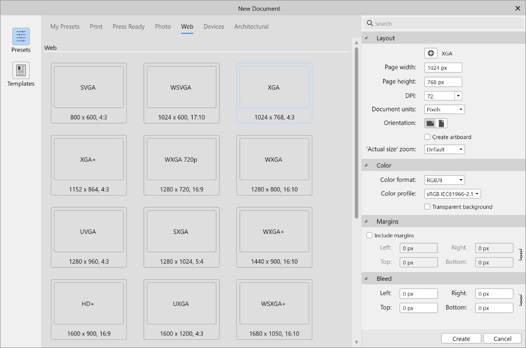
From the File menu choose New . You could always just use the Ctrl/Cmd + N shortcut. A new window will pop up allowing you to choose a document preset. Lets just go ahead and choose the 1024x768 px document from the Web presets.
Although, the size and the type dont really matter at this point. You can choose whichever document present you want, because Affinity Designer creates vector graphics, which means that you can freely resize your artwork.
If you want, you can check Create artboard at this point, but its not necessary as we wont be creating a multi-page document.
Once everything is ready, just hit Create and you will see a document window created.
In this project we will be using the following colors:
Dark grey | #373F47 |
Green | #62D16F |
Blue | #7699D4 |
Orange | #FFA630 |
Light blue | #D5E0F2 |
Light grey | #FEFCFD |
#2
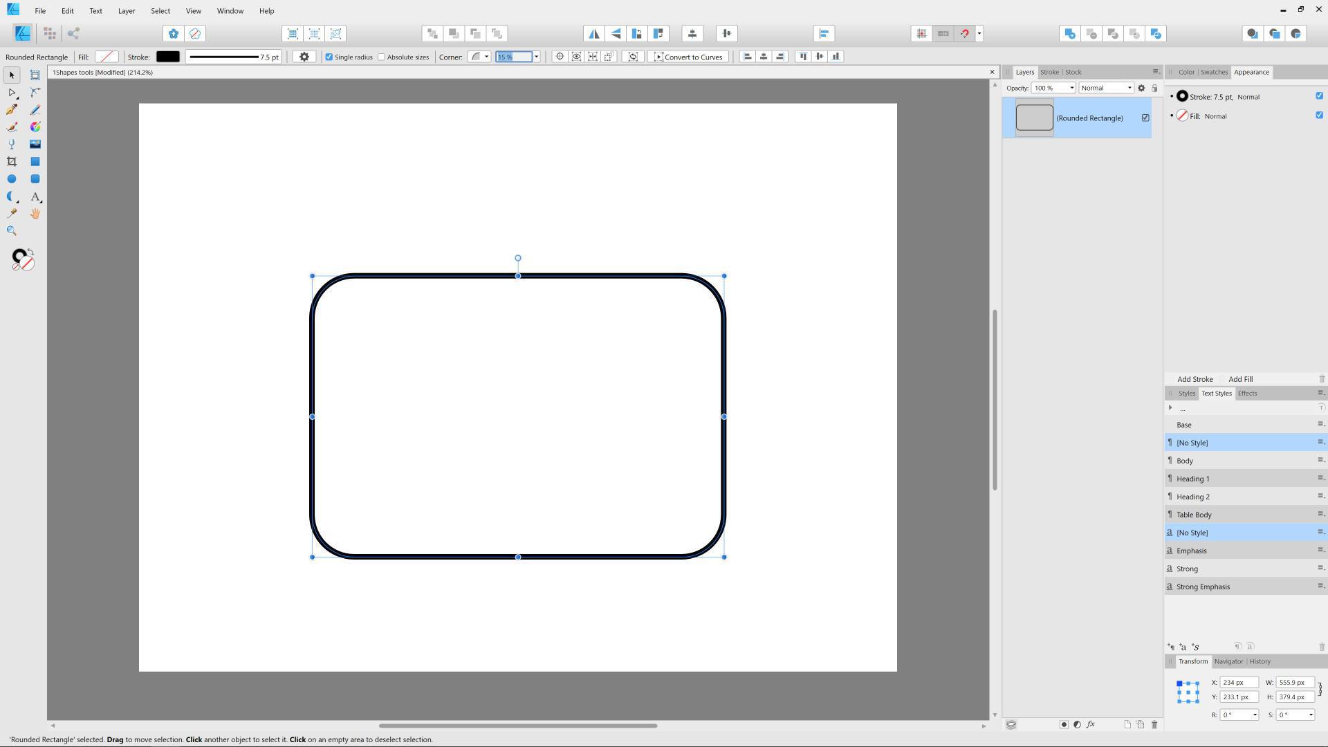
Our first step will be to create a rounded rectangle. Grab the Rounded rectangle tool from the Tools panel on the left. Click and drag to create a shape.
In the Context toolbar (on top) you can adjust the Corner value: decrease or increase the percentage of roundness applied to the corners of the rectangle.
#3
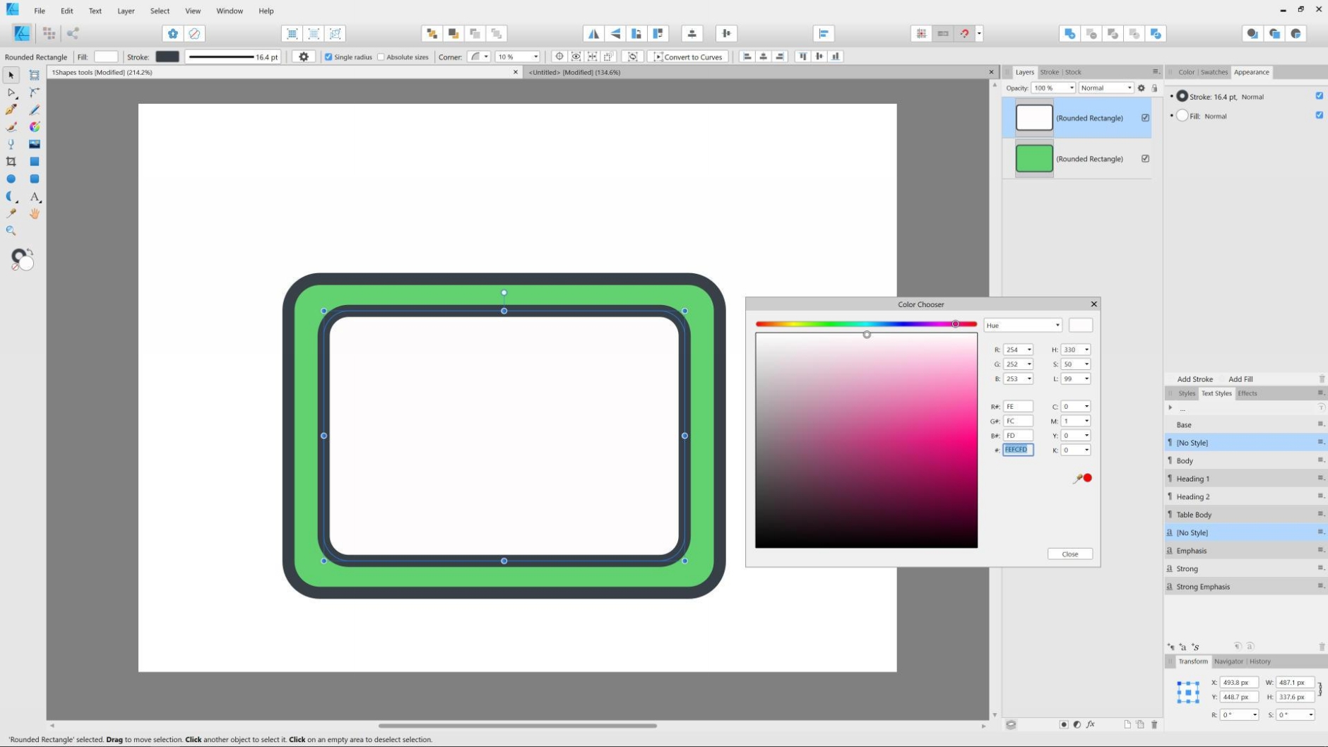
Now we can add the colors and adjust the stroke. First, make sure that the fill is active (you can check that in the Tools panel on the left - right now we have no fill as indicated by a red cross line in the image above).
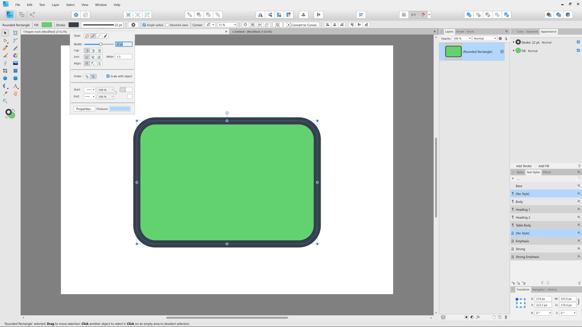
Double click on it to invoke the Color chooser and paste in the green color value to fill the shape.
Next make sure the stroke is active and add the dark grey as the stroke color. Lastly, in the context panel, increase the stroke width.
Of course you can modify it later and make it as wide or thin as you wish - there is no right or wrong here.
Your rectangle should look more or less like this:
#4
Now lets grab our rectangle and duplicate it by pressing Ctrl/Cmd + J on the keyboard, which is the same as going to the Layer menu and then Duplicate Selection.
We need to shrink it a bit and fill it with the light gray color. To do that, first grab the rectangle with the Move tool (the black arrow), hold down the Ctrl/Cmd key to start the transformation from the center spot and click and drag inward by one of the bounding boxs points.
Lastly, add the grey fill repeating the steps we took to fill our initial rectangle.
#5
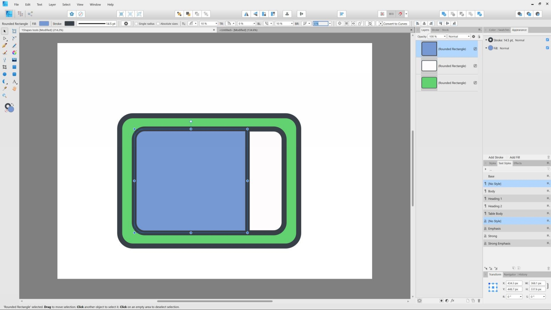
Duplicate the newly created rectangle, but this time shrink it to the left by dragging its right side. Then fill it with a blue color.
When you select the newly created rectangle, in the Context toolbar you can uncheck the Single radius option. This will allow you to remove the roundness of the top right (TR) and bottom right (BR) corners.
#6
Now lets take care of the reflection at the bottom of our TVs screen.
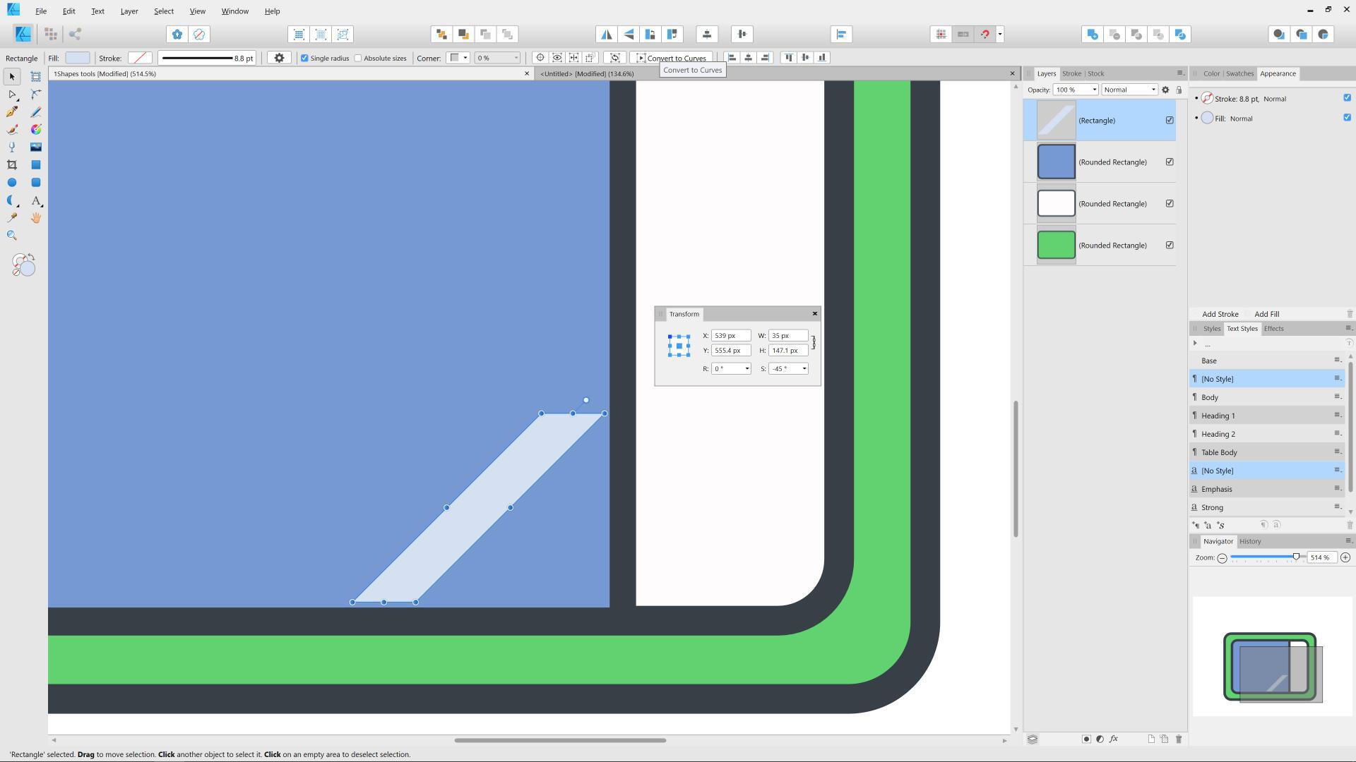
For that, using the Rectangle tool, we will create a simple rectangle that we will fill with the light blue color and shear it by a -45 deg in the Transform panel. Once its ready, move it closely to the bottom right edge of the screen. You can adjust the reflections size to anything you want.
All we need to do now is to adjust this rectangle so it goes along nicely with our design intent.
