Glover - Seasons: learn to paint seasons in acrylic step by step
Here you can read online Glover - Seasons: learn to paint seasons in acrylic step by step full text of the book (entire story) in english for free. Download pdf and epub, get meaning, cover and reviews about this ebook. City: Lake Forest;CA, year: 2017;2016, publisher: Walter Foster Publishing, genre: Home and family. Description of the work, (preface) as well as reviews are available. Best literature library LitArk.com created for fans of good reading and offers a wide selection of genres:
Romance novel
Science fiction
Adventure
Detective
Science
History
Home and family
Prose
Art
Politics
Computer
Non-fiction
Religion
Business
Children
Humor
Choose a favorite category and find really read worthwhile books. Enjoy immersion in the world of imagination, feel the emotions of the characters or learn something new for yourself, make an fascinating discovery.

- Book:Seasons: learn to paint seasons in acrylic step by step
- Author:
- Publisher:Walter Foster Publishing
- Genre:
- Year:2017;2016
- City:Lake Forest;CA
- Rating:5 / 5
- Favourites:Add to favourites
- Your mark:
Seasons: learn to paint seasons in acrylic step by step: summary, description and annotation
We offer to read an annotation, description, summary or preface (depends on what the author of the book "Seasons: learn to paint seasons in acrylic step by step" wrote himself). If you haven't found the necessary information about the book — write in the comments, we will try to find it.
Glover: author's other books
Who wrote Seasons: learn to paint seasons in acrylic step by step? Find out the surname, the name of the author of the book and a list of all author's works by series.


Seasons: learn to paint seasons in acrylic step by step — read online for free the complete book (whole text) full work
Below is the text of the book, divided by pages. System saving the place of the last page read, allows you to conveniently read the book "Seasons: learn to paint seasons in acrylic step by step" online for free, without having to search again every time where you left off. Put a bookmark, and you can go to the page where you finished reading at any time.
Font size:
Interval:
Bookmark:
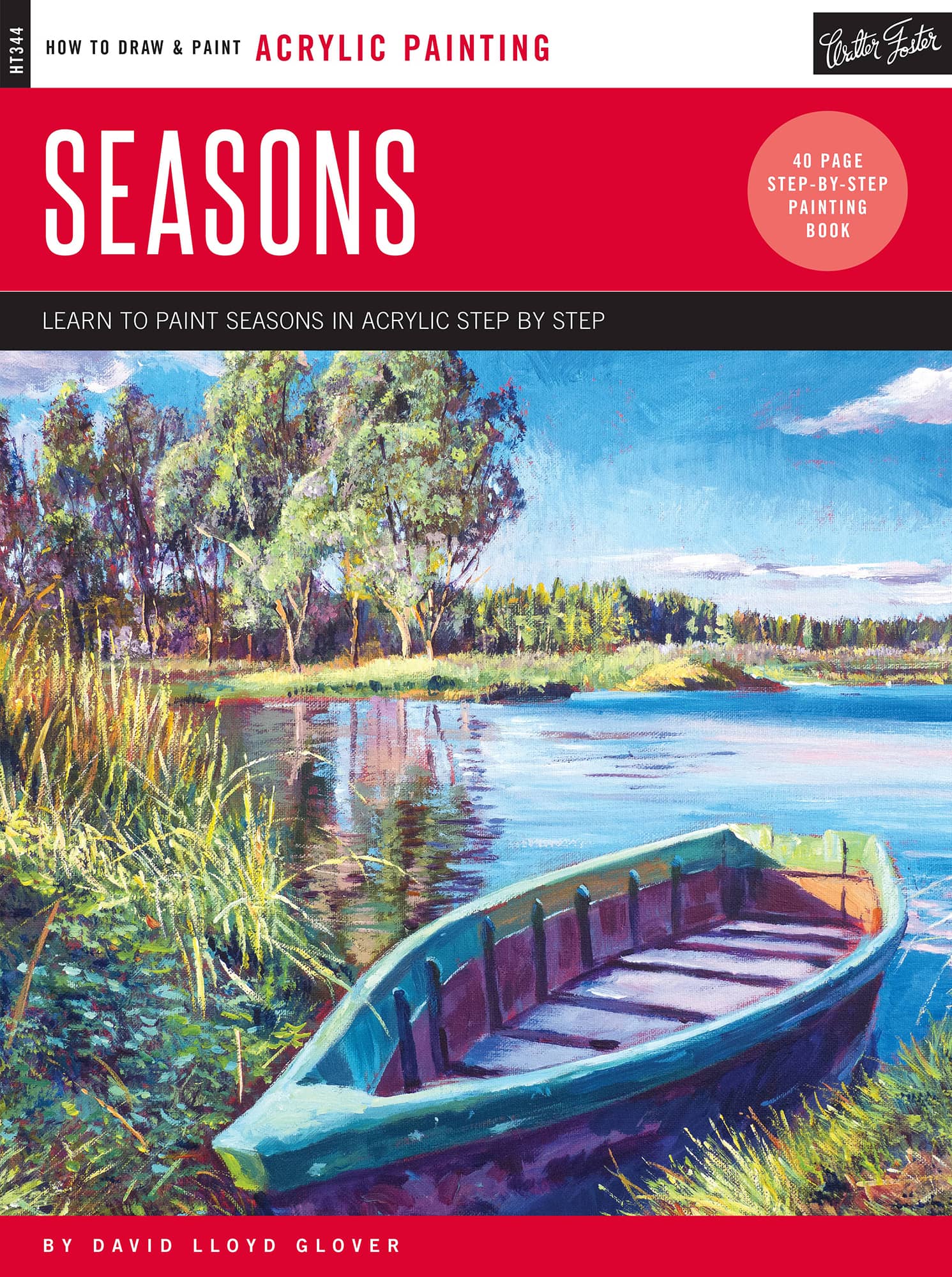

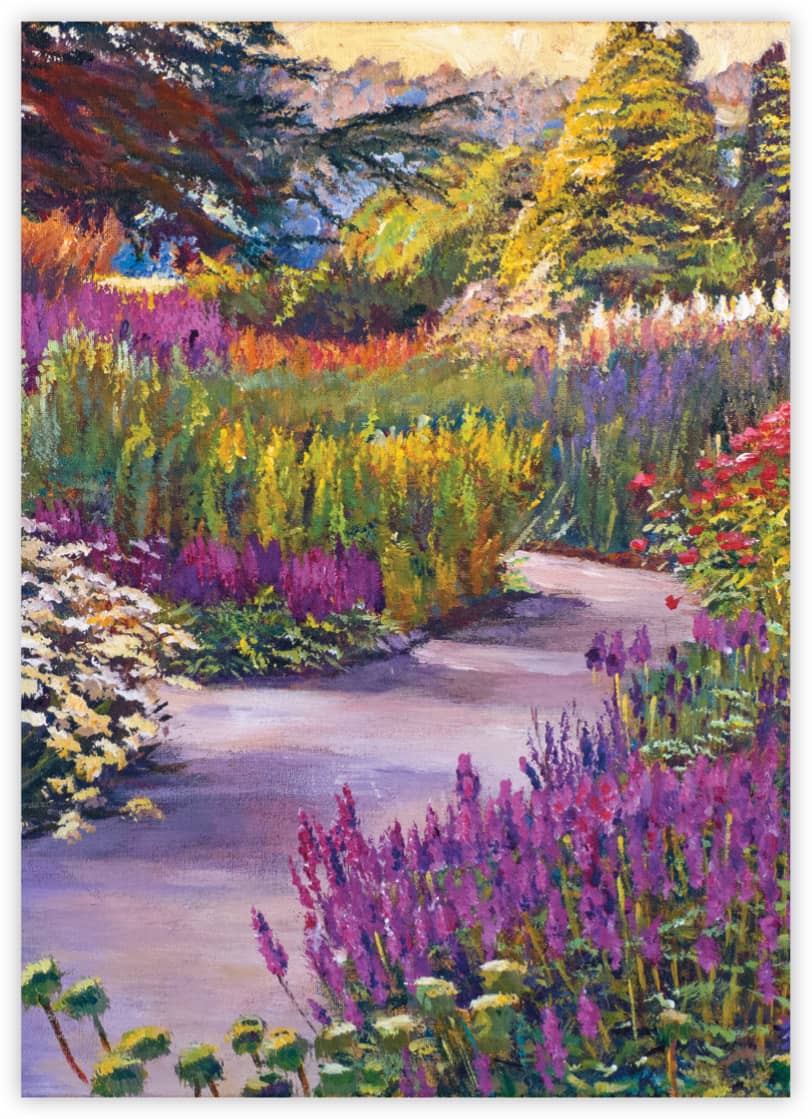
As sunlight changes throughout the year, so does the way we see color in nature, and with acrylics, you can create compelling paintings that celebrate each season at its colorful best. With each project in this book, youll learn the methods and techniques that make painting seasons a joyful experience. David Lloyd Glover
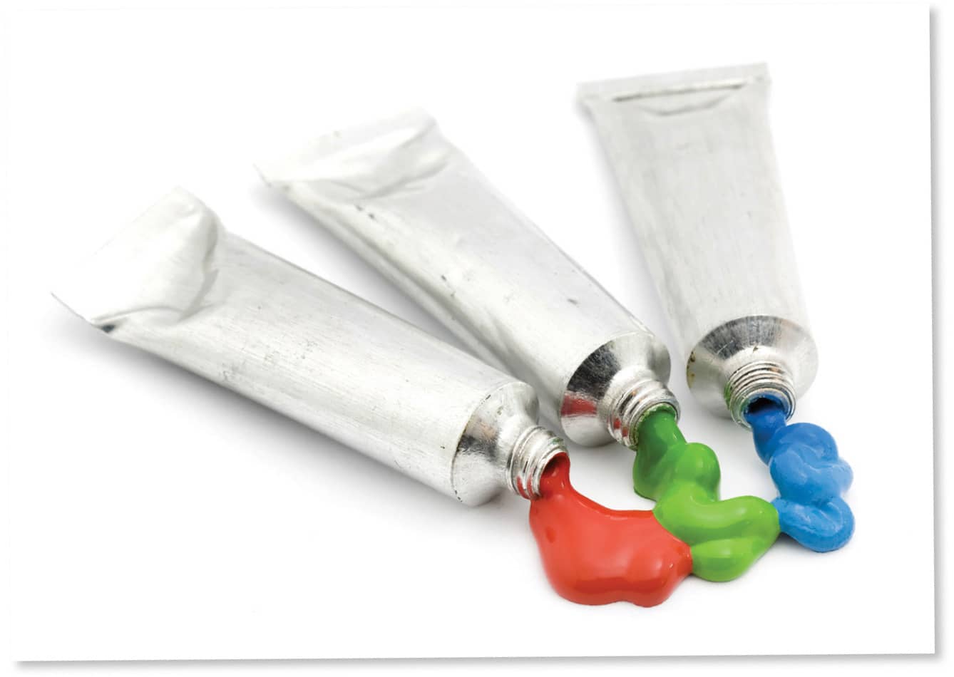
Paint varies in expense by grade and brand. Very inexpensive paints might lack consistency and affect your results, but buying the most costly color may also limit you. Find a happy medium.
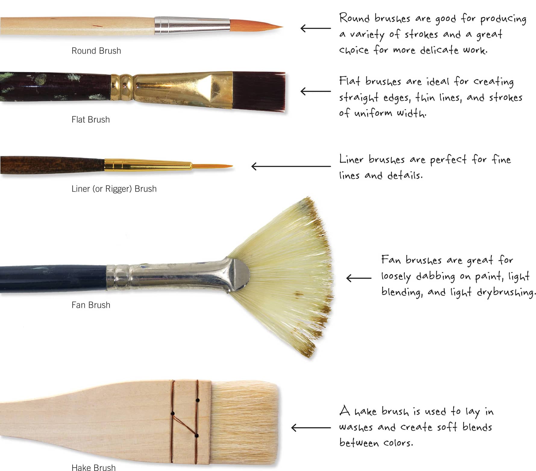
Synthetic brushes are best for acrylic painting because their strong filaments can withstand the caustic nature of acrylic. Build a starter set with small, medium, and large flat brushes; a liner (or rigger) brush; a medium fan brush; and a hake brush.
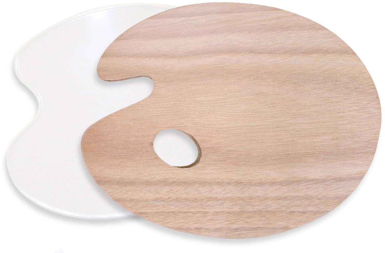
Palettes for acrylic paint range from white, plastic handheld palettes to sheets of plexiglass.
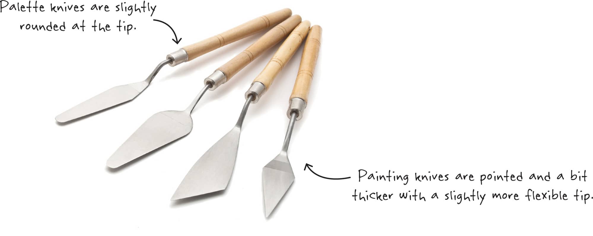
Palette & Painting Knives
Palette knives are mainly used to mix colors on your palette; they come in various sizes and shapes. Some can also be used for applying paint to your canvas, creating texture in your work, or even removing paint.
Sponges are great for dampening your canvas and applying paint to create texture.
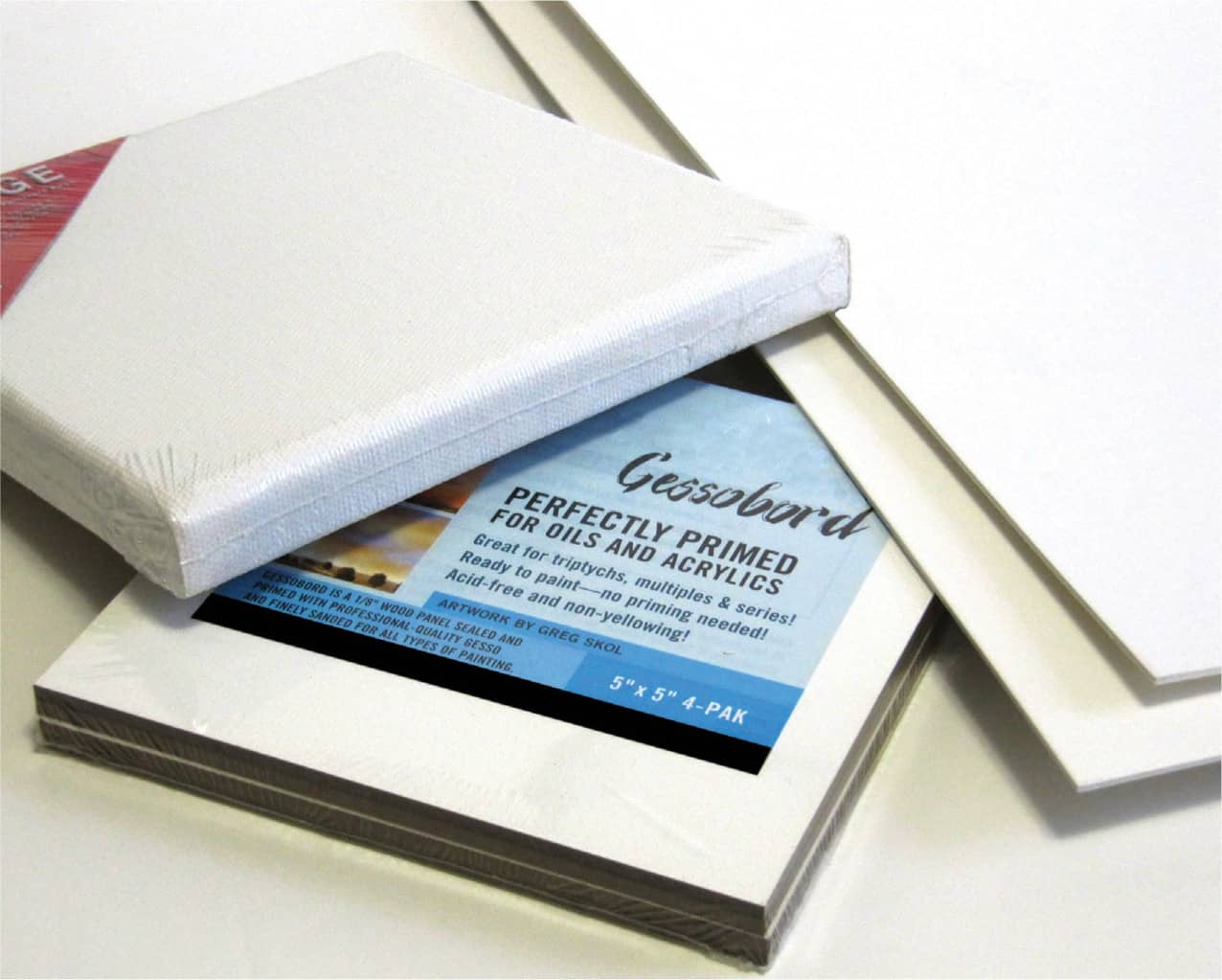
Although you can paint on many surfaces, canvas is the most popular choice. Pre-primed and stretched canvas, which is available at arts and craft stores, is stretched taut over a wood frame and coated with acrylic gessoa white primer that provides an ideal surface for holding paint.
Additional Supplies
Some additional supplies youll want to have on hand include:
Paper, pencils, and a sharpener for drawing, sketching, and tracing
Jars of water, paper towels, and a spray bottle of water
Blackboard chalk and/or vine charcoal for sketching over dry paint
Acrylic glazing medium or retarder
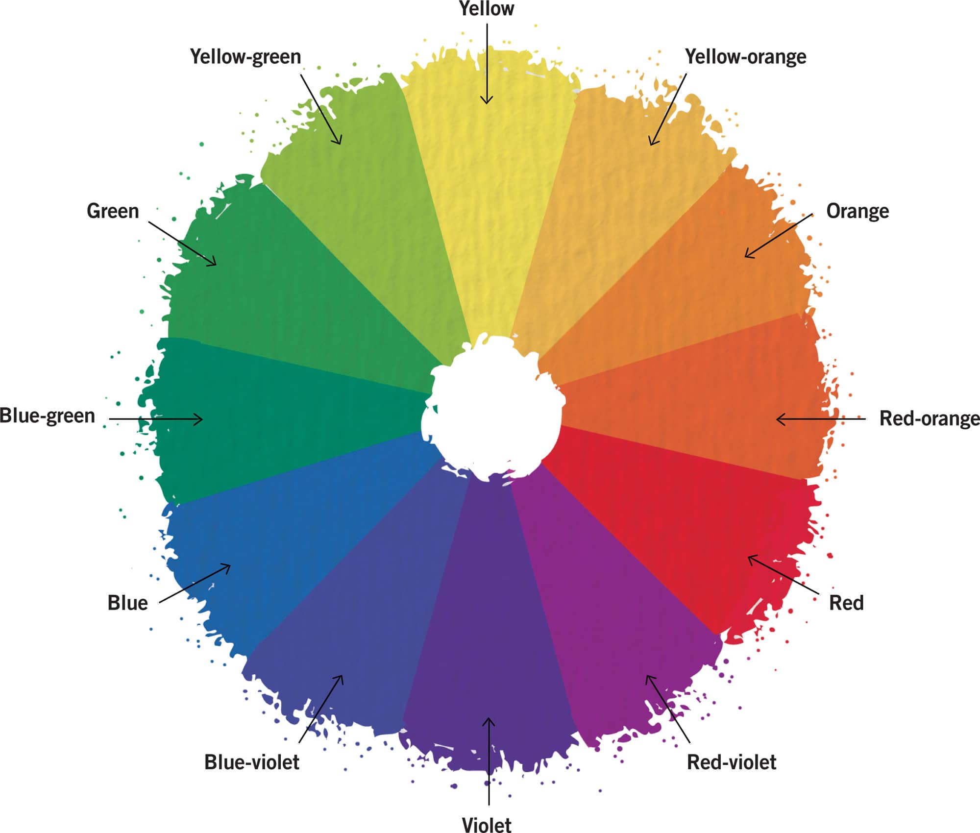
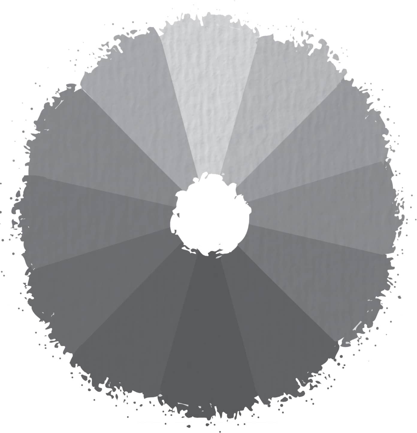
A basic knowledge of color and color relationships is essential in learning how to paint. One of the easiest ways to approach color is by seeing it on a color wheel, which is a visual organization of color hues around a circle. Seeing the colors organized in this fashion is helpful for color mixing and choosing color schemes.
The color wheel helps us see relationships between primary, secondary, and tertiary colors. Primary colors are blue, red, and yellow. We can create a multitude of other colors by combining blue, red, and yellow in various proportions, but we cant create the three primaries by mixing other colors. Secondary colors include orange, green, and violet. You can create these colors by combining two primaries. Red and yellow make orange, blue and red make violet, and yellow and blue make green. Tertiary colors are created by mixing each primary color with its neighboring secondary color. These colors include red-orange, yellow-orange, yellow-green, blue-green, blue-violet, and red-violet.
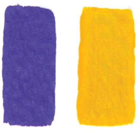
Complementary Colors
Complements sit opposite each other on the color wheel. For example, red sits opposite green, blue sits opposite orange, and yellow sits opposite purple. These colors are considered opposites in their hues and yield the maximum amount of color contrast possible. When complements are mixed together, they form a dull gray, brown, or neutral color.
Neutral Colors
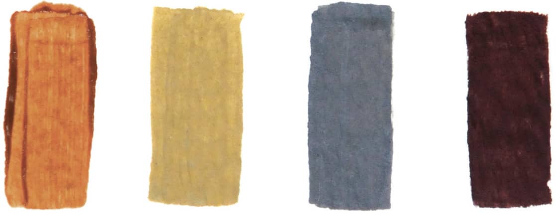
Neutral colors are browns and grays, both of which contain all three primary colors in varying proportions. Neutral colors are often dulled with white or black. Artists also use the word neutralize to describe the act of dulling a color by adding its complement.
Color temperature refers to the feeling one gets when viewing a color or set of colors. Generally, yellows, oranges, and reds are considered warm, whereas greens, blues, and purples are considered cool. When used within a work of art, warm colors seem to advance toward the viewer, and cool colors appear to recede into the distance. This dynamic is important to remember when suggesting depth or creating an area of focus.
Cool
Warm
Within each hue, you can achieve a range of valuesfrom dark shades to light tints. However, each hue has a value relative to others on the color wheel. For example, yellow is the lightest color and violet is the darkest. To see this clearly, photograph or scan a color wheel, and use computer-editing software to view it in grayscale. It is also very helpful to create a grayscale chart of all the paints in your palette so you know how their values relate to one another.
LIGHT & SHADOW
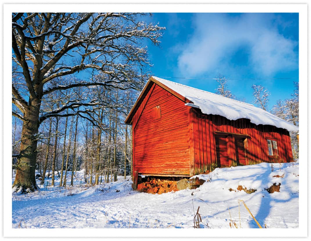
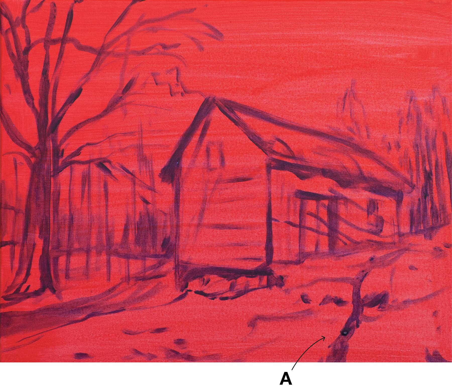
Winter scenes always evoke great nostalgia and give people a warm feeling. A simple palette highlights the weathered maple sugar barn in the New England countryside.
Font size:
Interval:
Bookmark:
Similar books «Seasons: learn to paint seasons in acrylic step by step»
Look at similar books to Seasons: learn to paint seasons in acrylic step by step. We have selected literature similar in name and meaning in the hope of providing readers with more options to find new, interesting, not yet read works.
Discussion, reviews of the book Seasons: learn to paint seasons in acrylic step by step and just readers' own opinions. Leave your comments, write what you think about the work, its meaning or the main characters. Specify what exactly you liked and what you didn't like, and why you think so.