Publisher: Amy Marson Creative Director: Gailen Runge Art Director/Cover Designer: Kristy Zacharias Editor: Monica Gyulai Technical Editors: Nan Powell and Amanda Siegfried Book Design: Page + Pixel Production Coordinator: Zinnia Heinzmann Production Editors: Alice Mace Nakanishi and Jessie Brotman Illustrator: Kirstie L. Pettersen Photo Assistant: Sarah Frost Style photography by Page + Pixel and instructional photography by Diane Pedersen, unless otherwise noted Published by Stash Books, an imprint of C&T Publishing, Inc., P.O. Box 1456, Lafayette, CA 94549 DEDICATION To Garrett: Two are better than one, because they have a good return for their work: If one falls down, his friend can help him up. But pity the man who falls and has no one to help him up! Ecclesiastes 4:910 ACKNOWLEDGMENTS I wish to thank the following people for their support, encouragement, knowledge, and inspiration: My husband, who took on more chores around the house, kept me fed, and made sure I was getting enough sleep. I love you more than words can ever express. We did it. We did it.
My three-year-old daughter, Audrey, whose willingness to give up a lot of our crafting, reading, and exploring time really helped me with this book. I hope you are proud of me. I love you. My parents, who taught me that through preparation, hard work and focus, goals can be accomplished. My in-laws, who shared their inspiring family quilts and pushed me to turn my hobby into a business. My handsome Bernese mountain dog, Harvey, who passed away during the writing of this book.
He was my running partner and silent companion and always sat near my feet when I sewed. I miss seeing your fur in my work, buddy. The rest of my family and friendsboth in my old hood of Rock Island, Illinois, and in Denver, Colorado. All of you hold a special place in my heart. All the quilters I have met along the way, especially the Longmont Quilt Guild Retreaters, Great American Quilt Factory staff, and Denver Quilt Guild. Thank you for your inspiration and friendship.
My church family throughout the years: Grace Korean Church, Bethel Assembly of God Church, University Hills Baptist Church, Mississippi Avenue Baptist Church, and Harvest Bible Chapel. Thank you for your fellowship and knowledge as I grew in my faith. Most important, I thank God for blessing me with this opportunity. introduction Its no secret that quilters love fabric. Many of us start our first quilts by purchasing fabric as needed for particular patterns. Some of us dive right into building a stash.
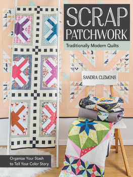
Eventually, all of us end up with unused yardage and leftover pieces stowed for future use. The thirteen fabulous quilts in this book were designed to make use of scraps. While many of the quilts rely on large pieces of neutral fabric to achieve a clean, modern look, they also include a range of colorful fabrics that pop. Dig into your own stash for these scrappy elements and make these designs your own. Each project includes design notes so that you can get the same look and feel when choosing fabrics from your own collection or the local quilt shop. 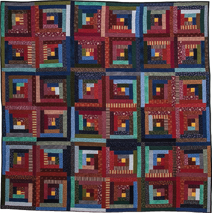 My first quilt, a Log Cabin design that measured 120 120 While scraps are useful, they have a way of piling up.
In Organizing Scraps and Stash Fabrics, you will learn the best methods for storing and organizing your scraps, building your stash, and narrowing down fabric choices to make beautiful quilts. Understanding color is important for both sorting your stash and selecting fabrics for quiltmaking. In Color Basics, you will learn how to get the look and feel you want in a quilt by choosing the right kind of color scheme. These scrappy, modern quilt designs are geared toward beginning and intermediate quilters. Step-by-step instructions and special methods explained in Special Techniques make it easy to get things right the first time, with minimal waste and simple assembly. These bright and clean designs rely on traditional elements, including classic block designs, structure, and traditional workmanship.
But they also have a modern feel, due to their use of solids and textured fabrics, large blocks, and bright colors combined in fresh ways. I started quilting ten years ago and have been hooked on the art form ever since. I hope you will enjoy the process of making these quilts as much as I did and become inspired to make a treasure of your own. Sandra P. Clemons sandraclemons.blogspot.com COLOR BASICS Part of the fun in quiltmaking is selecting colors and fabrics. However, this step can sometimes be overwhelming and intimidating, especially when working with scraps.
Understanding how color and fabric choices affect a quilts overall appearance makes choosing fabrics more enjoyable. color messagesColors deliver messages to us even when we dont realize it. Some colors are calming, while others rev us up. There is much discussion about what colors mean, but here are some common associations. When you choose a palette for a quilt, keep in mind how you want it to make people feel.RED: energy, strength, power, passion, and lovePINK: romance, friendship, grace, and femininityORANGE: joy, attraction, encouragement, trust, and enthusiasmYELLOW: happiness, sunshine, freshness, youth, and intellectGREEN: harmony, safety, and natureAQUA: healing and protectionBLUE: depth, peace, and sincerityPURPLE: royalty, power, luxury, and mysticismWHITE: light, goodness, and purityBLACK: elegance, formality, mystery, and powerBROWN: masculinity and stability Thinking About Color When thinking about colors, some people look to the color wheel for ideas and planning. It shows how colors relate to each other and helps identify why certain combinations are pleasing to the eye.
There are also colors that you dont see on the basic color wheeltints, tones, and shades. These variations of colors are lighter (tints), darker (shades), and muted (tones). Some of these variations fall into the category of neutrals. And then there are white and black. Whites can brighten areas, and blacks can anchor a design. 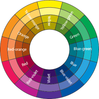 The color wheel VALUE AND CONTRAST Before discussing color, we need to talk about value and contrast. Value is the relative lightness or darkness of a color/fabric. Contrast is the difference between colors/fabrics. Contrast is the difference between colors/fabrics.
Contrast makes patterns or designs stand out. Contrast of value makes the strongest impression. Contrast and value are relative. A fabric may look dark when it is next to a light fabric and look light when it is next to a dark fabric. If you arent sure whether your fabrics have enough contrast, use your handy-dandy phone or camera to snap a black-and-white photo as you play with choices to see which fabrics stand out and which sit back. 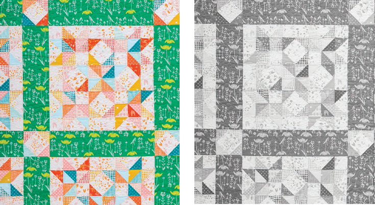 In this block from Meadows, the medium orange fabric is light when next to dark teal or dark orange, but it is dark when next to the light background. TIP Decoding Color
 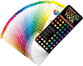 The Ultimate 3-in-1 Color Tool (by C&T Publishing) is a handy reference when trying to make sense of color and value when planning out quilts.
Next page
 My first quilt, a Log Cabin design that measured 120 120 While scraps are useful, they have a way of piling up.
 The color wheel VALUE AND CONTRAST Before discussing color, we need to talk about value and contrast. Value is the relative lightness or darkness of a color/fabric. Contrast is the difference between colors/fabrics. Contrast is the difference between colors/fabrics.
 In this block from Meadows, the medium orange fabric is light when next to dark teal or dark orange, but it is dark when next to the light background. TIP Decoding Color
  The Ultimate 3-in-1 Color Tool (by C&T Publishing) is a handy reference when trying to make sense of color and value when planning out quilts.