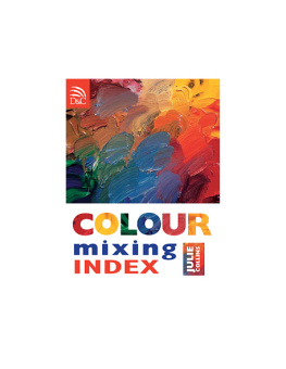
COLOUR mixing INDEX
JULIE COLLINS
COLOUR mixing INDEX
JULIE COLLINS
A DAVID & CHARLES BOOK
Copyright David & Charles Limited 2007
David & Charles is an F+W Publications Inc.
company
4700 East Galbraith Road
Cincinnati, OH 45236
First published in the UK in 2007
All rights reserved. No part of this
publication may be reproduced, stored in a
retrieval system, or transmitted, in any form
or by any means, electronic or mechanical,
by photocopying, recording or otherwise,
without prior permission in writing from the
publisher.
A catalogue record for this book is available
from the British Library.
ISBN-13: 978-0-7153-2295-6 flexi
ISBN-10: 0-7153-2295-8 flexi
Printed in by for David & Charles Brunel House Newton Abbot Devon
Commissioning Editor Freya Dangerfield
Assistant Editor Emily Rae
Art Editor Sarah Underhill
Designer Emma Sandquest
Production Controller Beverley Richardson
Visit our website at www.davidandcharles.co.uk
David & Charles books are available from
all good bookshops; alternatively you can
contact our Orderline on 0870 9908222
or write to us at FREEPOST EX2 110, D&C
Direct, Newton Abbot, TQ12 4ZZ (no
stamp required UK only); US customers call
800-289-0963 and Canadian customers call
800-840-5220.
PUBLISHERS NOTE:
The publisher would like to thank Winsor & Newton for their generous contribution of the materials for the colour mixes throughout this book.
PAINT NAMES:
The names and colours of Winsor & Newton paints are consistent across all mediums. For example, Naples yellow 422 is available as oil paint, watercolour paint, an acrylic and a gouache. However, because different mediums are manufactured in different ways, the colour will not be exactly the same across all mediums; the Naples yellow watercolour may look slightly different from the Naples yellow acrylic.
COLOUR REPRODUCTION:
The images in this book have been printed to the highest possible standards of colour reproduction. However, due to the printing process, the author and publishers cannot guarantee the exact accuracy of the colour images in this book.
Winsor & Newton have a policy of continuous product developement and improvement. Whilst the information in this book is as accurate as possible at the time of printing, Winsor & Newton reserve the right to amend specifications and discontinue lines without notice. If you have any queries please contact the manufacturer (see page 318).
CONTENTS
Introduction
This book is a practical and inspirational manual that shows you a huge range of colour mixes in five popular mediums: watercolour, oil, acrylic, gouache and ink. The aim of the book is to encourage you to get to know colours well and be motivated to explore and experiment with colour. Use the book as a handy reference when you want to know how to mix a specific colour, or as a catalogue of inspiration when seeking ideas to try in your work.
At the end of the book (page 320) there is a colour viewing card. Cut this out and use it to view each colour swatch in isolation. This will help sharpen your perception of the colour, or allow you to pinpoint a specific shade to use in your own work.
HOW TO USE THIS BOOK
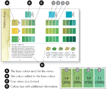
This book has five sections: one for each of the key media watercolour, oil, acrylic, gouache and ink. The colour mixes in each section follow a basic order: yellow, red, blue and green (some also include browns, blacks and greys). You can identify quickly the colour section you are in by the coloured strip down the edge of each left-hand page, which is an approximate match to the mixes on that spread. On each spread (see opposite), colour mixes are made using two colours: a base colour shown in a square on the left-hand page (A), and a mixing colour shown in a square at the top of the page (B). From these two colours, four mixes are made, using the colours in four different ratios (C).

Mixes
In mix 1, colour B is added to colour A at a ratio of 1:4 (25% of colour B). Mixes 2, 3 and 4 have increasingly higher ratios of colour B (see left).

Dilutions
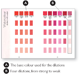
At the end of each section there are a few pages on diluting a colour, with water or with white paint, depending on the medium. This allows you to explore the tonal range that it is possible to obtain within an individual colour.
ABOUT COLOUR AND COLOUR MIXING
It is useful to know something about colour theory before you start experimenting with colour mixing. Traditionally, the relationships between colour have been demonstrated on a colour wheel. This is based on the relationships between primary, secondary and tertiary colours. The primary colours are red, yellow and blue. These cannot be made by mixing other colours, but all other colours can be created by mixing the primary colours in different proportions.
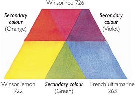
Mixing the primary colours together in equal proportions produces the secondary colours, as shown in the colour triangle below: orange (from red and yellow); violet (from red and blue); and green (from blue and yellow).

The colour triangle is made up of primary and secondary colours
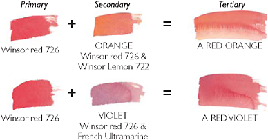
The tertiary colours are created by mixing a primary colour with an adjacent secondary colour. The tertiary colours are: orange-yellow, red-orange, red-purple, purple-blue, blue-green and yellow-green.
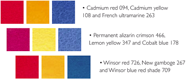
Making your own colour wheel, starting with just three tubes of paint for each of the primary colours, is an extremely useful exercise. You will be able to see what a huge array of colour mixes you can produce from blending your colours in different proportions. Here are a few ideas for some three-paint combinations from which you can explore a whole spectrum of colour mixes:
WARM AND COOL COLOURS
When you are learning about colour mixing, a basic set of primary colours red, blue and yellow is a good starting point. Using just three colours as the base for all your colour mixes is very useful for understanding how colours work, both separately and when mixed. With such a small range, you get to know the paints and the colour mixes they create very intimately.

