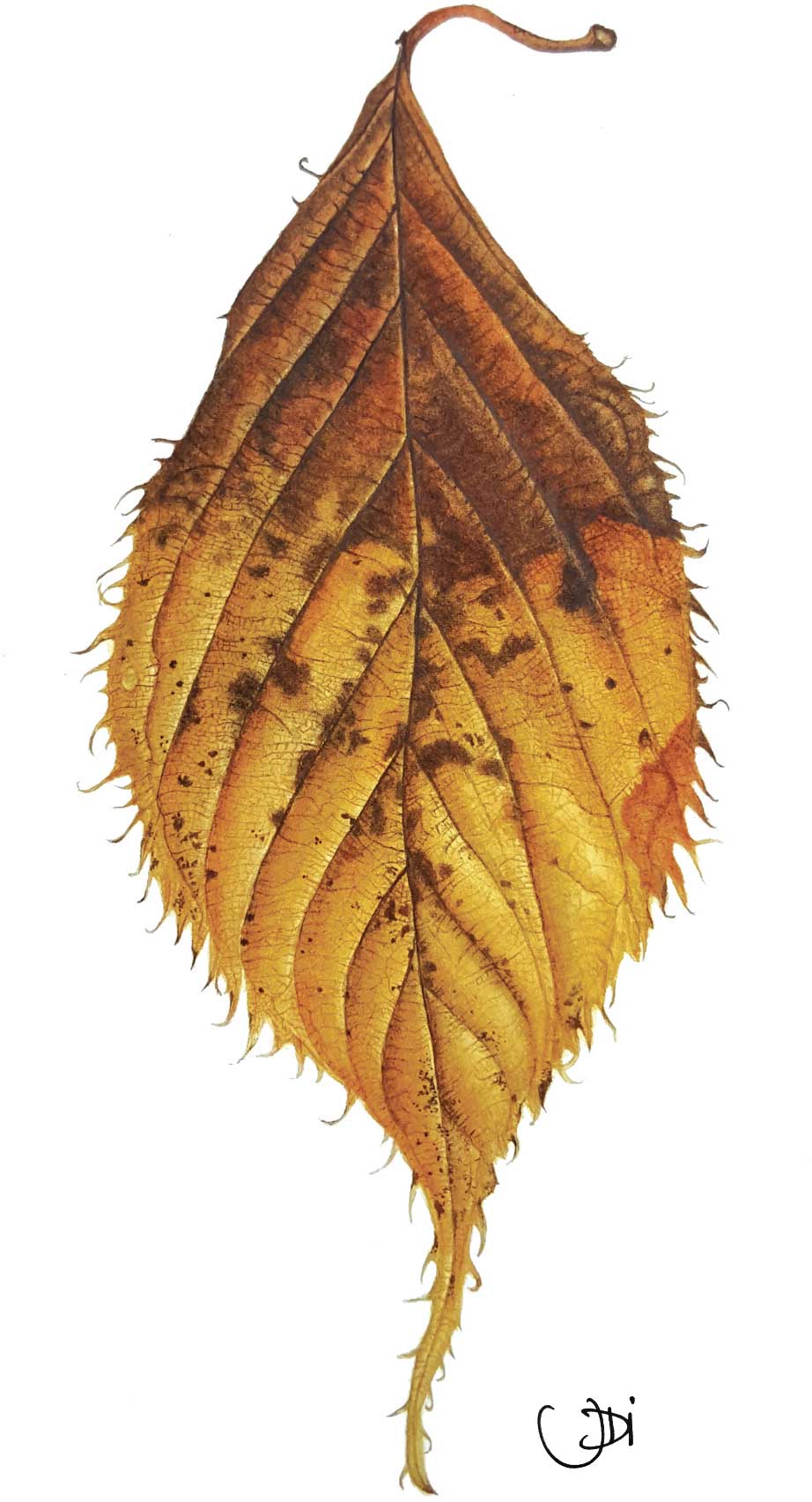
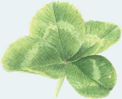
Cherry 'Chocolate ice' autumn leaf.
All rights reserved. This e-book is copyright material and must not be copied, reproduced, transferred, distributed, leased, licensed or publicly performed or used in any way except as specifically permitted in writing by the publishers, as allowed under the terms and conditions under which it was purchased or as strictly permitted by applicable copyright law. Any unauthorised distribution or use of this text may be a direct infringement of the authors and publishers rights, and those responsible may be liable in law accordingly.
My thanks and gratitude must go to my closest family, David and Tyler, for their patience and belief in me throughout my botanical career.
My special thanks must go to all those who have supported and helped me to develop along my journey; Billy Showell, Robert McNeill and Fiona Strickland.
Thank you to the following artists for allowing me to use photographs of their coursework within this publication; Renata Barilli, Susan Brunner, Lisa Chernyavska, Hilde de Hondt, Vivienne Rew, Vicky Sharman, Sue Stuart and Nathalie Wallace.
WHY IS COLOUR SO IMPORTANT TO ME?
I am passionate about colour and I have written this book to help botanical artists make informed decisions when mixing watercolour pigments.
My journey into botanical illustration came from a love of plants and gardening. After many years as a graphic designer I was made redundant and decided to take a garden design course in the hope of pursuing a new career. Learning about plants species, Latin names, soil types and how to put all this together into a beautiful garden design brought me closer to plants than I had ever been. I began to realize I had left nature and my art behind me during my working career and needed to revisit it.

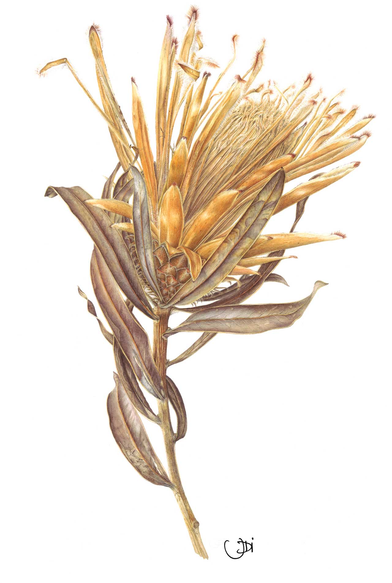
Faded Protea neriifolia Snowcrest by Jackie Isard.

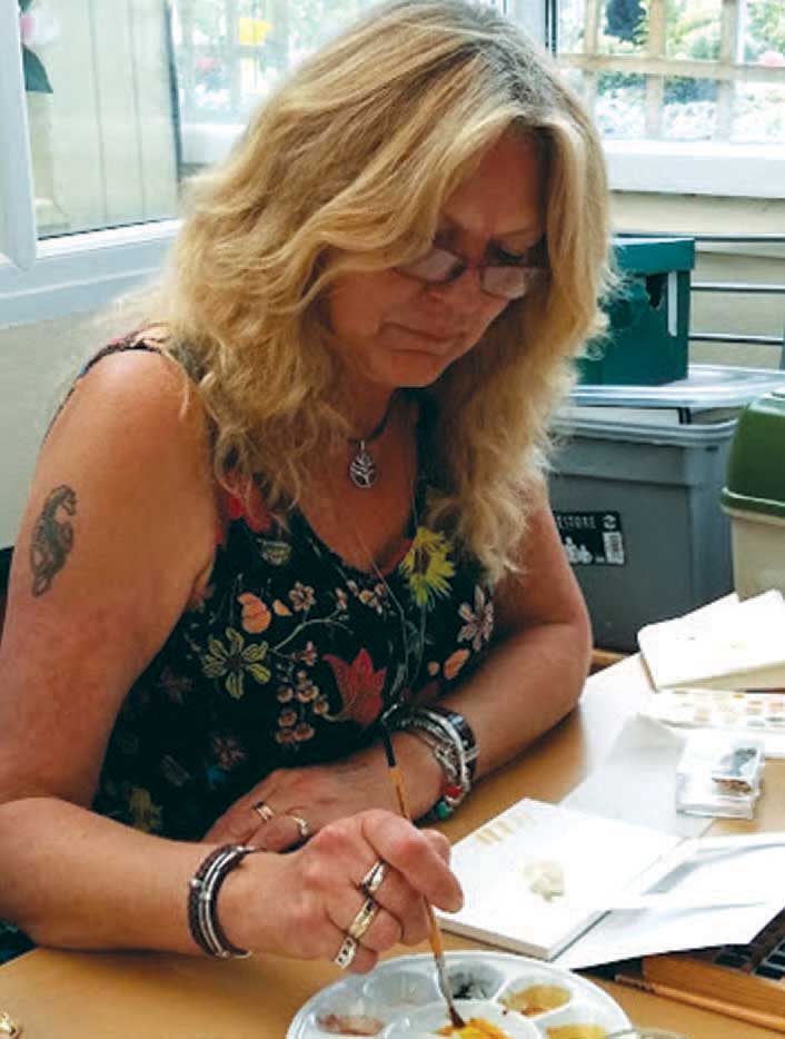
Jackie Isard BA (Hons) SBA Fellow CBM ASBA.
I always enjoyed art and drawing from a very young age. My lunch hours at school were spent in the art room from the age of eight. I didnt think I was very good at it and it wasnt until 2014 that I took up the paint brush again and tried my hand at painting botanical. Painting plant subjects has brought me closer to nature and there are some plants I really treasure; these are wild flowers.
My garden path has turned into a botanical journey. It is wonderful to be able to describe the beauty of nature on paper with watercolour and since I began, my paint brush has been glued to my hand! As a graphic designer I learned a great deal about colour accuracy and how to visually communicate ideas. Although graphic design is a completely different field to botanical art, the disciplines are very similar. All the skills I learned have been very useful but in different ways.
Observation Line, Shape, Colour, Botany
Balance Size, Proportion, Form
Rhythm Texture, Composition, Detail
Observation is definitely key in botanical art and balance and rhythm just as much so. We observe, we compose, we paint! To the botanical artist, colour is a very important part of the painting process. Recognizing and mixing colour accurately is much easier when using learned skills and keen observation. The more you look, the more you will see. Each painted subject will be a new learning experience.
Colour mixing is one of my favourite parts of the painting process. You can mix so many different colours with just primaries. On my watercolour mixing courses I introduce students to mixing with primaries only. They are astounded at what they can achieve with just primary warm/cool pigments and the difference it makes to a painting. I discovered over time that there was much more to colour mixing than one realizes and a great deal to be taught. There is so much that can be achieved by learning these techniques too; building up colour in layers, adding underlay shadow tones first, overlaying and underlaying thin soft glazes to enhance colour and getting the balance right with transition of colour temperature from warm to cool. It inspired me to write this book and share all this knowledge with you.
During my botanical career I have very much enjoyed teaching. I like to think I inspire, encourage and give confidence to my students. To me, the enjoyment of teaching is that happy moment when a student suddenly grasps a technique or mixes a perfect colour. I just love to teach!
The content of this book is based on Winsor & Newton Professional Watercolour pigments but the theory can be applied to any brand. I hope it will help you make informed choices when selecting pigments as well as learn all you need to know about colour mixing and application techniques. I have endeavoured to describe this in the best way I can. I have also added useful information about the painting process I use when making decisions about colour in step by step guides.

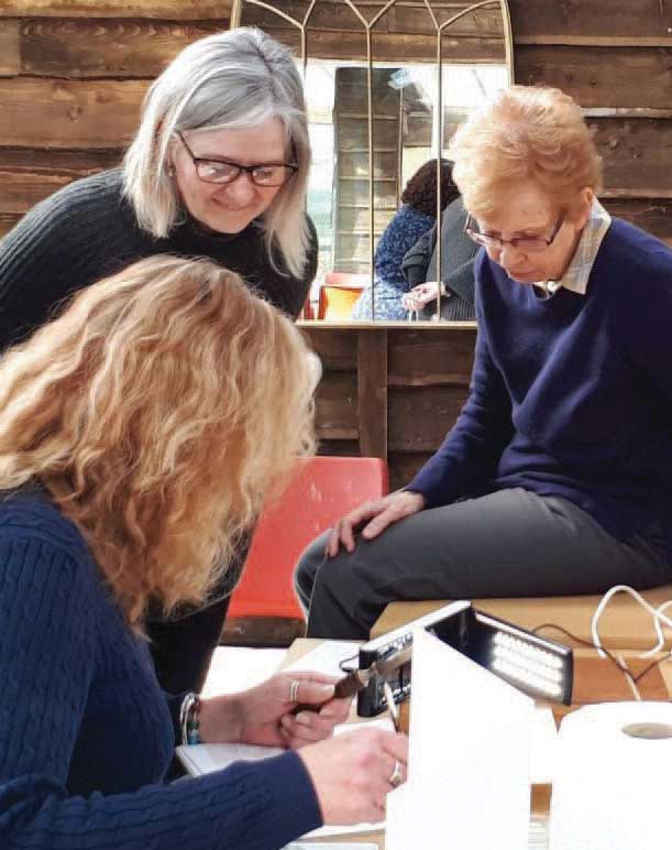
The author teaching at Brackenwood, Bristol.
I hope this book will be helpful to many and a much needed resource for learning about mixing watercolour.
A little history about pigment
Sir Isaac Newton (16421726) was the first person to enlighten us to the spectrum of colours. He developed a series of experiments, which he published in 1672. He started with the rainbow and set up experiments to find out why white light splits into these different colours. The experiment was conducted by shining a white light through a glass prism. The light split into red, orange, yellow, green, blue and violet. It is from these experiments that he determined a theory that red, yellow and blue were the primary colours from which all other colours are made. Newton developed a basic colour wheel to which he added secondary colours, violet, orange and green. In 1708 he devised a circular diagram, which became the model for many colour systems in the years to come. Later, tertiary colours were added by other experimentalists to complete the colour wheel we are familiar with today.

