Ali & Laurie who give so much
HERBERT PRESS
Bloomsbury Publishing Plc
50 Bedford Square, London, WC1B 3DP, UK
29 Earlsfort Terrace, Dublin 2, Ireland
This electronic edition published in 2021 by Bloomsbury Publishing Plc
BLOOMSBURY, HERBERT PRESS and the Herbert Press logo are trademarks of Bloomsbury Publishing Plc
First published in Great Britain 2019
Copyright Valerie C. Price, 2019
Valerie C. Price has asserted her right under the Copyright, Designs and Patents Act, 1988, to be identified as Author of this work.
All rights reserved
You may not copy, distribute, transmit, reproduce or otherwise make available this publication (or any part of it) in any form, or by any means (including without limitation electronic, digital, optical, mechanical, photocopying, printing, recording or otherwise), without the prior written permission of the publisher. Any person who does any unauthorised act in relation to this publication may be liable to criminal prosecution and civil claims for damages.
Bloomsbury Publishing Plc does not have any control over, or responsibility for, any third-party websites referred to or in this book. All internet addresses given in this book were correct at the time of going to press. The author and publisher regret any inconvenience caused if addresses have changed or sites have ceased to exist, but can accept no responsibility for any such changes.
A catalogue record for this book is available from the British Library.
Library of Congress Cataloguing-in-Publication data has been applied for.
ISBN: 978-1-9122-1773-1 (PB)
ISBN: 978-1-9122-1774-8 (eBook)
ISBN: 978-1-9122-1775-5 (ePDF)
To find out more about our authors and their books please visit www.bloomsbury.com where you will find extracts, author interviews and details of forthcoming events, and to be the first to hear about latest releases and special offers, sign up for our newsletters.

Contents
In Botanical Illustration the first Ten Lessons I hope I was able to introduce you to the basics of Botanical Illustration. The techniques you learnt there should be taken forward to help with this, Next Ten Lessons, where I will look at how a well-planned composition can take your work to the next level. In the Next Ten Lessons, are ten compositions using ten different colours, to help and guide you to using colour and composition with confidence.
Remember the lessons from the first book, and take them with you on this new journey. Refer back to it to remind yourself how to measure and draw accurately, how to mix and apply washes, and how to use different techniques in watercolour to finish your artwork. Take care, as always to make sure that observation, the recording of structure, form and detail with accuracy is still foremost in your drawings.
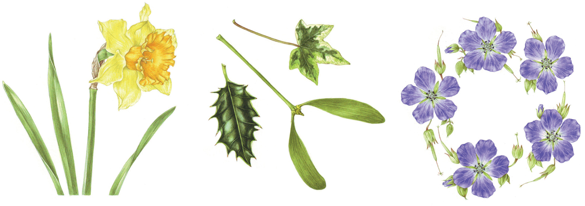
In botanical illustration, there are only so many studies of single plants or flowers that you want to do. Now consider the composition of your work. This will allow another level of interest, and enables you to incorporate different elements of your subject, be they through time; showing the opening of a flower, the life cycle of the plant, with its flower, foliage, fruit, and seeds, or the variety of its colours, or simply, different views, showing more of its story. Adding the foliage to a flower, balances, offsets, and enhances the colours, bringing life to the page. Eventually you will get bored of just painting single studies of flowers. Adding other flowers, or foliage, or buds, or seeds, will enhance the story you are trying to tell, about the variations in the plant, and its habitat. Adding dissections, explosions, enlargements, colour variations, or different aspects or views can enhance your composition. The placement of your subject on the watercolour paper, allowing space around it, can also change the balance and focus of the artwork.
Homegrown plants will give you access to the different stages, as well as plenty of available material. Foraged material has huge scope when illustrated with care and thought, and the natural beauty to be found in the hedgerows is not to be underestimated.
Allow a climbing plant to sprawl across the page, or crop the stems of very tall plants, to show just the flower heads grouped together. You can crop out unnecessary stems to make a more compact image, which focuses attention onto the most important parts, like the flower.
You may wish to work to a format or size because you have a mount or frame to fill, or because you have a commission, or even just to fit the artwork onto your watercolour paper.
Once you have mastered the basics of botanical illustration, you can move on to having fun with your subject, illustrating it from an unexpected angle, or just selecting different leaves or flowers to make the painting more interesting or attractive. As long as you follow the rules of botany, ensuring that your plant is botanically correct anything goes.
Having fun with the composition and placement of your artwork on the paper is one of the fun things to do with any botanical illustration.
Think outside the box, by sometimes, putting your study in a box.
| 1 Green | Foliage |
| 2 White | Daisy |
| 3 Yellow | Daffodils |
| 4 Red | Tulip |
| 5 Blue | Love in the mist |
| 6 Pink | Rose |
| 7 Purple | Geranium |
| 8 Orange | Tiger lily |
| 9 Brown | Pine cone |
| 10 Black | Blackberries |
We all see colour differently. In different lights, colours will appear to change. Always try to mix your colours in natural light. Mix them at full strength, compare them to your subject, and then dilute down to apply. If you have to paint by artificial light, try to use a daylight bulb, which is kinder to your eyes, and gives a better light for colour matching. It is often necessary to begin with a dilute over bright version of the colour, changing the mixture as you paint, or glazing another colour over the top. This is especially so for pinks and reds, and is often the only way to achieve a bright fresh colour or an iridescent finish.
As a general guide to mixing watercolour, the use of a colour straight from the pan or tube will be bright and vibrant, but lacking in subtlety.
Two colours mixed together should result in a subtle colour, which can be altered and adjusted as you work, giving you a range of rich vibrant tones. The mixing of three or more colours will be strong, but may also become muddy, though this may be what is needed.
Get to know the colours in your paint box, as a subtle blending from a set of twelve basic colours can often be more effective than working from thirty ready made colours which lack depth and travel. Buy extra colours as the need arises. Now that you are addicted to painting, buy the best quality you can afford, replacing colours as they are used up, with professional ranges, as these will give you the best results
Make a colour chart of each of the colours you have, showing them at a weak dilution through to full strength. ()

