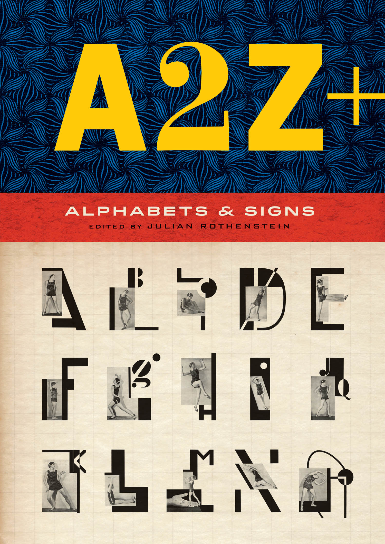
Gooding Mel - A2Z+: Alphabets & Signs
Here you can read online Gooding Mel - A2Z+: Alphabets & Signs full text of the book (entire story) in english for free. Download pdf and epub, get meaning, cover and reviews about this ebook. City: London, year: 2018, publisher: Princeton Architectural Press;Laurence King Publishing, genre: Home and family. Description of the work, (preface) as well as reviews are available. Best literature library LitArk.com created for fans of good reading and offers a wide selection of genres:
Romance novel
Science fiction
Adventure
Detective
Science
History
Home and family
Prose
Art
Politics
Computer
Non-fiction
Religion
Business
Children
Humor
Choose a favorite category and find really read worthwhile books. Enjoy immersion in the world of imagination, feel the emotions of the characters or learn something new for yourself, make an fascinating discovery.

- Book:A2Z+: Alphabets & Signs
- Author:
- Publisher:Princeton Architectural Press;Laurence King Publishing
- Genre:
- Year:2018
- City:London
- Rating:4 / 5
- Favourites:Add to favourites
- Your mark:
A2Z+: Alphabets & Signs: summary, description and annotation
We offer to read an annotation, description, summary or preface (depends on what the author of the book "A2Z+: Alphabets & Signs" wrote himself). If you haven't found the necessary information about the book — write in the comments, we will try to find it.
Gooding Mel: author's other books
Who wrote A2Z+: Alphabets & Signs? Find out the surname, the name of the author of the book and a list of all author's works by series.


A2Z+: Alphabets & Signs — read online for free the complete book (whole text) full work
Below is the text of the book, divided by pages. System saving the place of the last page read, allows you to conveniently read the book "A2Z+: Alphabets & Signs" online for free, without having to search again every time where you left off. Put a bookmark, and you can go to the page where you finished reading at any time.
Font size:
Interval:
Bookmark:
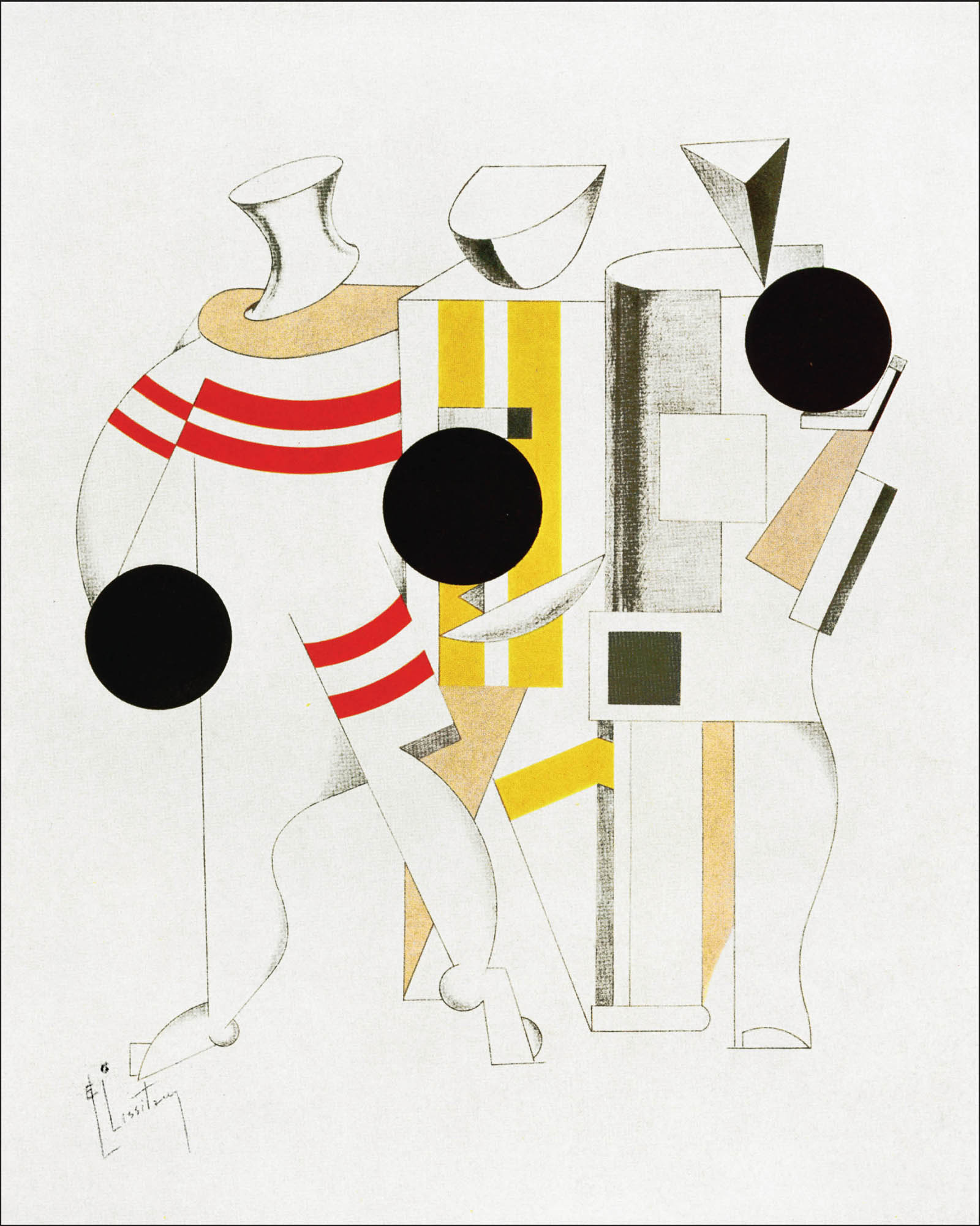 El Lissitzky, Sportsmen, USSR, c.1920
 Published by
Princeton Architectural Press
A McEvoy Group company
202 Warren Street
Hudson, NY 12534
www.papress.com Published in arrangement with Redstone Press
7a St Lawrence Terrace
London, UK W10 5SU
www.theredstoneshop.com Compilation 2018 Redstone Press
Introduction and texts 2018 Mel Gooding Manufactured by 1010 Printing International Limited, China
21 20 19 18 4 3 2 1 ISBN: 978-1-61689-707-9 No part of this book may be used or reproduced in any manner without written permission from the publisher, except in the context of reviews. Every reasonable attempt has been made to identify owners of copyright. Errors or omissions will be corrected in subsequent editions. Design: Julian Rothenstein
Copyeditor: Nolan Boomer
Artwork: Otis Marchbank
Production: Geoff Barlow For Princeton Architectural Press:
Project Editors: Rob Shaeffer and Nolan Boomer
Cover design: Paul Wagner, based on a design by Azi Rad Thanks to: Ariadne Arendt, David Batterham, Lutz Becker, Pavel Bchler, Pablo Butcher, Rhiannon Gooding, Richard Hollis, Nasreen Kabir, Hiang Kee, Sasha Lurye, Rick Poynor, Simon Rendall, Erika Rothenberg, Bertram Schmidt-Friderichs, Mimi Thompson, Brian Webb Special thanks to: Ryan Alcazar, Janet Behning, Nicola Brower, Abby Bussel, Benjamin English, Jan Cigliano Hartman, Kristen Hewitt, Lia Hunt, Valerie Kamen, Jennifer Lippert, Sara McKay, Eliana Miller, Nina Pick, Sara Stemen, Marisa Tesoro, and Joseph Weston of Princeton Architectural Press Kevin C. Lippert, publisher Library of Congress Cataloging-in-Publication Data Names: Rothenstein, Julian, 1948- editor. | Lettering. | Signs and signboards. | BISAC: DESIGN / Graphic Arts / Typography. | DESIGN / History & Criticism. | DESIGN / History & Criticism.
DESIGN / Graphic Arts / General.
Classification: LCC NK3600 .A28 2018 | DDC 659.13/42--dc23
LC record available at https://lccn.loc.gov/2017048894 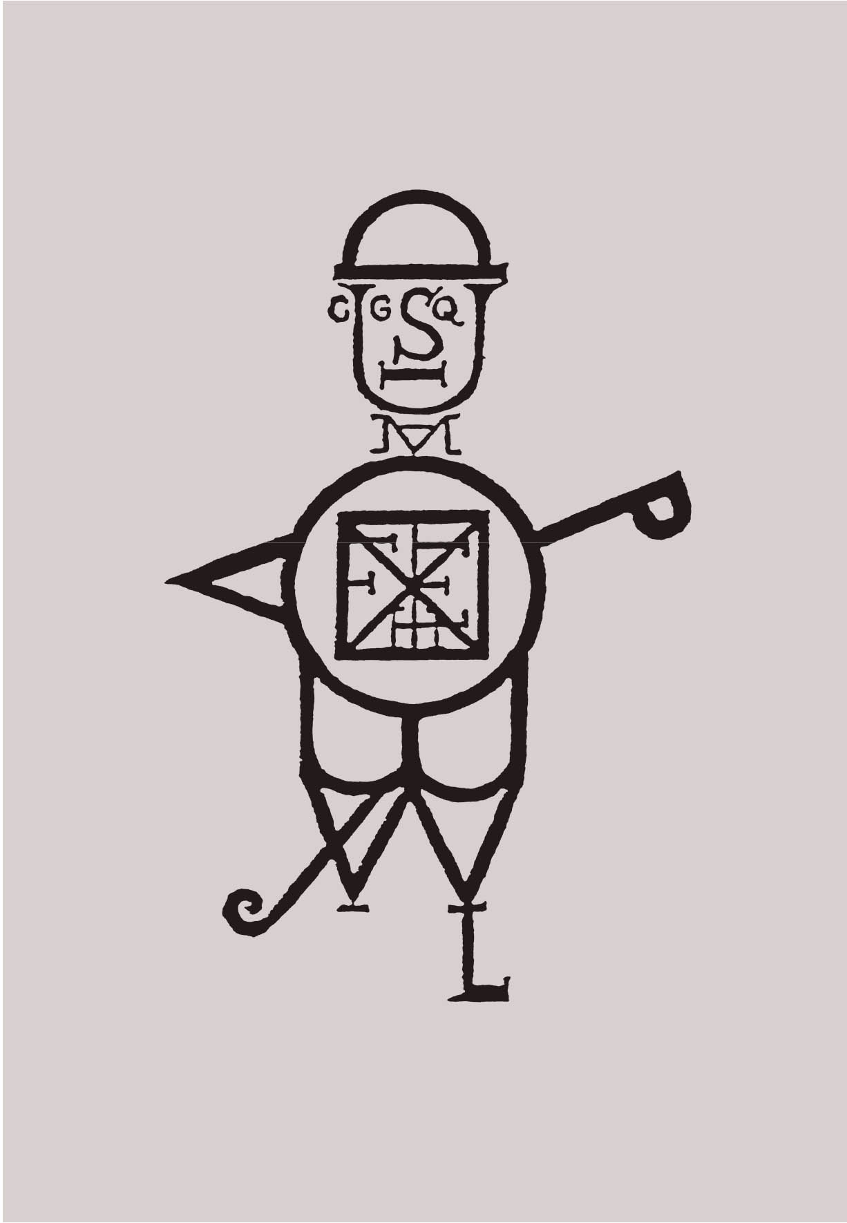 A Man of Letters, UK, c.1890
As the ancient Celtic proverb has it, every force evolves a form: in human affairs necessity creates energies, and out of energies evolve technologies. Of course, no sooner had alphabets come into existence, together with all the endless possibilities of variations in letterforms and calligraphic style, than they were joined by infinite varieties of sign, symbol, and image, illuminating, elaborating and reinforcing the verbal message. Much later, out of the big bang of early Renaissance printing technology, there was an ever-expanding new universe, the Gutenberg galaxy of visual-linguistic constellations. A2Z+ (a title which combines letter and sign, beginning and end) presents a dazzling sampling of this cosmos in its (mostly) modern manifestations. With the advent of printingthe defining technology of the modern world, the sine qua non of other modern technologies, perhaps the single most important invention since drawingcame the need for different letterforms to serve a multitude of diverse functions. Every job demands the lettering that will serve its purposes best.
The stonemasons lapidary, the stencil-makers schematic, the needleworkers stitchable, the signwriters eye-catching typeface, as well as the manifold forms that are necessary to the printers trade proper: so many alphabets for so many tasks in so many media! Each has a character and a face of its own, each bears the imprint of its time and the marks of its milieu. Alphabets come in unending diversity: in some the letterforms are pure and simple, in others, complex, complicated, extravagant, or fantastic. There are modest alphabets and flamboyant alphabets, silly alphabets and sad ones. Alphabets proliferate. In literate societies they are an index of human diversity: children that learn to write invent their own, as distinctive as their fingerprints. Every alphabet presents an orchestration of the letters to the eye, a systematic optical abstract, a visual matrix out of which any number of possible messages might be composed.
II: The Revival of Classical Typography Not all alphabets are equal. Some are elegant, reflecting the grace and intelligence of their makers and users, fit for the transparent setting of subtle and beautiful language; some are workaday and simple, democratic in spirit, apt for plain writing, plain printing; others are squat and blocky, their ugly faces betraying the brutality of their time and place in history; others are ludic, capricious, or idiosyncratic, drawing attention to their formal waywardness. As functional visual systems designed for communicative purposes, printed alphabets speak of their time and place, and assume recognizable styles. They invite contemplation as freestanding artifacts of their cultures, variously perfect, flawed, or simply queer. In every case they are aesthetically expressive and culturally shaped. It is no contradiction that for many typographers, printers, and publishers, especially those concerned with the setting of prose in books and newspapers, the perfect typeface is one in which the alphabet becomes invisible (so to speak) as the reader apprehends the matter carried by the complicated and rigorous arrangements of its individual characters.
These perfectionists imagine the typeset page as a clear window upon meaning; every letterform is balanced, and every relation between letters in words, or words in sentences, is designed to minimize distraction between the message and the medium. Printing should be invisible, writes Beatrice Warde, the writer and publicist for the Monotype Corporation in its golden years. (Monotype, founded in 1896, was the major supplier of typefaces in both the United States and the United Kingdom for much of the early twentieth century.) For the redoubtable Stanley Morison, the doyen of typographers in that period, there was no room for argument: typography was the efficient means to an essentially utilitarian and only accidentally aesthetic end. Therefore, any disposition of printing material which, whatever the intention, has the effect of coming between author and reader is wrong. For British typographers like Morison and Eric Gill, as well as the American Bruce Rogers and the Dutchman Jan van Krimpen, revivalists of the great classic typefaces as well as inventors of elegant new functional ones, the letter must modestly and discreetly serve the text: If readers do not notice the consummate reticence and rare discipline of a new type, it is probably a good letter, writes Morison. 
Font size:
Interval:
Bookmark:
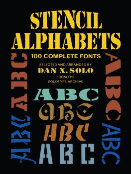
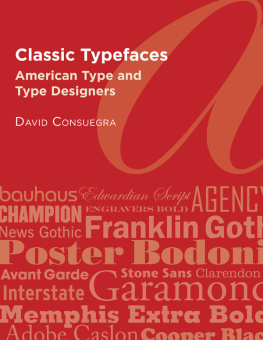
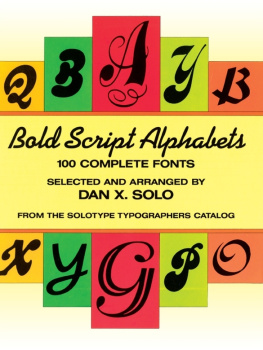
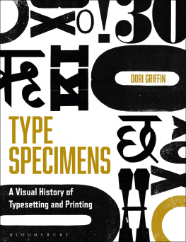
Similar books «A2Z+: Alphabets & Signs»
Look at similar books to A2Z+: Alphabets & Signs. We have selected literature similar in name and meaning in the hope of providing readers with more options to find new, interesting, not yet read works.
Discussion, reviews of the book A2Z+: Alphabets & Signs and just readers' own opinions. Leave your comments, write what you think about the work, its meaning or the main characters. Specify what exactly you liked and what you didn't like, and why you think so.