Quilt
with
confidence Nancy Zieman 2008 Nancy Zieman
Published by  Our toll-free number to place an order or obtain
a free catalog is (800) 258-0929. All rights reserved. No portion of this publication may be reproduced or transmitted in any form or by any means, electronic or mechanical, including photocopy, recording, or any information storage and retrieval system, without permission in writing from the publisher, except by a reviewer who may quote brief passages in a critical article or review to be printed in a magazine or newspaper, or electronically transmitted on radio, television, or the Internet.
Library of Congress Control Number: 2007940805
ISBN-13: 978-0-89689-593-5
ISBN-10: 0-89689-593-9
eISBN 13: 978-1-4402-2125-5
Designed by Laure Noe
Lead Editor: Pat Hahn
Editor: Diane Dhein
Printed in China Contents  chapter 1 Quilting Quick Start
 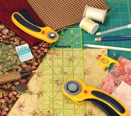 A new or wannabee quilter needs to know the basics of quiltingchoosing and coordinating fabrics, selecting batting, gathering the most essential tools, and setting up an ergonomic and efficient work area. The following pages contain the information needed for an enlightening quilting experience. Learn the basics, and a unique quilting project is just around the corner!
 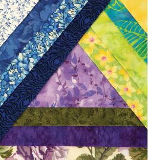 Choosing the Right Fabric Its time to quilt! Unless you use a kit that includes the fabric for your project, youll need to select some fabrics. Youll want to consider quality, color schemes and fabric combinations, fabric design, and fabric care.
Your completed project is bound to have more appeal when you do some planning! Choosing fabric for your designsthats the amazing part of quilting! Whether you are shopping for new fabric or delving into your precious stash, youll find an overwhelming assortment of beautiful prints and colors. Consider the following guidelines when deciding which fabric is right for your project:
Quality
100% cotton is the traditional fabric choice for most quilting. It is very durable, and it holds a crease well. Holding a pressed crease will help define your patchwork lines and control points and curves on appliqu pieces. Good-quality fabric tends to be colorfast, and it is usually treated to resist wrinkling and soil. Color Selection (Hue) You dont need to be an artist to choose colors for your quilting project, but you do need to understand how colors relate to each other.
Be creativethere isnt a wrong choice. There are, however, a few practical pointers for using color that will help you create the best designs. Value The value of a color is the amount of lightness or darkness that a color has. Adding white to a color produces a tint, and adding black gives the color a shade. Value creates illusions of movement and depth in your quilt. 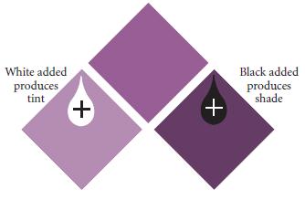 If you have a difficult time determining a colors value, use a value finder, which is made of clear red plastic.
  If you have a difficult time determining a colors value, use a value finder, which is made of clear red plastic.
Look through it when viewing fabrics for value because it subtracts the color from the fabric and allows you to see only the value. The value finder helps you decide whether your fabrics are light, medium, or dark values. It is best to have a green value finder too, because the red one does not work on red fabrics. The value of a fabric depends on its own lightness or darkness plus the fabrics that surround it. A medium color may look light when placed with darks, or it may look dark when placed with lights. 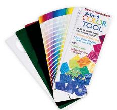
 NOTE FROM NANCY
Another way to determine fabric values is to photocopy the fabrics in black and white.
The values will be very evident. Make certain the copier is set at grey scalenormal copying will not produce values.
Intensity
The brightness or dullness of a color is referred to as its intensity. You change intensity by adding grey or the colors complement (directly across from it on the color wheel). In a harmonious color combination the fabrics have the same intensity. If one of the colors is too bright, the color scheme doesnt balance. For example, if you add a bright neon green to a primitive quilt with duller colorations it would signal the color disaster team! This doesnt mean that you cant mix different intensities.
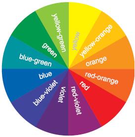
It simply suggests that a more intense color should be used in a smaller space so that it isnt overpowering. 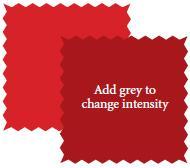 Color Schemes and Fabric CombinationsColor Wheel Based: A color wheel has twelve colors including the primary colors of yellow, red, and blue. The remaining colors on the wheel are obtained by mixing these three colors.
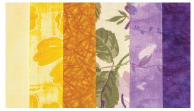
 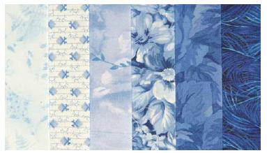 Monochromatic Schemes are tints and shades of one color such as light blue, medium blue, and navy blue. Tints of a color are those that have varying degrees of white added to them. In this instance light blue would be a tint of blue.
Shades have varying degrees of black added to them. Navy blue is a shade of blue. Monochromatic schemes tend to be quiet and soothing. However, as a whole quilt, they may be a bit boring unless you vary the size of the prints used. 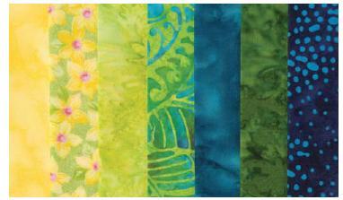 Analogous (similar or related) Color Schemes are colors that are next to each other on the color wheel, such as yellows, greens, and blues. Tints and shades of these colors make a very pleasing arrangement.
Or, choose a color directly across from one of these colors as an accent. 

Next page


 Nancy Zieman 2008 Nancy Zieman
 Our toll-free number to place an order or obtain
 chapter 1 Quilting Quick Start
  A new or wannabee quilter needs to know the basics of quiltingchoosing and coordinating fabrics, selecting batting, gathering the most essential tools, and setting up an ergonomic and efficient work area. The following pages contain the information needed for an enlightening quilting experience. Learn the basics, and a unique quilting project is just around the corner!
  Choosing the Right Fabric Its time to quilt! Unless you use a kit that includes the fabric for your project, youll need to select some fabrics. Youll want to consider quality, color schemes and fabric combinations, fabric design, and fabric care.
 If you have a difficult time determining a colors value, use a value finder, which is made of clear red plastic.
 NOTE FROM NANCY
 Color Schemes and Fabric CombinationsColor Wheel Based: A color wheel has twelve colors including the primary colors of yellow, red, and blue. The remaining colors on the wheel are obtained by mixing these three colors.
  Monochromatic Schemes are tints and shades of one color such as light blue, medium blue, and navy blue. Tints of a color are those that have varying degrees of white added to them. In this instance light blue would be a tint of blue.
 Analogous (similar or related) Color Schemes are colors that are next to each other on the color wheel, such as yellows, greens, and blues. Tints and shades of these colors make a very pleasing arrangement.