1. Quick Start with Foundation
Foundation is a powerful and intuitive CSS framework created by the folks at Zurb for use in developing front-end code in a quick and efficient manner. Foundation adheres to the mobile-first paradigm and comes with built-in HTML, CSS, and JavaScript plug-ins for creating responsive websites.
Backed by a vibrant community, Foundation is a robust toolkit that helps you create feature-rich websites in a jiffy. Before we delve into it, however, lets first understand why responsive web design is important and what the benefits are of using a CSS framework in web design.
Responsive Web Design and CSS Frameworks
Responsive web design is now the norm, given the reach of smartphones and tablets in this digital era. Studies suggest that with the advent of e-commerce, consumers would prefer to purchase from their mobile phones rather than from conventional desktops. Consumers want mobile websites that are fully functional rather than a watered-down version of their bulky desktop counterparts.
Responsive web design adopts a one-site-fits-all approach wherein your website is not limited to a certain device type or screen size. It means that your website will have the same URL and a single code base on all devices, thereby eliminating the need to create separate websites for the mobile and desktop versions. This device-agnostic strategy also results in easy code handling and maintenance. Google recommends responsive web design as an industry-wide best practice. The most important aspect of responsive web design is creating an optimal user experience, as users will have access to the same content irrespective of the device. You do not have to worry about future scalability, because responsive websites are fluid in nature.
Writing HTML, CSS, and JavaScript code from scratch for a responsive website can be quite tedious. Add cross-browser compatibility to it and you have an enormous task at hand. Deadlines for the completion of work and the need to maintain consistency in coding among the team of designers make it even more difficult. It can be quite an arduous task indeed to construct the layout and then write loads of JavaScript code to develop a fancy website.
To counter these issues, it is important to have a toolkit that takes into consideration all the constraints involved when designing a feature-rich website. In short, a CSS framework helps you streamline your web-design process and helps you develop a website in an easier and faster way. CSS frameworks come with pre-defined sets of code and utilities that you can use, eliminating worries about the presentation code and freeing you to focus on the imperative tasks in your projects.
A CSS framework not only speeds up development but also takes care of concerns such as cross-browser compatibility and responsiveness. In addition to not writing the code from scratch, you can also reuse the code several times in your projects. A CSS framework supports the Dry principle that states that every piece of knowledge must have a single, unambiguous, authoritative representation within a system." It means that instead of copy-pasting code at various places in your file, you can create components that can be used wherever necessary.
Enter Foundation: an easy-to-use, potent, and advanced CSS framework that helps you create clean and symmetrical grid-based layouts, thus taking the guesswork out and saving you huge chunks of development time while at the same time ensuring that your website scales effectively over devices of any make or screen size.
Getting Started with Foundation 6
Foundations usability and semantics-prone pattern makes it the go-to-framework for your web-design projects. In this section, we will look at the process of setting up the Foundation files, which can be downloaded from the main website. You need to go to .
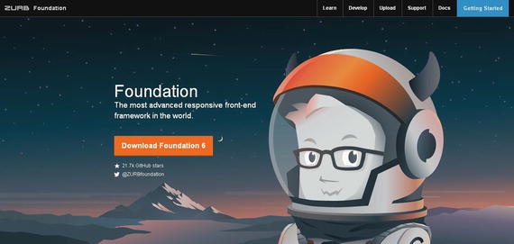
Figure 1-1.
Foundation 6 homepage
We have used Google Chrome as the browser for code examples in this book; alternatively, you can use Firefox or any compatible browser of your choice. Just make sure that you use the latest version of your browser, as older versions may not support all features.
Refer to the following link to be in sync with information related to browser compatibility:
http://foundation.zurb.com/sites/docs/compatibility.html
In the preceding screenshot, you can see the Zurb Foundation homepage. If you decrease the browser size or minimize it, you will see that the site is responsive, meaning it adjusts the layout on screen according to the size of the browser.
See Figure .
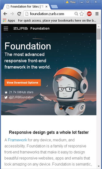
Figure 1-2.
Foundation homepage on a small screen
From the preceding screenshot, you can see that the Foundation site is itself responsive.
If you click on the Navicon (also known as the Hamburger icon), you can view the same menu items as are displayed in the top menu bar on both large and medium screens.
On clicking the Download item, you see the four download options available in Foundation, namely Complete , Essential , Custom , and Sass (see Figure ).
Figure 1-3.
Download options in Foundation 6
The Complete version contains all the components and utilities available in Foundation 6.
The Essentials version is a stripped-down version containing the minimum required components, such as Typography, Grid, and buttons without the bloat or clutter.
The Custom version includes only those utilities that you need. You can choose which features you want for your web design and omit the unnecessary ones, thereby reducing the file size considerably.
The fourth is the Sass version, which is used if you want to set your variables and mixins in SCSS.
You need to choose the appropriate version as per your requirements. However, remember that you will have to include all the missing JavaScript and CSS files (along with having to recompile Sass files to CSS if you are using Sass) if you upgrade from a Custom or Essentials download to the comprehensive Complete bundled package.
In our case, we will download the Complete build (i.e., Foundation 6 for Sites).
The advantage of using the Complete version is that you have all the components you could possibly need, meaning you need not include separate files for individual functionality. In real-time scenarios, you can use a custom build, as it will be lightweight and therefore will ensure optimal page-load times. For example, if you only want to use the grid-layout functionality in Foundation, there is no need to include the JavaScript plug-ins. This results in less bloat and clutter in your web design.
Downloading the Complete build will result in a Foundation ZIP file that you can extract and store in the root directory of your useful web projects.
Upon extraction, you will see the following folders and files, as displayed in Figure .
