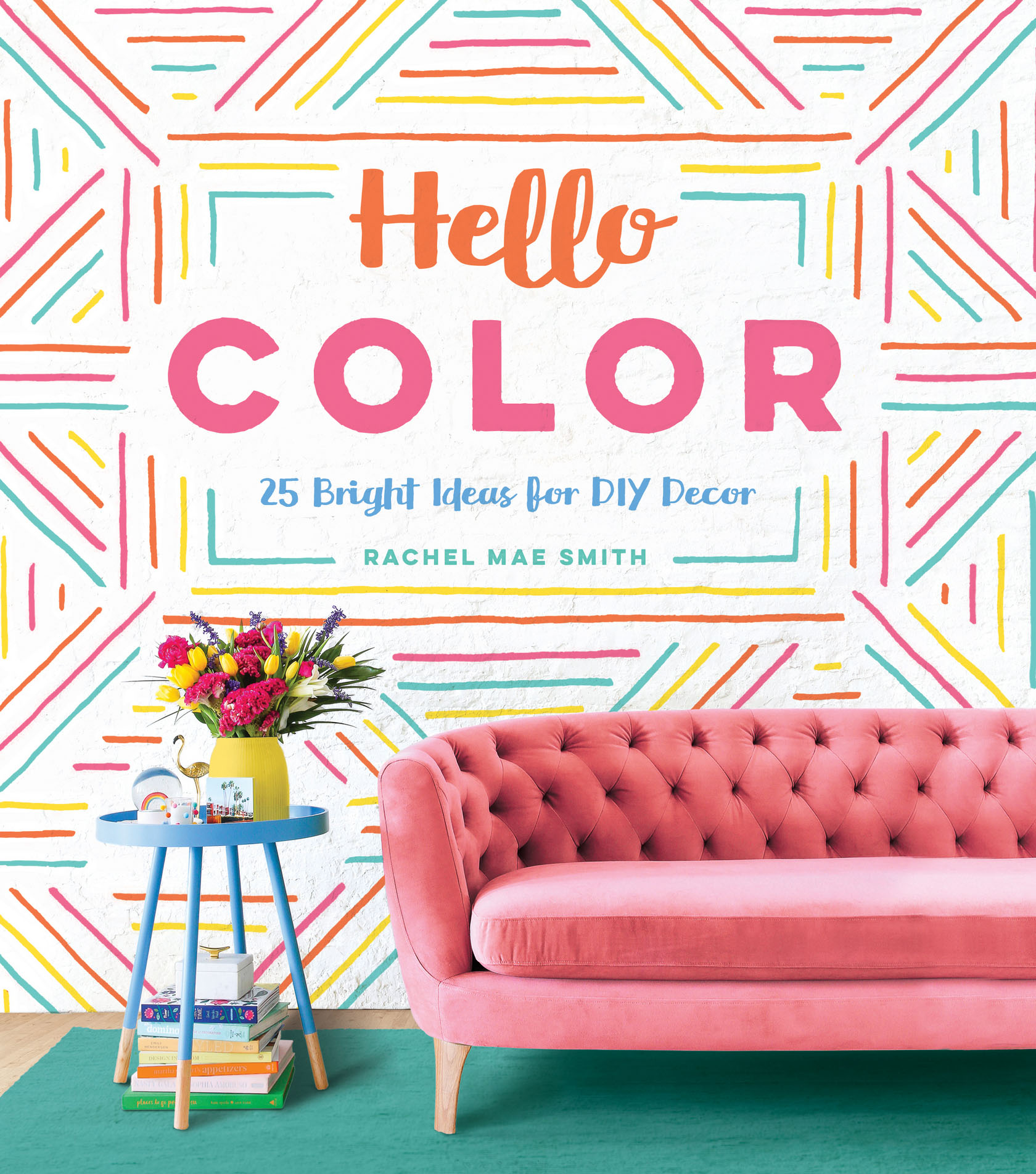
Smith - Hello color: 25 bright ideas for DIY decor
Here you can read online Smith - Hello color: 25 bright ideas for DIY decor full text of the book (entire story) in english for free. Download pdf and epub, get meaning, cover and reviews about this ebook. City: Philadelphia, year: 2018, publisher: Quirk Books, genre: Home and family. Description of the work, (preface) as well as reviews are available. Best literature library LitArk.com created for fans of good reading and offers a wide selection of genres:
Romance novel
Science fiction
Adventure
Detective
Science
History
Home and family
Prose
Art
Politics
Computer
Non-fiction
Religion
Business
Children
Humor
Choose a favorite category and find really read worthwhile books. Enjoy immersion in the world of imagination, feel the emotions of the characters or learn something new for yourself, make an fascinating discovery.

- Book:Hello color: 25 bright ideas for DIY decor
- Author:
- Publisher:Quirk Books
- Genre:
- Year:2018
- City:Philadelphia
- Rating:3 / 5
- Favourites:Add to favourites
- Your mark:
Hello color: 25 bright ideas for DIY decor: summary, description and annotation
We offer to read an annotation, description, summary or preface (depends on what the author of the book "Hello color: 25 bright ideas for DIY decor" wrote himself). If you haven't found the necessary information about the book — write in the comments, we will try to find it.
Smith: author's other books
Who wrote Hello color: 25 bright ideas for DIY decor? Find out the surname, the name of the author of the book and a list of all author's works by series.


Hello color: 25 bright ideas for DIY decor — read online for free the complete book (whole text) full work
Below is the text of the book, divided by pages. System saving the place of the last page read, allows you to conveniently read the book "Hello color: 25 bright ideas for DIY decor" online for free, without having to search again every time where you left off. Put a bookmark, and you can go to the page where you finished reading at any time.
Font size:
Interval:
Bookmark:

One of the most amazing things about working with color is that it really is subjective. We perceive color based on wavelengths of light that bounce off objectsso, for example, a red apple absorbs all wavelengths but red and reflects those back to our eyes, which then perceive the apple as (you guessed it!) red. But every persons perception is slightly differentand, of course, everyone has different favorites.
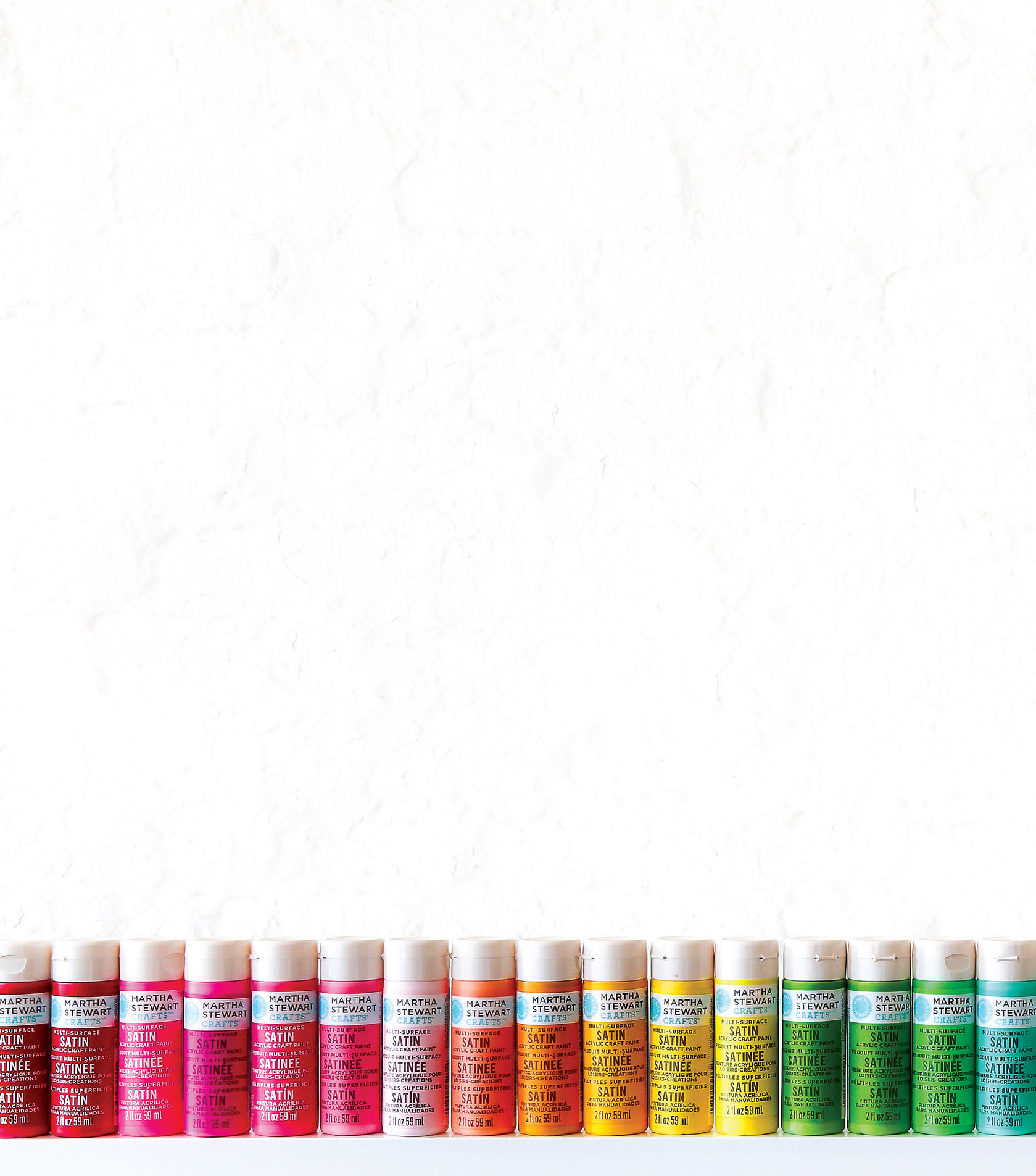
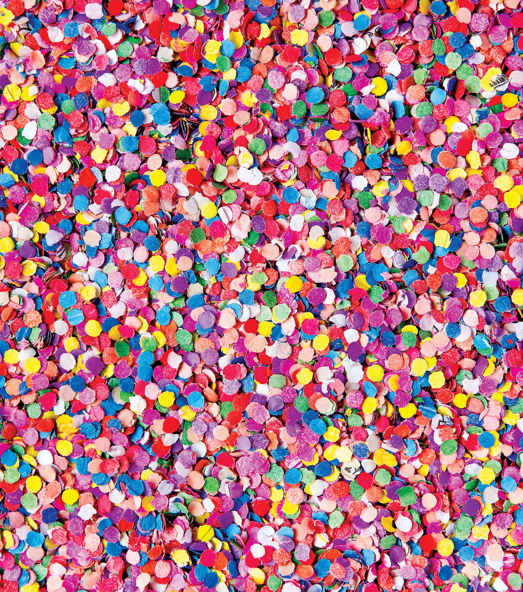
Fortunately, colors come in thousands (yes, thousandsPantone alone has at least 1,114 spot colors) of options. But so many choices can be overwhelming, especially if youre new to decorating, dont know where to start, or just have a hard time making decisions. The good news is that, in all of those thousands of colors, youre bound to find at least one or two bright ones that work in your home. With those selections and a little know-how about mixing and matching, soon youll be pairing palettes like a pro!
COLOR TERMS
PRIMARY COLORS: The colors that kick off the color wheelred, blue, and yellow. These hues cannot be formed by any combination of other colors, and all other colors are derived from some mixture of two or three of these bases.
SECONDARY COLORS: Colors that result from mixing primary colors togetherpurple (red + blue), green (blue + yellow), and orange (red + yellow).
TERTIARY COLORS: Colors made by mixing adjacent primary and secondary colors. For example, red and orange will give youred-orange!
TINT: A lighter version of a base color, created by mixing the color with white.
SHADE: A darker version of a base color, created by mixing the color with black.
VALUE: The lightness or darkness of a color (i.e., its placement on the spectrum from tint to shade).
PASTEL: A soft, delicate, subtle color that reflects a lot of light.
JEWEL TONE: A dark, intense color (like a gemstone) that absorbs a lot of light.
SATURATION: The intensity of a color, determined by how much the color differs from white; for example, pastels are less saturated than jewel tones.
TONE: A less-saturated version of a base color, created by mixing the color with gray.
BASIC COLOR SCHEMES
In color theory, a color scheme is a combination of colors, often drawn from the color wheel. A color scheme forms the basis of your palette, or range of colors used in a design. These are the most common combinations.
COMPLEMENTARY COLORS: A pair of colors that lie opposite each other on the color wheel. Side by side, they brighten, pop, and have the most contrast of any pairing, but when mixed they become dull and muddy.
TRIADIC COLOR SCHEME: A set of colors that are equal distance from one another around the color wheel (typically every fourth color), a slight variation on complementary colors.
ANALOGOUS COLOR SCHEME: A set of colors made up of three colors that fall next to one another on the color wheelfor example, red, orange, and yellow.
MONOCHROMATIC COLOR SCHEME: A set of colors made up of a base color plus tints and shades of that same color.
Knowing and understanding these words and phrases will help you work with color.
CREATING A COLOR SCHEME
Rule number one for bringing color into your home: it should make you happy. Home is your own personal space in this world, and above all it should bring you joy. Dont feel as though you have to throw around a bunch of wild colors if youre more of a pastel person, and dont feel bad about breaking the rules, like no bright colors in the bedroom, only light colors in small spaces, or never put bold colors side by side. If you choose colors you lovefrom the pieces you buy to the projects you makeI guarantee youll love the results, too. Simple as that!
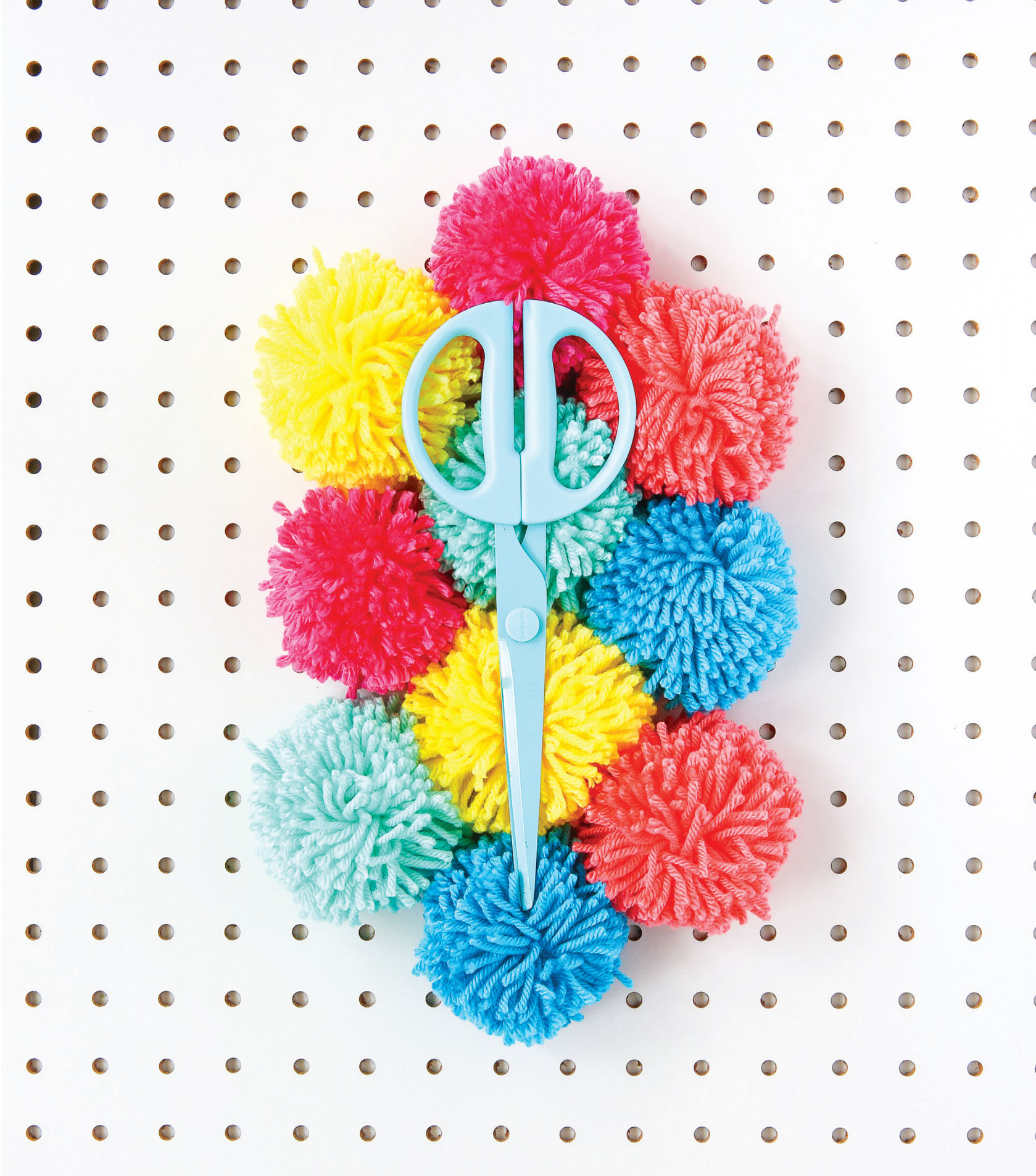
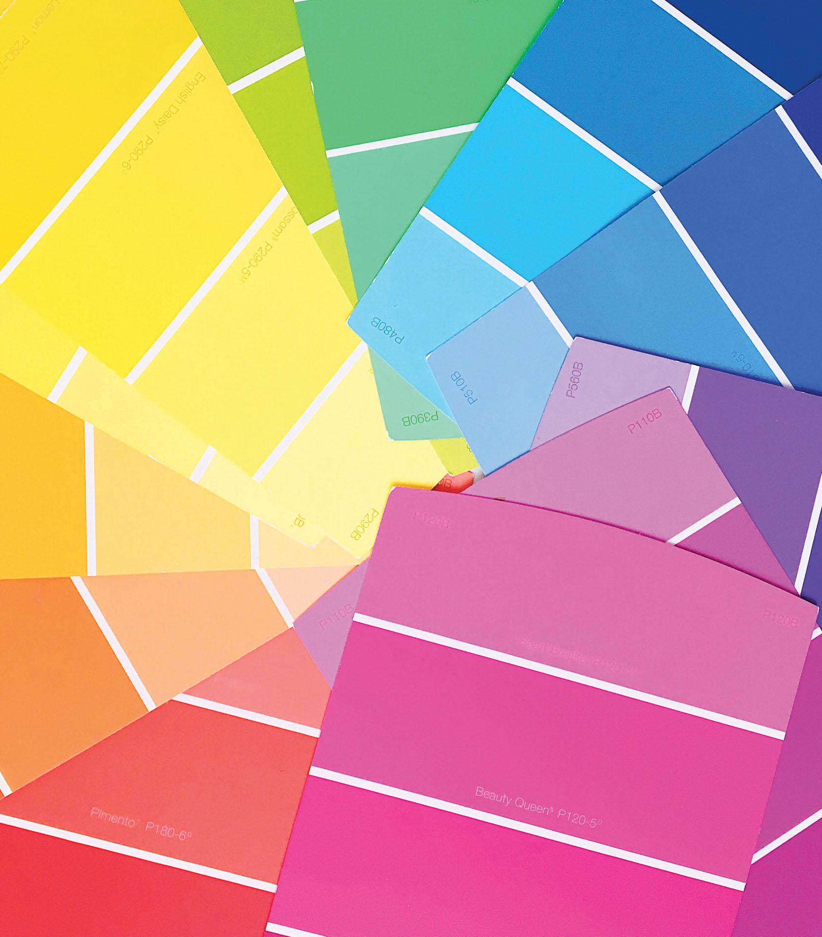
For custom-creating your own color scheme, also called a palette, the simplest way to play around with various combinations is to pick up a bunch of paint sample chips from your local hardware store and start laying them out. (And once youve found a combination you like, cut out each of the colors and tape them together on an index card so that your palette is portable.) You can go back and buy the colors of paint youve selected, but you dont have toyou can just use the paint chip palette as reference when you buy other supplies and objects. Think of them as color flash cards!
Once youve acquired a bunch of paint chips to play with, its time to get palette-making. We all know that color preferences are subjective, but there are a few simple tricks that everyone can use to put together a scheme, no matter their individual taste. One good rule of thumb is to select between three and five colors for your palette: one dominant color, plus several supporting and accent colors. This method will help you strike the right balance: if your palette has too few colors, youll have a harder time distributing your hues because of your limited options. Too many colors and you may find yourself overwhelmed. (Of course if you absolutely must have everything in your house pink, who am I to judge? Just be sure to invite me over for ros and a selfie!)
For your first color scheme, start with a color you already love and build from there, using one of the classic schemes described say, analogous or triadic. Then add and adjust to bring a pop of contrast. For example, if you choose an analogous theme of green and blue, consider adding coral as an accent.
You can also start with a pairing you already lovelike pink and yellow, or blue and purpleand see how they look side by side. Then add a shade or tint of one of them, or another color as an accent, to create a palette. (If you dont have a favorite color, work backward from colorful objects or furniture you already own.) Your scheme might not look great at firstmaybe two saturated colors like royal purple and mandarin orange compete too muchso try throwing in tints and shades of your colors to create harmony. Combine lighter hues with stronger ones, make an all-pastel palette, or just go all-in and amp up to strong jewel tonesso long as the saturation and value of the jewel tones are close, no one color will look out of place.
Once youve pulled together a starter palette, dont be afraid to tinker! The strongest palettes create a sense of balance and energy: they pull the viewers eye along without overloading, and they include at least one gentler color (i.e., one with less saturation) for the gaze to rest on. If your fave colors feel overwhelming side by side, consider splitting them across multiple palettes and giving each its place to shine. That doesnt mean you have to give up more daring combos, thoughalthough all colors get equal billing on the palette, that arrangement is just an abstract way to see how colors look together. When you go to create dcor and set up your space, theres no need to keep even proportions of every color, so you can let one dominate while the others come in with a lighter touch.
Font size:
Interval:
Bookmark:
Similar books «Hello color: 25 bright ideas for DIY decor»
Look at similar books to Hello color: 25 bright ideas for DIY decor. We have selected literature similar in name and meaning in the hope of providing readers with more options to find new, interesting, not yet read works.
Discussion, reviews of the book Hello color: 25 bright ideas for DIY decor and just readers' own opinions. Leave your comments, write what you think about the work, its meaning or the main characters. Specify what exactly you liked and what you didn't like, and why you think so.