Garcia - The Story : Volume III
Here you can read online Garcia - The Story : Volume III full text of the book (entire story) in english for free. Download pdf and epub, get meaning, cover and reviews about this ebook. year: 2019, publisher: Thane & Prose, genre: Home and family. Description of the work, (preface) as well as reviews are available. Best literature library LitArk.com created for fans of good reading and offers a wide selection of genres:
Romance novel
Science fiction
Adventure
Detective
Science
History
Home and family
Prose
Art
Politics
Computer
Non-fiction
Religion
Business
Children
Humor
Choose a favorite category and find really read worthwhile books. Enjoy immersion in the world of imagination, feel the emotions of the characters or learn something new for yourself, make an fascinating discovery.

- Book:The Story : Volume III
- Author:
- Publisher:Thane & Prose
- Genre:
- Year:2019
- Rating:3 / 5
- Favourites:Add to favourites
- Your mark:
The Story : Volume III: summary, description and annotation
We offer to read an annotation, description, summary or preface (depends on what the author of the book "The Story : Volume III" wrote himself). If you haven't found the necessary information about the book — write in the comments, we will try to find it.
Garcia: author's other books
Who wrote The Story : Volume III? Find out the surname, the name of the author of the book and a list of all author's works by series.

The Story : Volume III — read online for free the complete book (whole text) full work
Below is the text of the book, divided by pages. System saving the place of the last page read, allows you to conveniently read the book "The Story : Volume III" online for free, without having to search again every time where you left off. Put a bookmark, and you can go to the page where you finished reading at any time.
Font size:
Interval:
Bookmark:
The Story 2019 Mario Garca
Published by Thane & Prose, New York
All rights reserved. Printed in the United States of America.
No part of this book may be used or reproduced in any manner whatsoever without written permission except in the case of brief quotations embodied in critical articles and reviews.
First Edition
Book cover and interior design by Garca Media
Art Director Paula Ripoll
Illustrations Jeff Goertzen
Cover typeset in Deutsche G othic Regular, interior pages typeset in Bembo Std. Headlines, bylines, pullquotes and navigation elements in Exchange.
ISBN 978-1-0878-4846-4
ISBN 978-1-0878-6066-4 (e-book)

To my grandchildren, the best part of the story of my life: Brianna, Max, Ty, Sophia, Michael, Danny, Angelina, Jack, Frankie, David and Daniel.

Contents
The ever shrinking canvas
by MARIO R. GARCA
Design
Its an ever shrinking canvas designers have to work with. In my four-decade career, I have seen the trend for downsizing that canvas starting in the 1980s.
Remember when most newspapers globally were in a broadsheet format? Yes, those giant 8 or more column pages which could accommodate 20 or more headlines and photos, allowing readers to move their eyes from one headline to the other, usually for about 35 seconds or longer. I always equated this experience as what we do at a Sunday brunch buffet, where we grab our plate and keep it close to our chest, still empty, while sampling all that the chef has set out for us to enjoy. Of course, we never eat all that is on display at a Sunday brunch. We choose and pick, and, eventually, fill our plate and satisfy our appetite. But the world of storytelling started shrinking its canvas around the 1980s, with many newspapers opting for the tabloid format.
I know that tabloid has a negative connotation associated with downmarket newspapers. However, in terms of newspaper formats, tabloid refers to a smaller sheet, usually about four to five columns, shorter, easier to manage. Europe was first to move tabloid, with most major titles doing so.
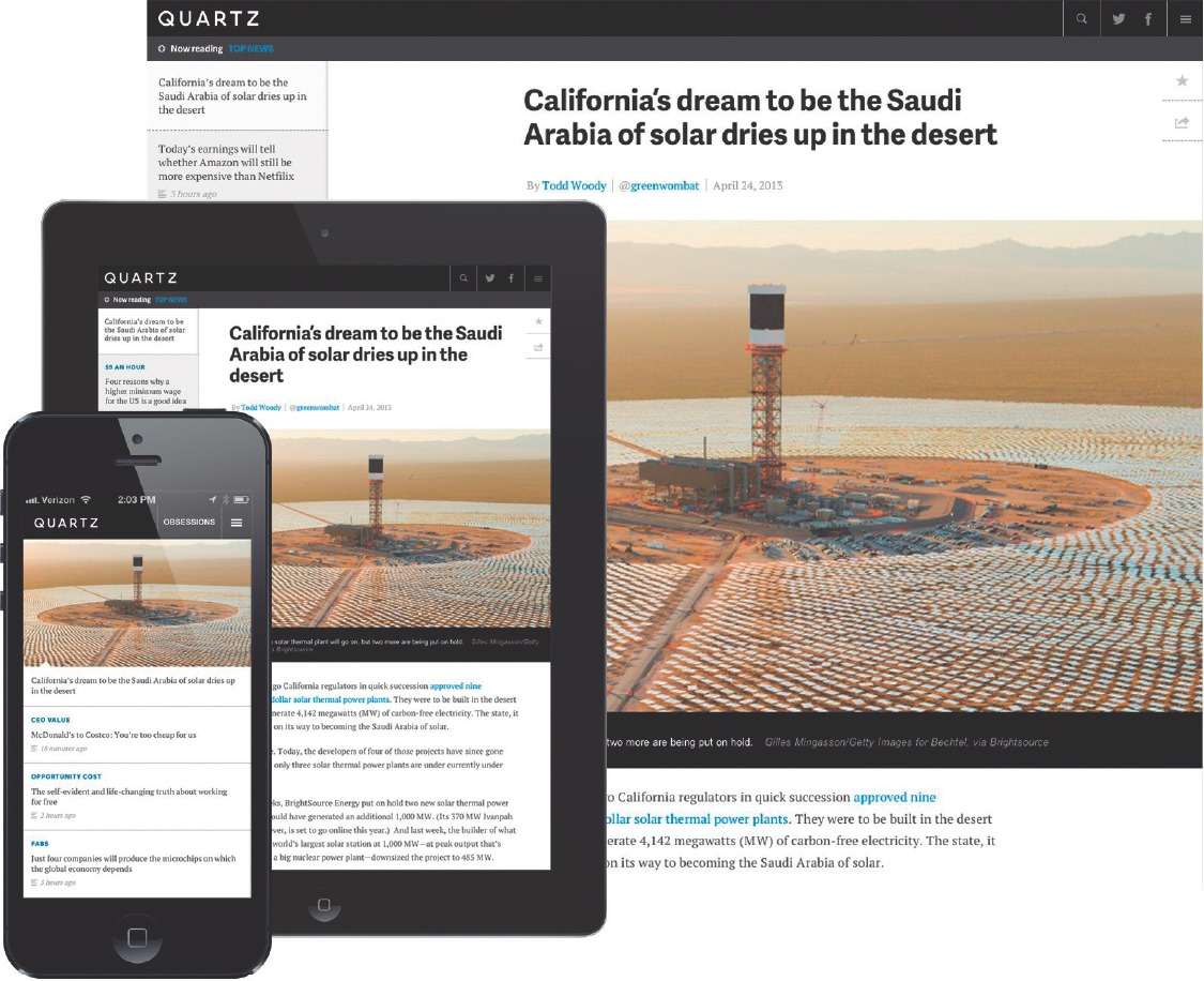
I remember the furor when I was invited to convert the European and Asian edition of The Wall Street Journal to tabloid. In countries like Spain and Sweden, the move to tabloid was swift and full of meaning. Most Spanish newspapers converted to tabloid formats immediately following the end of the Franco dictatorship era in the late 1970s: a rebellion against all that was, including those huge 10-column newspapers. In Sweden, on October 5, 2004, all newspapers orchestrated a national day of converting to tabs. All in all, I have personally been involved with the change of format of 22 newspapers worldwide, and still doing so today. Adapting content to a smaller canvas continued in the early 1990s when newspapers began to bring their products to online editions. The small page of the tabloid gave way to an even smaller canvas: the screen of the desktop. Then around 2011 we were reading on iPads and other tablets, another reduction of size, but with more interesting visual challenges for designers. Suddenly, we were not only designing for the brain and for the eyes, but also for the finger. It was the start of this new tactile revolution.
Readers did not simply wish to read, they wanted to touch the screen and see something happen. Remember all those pop-ups of the early days of the iPad? I advised editors and designers to make sure they kept the finger happy then. I still do so when it comes to the screen of the smartphone.
It is not just that the canvas in which we are creating many of our design concepts is small, but that some of the things that we as designers are obsessed with are no longer of importance, or it is impossible to transfer them from one platform to the other.
For example, many of us were trained to write headlines that are direct, carry the message of the story and do not split infinitives at the end of a line, or, worse yet, include dangling prepositions. Oh, how I punished my Columbia University students every time their assignments turned up with these violations, only to be reminded by my young teaching assistant that perhaps the students did it right, but in responsive design compositions things tend to go to hell, including perfectly written headlines. Perfectly identical design -and headlines-across browsers and platforms is unrealistic, if not impossible.
Design, the user experience
Today we design news for mobile consumption, working with the smallest canvas of all. Here lies the challenge -and the enormous possibilities.
First, the same design essentials that affect what we do on any platform apply here: the creation of solid story structures, consistent grids, legible and attractive typography, a color palette that is appropriate to the product and its content. But we must consider another essential: the design of a functional and pleasant user experience. Todays designer/art director must understand the principles of good information architecture and user experience.
I believe that when it comes to mobile, an effective user experience, with ease of navigationhow a user movesmay be even more important than the aesthetics of the app or site. When we design for mobile we must be conscious of the fact that users value familiarity with the news and information products they sample on their phone. Remember that an average user may come to her phone almost 100 or more times in a day.
That is the reason that templates do so well with mobile products.
When we design a newspaper or a magazine, we also create style guides and templates, but the formula there is usually 60% formula (templates) and 40% surprise (the visual delights that a good art director brings to the pagethat photo or illustration selected to illustrate the story, the special treatment with type, the colors). In mobile design, I figure that this equation is more like 80% formula and 20% surprise. The surprises are usually going to be the stories.
So, I spend considerable time creating templates. It does not mean that our creativity is curtailed. Quite the contrary, building good and workable templates for better linear storytelling, for example, is a creative process. I have created as many as 15 templates for some of my clients, some of which we will share with you here. Templates may range from a basic breaking news one: What we Know, What we Dont, to a more elaborate one, such as one to accommodate an investigative report or show with graphics and videos how an event took place.
Creating storyboards
Indeed, the mobile art director needs to remember that while mobile is not like television, radio, newspapers/magazines or film, it does have elements of all. An ideal art director for mobile knows how to handle audio, motion, and understands that, in terms of layout, the experience is like that of creating a storyboard for a film.
The designer of today is not going to be working on one medium only. In fact, what is becoming popular in many of the larger media houses is to have a design director who is in charge of the design and look of all the products created there, including being the guardian of the branding elements and how they are used across platforms.
Next pageFont size:
Interval:
Bookmark:
Similar books «The Story : Volume III»
Look at similar books to The Story : Volume III. We have selected literature similar in name and meaning in the hope of providing readers with more options to find new, interesting, not yet read works.
Discussion, reviews of the book The Story : Volume III and just readers' own opinions. Leave your comments, write what you think about the work, its meaning or the main characters. Specify what exactly you liked and what you didn't like, and why you think so.