Colored Pencils: The Complementary Method Step byStep
Carrie L. Lewis
Published by Carrie L. Lewis at Smashwords.
Copyright 2014
Smashwords Edition, License Notes
Thank you for downloading this ebook. This bookremains the copyrighted property of the author, and may not beredistributed to others for commercial or non-commercial purposes.If you enjoyed this book, please encourage your friends to downloadtheir own copy from their favorite authorized retailer. Thank youfor your support.
Table of Contents
s
Introduction
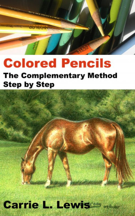
In this demonstration, well take a look atusing a complementary under drawing with colored pencil. Thistwo-step process is a variation on the classical, seven-step methodused by many Flemish artists and which is most commonly used withoil paints.
With the complementary under drawing, thoseseven steps are combined into two. The first step is the underdrawing. The second step is local (final) color.
The under drawing is created using colorsopposite the final colors on the color wheel. In the piece Imusing for this demonstration, the horse is shades of red, so theunder drawing will be shades of green. All of the greens in thebackground will have an under drawing made up of shades of red orearth tones.
Color plays a major role in this method, butvalue is also important. A final color that is light in value suchas yellow or light blue will require a complement that is alsolighter in value. Parma Violet is an excellent choice for underdrawing yellow or you can use a darker color applied with verylight pressure.
Tint is also an important consideration. Ablue-green subject will require a red-orange under painting. Thisis where your color wheel will prove its worth.
Technical Tip
If you dont have a color wheel, this is a goodtime to purchase one or make one. A template for a basic colorwheel can be found at the back of this book, along withinstructions for making your own color wheel.
If you prefer to purchase a color wheel, you canfind one at most art supply stores or print shops. They are aninexpensive, but invaluable tool.
Step 1: Startingthe Under Drawing

This drawing is on Strathmore Artagain DrawingPaper in Beach Sand Ivory. The paper is ivory in color, which isperfect color for this painting. The color of the paper will affectthe overall look of the finished artwork. While white paper can beused, a complementary base color will essentially allow the artistto start with one layer already in place, enhance the tone of thefinished artwork, and facilitate quicker attention to detailedareas in the painting.
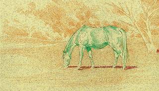
For the horse I used Grass Green tooutline the horse, then began 'picking out' the highlights bylightly outlining them, then shading around them. There are aminimum of three layers of Grass Green at this stage, buildingdarker values with each pass.
I used light pressure with each layer, buildingvalue with layering rather than pressure. It is important to startwith light pressure so that mistakes can be easily erased orcovered. Work carefully around the highlights and shadows.
For the background The same process wasused in the background, where I used Burnt Ochre and Sienna Brownto establish the shapes in the trees and the values in thegrass.
Step 2:Finishing the Under Drawing

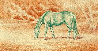
Once the basic shapes of subject and backgroundare in place, and the highlights and shadows are established, theprocess shifts from adding color to building on values to bring theunder drawing and the composition to life. Extend the range ofvalues throughout the artwork and bring out the highlights bydarkening shadows and middle tones.
Continue to create visual interest by varyingstrokes. Use short, vertical strokes with the point of the pencilin the grassy areas, particularly in the foreground. Use long,sweeping strokes with the point of the pencil in the tail. Usebroad horizontal strokes with the side of the pencil in the hillsand circular or looping strokes with the sides and point of thepencil in the trees. Matching the right stroke to each area savestime and effort in the long run.
Whenever possible, stroke in the direction ofnatural patterns. Stroke grass upward, just as it grows. Stroketail and mane from the point of growth toward the ends of thehairs.
Work the under drawing until it is satisfactory.Get as much detail as possible at this stage. As you gainexperience using under drawings, youll discover personalpreferences in finishing the under drawing.
Personally, I like to get as finished a look aspossible with the under drawing. I attempt to develop an underdrawing until it could be a standalone artwork.
Step 3:Beginning Color Work in the Landscape

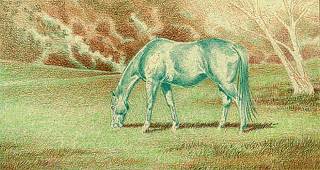
Color work should follow much the same processas the under drawing. Begin with light pressure and suit thestrokes you use to the area youre working. Also begin with thelighter colors and work toward the dark colors.
In this first step of color work, I workedexclusively in the background, building greens one color at a time.I started with Grass Green, which I applied in broad horizontalstrokes throughout the grassy meadow. In the foreground, I thenadded short vertical strokes to mimic the look of grass. PeacockGreen, Apple Green, and Spring Green were then applied to the sameareas and in the same manner.
In the trees, I used Peacock Green to lay inmiddle tones and Dark Green in the shadows.
Technical Tip
Use light pressure at this stage. You want toadd color over the under drawing; you dont want to cover up theunder drawing. Colored pencil is a transparent medium overall, butit is possible to apply color so heavily that you obliterate theunder drawing. A good rule of thumb is to go through all the colorsyou want to use at least once using light pressure. Then you canuse heavier pressure in those areas you want to accent or where youneed to burnish.
Step 4:Beginning Color Work in the Horse

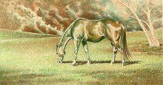
I began adding color to the horse by workinglight to dark using Burnt Ochre, Sienna Brown, and Pumpkin Orangeas the base color. I used light pressure and a sharp pencil to workaround the shapes of muscle groups, body contours and the edges ofthe horse.
I layered Burnt Ochre over all of the horseexcept the brightest highlights. Next, I layered Sienna Brown overall of the horse except the brightest highlights and surroundingareas. Finally, I added Pumpkin Orange to the darkest middle tonesand shadows.
The lighter colors were worked closely andcarefully around the highlights. As I moved through the darkercolors, I gave the highlight areas more space. That created areasof smooth and very soft color and value gradations around thehighlights.
In this illustration, the back half of the horseshows all three colors in place and shows you how the green underdrawing is contributing to the form and mass of the horse.
The front half of the horse shows only the BurntOchre glaze. The area immediately behind the shoulder is a blendingof Burnt Ochre glaze and Sienna Brown glaze.
Next page
