

published by
Princeton Architectural Press
37 East Seventh Street
New York, New York 10003
Visit our website at www.papress.com.
2015 Gail Anderson
All rights reserved
No part of this book may be used or reproduced in any manner without written permission from the publisher, except in the context of reviews.
Every reasonable attempt has been made to identify owners of copyright. Errors or omissions will be corrected in subsequent editions.
editor : Tom Cho
designer : Anderson Newton Design
Special thanks to: Nicola Bednarek Brower, Janet Behning, Erin Cain, Megan Carey, Carina Cha, Andrea Chlad, Tom Cho, Barbara Darko, Benjamin English, Jan Cigliano Hartman, Jan Haux, Lia Hunt, Mia Johnson, Stephanie, Leke, Diane Levinson, Jennifer Lippert, Jaime Nelson, Rob Shaeffer, Marielle Suba, Kaymar Thomas, Paul Wagner, Joseph Weston, and Janet Wong of Princeton Architectural Press
Kevin C. Lippert, publisher
Library of Congress Cataloging-in-Publication Data
Anderson, Gail, 1962
Outside the box : hand-drawn packaging from around the world / Gail Anderson. First edition.
pages cm
ISBN 978-1-61689-336-1 (paperback)
ISBN 978-1-61689-476-4 (epub, mobi)
1. Packaging Design Themes, motives. I. Title.
NC1002.P33A53 2015
741.6dc23
LETTERS OF LOVE


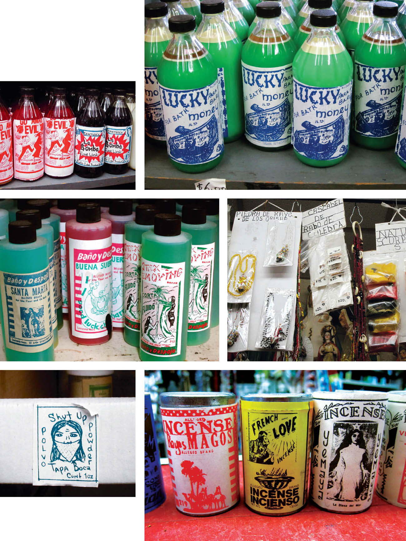
Justo Botanicas handmade and printed labels date back in some cases to the 1940s, when owner Jorge Vargass stepfather ran the shop.
INTRODUCTION
M y infatuation with hand-drawn type began about five years ago while visiting Justo Botanica, in New York Citys El Barrio in East Harlem. Id ride my bike over to visit with Jorge Vargas, the shops proprietor and neighborhood herbalist, and before long, Id find myself photographing or buying many of his fragrant remedies, prayer candles, and oils.
Fast forward to the present and I could probably open my own shop with the amount of stuff Ive picked up at Justo. My intention was not to ward off evil spirits, though that certainly couldnt hurt. I was enamored of the hand-drawn type that Jorge and his stepfather before him created for their packages. On a random visit, he asked what I thought of the idea of using digitally designed labels for his products, as a local graphic designer suggested that he do. I was aghast. Jorge was amused by my reaction and probably a bit confused, since, after all, wasnt I one of those graphic designers with a fancy computer?
Justo Botanicas earnest, often crudely handwritten and illustrated packages are right up my alley. I love the completely unselfconscious way in which they were created, and are then marketed in the shop. Jorge uses a two-color, hand-cranked printerI couldnt tell you what its called and photocopies to create his artwork. And while he laughs off my horror at the thought of going digital, I think he takes great pride in the heritage and authenticity of the work hes created by hand.
Another collection of hand-drawn packaging that I photographed, and then bought (of course), was from Jamie Olivers Jme line of home products. While its creator, Pearlfisher, had no sketches available for this project, I felt the book would be incomplete without its inclusion. Pearlfisher was tasked with creating a new brand and lifestyle concept for celebrity chef Jamie Oliver, which would transport the Jamie Oliver brand from the restaurant to the home. The strikingly original packaging for this eclectic lifestyle brand reflects the specific function of each product, while the bold Jme logo holds the collection together. As Pearlfisher describes it, Using the idea of taking the Jamie Oliver experience from the kitchen to the home, the hand-drawn design was inspired by...hand-drawn labels on the jars of homemade jam and the fresh produce found at farmers markets. Tasty.

From passing trend to established mtier, hand-inscribed packages draw their inspiration from the kitchen table jams, jellies, and liquors that were once appealingly quaint and now are professionally appealing, says author and School of Visual Arts MFA Design cochair Steven Heller (though he fails to mention Justo Botanica, so Ill have to take him there some day). The growing contemporary movement has extended beyond stationery and posters all the way to advertising and, of course, packaging.
The genius of hand lettering is that the final product must look spontaneous, emotional, and energetic, but the development of it must be meticulous, logical, and controlled, says Maryann Mitkowski, vice president and director of Creative Services for Parham Santana, the New York Citybased brand extension agency. Every counter space, stress, and stroke telegraphs a specific positioning or attitude. It takes a masterful hand to get it right.

Mitkowski continues: Now more than ever, we need to balance our constant barrage of digitized images with the unique imperfections that come from the human hand. Of all the beautiful typefaces in the world, none puts the heart on the page as quickly as hand-drawn type.
Andrew Gibbs, founder and CEO of The Dieline, the worlds largest packaging blog, adds, In all my years of seeing packaging trends come and go, there is one style that has stood the ultimate test of time: hand-drawn. In the past few years, I have seen this style become even more popular on a global scale. After the recession, peoples shopping habits changed. They bought less consumer products, especially products that were considered excessive or unnecessary. Consumers began to demand products that were authentic, honest, and simple. Brands had to respond to this quick consumer shift, and many responded by returning to the authentic core of their brand.
For a lot of companies, Gibbs continues, their authenticity was best visually represented by hand-drawn elements. This is because there is nothing that can replicate the artistry of handmade lettering and hand-illustrated graphics. Hand-drawn designs are the ultimate expression of authenticity and humanity, which is why it is so effective across so many products, and so effective over the course of time.
Next page


