About the Author

Jen Rozenbaum embraces her femininity, while allowing women to embrace their own. By daring her clients to shed their clothes, Jen encourages them to shed their inhibitions. In just six years, Jen has found a burgeoning audience in the intimate photography market. She proves that you can own your world if you live fearlessly, think audaciously, and act spontaneously.
In the six years that Jen has been working professionally she has photographed thousands of boudoir sessions with all types of women, allowing her to learn how womens bodies work in front of the camera. Her education in fine art and figure drawing has helped her develop her own foolsproof posing style, which helps new and seasoned photographers alike.
Jen has been featured on Good Morning America and in Entrepreneur Magazine and AOL.

Copyright 2015 by Jen Rozenbaum
All rights reserved.
All photographs by the author unless otherwise noted.
Published by:
Amherst Media, Inc., P.O. Box 586, Buffalo, N.Y. 14226, Fax: 716-874-4508
www.AmherstMedia.com
Publisher: Craig Alesse
Senior Editor/Production Manager: Michelle Perkins
Editors: Barbara A. Lynch-Johnt, Harvey Goldstein, Beth Alesse
Associate Publisher: Kate Neaverth
Editorial Assistance from: Carey A. Miller, Sally Jarzab, John S. Loder
Business Manager: Adam Richards
Warehouse and Fulfillment Manager: Roger Singo
ISBN-13: 978-1-60895-881-8
Library of Congress Control Number: 2014955660
10 9 8 7 6 5 4 3 2 1
No part of this publication may be reproduced, stored, or transmitted in any form or by any means, electronic, mechanical, photocopied, recorded or otherwise, without prior written consent from the publisher.
Notice of Disclaimer: The information contained in this book is based on the authors experience and opinions. The author and publisher will not be held liable for the use or misuse of the information in this book.

www.facebook.com/AmherstMediaInc
www.youtube.com/c/AmherstMedia
www.twitter.com/AmherstMedia
Contents


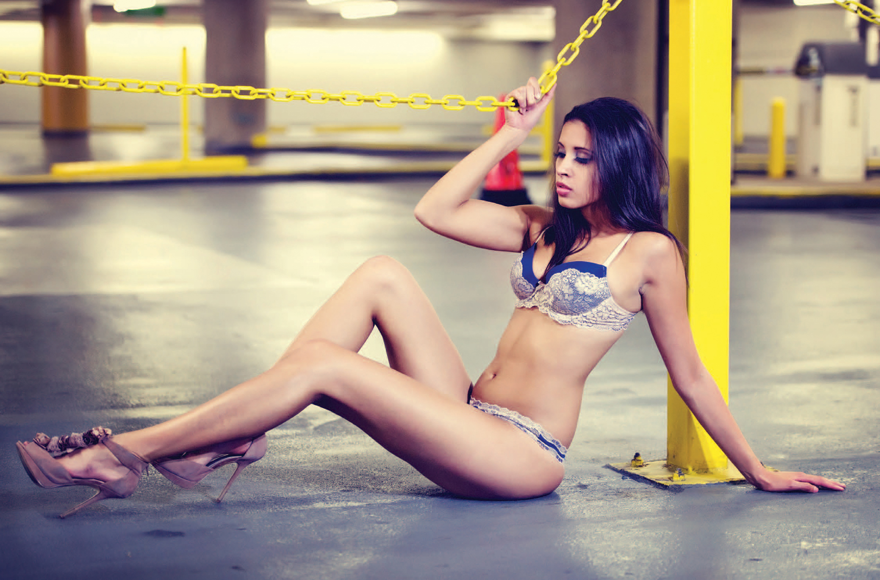
The bright yellow chain and stanchion in this parking garage worked well with my subjects blue lingerie. I am not intimidated by offbeat or grungy locations. Locations that are not as pretty as the subject allow her beauty to shine even more. I like the yin and yang quality of the pretty woman and her delicate shoes contrasting on the concrete floor. This image was photographed with a Nikon D3S, using a 70200mm Sigma lens set at 80mm. My exposure was 
 second at f/2.8.
The challenge in this image was the ambient light from the fluorescent lamps.

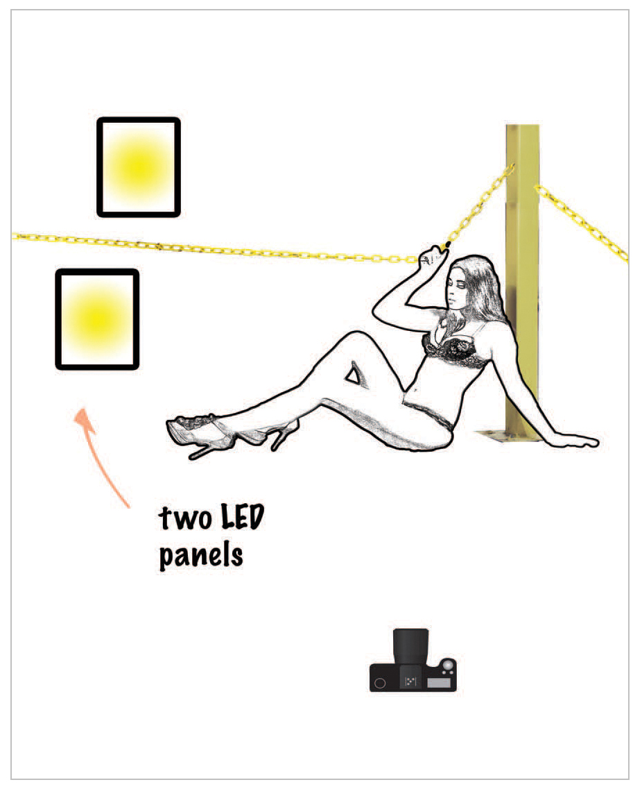
Ingredients: grungy location two LED light panels a very feminine model to offset the grunginess.


The challenge in this image was the ambient light from the fluorescent lamps in the garage. We could not control the ambient light, so we used two small LED panels that were hand-held to light the subject. They gave us enough light and overpowered what the florescent lights were doing to her face; when you only have ambient light from above, it casts a shadow and it is not the most flattering light. Be careful about lighting temperature because the temperature can change often when working with florescent lights. Make sure that if you are working around a light that is overly warm in color, you consider putting a corrective gel on your LED panels. Be aware of your ambient-light color so that you do not end up with an image with five different colors on the subject.
Her geometric pose was not a coincidence but well thought out. The triangles and the lines work off of the lines of the parking garage, with the columns and the horizontal, yellow linked chain. I broke a few of my own rules for this image, but I feel that worked. I would usually have her front leg higher than the back leg, but because this model is slim and has long legs, her thighs looked proportional. Leaning on a hand extends the triceps and can make the arm look heavy, but it was successful here. She was sitting on the garage floor, which was kind of gross, but because I wanted her leaning or touching as little as possible, she supported herself more with the chain than she was with her back arm. It is very important in a situation such as this to have a very graceful pose that creates interest and harmony within the environment.
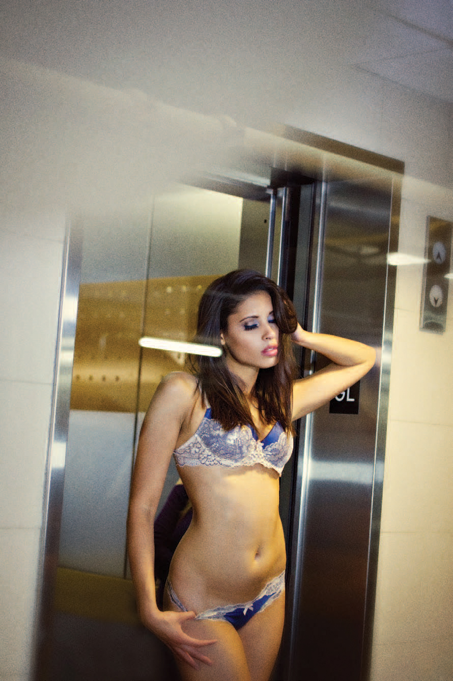
T his image was created with a 70200mm lens set at 70mm. My exposure was 
 second at f/2.8. It was lit using only the ambient light in the garage. I photographed my client through the glass of a small vestibule that was between us and the elevator door; the white lines going through her legs are the lights from the ceiling in the parking garage.
When I first made this image, I did not feel that it was interesting enough to have her long legs appear just the one time; I wanted to create more interest by making it seem that there were even more reflections, which was why I duplicated her legs. I am always looking for a unique image to show clients. I pay attention to the environment outside of the studio, seeing what I can find and how to make it interesting. I converted the image to black & white because there were so many different colors in the lighting and reflections that it was distracting. Fashioning it in black & white made it easier to see, more interesting with the hot spots and the dark spots, and more appealing to the eye. I liked the geometric elements with the lines and the patterns from the curves of her body, making her look even more feminine.
Next page