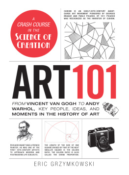
ART
FROMVINCENT VAN GOGHTOANDY WARHOL, KEY PEOPLE, IDEAS, AND MOMENTS IN THE HISTORY OF ART
Eric Grzymkowski

Avon, Massachusetts
INTRODUCTION
Many people are intimidated by art books. And rightfully so: Too often, the writer assumes that the reader possesses a level of technical skill and knowledge far beyond that of the casual art enthusiast. Simple concepts like perspective, color theory, and the process of combining lines to create shapes are glossed over (or omitted entirely). The beauty of Leonardo da Vincis Mona Lisa is presented as indisputable fact, without any explanation as to why it is supposed to be the greatest painting ever created.
Not Art 101, however. Here, youll be able to learn about art without feeling like youre reading a textbook for advanced art students. Youll find art techniques, movements, and mediums as well as the fascinating stories of famous artists presented in such a way that you can understand and appreciate themand maybe throw around a few key terms at museums or cocktail parties.
While it would take tens of thousandspossibly even millionsof pages to cover every aspect of art, the topics featured in this book encompass a large swathe of art history, theory, and technique. Many of the entries directly relate to one another (such as Henri Matisse and Modern Art), but you can also pick and choose the topics you find most compelling and skip around at your leisure. You can read about Van Goghs struggles for notoriety and transition straight to ancient cave art. Maybe youre interested in sculpture or want to brush up on the history of typography. Just like a museum, this book contains rooms of myriad topics from around the world and throughout time. After reading Art 101, youll finally be able to fully appreciate whats hanging on the walls and sitting behind glass
COLOR THEORY
Why we like what we see
Color is one of the essential building blocks for creating works of art, along with line, texture, shape, and a few other elements. Color can be used to alter the mood of a piece, draw the viewers eye to a certain portion of the canvas, and define the various objects within a work of art. The decisions an artist makes in regard to color may appear random, but they are often quite purposeful and are almost as much a science as an art.
COMBINING COLORS
Most children are taught three primary colors: red, yellow, and blue (RYB). By combining these three colors in different proportions, it is assumed any imaginable color could be created. While this is mostly true, RYB is actually just one set of primary colors. Other color combinations can also be used to produce an array of other colors, such as red, green, blue (RGB) and cyan, magenta, yellow (CMY). For most artists, however, red, yellow, and blue remain the most popular primary colors.
Colors created by combining two primary colors, such as purple from mixing red and blue, are referred to as secondary colors. Those colors created by mixing a primary color with a secondary color, or by mixing two secondary colors, are known as tertiary colors, such as with mixing blue and green to create blue-green.
COMPLEMENTARY COLORS
The concept of complementary colors first began to take shape when Aristotle noted that the viewers impression of a color could change depending on the way light hit that color. Saint Thomas Aquinas would later expand on this in the thirteenth century, when he noted that certain colors appeared more pleasing when placed next to certain other colors. For example, purple appeared more pleasant next to white than it did next to black. During the Renaissance, artists such as Leonardo da Vinci also noted that certain colors, such as red and green, looked particularly pleasing when placed alongside one another, but they did not understand why.
In 1704, Isaac Newton expanded on the observations of Renaissance artists to create a circle divided into seven colors. Those colors opposite each other were the most contrasting, with those next to each other being the least contrasting. His circle would later be divided into twelve sections to produce the color wheel recognizable by todays artists.
The term complementary colors was first introduced by an American scientist living in Britain named Benjamin Thompson. While observing lit candles, he discovered that the colored light produced by the candle and the shadow it produced contained colors that complement one another. (Although shadows may appear gray or black, they are actually made up of a combination of complex colors that are directly affected by the light that casts them.) He determined that this must be true with all colors of the spectrum, and that each individual color had its perfect counterpoint.
Artists and scientists later discovered that the attributes of complementary colors go well beyond the simple matter of being pleasing to the eye when adjacent to one another. For one, when a color appears on top of another, it takes on elements of the color that is complementary to the background. For example, a red ribbon placed on a yellow background will take on a slightly purple hue, because purple is the complementary color to yellow.
Additive Versus Subtractive Colors
While experimenting with different color combinations and how colors interacted, artists and scientists discovered that colors behave differently depending on the medium. This lead to two classifications of color: additive color and subtractive color. Additive color generally refers to light and can be observed on modern televisions and projectors. In essence, the complete absence of light creates a dark blackness that is altered when colored light of particular wavelengths is added. By contrast, subtractive color refers to pigments and dyes that are added to block or subtract certain wavelengths of light to display the desired color. For example, red paint on a canvas actually absorbs or subtracts all other colors of the spectrum and leaves the viewer with the color red.
THE TEMPERATURE OF COLORS
It is generally believed that certain colors can evoke particular moods and emotions in the viewer. When referred to in this manner, colors can roughly be broken down into cool colors and warm colors:
- The cool colors generally consist of blues, greens, and grays and are believed to relax the viewer and recede into the background.
- By contrast, warm colors like reds, yellows, and browns imply motion and excite the viewer.
THE COLOR OF COLOR
The way a color appears to the viewer is greatly dependent on how deep the color is, also known as saturation. In a simple sense, how red is a particular red? An artist can adjust the appearance of a color by adding different colors. For example, adding a little black paint to blue paint creates a darker shade of blue, while adding white paint to orange paint produces a lighter tint. The artist is not limited to just black and white, however, and can use any range of colors to lighten or darken colors. He or she could also mix the paint with both light and dark colors to produce a tone, which is created by adding grey or with a combination of shading and tinting.
The Eye of the Beholder


