Dont Make Me Think, Revisited
A Common Sense Approach to Web Usability
Steve Krug
Dont Make Me Think, Revisited
A Common Sense Approach to Web Usability
Copyright 2014 Steve Krug
New Riders
www.newriders.com
To report errors, please send a note to
New Riders is an imprint of Peachpit, a division of Pearson Education.
Editor: Elisabeth Bayle
Project Editor: Nancy Davis
Production Editor: Lisa Brazieal
Copy Editor: Barbara Flanagan
Interior Design and Composition: Romney Lange
Illustrations by Mark Matcho and Mimi Heft
Farnham fonts provided by The Font Bureau, Inc. (www.fontbureau.com)
Notice of Rights
All rights reserved. No part of this book may be reproduced or transmitted in any form by any means, electronic, mechanical, photocopying, recording, or otherwise, without the prior written permission of the publisher. For information on getting permission for reprints and excerpts, contact .
Notice of Liability
The information in this book is distributed on an As Is basis, without warranty. While every precaution has been taken in the preparation of the book, neither the author nor Peachpit shall have any liability to any person or entity with respect to any loss or damage caused or alleged to be caused directly or indirectly by the instructions contained in this book or by the computer software and hardware products described in it.
Trademarks
Its not rocket surgery is a trademark of Steve Krug.
Many of the designations used by manufacturers and sellers to distinguish their products are claimed as trademarks. Where those designations appear in this book, and Peachpit was aware of a trademark claim, the designations appear as requested by the owner of the trademark. All other product names and services identified throughout this book are used in editorial fashion only and for the benefit of such companies with no intention of infringement of the trademark. No such use, or the use of any trade name, is intended to convey endorsement or other affiliation with this book.
ISBN-13: 978-0-321-96551-6
ISBN-10: 0-321-96551-5
9 8 7 6 5 4 3 2 1
Printed and bound in the United States of America
First Edition
To my father, who always wanted me to write a book,
My mother, who always made me feel like I could,
Melanie, who married methe greatest stroke of good fortune of my life,
and my son, Harry, who will surely write books much better than this one whenever he wants to.
Second Edition
To my big brother, Phil, who was a mensch his whole life.
Third Edition
To all the peoplefrom all parts of the worldwho have been so nice about this book for fourteen years. Your kind wordsin person, in email, and in your blogshave been one of the great joys of my life.
Especially the woman who said it made her laugh so hard that milk came out of her nose.
Contents
Throat clearing and disclaimers
Krugs First Law of Usability
Scanning, satisficing, and muddling through
Designing for scanning, not reading
Why users like mindless choices
The art of not writing for the Web
Designing navigation
The importance of getting people off on the right foot
Why most arguments about usability are a waste of time, and how to avoid them
Keeping testing simpleso you do enough of it
Welcome to the 21st Century. You may experience a slight sense of vertigo
Why your Web site should be a mensch
Just when you think youre done, a cat floats by with buttered toast strapped to its back
Making usability happen where you live
Preface: About this edition
People come and go so quickly here!
DOROTHY GALE (JUDY GARLAND) IN THE WIZARD OF OZ (1939)
I wrote the first edition of Dont Make Me Think back in 2000.
By 2002, I began to get a few emails a year from readers asking (very politely) if Id thought about updating it. Not complaining; just trying to be helpful. A lot of the examples are out of date was the usual comment.
My standard response was to point out that since I wrote it right around the time the Internet bubble burst, many of the sites I used as examples had already disappeared by the time it was published. But I didnt think that made the examples any less clear.
Finally, in 2006 I had a strong personal incentive to update it. But as I reread it to see what I should change, I just kept thinking This is all still true. I really couldnt find much of anything that I thought should be changed.
Half of the royalties for the book were going to a company that no longer existed, and doing a new edition meant a new contractand twice the royaltiesfor me.
If it was a new edition, though, something had to be different. So I added three chapters that I didnt have time to finish back in 2000, hit the snooze button, and happily pulled the covers back over my head for another seven years.
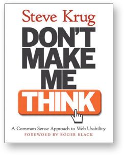
2000

2006
(Writing is really hard for me, and Im always happy to have a reason not to do it. Give me a good old root canal over writing any day.)
So why now, finally, a new edition? Two reasons.
#1. Lets face it: Its old
Theres no doubt about it at this point: It feels dated. After all, its thirteen years old, which is like a hundred years in Internet time. (See? Nobody even says things like in Internet time anymore.)
Most of the Web pages I used for examples, like Senator Orrin Hatchs campaign site for the 2000 election, look really old-fashioned now.
Sites these days tend to look a lot more sophisticated, as you might expect.
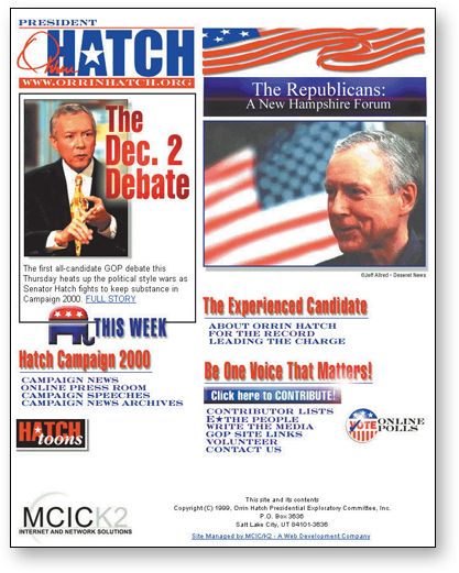
www.orrinhatch.com 1999

www.orrinhatch.com 2012
Recently Ive been starting to worry that the book would finally reach a point where it felt so dated that it would stop being effective. I know it hasnt happened yet because
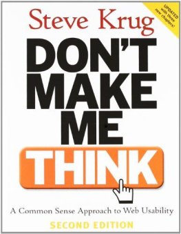
 Its still selling steadily (thank heavens), without any sign of slowing down. Its even become required reading in a lot of courses, something I never expected.
 New readers from all over the world continue to tweet about things theyve learned from it.





 Its still selling steadily (thank heavens), without any sign of slowing down. Its even become required reading in a lot of courses, something I never expected.