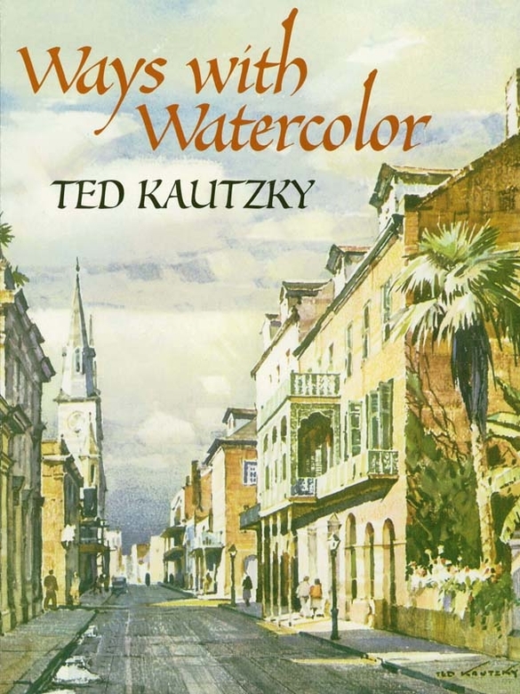
Ted Kautzky - Ways with Watercolor
Here you can read online Ted Kautzky - Ways with Watercolor full text of the book (entire story) in english for free. Download pdf and epub, get meaning, cover and reviews about this ebook. year: 2012, publisher: Dover Publications, genre: Art / Computer. Description of the work, (preface) as well as reviews are available. Best literature library LitArk.com created for fans of good reading and offers a wide selection of genres:
Romance novel
Science fiction
Adventure
Detective
Science
History
Home and family
Prose
Art
Politics
Computer
Non-fiction
Religion
Business
Children
Humor
Choose a favorite category and find really read worthwhile books. Enjoy immersion in the world of imagination, feel the emotions of the characters or learn something new for yourself, make an fascinating discovery.

- Book:Ways with Watercolor
- Author:
- Publisher:Dover Publications
- Genre:
- Year:2012
- Rating:3 / 5
- Favourites:Add to favourites
- Your mark:
Ways with Watercolor: summary, description and annotation
We offer to read an annotation, description, summary or preface (depends on what the author of the book "Ways with Watercolor" wrote himself). If you haven't found the necessary information about the book — write in the comments, we will try to find it.
In simple, direct language, accompanied by purposeful illustrations, teacher and master watercolorist Ted Kautzky shows beginners how to handle the medium. Widely regarded as the authors best work, the book discusses color pigments, paper, and other supplies; washes, strokes, and the use of accessories for special effects. Important chapters follow on the characteristics and techniques of handling limited and full palettes. Valuable instructions on composition and related subjects are interwoven throughout the text. In addition to many demonstrations, there is also challenging practice material.
**
Ted Kautzky: author's other books
Who wrote Ways with Watercolor? Find out the surname, the name of the author of the book and a list of all author's works by series.


Ways with Watercolor — read online for free the complete book (whole text) full work
Below is the text of the book, divided by pages. System saving the place of the last page read, allows you to conveniently read the book "Ways with Watercolor" online for free, without having to search again every time where you left off. Put a bookmark, and you can go to the page where you finished reading at any time.
Font size:
Interval:
Bookmark:
MANDALA DESIGNS, Martha Bartfeld. (41034-X)
COLOR YOUR OWN MARY CASSATT MASTERPIECES, Mary Cassatt. (41040-4)
COLOR YOUR OWN GAUGUIN PAINTINGS, Paul Gauguin. (41325-X)
COLOR YOUR OWN ABSTRACT ART MASTERPIECES, Muncie Hendler. (40800-0)
COLOR YOUR OWN MATISSE PAINTINGS, Muncie Hendler. (40030-1)
GEOMETRICAL DESIGN, Spyros Horemis. (20180-5)
VISUAL ILLUSIONS, Spyros Horemis. (21595-4)
KALEIDOSCOPIC DESIGN, Lester Kubistal. (40566-4)
Op ART, Jean Larcher. (23172-0)
THE 3-D ALPHABET, Jean Larcher. (23632-3)
CELTIC ANIMALS, Mallory Pearce. (29729-2)
DAZZLING DESIGNS, Koichi Sato. (40031-X)
OPTICAL ILLUSIONS, Koichi Sato. (28330-5)
ANCIENT EGYPTIAN DESIGN, Ed Sibbett Jr. (23746-X)
CELTIC DESIGN, Ed Sibbett Jr. (23796-6)
JAPANESE PRINTS, Ed Sibbett Jr. (24279-X)
3-D DESIGNS, Wil Stegenga. (40363-7) $2.95
COLOR YOUR OWN VAN GOGH PAINTINGS, Vincent Van Gogh. (40570-2)
PRISMATIC DESIGN, Peter Von Thenen. (23716-8)
Paperbound unless otherwise indicated. Available at your book dealer, online at www.doverpublications.com , or by writing to Dept. 23, Dover Publications, Inc., 31 East 2nd Street, Mineola, NY 11501. For current price information or for free catalogs (please indicate field of interest), write to Dover Publications or log on to www.doverpublications.com and see every Dover book in print. Each year Dover publishes over 500 books on fine art, music, crafts and needlework, antiques, languages, literature, childrens books, chess, cookery, nature, anthropology, science, mathematics, and other areas.
Manufactured in the U.SA.
If you are going to paint in watercolor, the first thing you will obviously need to know about is the color pigments themselvesthe mineral, vegetable or, rarely, animal substances that are to be dissolved in water and applied to the paper surface with your brush. Some of them have a long history, going back to the prehistoric periods when man first smeared colored earths on the walls of caves; others have been developed by modern chemical sciencebut were not going into either history or chemistry. What we want to know is how to identify the colors by sight and by name, in what form they are available, how each one behaves during application by itself and in combination with others, and how permanently they will retain their original hues under the action of light and polluted air.
Such facts, set down in printed form, can be useful as a guide to beginners and for occasional reference later on. But the only way to really fix them in your mind is through experience extended over time. Understanding this, I am going to give you here only enough information to get you started. Later on, when you are ready for more detailed knowledge, you can consult one of the specialized books available which deal exhaustively with painters colors.
The business of providing artists supplies has grown in modern times into a big industry. There are now art materials stores in most sizable communities throughout the United States, handling the products of a number of reliable manufacturers. Even in small towns there is often some variety or stationery store that sells at least the commoner colors, and if what you want is not in stock, the dealer can always order it for you by mail or you can write direct to one of the many firms which advertise in art magazines. So I know you can get the colors you need.
My advice is to always buy the best colors you can afford. It does not pay to use cheap ones. Those provided by the best manufacturers do not vary greatly in price. Personally, I prefer colors made by Winsor & Newton or Grumbachertwo world-famous brands. But you may wish to choose some other reputable manufacturer, for each artist has his own favorite brand, which he has found by experience to give him best results.
The watercolor paints I use are of the sort classed as transparent. I do not use opaque watercolors at all. Transparent colors come in cakes, pans, and tubes; I prefer the tubes as giving quicker solubility, an important consideration when working rapidly while washes are wet. Before beginning to paint, I squeeze out a plentiful supply of each color I am going to use into the wells of my color box or palette, where it is immediately available for mixing. In the event that I should run short during a big wash, it would take only a moment to squeeze out more. With cake or pan colors, which are solid and dry rather than pasty and moist, it would take so much time to dissolve enough pigment that my wash would dry out while I did it.
The hues available to artists in prepared watercolors number well over a hundred, but no artist I ever knew uses more than a fraction of the total. Many of the unusual colors are fugitive (liable to fade) and are shunned for that reason if for no other. The principal manufacturers commonly recommend that the painter make his choice from a list of fifty or sixty fairly permanent colors and it is rare to find a painter today who habitually uses more than twenty. In any single painting, he is likely to confine himself to ten or less. I often work with but three or four colors, as you will see.
When you come right down to it, all this great array of available pigments can, for the practical purposes of a working palette, be reduced to half a dozen small groups; the primary reds, blues, and yellows constituting the most essential colors, and the less vivid greens, browns, and grays the rest. With the primaries it is theoretically possible to mix the entire range of the spectrum, but for convenience, to save time and trouble, greens and browns are handy to have. The grays, including black and white, can be omitted entirely, since you paint on white paper and other shades of gray can be produced by mixing complements or triads. The oranges may be considered as reds or yellows, depending on which way they lean. For violets or purples there is ordinarily little use; when you do need them it is easy to mix red and blue.
For my own working palette, which is shown in orderly arrangement on page 13, I have two reds, four yellows (one is an orange), three blues, four browns, a green, and two grays (one warm and one cool). This does not mean that I never use any others; simply that I find these sufficient for most purposes.
Of the reds I have selected, the Alizarin Crimson is a deep rich red. The Vermilion is a lighter and more vivid color, approaching orange; in fact, I often use Orange Vermilion in its place. Some color-men and artists counsel against using the Alizarin , which is a coaltar derivative, because it is said to be affected chemically when mixed with some of the other colors such as the cobalts, the chromium-oxide greens, and the common earth colorsochres, siennas, and umbers. I have not found any serious difficulty of this sort in my watercolors, perhaps because I do not use a great quantity of this red. If you have any fear of it, you can substitute one of the Cadmium Reds , but you will find it hard to match the hue of the Alizarin .
In the yellow segment, I have chosen a set of four, which graduate in their paleness from the Cadmium Orange , which is slightly tinged with red, through the Cadmium Yellow and the Aureolin (or Cobalt Yellow ) to the delicate Cadmium Lemon , commonly called Lemon Yellow. They are all reliably permanent and fairly transparent.
For the blues, I use French Ultramarine most often. It is a rich, intense blue which mixes well, gives a good range of values, and has a certain degree of opacity when used heavily. It has another interesting propertythat of lending itself to the production of settling washes, either alone or combined with some other pigment like Burnt Sienna or Burnt Umber , usually on rough or medium-rough paper. The Cobalt is somewhat lighter, also settles, and is useful in painting summer skies, etc. Winsor Blue is a cold, heavy, clear blue, and I often use it or the similar Antwerp Blue for painting cool skies and mountain scenery. Other colors are of course mixed with any of these blues to produce a large variety of related hues as needed.
Font size:
Interval:
Bookmark:
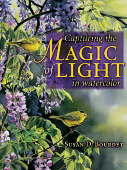
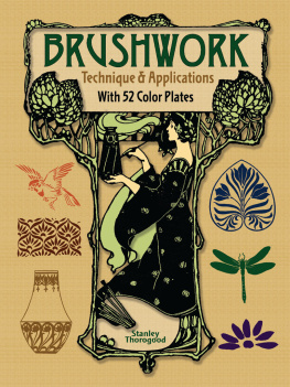
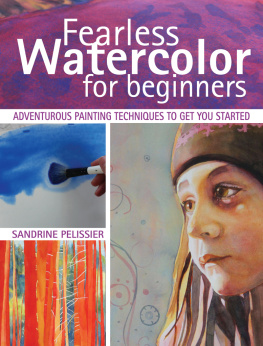
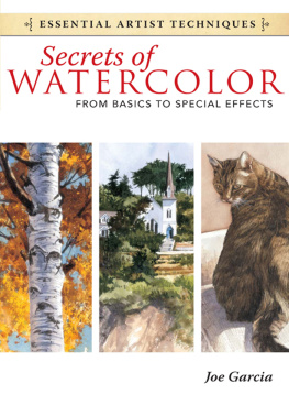
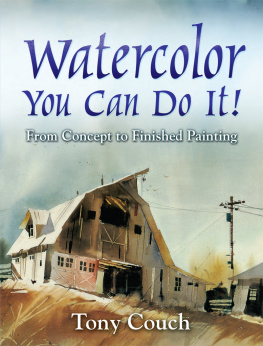
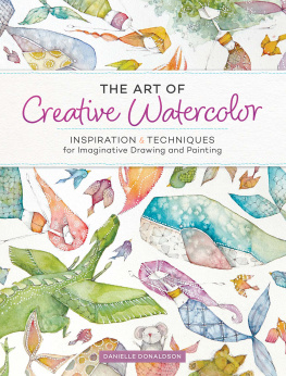
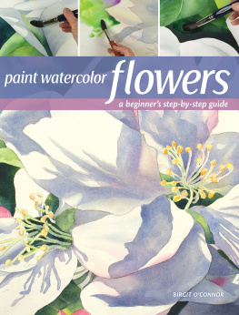
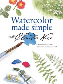
Similar books «Ways with Watercolor»
Look at similar books to Ways with Watercolor. We have selected literature similar in name and meaning in the hope of providing readers with more options to find new, interesting, not yet read works.
Discussion, reviews of the book Ways with Watercolor and just readers' own opinions. Leave your comments, write what you think about the work, its meaning or the main characters. Specify what exactly you liked and what you didn't like, and why you think so.