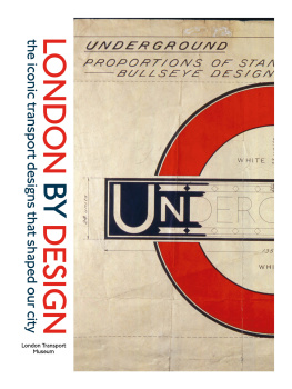
Mark Ovenden - London Underground by Design
Here you can read online Mark Ovenden - London Underground by Design full text of the book (entire story) in english for free. Download pdf and epub, get meaning, cover and reviews about this ebook. year: 2019, publisher: Penguin Books, genre: Art. Description of the work, (preface) as well as reviews are available. Best literature library LitArk.com created for fans of good reading and offers a wide selection of genres:
Romance novel
Science fiction
Adventure
Detective
Science
History
Home and family
Prose
Art
Politics
Computer
Non-fiction
Religion
Business
Children
Humor
Choose a favorite category and find really read worthwhile books. Enjoy immersion in the world of imagination, feel the emotions of the characters or learn something new for yourself, make an fascinating discovery.

- Book:London Underground by Design
- Author:
- Publisher:Penguin Books
- Genre:
- Year:2019
- Rating:4 / 5
- Favourites:Add to favourites
- Your mark:
London Underground by Design: summary, description and annotation
We offer to read an annotation, description, summary or preface (depends on what the author of the book "London Underground by Design" wrote himself). If you haven't found the necessary information about the book — write in the comments, we will try to find it.
London Underground By Design is the beautifully illustrated new book from Mark Ovenden, the acclaimed author of Great Railway Maps of the World, published to coincide with the 150th anniversary of the Tube in 2013.
Since its establishment 150 years ago as the worlds first urban subway, the London Underground has continuously set a benchmark for design that has influenced transit systems from New York to Tokyo, Moscow to Paris and beyond. London Underground by Design is the first meticulous study of every aspect of that feat, a comprehensive history of one of the worlds most celebrated design achievements, and of the visionaries who brought it to life.
Beginning in the pioneering Victorian age, Mark Ovenden charts the evolution of architecture, branding, typeface, map design, interior and textile styles, posters, signage and graphic design and how these came together to shape not just the Undergrounds identity, but the character of London itself. This is the story of celebrated designers - from Frank Pick, the guru who conceptualised the modern Tubes look under the design fit for purpose mantra, to Harry Beck, Tube diagram creator, and from Marion Dorn, one of the twentieth centurys leading textile designers, to Edward Johnston, creator of the distinctive font that bears his name, as well as Leslie Green, designer of central Londons distinctive ruby-red tiled stations, and the Design Research Units head, Misha Black, who in the 1960s rebranded British Railways and created the Victoria lines distinctive style, and Sir Norman Foster, architect of Canary Wharf station.
Mark Ovenden: author's other books
Who wrote London Underground by Design? Find out the surname, the name of the author of the book and a list of all author's works by series.


London Underground by Design — read online for free the complete book (whole text) full work
Below is the text of the book, divided by pages. System saving the place of the last page read, allows you to conveniently read the book "London Underground by Design" online for free, without having to search again every time where you left off. Put a bookmark, and you can go to the page where you finished reading at any time.
Font size:
Interval:
Bookmark:
UNDERGROUND
BY
DESIGN
For Pat and Derek who picked Penguins for Tube travel
The majority of the images in this book have been sourced from and reproduced with kind permission of the London Transport Museum, TfL Archives and the extensive private collections of those such as Mike Ashworth, Peter Lloyd, Derek Mayes and Max Roberts, plus many images from the authors own collection.
Additional images have been provided by courtesy of and with much appreciation to: Acanthus LW Architects ().
Images lent by various collectors above including from periodicals: Electric Review (), The copyright of all of the images remains with the original owners.

Kevin McCloud, Channel 4s Grand Designs presenter and architect
To travel the underground is to travel through design time. One hundred and fifty years of it. From the crystalline concrete light wells of Heathrow Terminal 5 you can trundle six stops to the Art Deco triumphalism of Osterley, thence straight on to visit the glorious Arts and Crafts facade of Russell Square before changing at Kings Cross to admire the original Victorian brickwork of the Metropolitan line, the first underground railway in the world, completed in 1863. This will lead you to the planetarium for a forty-five minute tour of Deep Time. Nothing, however, rivals the architectural and design experience of the Underground. It is encapsulating and immersive; a contrived world that you cannot confuse with a National Trust tour, thanks to the advertising, the smell of brakes and the purposefulness of it all. The Underground is no heritage site or fusty working museum. It is a complex, functioning piece of infrastructure, animated by the one billion people that use it every year, as much as by the trains.
Travelling within the confines of the Circle line, it would be tempting to think of the Underground as a principally twentieth-century invention. It was not. It was a twentieth-century reinvention or integration of a system that had grown with lightning speed between 1863 and the end of the nineteenth century, created by rival operating companies of different lines: the Met, the District, the City and South London Railway, the Central London Railway or Tube and the Underground Electric Railway Company of London. Their separate identities are still clearly visible on the suburban lines. Was there a coherent style? No. There was a jumbled mass of architecture, typefaces and liveries, especially in those early years of steam. Simple wooden stations vied with ornate brickwork and the lunatic Ottoman extravagance and thirty-metre minarets of Blackfriars Underground station. Timetables and maps were printed with gothic tracery and vignettes of the corners of the Empire. Amidst all this mayhem, however, there were the inklings of clarity. For example, the original Metropolitan Railway had, almost from the start, adopted clear, sans-serif typography for its signage, redolent of the mainline railways, and a relatively consistent architectural language in the popular Italianate style.
With the passing of the decades and with electrification of the Underground came greater coherence. With electric lighting came white glazed tiling that was to influence the style of Underground stations from Budapest to Paris (which lifted Londons emerging design ethos wholesale). And all the while, thanks to its decades-long head start, Londons Underground was haphazardly forging, from the scramble of the vying companies ambitions, a design code, architectural language and brand identity. Not that any of these terms or concepts existed as such.
The overwhelmingly period and coherent feel of the Tube results in no small part from the co-ordinated work of Frank Pick, erstwhile publicity officer, commercial manager and finally managing director of the Underground Electric Railways Company of London. He steered its branding and identity out of the Edwardian period into the Modern age. Nikolaus Pevsner described him as the greatest patron of the arts whom this century has so far produced in England, and indeed the ideal patron of our age. Pick adopted the famous topological map, designed by engineering draughtsman Harry Beck in 1931 in his spare time (not commissioned and not received with a great deal of enthusiasm from London Underground); he commissioned the typeface designed by Edward Johnston to Picks brief in 1913 (surely it feels much later?); he coordinated signage and architecture across the entire network.
The Undergrounds latterday character has been as accretive and (almost) as clearly directed. It remains a glorious palimpsest of design, a repository of design work and design values of the last one hundred and fifty years, a sort of working reference that charts the history of taste and style. So this is not a book merely about the growth of Londons Tube network. It records the birth of a new idea in the nineteenth century the transport interchange and unfolds the invention of branding in the twentieth. It plots the organization of commercial illustration, lettering design and printing into a new discipline called graphic design. It follows the adaptation of architecture into a commercial tool. It also roundly celebrates the Titans of engineering and design, individuals like Benjamin Baker, who built a transport system so coherent, it paved the way for London to grow into the international city it now is.
Bakerloo see
Board see
BPCR Brompton and Piccadilly Circus Railway
BSWR/Bakerloo Baker Street and Waterloo Railway
CCEHR/Hampstead Charing Cross, Euston and Hampstead Railway
CLR Central London Railway
CMP Compagnie du Chemin de Fer Mtropolitain de Paris
CSLR City and South London Railway
DIA Design and Industries Association
District Metropolitan District Railway
DLR Docklands Light Railway
DRU Design Research Unit
ELL East London line
ELR East London Railway
GER Great Eastern Railway
GLC Greater London Council
GNCR Great Northern and City Railway
GNPBR/Piccadilly Great Northern, Piccadilly and Brompton Railway
GNR Great Northern Railway
GWR Great Western Railway
Hampstead see
HCR Hammersmith and City Railway
HLS Henrion Ludlow Schmidt
JLE Jubilee Line Extension
LBSC London Brighton and South Coast
LDDC London Docklands Development Corporation
LMS London, Midland and Scottish Railway
LNER London and North Eastern Railway
LNWR London and North Western Railway
LPTB/Board London Passenger Transport Board
LSWR London and South Western Railway
LT London Transport
LTSR London Tilbury and Southend Railway
LU London Underground
LUL London Underground Limited
Met Metropolitan Railway
NER North Eastern Railway
NWP New Works Programme
PEDs platform-edge doors
PFA Platform for Art
Piccadilly see
PPP PublicPrivate Partnership
RIBA Royal Institute of British Architects
SECR South Eastern and Chatham Railway
TfL Transport for London
UERL Underground Electric Railways of London
WLR West London Railway
A book such as this is rarely just the work of one individual but inevitably it is assembled by an author against the backdrop of many loving and supportive hands. The initial inspiration for this project came during discussions with Mike Ashworth, David Ellis, David Lawrence, Christopher Saynor and Mike Walton who have provided encouragement to the author on several published works. He is indebted to Helen Conford for seeing the possibilities of the book and running with it, the artistic guidance of Jim Stoddart, and the help of Rebecca Lee, Patrick Loughran, Richard Marston, Hannah Bradbury and the publicity department at Penguin.
Font size:
Interval:
Bookmark:
Similar books «London Underground by Design»
Look at similar books to London Underground by Design. We have selected literature similar in name and meaning in the hope of providing readers with more options to find new, interesting, not yet read works.
Discussion, reviews of the book London Underground by Design and just readers' own opinions. Leave your comments, write what you think about the work, its meaning or the main characters. Specify what exactly you liked and what you didn't like, and why you think so.