Making Data Visual
by Danyel Fisher and Miriah Meyer
Copyright 2018 Miriah Meyer, Microsoft. All rights reserved.
Printed in the United States of America.
Published by OReilly Media, Inc. , 1005 Gravenstein Highway North, Sebastopol, CA 95472.
OReilly books may be purchased for educational, business, or sales promotional use. Online editions are also available for most titles ( .
Editor: Rachel Roumeliotis | Interior Designer: David Futato |
Production Editor: Justin Billing | Cover Designer: Karen Montgomery |
Copyeditor: Rachel Head | Illustrator: Rebecca Demarest |
Proofreader: Gillian McGarvey | Additional illustrations: Dominik Moritz |
Indexer: Ellen Troutman-Zaig | and Kanit Ham Wongsuphasawat |
- January 2018: First Edition
Revision History for the First Edition
- 2017-12-19: First Release
See http://bit.ly/making-data-visual for release details.
The OReilly logo is a registered trademark of OReilly Media, Inc. Making Data Visual, the cover image, and related trade dress are trademarks of OReilly Media, Inc.
While the publisher and the authors have used good faith efforts to ensure that the information and instructions contained in this work are accurate, the publisher and the authors disclaim all responsibility for errors or omissions, including without limitation responsibility for damages resulting from the use of or reliance on this work. Use of the information and instructions contained in this work is at your own risk. If any code samples or other technology this work contains or describes is subject to open source licenses or the intellectual property rights of others, it is your responsibility to ensure that your use thereof complies with such licenses and/or rights.
978-1-491-92846-2
[LSI]
Preface
Visualization is a vital tool for understanding and sharing insights around data. The right visualization can help express a core idea or open a space to examination; it can get the world talking about a dataset or sharing an insight .

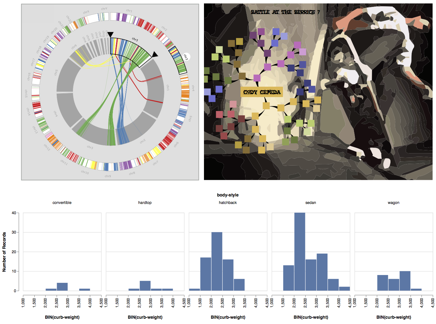
Figure P-1. Visualizations can take many forms, from views that support exploratory analysis (top left), to those that provide quick overviews in a dashboard (bottom), to an infographic about popular topics (top right).
Visualizations provide a direct and tangible representation of data. They allow people to confirm hypotheses and gain insights. When incorporated into the data analysis process early and often, visualizations can even fundamentally alter the questions that someone is asking.
Creating effective visualizations is hard. Not because a dataset requires an exotic and bespoke visual representationfor many problems, standard statistical charts will suffice. And not because creating a visualization requires coding expertise in an unfamiliar programming languageoff-the-shelf tools like Excel, Tableau, and R are ample enough to suffice.
Rather, creating effective visualizations is difficult because the problems that are best addressed by visualization are often complex and ill-formed. The task of figuring out what attributes of a dataset are important is often conflated with figuring out what type of visualization to use. Picking a chart type to represent specific attributes in a dataset is comparatively easy. Deciding on which data attributes will help answer a question, however, is a complex, poorly defined, and user-driven process that can require several rounds of visualization and exploration to resolve. In this book, we focus on the process of going from high-level questions to well-defined data analysis tasks, and on how to incorporate visualizations along the way to clarify understanding and gain insights.
Who Is This Book For?
This book is for people who have access to data and, perhaps, a suite of computational tools but who are less than sure how to turn that data into visual insights. We find that many data science books assume that you can figure out how to visualize the data once collected, and visualization books assume that you already have a well-defined question, ready to be visualized. If, like us, you would like to address these assumptions, then this book is for you.
This book does not cover how to clean and manage data in detail or how to write visualization code. There are already great books on these topics (and, when relevant, we point to some of them). Rather, this book speaks to why those processes are important. Similarly, this book does not address how to choose a beautiful colormap or select a typeface. Instead, we lay out a framework for how to think about data given the possibilities and constraints of visual exploration. Our goal is to show how to effectively use visualizations to make sense of data.
Who Are We?
The authors of this book have a combined three decades of experience in making sense of data through designing and using visualizations. We have worked with data from a broad range of fields: biology and urban transportation, business intelligence and scientific visualization, debugging code and building maps. We have worked with analysts from a variety of organizations, from small, academic science labs to teams of data analysts embedded in large companies. Some of the projects we have worked on have resulted in sophisticated, bespoke visualization systems designed collaboratively with domain specialists, and at other times we have pointed people to off-the-shelf visualization tools after a few conversations. We have taught university classes in visualization and have given lectures and tutorials. All in all, we have visualized hundreds of datasets.
We have found that our knowledge about visualization techniques, solutions, and systems shapes the way that we think and reason about data. Visualization is fundamentally about presenting data in a way that elicits human reasoning, makes room for individual interpretations, and supports exploration. We help our collaborators make their questions and data reflect these values. The process we lay out in this book describes our method for doing this.
Overview of Chapters
illustrates the process of making sense with visualizations through a quick example, exposing the role that a visual representation can play in data discovery.
starts to get into details. It discusses a mechanism to help narrow a question from a broad task into something that can be addressed with an iterative visualization process. For example, the broad question Who are the best movie directors? does not necessarily suggest a specific visualizationbut Find movie directors who directed top-grossing movies using an IMDB dataset can lead more directly to an answer by way of a visualization or two. This process creates an operationalized question, one that consists of particular tasks that can be directly addressed with data.
This process of narrowing a question down to actionable tasks requires input from multiple stakeholders. lays out an iterative set of steps for getting to the operationalization, which we call data counseling. These steps include finding the right people to talk to, asking effective questions, and rapidly exploring the data through increasingly sophisticated prototypes.
The numerical nitty-gritty of the book follows. explores powerful visualization techniques that use multiple views and interaction to support analysis of large, complex datasets.These three chapters are meant to provide an overview of some of the most effective and commonly used ideas for supporting sensemaking with visualizations, and are framed using the operationalization and data counseling process to help guide decision-making about which visualizations to choose.

