1. Understanding Data Visualization
Created in 2007, D3.js is a powerful charting library best used for complex and nonstandard data visualizations. Thus, before we get into the fine details of how to use D3.js for data visualization, we need to talk about the basics: how to learn to see data, how to transform data into a visual, and what is best suited for the human eye.
Everyone likes to snap photos and post them online. We enjoy it yet more when friends and strangers like it. And, well, pretty pictures are the best. Marketers who use visuals observe significant returns of readers, customers and leadsand, by extension, revenue. That is why web communication experts have recommended using visuals and, more specifically, well-designed and easy-to-digest infographics. After all, a picture is worth a thousand words; it works because it makes sense: 90 percent of the data transmitted to the brain is visual, and visuals are processed 60,000 times faster in the brain than text. But there is even more to that: New York University psychologist Jerome Bruner has observed a significant difference in information retention depending on how it is introduced. He found that 80 percent was retained using visuals, as opposed to 10 percent from hearing and 20 percent from reading.
We are constantly faced with a data glut of infographics and data visualizationsstatic snapshots are not enough any longer. Different services exist, both for general and for more specific uses of companies, experts and journalists. Big, open, or smart, data needs to be processed and visualized to make sense.
No matter the technology one chooses and adopts, though, visualizing data is not done at random. When infographics were the new black, we would stumble upon fulgurant heaps of colors and typographies aimed to send important visual messages. Most of these were pretty, but also difficult to process and, more often than not, provided a little depth. Web communication consultants and designers were fighting the data visualization fight with statisticians and data analysts, the former saying that conveying a message swiftly and to the widest possible audience was far more important than being exhaustive about facts and numbers, a stance supported by the latter.
It took those of us working with data visualization some time to comprehend that transmitting information can be both beautiful and functional. Interactive graphics and creative imagination provide with the opportunity to produce deep and rich explorations while stunning the audience with aesthetics. We are nowadays even more often stunning than notwith visualizations that are too complex to understand and that are oft-geared toward showcasing ones technical skills.
Visualising Raw Data
One of the primary goals of a data visualization is to explain complex matters. These can be answering a question, supporting a logistical decision, describing demography, communicating observations, or increasing efficiency. These are rather passive processes.
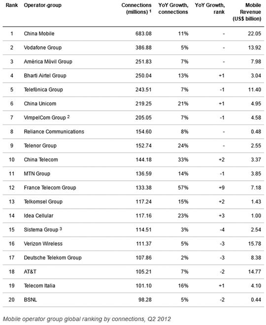
In these cases, the visualization is simple and straightforward; it answers one precise question or supports one given statement. There is a clear advantage to applying such a chart as looking through the raw data itself is much more time-consuming. Take Figure , for example; can you tell, in less than 10 seconds, which are the top three of the worlds 20 dominant mobile operators in terms of mobile revenue? (Hint: Some are at the bottom.)
Figure 1-1.
The worlds top 20 mobile carriers
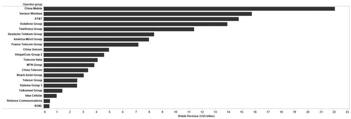
Now have a look at Figure . Can you tell in less than 10 seconds, which are the top three of the worlds 20 dominant mobile operators in terms of mobile revenue?
Figure 1-2.
The data from Figure , plotted
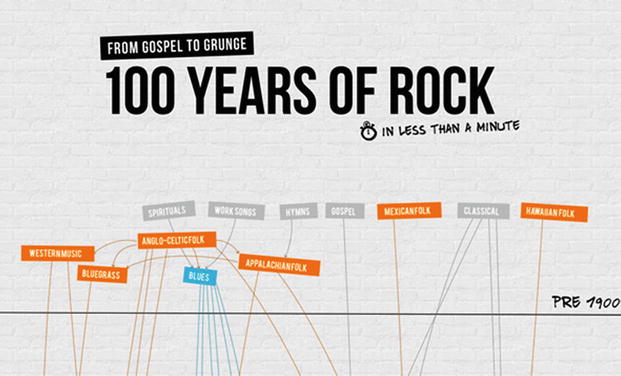
Visualizing data enables fast understanding. But it can also allow to see what would otherwise go unnoticed or to bring forth questions one would not formulate otherwise. Good visualization enables anyone to browse, to research and to interact with data. Exploratory visuals offer multiple and layered dimensions to a dataset, that one can use to compare multiple datasets with each other or to fish for singularities across datasets from different natures. An interactive visualization gives the opportunity to not only observe and conclude about one fact but also to ask questions along the wayand find answers to those questions. Figure , for example, shows a playful visualization of data using D3.js .
Figure 1-3.
100 Years of rock, by Brittany Klontz for ConcertHotels.com
Having a Good Eye for Data
In his New York Times article, Learning to See Data Benedict Carey explains:
Perceptual learning is such an elementary skill that people forget they have it. Its what we use as children to make distinctions between similar-looking letters, like U and V, long before we can read. Its the skill needed to distinguish an A sharp from a B flat (both the notation and the note), or between friendly insurgents and hostiles in a fast-paced video game. By the time we move on to sentences and melodies and more cerebral gamingchunking the information into larger blocksweve forgotten how hard it was to learn all those subtle distinctions in the first place.
The New York Times piece centers on the reasons behind such reactions. Needless to dive in the realm of perceptual learning studies here: in a nutshell, we learn constantly, rather seamlessly and not that consciously, to distinguish patterns and shapes. Take a new language for example. If you are a native English speaker who decides to learn French, you will need to figure out which letters use diacritics and how to pronounce specific two-letter combinations. (And then, grammar, of course.) So, what to do when rules for placing such letters do not exist? With practice and time, you get the gut feeling of where an should stand rather than an . Nothing supernatural here: you just get to see trends of how words form which informs your spelling.
The same happens with data. A small table or a JSON file is a technical detail. What you get to learnwith practiceis how to look at the data rather than trying to see whether there is a zero somewhere. It is the same as with language: if you are a native English speaker, it is difficult to explain why you prefer to use quick rather than swift. To any of us, it is uneasy and somewhat bizarre to explain how to read a bar chart, we just grasp the meaning of it in nanoseconds. This is because it has been there forever, our brains are thus exposed to it often enough to effortlessly understand what it is showing. We take bar charts for granted, and that interpretation is the imperceptible gut feeling.