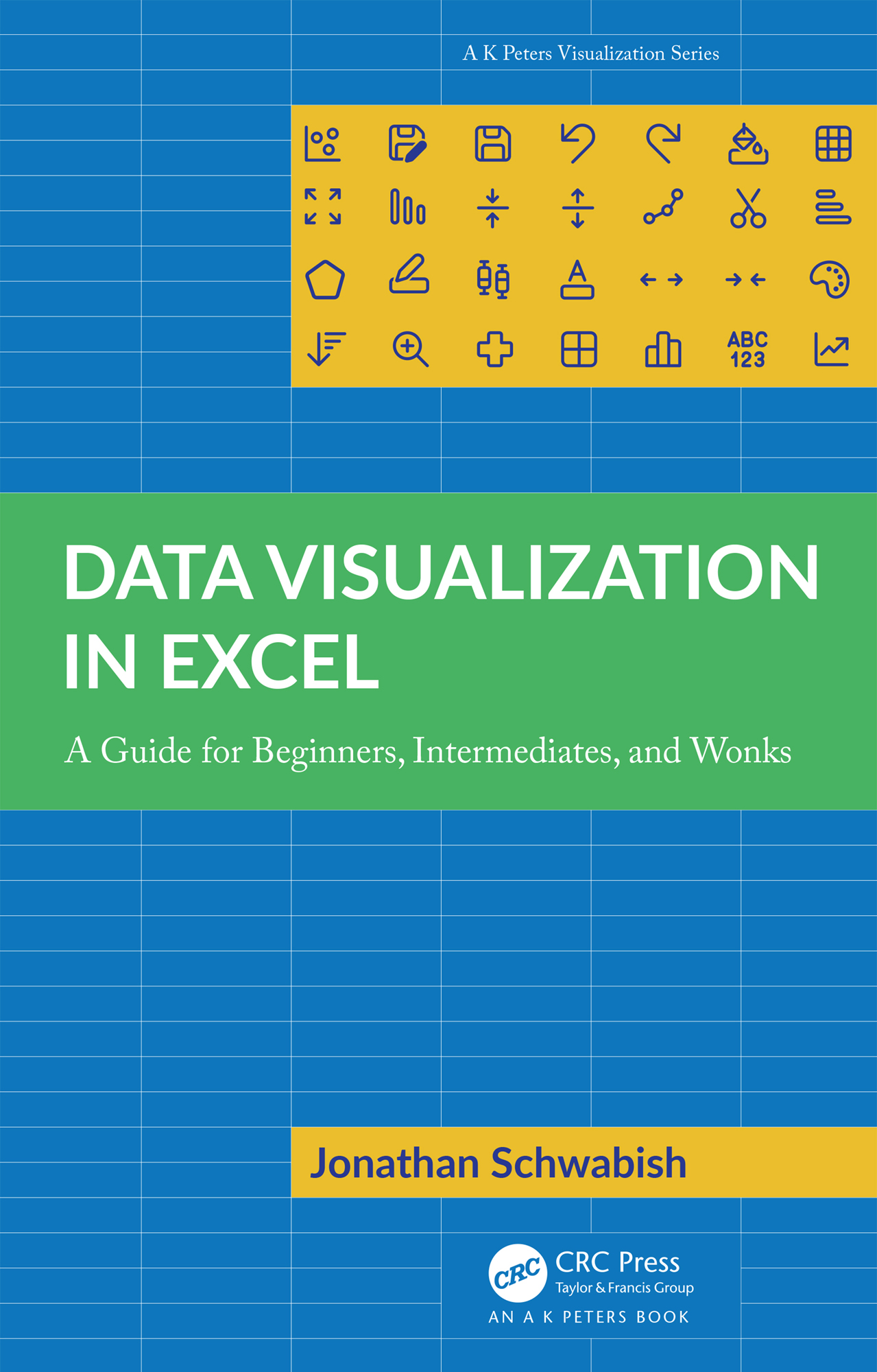
Schwabish Jonathan - Data Visualization in Excel
Here you can read online Schwabish Jonathan - Data Visualization in Excel full text of the book (entire story) in english for free. Download pdf and epub, get meaning, cover and reviews about this ebook. City: Boca Raton, year: 2023, publisher: CRC Press/A. K. Peters, genre: Computer. Description of the work, (preface) as well as reviews are available. Best literature library LitArk.com created for fans of good reading and offers a wide selection of genres:
Romance novel
Science fiction
Adventure
Detective
Science
History
Home and family
Prose
Art
Politics
Computer
Non-fiction
Religion
Business
Children
Humor
Choose a favorite category and find really read worthwhile books. Enjoy immersion in the world of imagination, feel the emotions of the characters or learn something new for yourself, make an fascinating discovery.

- Book:Data Visualization in Excel
- Author:
- Publisher:CRC Press/A. K. Peters
- Genre:
- Year:2023
- City:Boca Raton
- Rating:4 / 5
- Favourites:Add to favourites
- Your mark:
Data Visualization in Excel: summary, description and annotation
We offer to read an annotation, description, summary or preface (depends on what the author of the book "Data Visualization in Excel" wrote himself). If you haven't found the necessary information about the book — write in the comments, we will try to find it.
Schwabish Jonathan: author's other books
Who wrote Data Visualization in Excel? Find out the surname, the name of the author of the book and a list of all author's works by series.
Data Visualization in Excel — read online for free the complete book (whole text) full work
Below is the text of the book, divided by pages. System saving the place of the last page read, allows you to conveniently read the book "Data Visualization in Excel" online for free, without having to search again every time where you left off. Put a bookmark, and you can go to the page where you finished reading at any time.
Font size:
Interval:
Bookmark:
Microsoft Excel is already installed on 750 million computers. But creating modern visualizations using Excel charts seems impossible. In this book, Jonathan Schwabish gives you the step-by-step instructions to make Excel charts do what most people (including me) previously thought was impossible in Excel. Every chapter, you will learn how to make visualizations that most people assume require Python or R.
Bill Jelen,Excel MVP and publisher of MrExcel.com
Those who expanded their graphicacy with Schwabishs Better Data Visualizations are going to love the follow up, in which Jon outlines how to make graphs using the ubiquitous Microsoft Excel. Readers will appreciate Jons pragmatic examples, easy-to-follow instructions and entertaining writing. If you need to communicate with data and lack confidence making graphs in Excel, I urge you to add Data Visualization in Excel to your library!
Cole Nussbaumer Knaflic,founder and CEO of storytelling with data (SWD)
Wow, just wow. One book that explains how to make all the fancy, powerful charts you see in good ol Excel. If you want to impress your boss with Excel charting wizardry, this is THE BOOK for you. Not only does the book explain the chart construction process, it also provides guidance on designing great outputs. I wish I had this book when I started my data analyst journey. A must buy. Highly recommended.
Chandoo (Purna Duggirala),Microsoft MVP, Chandoo.org
This book takes you well beyond the defaults of Excel charting. It shows you how to apply principles and best practices of data visualization in an accessible way. In the process it streamlines the use of Excel while enabling the creation of much more advanced graphics.
Jon Peltier,Peltier Technical Services
Thank you Jonathan Schwabish for giving us such a clear how-to book! Data Visualization in Excel shows us how far we can go with Excel to make data visualization insights accessible to a much broader audience! I am making this my go-to textbook for teaching myself and my students to create better, more effective, and different graphs in Excel to operationalize the data visualization concepts and strategies the earlier books have inspired in us.
Kosali Simon,Distinguished Professor, Indiana University, ONeill School of Public and Environmental Affairs
There arent many places where the cliche think outside the box can be applied with such propriety (and benefits) than when making charts in Excel. If you go beyond its poor chart library and defaults, there is a whole world to discover, and Jons new book is a great journey companion. This detailed step-by-step tutorial will show you how to take advantage of Excels flexibility, how to use design and formatting options far from their original intent and how to visualize data directly on the spreadsheet, going even further away from the chart library. On top of this, Jon is a communicator and a data visualization expert, so his many examples are relevant (many analytical tasks can benefit from them) and designed for effectiveness applying sound data visualization guidelines.
Jorge Camdes,data visualization consultant, founder of Excelcharts.com
For data visualisation practitioners looking to hone their charting craft there are three core questions: what, when, and how. What different options exist. When should I use. How do I make them. Jons bestseller Better Data Visualizations: A Guide for Scholars, Researchers, and Wonks addresses the first two of those enquiries, and much more besides, but this excellent new text gives explicit solutions for the matter of how. For Excel users, beginners or advanced, this book will become an essential practical companion. Youll learn how to elegantly master the standard charting functions in the most effective and efficient way, but youll also discover how to truly make Excel sing, finding novel approaches and clever workarounds to expand your visual vocabulary even further.
Andy Kirk,independent consultant, educator, and author, founder of visualisingdata.com
I found this book 20 years too late! Seriously, I wish I had this book a long time ago, for its rich collection of tutorials, best practices, lessons learned, and principles of data visualization using Excel. From broken stacked bars to Gantt charts, heatmaps, tile grid maps, and waffle plots (and so much more from A to Z), the many detailed visualization examples in this book will provide tremendous benefit in the workplace whenever and wherever data storytelling, visual analytics, or data-driven decision insights are required. Excel users from beginners to experts will discover useful data visualization examples, corresponding detailed instructions, and perhaps some secrets of Excel here in this wonderful book.
Kirk Borne,Chief Science Officer, DataPrime Inc.
Jonathan Schwabish taught me what constitutes a good chart. In this incredibly useful volume, he teaches me how to make a good chart in Excel. A step-by-step guide - practical, easy to follow and (of course) well-illustrated.
David Wessel,Director, Hutchins Center on Fiscal & Monetary Policy, The Brookings Institution
Finally, a comprehensive data visualisation book for Excel thats detailed enough that a relative beginner can use it, and extensive enough that an experienced user will also discover tips and learn valuable Excel techniques and data visualisation best practices.
Mynda Treacy,MyOnlineTrainingHub.com
Data visualization has an ever-growing toolbox of applications and programming languages for creating charts, but some may come with steep learning curves, some may require coding skills, and some resources may lack the full range of functionality we really need. The one, often overlooked tool familiar and often available to most of us is Microsoft Excel. In this companion book to Better Data Visualizations: A Guide for Scholars, Researchers and Wonks, Jon Schwabish systematically and expertly shows us how to create a wide variety of visualization types, from simple heatmaps right through to more complex examples such as raincloud plots and Marimekko charts, each with detailed tutorials and with all companion resources available via his website. This book first opens your eyes to the wide range of visualization possibilities that were most likely available to you all along in Excel, then promptly equips you with the skills to create them all.
Neil Richards,Lead Business Intelligence Analyst at JLL, former Knowledge Director for the Data Visualization Society
This book closes the gap between what people think Excel can do and what they can achieve in the tool. Over the past few years, recognition of the importance of effectively visualizing data has led to an explosion of data analysis and visualization software tools. But for many people, Microsoft Excel continues to be the workhorse for their data visualization needs, not to mention the only tool that many data workers have access to. Although Excel is not a specialist data visualization platform, it does have strong capabilities. The default chart types do not need to be the limit of the tools data visualization capabilities, and users can extend its features by understanding some key elements and strategies. Data Visualization in Excel provides a step-by-step guide to creating more advanced and often more effective data visualizations in Excel and is the perfect guide for anyone who wants to create better, more effective, and more engaging data visualizations.
Next pageFont size:
Interval:
Bookmark:
Similar books «Data Visualization in Excel»
Look at similar books to Data Visualization in Excel. We have selected literature similar in name and meaning in the hope of providing readers with more options to find new, interesting, not yet read works.
Discussion, reviews of the book Data Visualization in Excel and just readers' own opinions. Leave your comments, write what you think about the work, its meaning or the main characters. Specify what exactly you liked and what you didn't like, and why you think so.