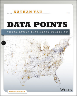
Nathan Yau - FlowingData.com Data Visualization Set
Here you can read online Nathan Yau - FlowingData.com Data Visualization Set full text of the book (entire story) in english for free. Download pdf and epub, get meaning, cover and reviews about this ebook. year: 2014, publisher: Wiley, genre: Politics. Description of the work, (preface) as well as reviews are available. Best literature library LitArk.com created for fans of good reading and offers a wide selection of genres:
Romance novel
Science fiction
Adventure
Detective
Science
History
Home and family
Prose
Art
Politics
Computer
Non-fiction
Religion
Business
Children
Humor
Choose a favorite category and find really read worthwhile books. Enjoy immersion in the world of imagination, feel the emotions of the characters or learn something new for yourself, make an fascinating discovery.

- Book:FlowingData.com Data Visualization Set
- Author:
- Publisher:Wiley
- Genre:
- Year:2014
- Rating:4 / 5
- Favourites:Add to favourites
- Your mark:
FlowingData.com Data Visualization Set: summary, description and annotation
We offer to read an annotation, description, summary or preface (depends on what the author of the book "FlowingData.com Data Visualization Set" wrote himself). If you haven't found the necessary information about the book — write in the comments, we will try to find it.
Data Points focuses on the approach to visualization and data. Visualization is a medium that can be used as a tool, art, a way to tell stories, etc., Data Points guides readers through making data approachable through visualization techniques and best practices. The focus is on designing with a purpose in mind. Data Points discusses why recipes (from the rules) work and expands on how readers can make their own recipes. The book is example-driven, featuring work from people in areas of art, design, business, statistics, computer science, cartography, and online media, as well as many of the authors own illustrations. The major sections of the book cover:
- Visualization as Medium -- In the same way not all movies are documentaries, not all visualization is about optimal visual perception.
- Data Representation -- There are rules across all visualization applications, such as the use of appropriate shapes to accurately represent values.
- Design with Purpose -- Rules can be broken though. It all depends on who and what youre designing for.
Data Points digs deep into the foundations of data visualization:
- Understanding Data and Visualization
- Representing Data
- Exploring Data Visually
- Designing for an Audience
- Visualizing with Clarity
- Putting Everything Into Practice with Tools and Resources
Nathan Yau: author's other books
Who wrote FlowingData.com Data Visualization Set? Find out the surname, the name of the author of the book and a list of all author's works by series.


FlowingData.com Data Visualization Set — read online for free the complete book (whole text) full work
Below is the text of the book, divided by pages. System saving the place of the last page read, allows you to conveniently read the book "FlowingData.com Data Visualization Set" online for free, without having to search again every time where you left off. Put a bookmark, and you can go to the page where you finished reading at any time.
Font size:
Interval:
Bookmark:
Contents
Chapter 1
Telling Stories with Data
Think of all the popular data visualization works out therethe ones that you always hear in lectures or read about in blogs, and the ones that popped into your head as you were reading this sentence. What do they all have in common? They all tell an interesting story. Maybe the story was to convince you of something. Maybe it was to compel you to action, enlighten you with new information, or force you to question your own preconceived notions of reality. Whatever it is, the best data visualization, big or small, for art or a slide presentation, helps you see what the data have to say.
More Than Numbers
Face it. Data can be boring if you dont know what youre looking for or dont know that theres something to look for in the first place. Its just a mix of numbers and words that mean nothing other than their raw values. The great thing about statistics and visualization is that they help you look beyond that. Remember, data is a representation of real life. Its not just a bucket of numbers. There are stories in that bucket. Theres meaning, truth, and beauty. And just like real life, sometimes the stories are simple and straightforward; and other times theyre complex and roundabout. Some stories belong in a textbook. Others come in novel form. Its up to you, the statistician, programmer, designer, or data scientist to decide how to tell the story.
This was one of the first things I learned as a statistics graduate student. I have to admit that before entering the program, I thought of statistics as pure analysis, and I thought of data as the output of a mechanical process. This is actually the case a lot of the time. I mean, I did major in electrical engineering, so its not all that surprising I saw data in that light.
Dont get me wrong. Thats not necessarily a bad thing, but what Ive learned over the years is that data, while objective, often has a human dimension to it.
For example, look at unemployment again. Its easy to spout state averages, but as youve seen, it can vary a lot within the state. It can vary a lot by neighborhood. Probably someone you know lost a job over the past few years, and as the saying goes, theyre not just another statistic, right? The numbers represent individuals, so you should approach the data in that way. You dont have to tell every individuals story. However, theres a subtle yet important difference between the unemployment rate increasing by 5 percentage points and several hundred thousand people left jobless. The former reads as a number without much context, whereas the latter is more relatable.
Journalism
A graphics internship at The New York Times drove the point home for me. It was only for 3 months during the summer after my second year of graduate school, but its had a lasting impact on how I approach data. I didnt just learn how to create graphics for the news. I learned how to report data as the news, and with that came a lot of design, organization, fact checking, sleuthing, and research.
There was one day when my only goal was to verify three numbers in a dataset, because when The New York Times graphics desk creates a graphic, it makes sure what it reports is accurate. Only after we knew the data was reliable did we move on to the presentation. Its this attention to detail that makes its graphics so good.
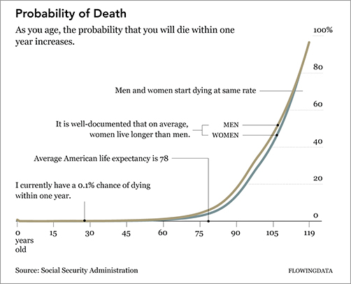
Take a look at any New York Times graphic. It presents the data clearly, concisely, and ever so nicely. What does that mean though? When you look at a graphic, you get the chance to understand the data. Important points or areas are annotated; symbols and colors are carefully explained in a legend or with points; and the Times makes it easy for readers to see the story in the data. Its not just a graph. Its a graphic.
The graphic in is similar to what you will find in The New York Times . It shows the increasing probability that you will die within one year given your age.
Probability of death given your age
Check out some of the best New York Times graphics at http://datafl.ws/nytimes .
The base of the graphic is simply a line chart. However, design elements help tell the story better. Labeling and pointers provide context and help you see why the data is interesting; and line width and color direct your eyes to whats important.
Chart and graph design isnt just about making statistical visualization but also explaining what the visualization shows.
Note
See Geoff McGhees video documentary Journalism in the Age of Data for more on how journalists use data to report current events. This includes great interviews with some of the best in the business.
Art
The New York Times is objective. It presents the data and gives you the facts. It does a great job at that. On the opposite side of the spectrum, visualization is less about analytics and more about tapping into your emotions. Jonathan Harris and Sep Kamvar did this quite literally in We Feel Fine ().
We Feel Fine by Jonathan Harris and Sep Kamvar
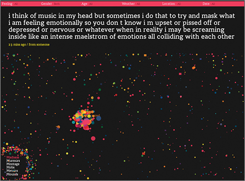
The interactive piece scrapes sentences and phrases from personal public blogs and then visualizes them as a box of floating bubbles. Each bubble represents an emotion and is color-coded accordingly. As a whole, it is like individuals floating through space, but watch a little longer and you see bubbles start to cluster. Apply sorts and categorization through the interface to see how these seemingly random vignettes connect. Click an individual bubble to see a single story. Its poetic and revealing at the same time.
Interact and explore peoples emotions in Jonathan Harris and Sep Kamvars live and online piece at http://wefeelfine.org .
There are lots of other examples such as Golan Levins The Dumpster , which explores blog entries that mention breaking up with a significant other; Kim Asendorfs Sumedicina , which tells a fictional story of a man running from a corrupt organization, with not words, but graphs and charts; or Andreas Nicolas Fischers physical sculptures that show economic downturn in the United States.
See FlowingData for many more examples of art and data at http://datafl.ws/art .
The main point is that data and visualization dont always have to be just about the cold, hard facts. Sometimes youre not looking for analytical insight. Rather, sometimes you can tell the story from an emotional point of view that encourages viewers to reflect on the data. Think of it like this. Not all movies have to be documentaries, and not all visualization has to be traditional charts and graphs.
Entertainment
Somewhere in between journalism and art, visualization has also found its way into entertainment. If you think of data in the more abstract sense, outside of spreadsheets and comma-delimited text files, where photos and status updates also qualify, this is easy to see.
Facebook used status updates to gauge the happiest day of the year, and online dating site OkCupid used online information to estimate the lies people tell to make their digital selves look better, as shown in . These analyses had little to do with improving a business, increasing revenues, or finding glitches in a system. They circulated the web like wildfire because of their entertainment value. The data revealed a little bit about ourselves and society.
Font size:
Interval:
Bookmark:
Similar books «FlowingData.com Data Visualization Set»
Look at similar books to FlowingData.com Data Visualization Set. We have selected literature similar in name and meaning in the hope of providing readers with more options to find new, interesting, not yet read works.
Discussion, reviews of the book FlowingData.com Data Visualization Set and just readers' own opinions. Leave your comments, write what you think about the work, its meaning or the main characters. Specify what exactly you liked and what you didn't like, and why you think so.