Nathan Yau - Data Points: Visualization That Means Something
Here you can read online Nathan Yau - Data Points: Visualization That Means Something full text of the book (entire story) in english for free. Download pdf and epub, get meaning, cover and reviews about this ebook. year: 2013, publisher: Wiley, genre: Computer. Description of the work, (preface) as well as reviews are available. Best literature library LitArk.com created for fans of good reading and offers a wide selection of genres:
Romance novel
Science fiction
Adventure
Detective
Science
History
Home and family
Prose
Art
Politics
Computer
Non-fiction
Religion
Business
Children
Humor
Choose a favorite category and find really read worthwhile books. Enjoy immersion in the world of imagination, feel the emotions of the characters or learn something new for yourself, make an fascinating discovery.
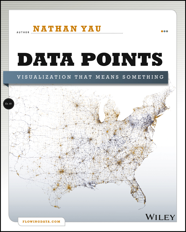
- Book:Data Points: Visualization That Means Something
- Author:
- Publisher:Wiley
- Genre:
- Year:2013
- Rating:4 / 5
- Favourites:Add to favourites
- Your mark:
Data Points: Visualization That Means Something: summary, description and annotation
We offer to read an annotation, description, summary or preface (depends on what the author of the book "Data Points: Visualization That Means Something" wrote himself). If you haven't found the necessary information about the book — write in the comments, we will try to find it.
Nathan Yau: author's other books
Who wrote Data Points: Visualization That Means Something? Find out the surname, the name of the author of the book and a list of all author's works by series.


Data Points: Visualization That Means Something — read online for free the complete book (whole text) full work
Below is the text of the book, divided by pages. System saving the place of the last page read, allows you to conveniently read the book "Data Points: Visualization That Means Something" online for free, without having to search again every time where you left off. Put a bookmark, and you can go to the page where you finished reading at any time.
Font size:
Interval:
Bookmark:
Chapter 1
Understanding DataWhen you ask people what data is, most reply with a vague description of something that resembles a spreadsheet or a bucket of numbers. The more technically savvy might mention databases or warehouses. However, this is just the format that the data comes in and how it is stored, and it doesnt say anything about what data is or what any particular dataset represents. Its an easy trap to fall in because when you ask for data, you usually get a computer file, and its hard to think of computer output as anything but just that. Look beyond the file though, and you get something more meaningful.
What Data Represents
Data is more than numbers, and to visualize it, you must know what it represents. Data represents real life. Its a snapshot of the world in the same way that a photograph captures a small moment in time.
A single photo, a single data point

Look at . If you were to come across this photo, isolated from everything else, and I told you nothing about it, you wouldnt get much out of it. Its just another wedding photo. For me though, its a happy moment during one of the best days of my life. Thats my wife on the left, all dolled up, and me on the right, wearing something other than jeans and a T-shirt for a change. The pastor who is marrying us is my wifes uncle, who added a personal touch to the ceremony, and the guy in the back is a family friend who took it upon himself to record as much as possible, even though we hired a photographer. The flowers and archway came from a local florist about an hour away from the venue, and the wedding took place during early summer in Los Angeles, California.
Thats a lot of information from just one picture, and it works the same with data. (For some, me included, pictures are data, too.) A single data point can have a who, what, when, where, and why attached to it, so its easy for a digit to become more than a toss in a bucket. Extracting information from a data point isnt as easy as looking at a photo, though. You can guess whats going on in the photo, but when you make assumptions about data, such as how accurate it is or how it relates to its surroundings, you can end up with a skewed view of what your data actually represents. You need to look at everything around, find context, and see what your dataset looks like as a whole. When you see the full picture, its much easier to make better judgments about individual points.
Imagine that I didnt tell you those things about my wedding photo. How could you find out more? What if you could see pictures that were taken before and after?
Now you have more than just a moment in time. You have several moments, and together they represent the part of the wedding when my wife first walked out, the vows, and the tea drinking ceremony with the parents and my grandma, which is customary for Chinese weddings. Like the first photo, each of these has its own story, such as my father-in-law welling up as he gave away his daughter or how happy I felt when I walked down the aisle with my bride. Many of the photos captured moments that I didnt see from my point of view during the wedding, so I almost feel like an outsider looking in, which is probably how you feel. But the more I tell you about that day, the less obscure each point becomes.
Still though, these are snapshots, and you dont know what happened in between each photo. (Although you could guess.) For the complete story, youd either need to be there or watch a video. Even with that, youd still see only the ceremony from a certain number of angles because its often not feasible to record every single thing. For example, there was about five minutes of confusion during the ceremony when we tried to light a candle but the wind kept blowing it out. We eventually ran out of matches, and the wedding planner went on a scramble to find something, but luckily one of our guests was a smoker, so he busted out his lighter. This set of photos doesnt capture that, though, because again, its an abstraction of the real thing.
This is where sampling comes in. Its often not possible to count or record everything because of cost or lack of manpower (or both), so you take bits and pieces, and then you look for patterns and connections to make an educated guess about what your data represents. The data is a simplificationan abstractionof the real world. So when you visualize data, you visualize an abstraction of the world, or at least some tiny facet of it. Visualization is an abstraction of data, so in the end, you end up with an abstraction of an abstraction, which creates an interesting challenge.
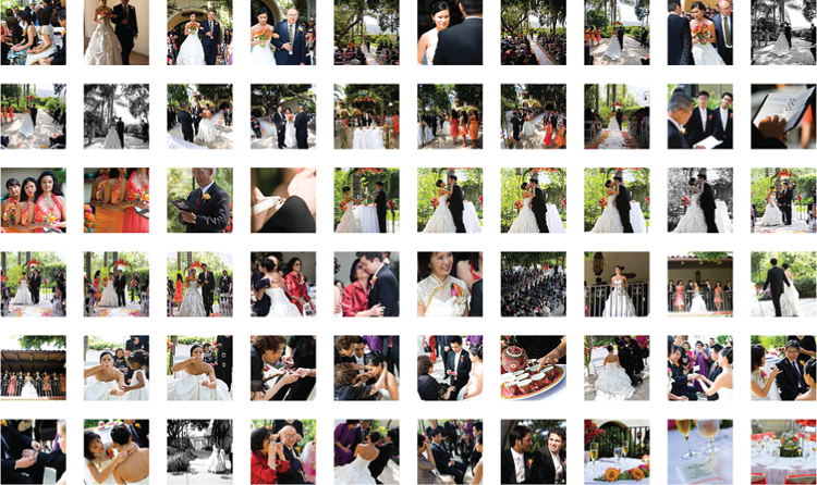
However, this is not to say that visualization obscures your viewfar from it. Visualization can help detach your focus from the individual data points and explore them from a different angleto see the forest for the trees, so to speak. To keep running with this wedding photo example, were subsets of. Each rectangle represents a photo from our wedding album, and they are colored by the most common shade in each photo and organized by time.
Grid of photos
Colors in the wedding
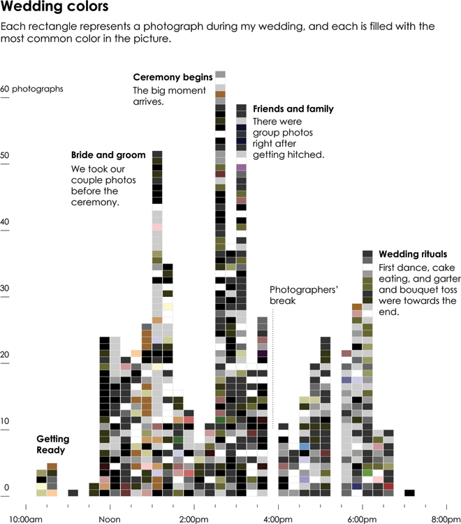
With a time series layout, you can see the high points of the wedding, when our photographers snapped more shots, and the lulls, when only a few photos were taken. The peaks in the chart, of course, occur when there is something to take pictures of, such as when I first saw my wife in her dress or when the ceremony began. After the ceremony, we took the usual group photos with friends and family, so there was another spike at that point. Then there was food, and activity died down, especially when the photographers took a break a little before 4 oclock. Things picked up again with typical wedding fanfare, and the day came to an end around 7 in the evening. My wife and I rode off into the sunset.
In the grid layout, you might not see this pattern because of the linear presentation. Everything seems to happen with equal spacing, when actually most pictures were taken during the exciting parts. You also get a sense of the colors in the wedding at a glance: black for the suits, white for the wedding dress, coral for the flowers and bridesmaids, and green for the trees surrounding the outdoor wedding and reception. Do you get the detail that you would from the actual photos? No. But sometimes that level isnt necessary at first. Sometimes you need to see the overall patterns before you zoom in on the details. Sometimes, you dont know that a single data point is worth a look until you see everything else and how it relates to the population.
You dont need to stop here, though. Zoom out another level to focus only on the picture-taking volumes, and disregard the colors and individual photos, as shown in .
Font size:
Interval:
Bookmark:
Similar books «Data Points: Visualization That Means Something»
Look at similar books to Data Points: Visualization That Means Something. We have selected literature similar in name and meaning in the hope of providing readers with more options to find new, interesting, not yet read works.
Discussion, reviews of the book Data Points: Visualization That Means Something and just readers' own opinions. Leave your comments, write what you think about the work, its meaning or the main characters. Specify what exactly you liked and what you didn't like, and why you think so.