The Design and Construction of
eBooks
Steve Thomas
Original publication for eBooks@Adelaide.
Rendered into HTML by Steve Thomas.
Last updated Monday, August 24, 2015 at 16:05.
To the best of our knowledge, the text of this
work is in the Public Domain in Australia.
HOWEVER, copyright law varies in other countries, and the work may still be under copyright in the country from which you are accessing this website. It is your responsibility to check the applicable copyright laws in your country before downloading this work.
eBooks@Adelaide
The University of Adelaide Library
University of Adelaide
South Australia 5005
https://ebooks.adelaide.edu.au/about/index.html
Last updated Tuesday, January 26, 2016 at 23:27
The Design and Construction of eBooks, by Steve Thomas
Table of Contents
https://ebooks.adelaide.edu.au/about/contents.html
Last updated Tuesday, January 26, 2016 at 23:27
The Design and Construction of eBooks, by Steve Thomas
Preface
Ive been creating ebooks since 1998, building the web site eBooks @ Adelaide from a proof-of-concept single text into todays popular collection of nearly 3,000 works. In that time almost 15 years as I write I have learned a great deal. I blush now to think of the earliest efforts, and todays books are several orders more sophisticated in their design and construction than my first attempts.
In this short book I have attempted to distill everything Ive learned along the way. It may encourage others to contribute to the world of ebooks: so much the better for the world. There is a great wealth of books out there waiting to be made available in accessible formats.
This book is in two parts. The first gives an introduction to the design and construction of ebooks, from the perspective of my experience with the eBooks @ Adelaide site. Design issues are largely subjective, therefore this will be a very personal view of what constitutes good ebook design.
The second part deals with the technical details of structure and presentation. It does contain large dollops of HTML and CSS code, and those with prior knowledge of those will doubtless derive more from it than the novice. But I believe that even those new to coding will find it sufficiently clear to follow. CSS in particular is highly readable.
I must acknowledge the support provided by the University of Adelaide Library, in providing server space for the collection and allowing use of its name. And of course I must also acknowledge the efforts of countless unnamed volunteers who have scanned, transcribed and corrected the raw text of the thousands of works available on the web. Without their work, neither this nor the majority of ebook sites could exist.
https://ebooks.adelaide.edu.au/about/preface.html
Last updated Tuesday, January 26, 2016 at 23:27
The Design and Construction of eBooks, by Steve Thomas
https://ebooks.adelaide.edu.au/about/part1.html
Last updated Tuesday, January 26, 2016 at 23:27
The Design and Construction of eBooks, by Steve Thomas
A Brief History Lesson
I started making ebooks in 1998. I was aware of other e-text projects and had compiled a web page directory of these sites, but I was dissatisfied with their presentation. Most of them used plain text for the books, which is utilitarian but not very inviting from a readers viewpoint.
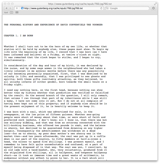
Heres the venerable Project Gutenberg, plain text version of David Copperfield, chapter 1:

Screen shot from gutenberg.org, taken 2011-12-30.
Its not awful. Just... dull.
Some sites (actually, most) presented their works in ways which I, personally, found annoying -- and they still do: they use coloured backgrounds, the pages are festooned with advertisements, sidebars and other extraneous material, they use ugly fonts, too small fonts, etc. While the plain text sites made no attempt at readability, these sites seemed to actively attack it!
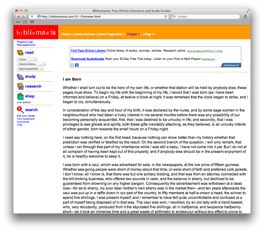
Heres David again, from another site:

Screen shot from bibliomania.com, taken 2011-12-30.
This was taken recently, but has been unchanged since 1998. It replaces dull with hideous. And whereas the Project Gutenberg text gave us the entire book in one single file, this goes to the other extreme and breaks the book into many small segments.
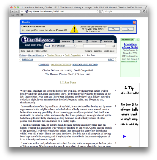
And heres a screen shot from one of the better sites, Bartleby.com:

Screen shot from bartleby.com, taken 2011-12-30.
You have to go to the site to get the full horror of this, because that advertisement at the top of the screen is actually animated. So while you are reading, this thing is flashing and wobbling in your face.
Some sites dont use HTML at all, and expect you to read PDF. Thats OK for printing, but I find PDF too inflexible. PDF is designed for printing, so the text is formatted as it will appear when printed, usually on A4 paper. Unless you have an A4 sized screen, this will not be helpful. And as with the printed page, PDF does not allow you to increase or decrease font size, or any other aspect of presentation. What you see is all there is.

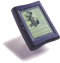
[www.rocket-ebook.com At the same time, the first ebook readers, notably the Rocket eBook, had appeared. While interesting, it occurred to me that we all had perfectly good screens on our desks which could be used for reading, if only the work was better formatted.*
* Most of the world seemed to disagree with me at the time, and to this day there is great resistance to the idea of reading a book on your computer, even though many of us do most of our work with such screens. Admittedly, screen quality has improved dramatically over the past decade, and todays LCD screens are much sharper and clearer than the CRT screens of 1998.
With these things in mind, I set out to explore how one might present a book using HTML in such a way that it was as readable and enjoyable as a printed book. Having proved the concept, I then began adding titles and refining the format, and refinement continues to this day.
The first title publicly promoted was Dickenss Our Mutual Friend, done in order to tie in with an ABC TV adaptation which was showing at the time.
https://ebooks.adelaide.edu.au/about/part1.1.html
Last updated Tuesday, January 26, 2016 at 23:27
The Design and Construction of eBooks, by Steve Thomas
A Digression
eBooks vs. Print
The Romance of Books
You would think that by now, the ebook vs. print debate would be over. Not with a win to one side or the other, but in a draw, with everybody recognising that there are merits in both formats. Its not difficult to find pro and con lists on the Web (my personal favourite is that you cant throw an ebook across the room in disgust!) so I wont replicate them here. But it is worth exploring some differences.

