Welcome to the brave new world of Windows 8. In this introductory chapter, you take a walk through the new, drastically different UI. You grab a glimpse into the meaning of Windows reimagined. You begin the exploration of what it means to a Windows app developer when you take away the iconic desktop concept and replace it with full application integration. Technological and social impacts are considered as you, the developer, prep through explanations, examples, and an examination of where the technology melds with the business of life.
Presently, Windows 8 is essentially the only OS out there that can run on anything from a phone all the way up to a personal computer with the diverse reach of languages that are supported natively for Windows 8 development. This book is about one such languageJavaScriptand how you, as a JavaScript developer, can use your knowledge of the language (and of HTML and CSS as a UI layout engine) to build Windows 8 applications that feel to the user as real as applications using .NET or even native C++.
A Not-So-Brief Introduction
To begin, allow us to shed some light on who we are so that you, dear reader, might understand the unique perspective of this book. This is not a book by Microsoft fan-boys, but rather by commonsense, get-the-job-done technology lovers. We also love an opportunity to make money while doing something cool, cutting edge, and meaningful, so when we say that Windows 8 is the most significant opportunity for developers since well, ever, take notice. Although this might sound like regurgitated MS marketing spin, weve been on the front API lines, and we boldly claim that everything in Windows 8 is reimagined from the ground up, examined, and innovated upon.
Before diving in, its important to provide an introduction to Windows 8 from a developers perspective, specifically focusing on how applications work and are managed by the system. The discussion isnt exhaustive, because the subject could probably span multiple books, but it should provide you with a baseline of information in order to understand the basics of Windows 8 and Windows 8 app development using the Windows Runtime.
For the purpose of explanation, lets walk through the Windows 8 UI artifactsnot because you dont already understand how Windows works, but for those of you who may not yet have access to the operating system.
The Windows 8 shell is a sort of digital reverse mullet: party time in the front, and good old-fashioned business behind that. At a first glimpse of Windows 8, youre immediately struck by the party component of the analogy: the Windows 8 Start screen shown in Figure .
Figure 1-1.
Windows 8 Start screen
The Windows 8 Start screen is the newor rather, reimaginedLaunchpad for applications. It replaces the Windows Start menu. This means there is no Start menu on Windows 8 . So dont expect to find some registry hack or setting that will enable it: there is none.
Note
There are some third-party applications that can be purchased to enhance the Windows 8 experience with a Start menu: Start8 from Stardock, for example.
A lot has been made of the omission of the standard Windows Start menu from Windows 8. The truth is that this is just a semantic removal. If people would calm down, they would realize that every feature youve come to love about the Start menu exists in the Start screen, with one difference: the old Start menu doesnt take up the whole screen. In every sense of the word, the new Start screen is a superset and natural evolution of its predecessor, and once people start using it, they quickly recognize this.
Note
Microsoft published a comprehensive blog outlining the details or the rationale behind many of the Windows 8 features. One such blog posts highlights the complex research that led Microsoft to using the Start screen in Windows 8 in favor of the old Start menu. If you would like to find out more about this, head to the Building Windows 8 blog at http://blogs.msdn.com/b/b8/ . The specific blog post that walks through the evolution of the Windows Start Screen can be found at http://blogs.msdn.com/b/b8/archive/2011/10/03/evolving-the-start-menu.aspx .
In Figure shows two states of the Calendar application live tile. The image to the left is the default state; when a meeting is approaching, the tile takes on a different appearance (right).
Figure 1-2.
A Windows 8 app tile
An application like Windows Essentials (Windows Live for those of you who still have the earlier version of the application) may have a system tray icon that changes appearance when the application switches from online to offline; it may have a large, beautiful shortcut on the Windows desktop and flash yellow (on Windows 7) when an instant message is sent your way when the application isnt an active window. The Windows 8 live tile encapsulates those three functions in one. Through the live tile, you can of course launch the application; but as shown in Figure , tiles can also display notifications based on things happening in the application or even on things happening while the application isnt running.
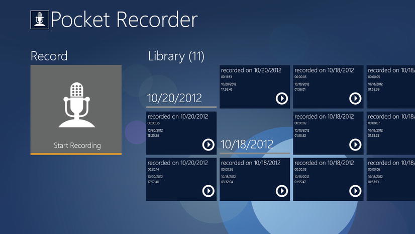
Note that not all tiles on the Start screen are live tiles. Legacy applications such as Visual Studio, Microsoft Word, and Adobe Photoshop can also appear on the Start screen as tiles, but these tiles arent livethey dont possess the ability to present dynamic content on their surface. Legacy Windows application tiles function more or less like the application icons of old (we say more or less because Windows 8 exposes some shortcut features to these sorts of tiles that follow patterns similar to their live alternatives, such as being able to launch in administrator mode). Applications built using the new paradigm, which can express themselves through live tiles, are referred to by Microsoft as Windows 8 apps . For the remainder of this book, we use this terminology to refer to them. Figure shows how a launched Windows 8 modern application looks.
Figure 1-3.
A Windows 8 app
Notice something missing? Its the ubiquitous close , minimize , and maximize / restore buttons. Windows 8 apps take up the entire screen at all times. There is no exception to this rule: even if the plan is to build a simple utility window, you as the developer must consider how you intend to lay things out in a manner that reduces negative space. Its a tough problem, compounded by the variety of screen resolutions your application must support. Later chapters delve more into this as we start to talk about style guidelines and how to pass certification.


