RIP Windows 8
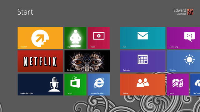
In July, 2013, Windows 8, an operating system as innovative as it is disjointed, turned the computing world upside down with a boldly reimagined user experience that focused on touch as a first-class citizen. Windows 8 introduced us to the start screen, the charms bar, tiles, and dedicated full screen applications. For many, this was a dream come true, a fast and fluid version of Windows with far fewer hardware requirements, a beautiful touch-first user interface complete with fluid, intuitive edge-driven interaction patterns, and access to the legacy desktop when needed for running old-school Win32 applications. Despite the forward progress Microsoft made with Windows 8, however, it was widely panned as an operating system fit only for the schizophrenic; see Figure .
Figure 1-1.
Windows 8 Start screen
Many found that although it offered great innovations, the lack of consistency between the two operating environments running within the overarching OS made using it quite confusing at times. Users would open files that would launch them into a full screen experience in one situation, while other file types would jarringly bring them out of the full screen immersive experience into the desktop! The touch-first nature of Windows 8 was another common complaint, as it appeared that Microsoft had foregone any consideration for users working with a mouse and keyboard. Indeed, what seemed easy to do with the finger proved laborious when working with a Windows 8 device that had no touch interface included. Finally, and probably most importantly, the choice to do away from the Start menu proved to be too much of a deviation from what users were comfortable with.
Note
There are some third-party applications that can be purchased to enhance the Windows 8 experience with a Start menu, such as Start8 from Stardock.
The arguments from all sides were the same. Customers wanted input into the decision-making process for features of the Microsoft operating system; they had largely been shunned by Microsoft all through the Windows 8 development cycle despite months of clamoring for the inclusion of a Start menu feature and windowed Modern apps running on the desktop (after all, the OS *was* called Windows). Despite all the metrics Microsoft consistently threw at Windows 7 users who wanted to see a Start menu, customers still felt quite strongly that a Start menu was neededor they at least wanted the freedom to pick one option (having a Start menu) versus the other (using the Start screen).
Windowed applications were also a critical ask from customers and a reason behind Windows 8 not being fully embraced. The shift to full screen applications that Windows 8 introduced seemed to most like a gigantic step backwards from all the innovations of the Windows-of-old genre. Microsoft, it seemed, had ventured too far towards the tablet world for really no reason at all. Tablet operating systems had that limitation because the hardware they ran on (screen, chip, memory) had that limitation, not because it was an innovation on user experience. It worked for phones because the screens were too small for multitasking. It worked for tablets because there was hardly enough stored energy, memory, and processing power to keep things running the way windowed applications required them to be kept running. Full-fledged workstations and laptops had no such constraints: they had large enough screens to do multiple things at one time, they had plenty of processing power, and they were not intended to be used in full fidelity mobility scenarios like tablets and phones are.
What Microsoft needed with its next operating system endeavor was an OS that continued with the powerful new innovations they had introduced with Windows 8 while dialing down the tablet-focused mindset. They needed an operating system that was able to smoothly merge both operating environments: the modern, touch-friendly, secure operating environment with the legacy tools and features of the Windows 7 paradigm. Windows 10 unites these two worlds seamlessly into one while continuing on the path of innovation that Windows 8 began.
Note
Microsoft published a comprehensive blog outlining the details or the rationale behind many of the Windows 8 features. One blog post highlights the complex research that led Microsoft to using the Start screen in Windows 8 in favor of the old Start menu. If you would like to find out more about this, head to the Building Windows 8 blog at http://blogs.msdn.com/b/b8/ . The specific blog post that walks through the evolution of the Windows Start screen can be found at http://blogs.msdn.com/b/b8/archive/2011/10/03/evolving-the-start-menu.aspx .
Hello, Windows 10
Welcome to the brave new world of Windows 10! In this introductory chapter, you will take a walk through yet another new user interface for Windows that might appear familiar to some and drastically, even jarringly, different to others. If you are coming from Windows 7 or anything previous, Windows 10 will seem like a major upgrade to you, but one that you will quite possibly cognitively recognize from the standpoint of usability and user experience. Unfortunately for Windows 8/8.1 users, Windows has once again been reimagined, but this time for the better.
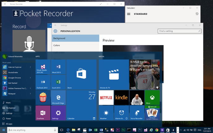
An interesting thing happened between the end of development of Windows 8/8.1 and the beginning of Windows 10 development. For whatever reason, Microsoft finally decided that perhaps their customers knew a thing or two about how they would like to use the operating system, so Microsoft began listening! As a result, Windows 10 reintroduces the Start menu as a combination of both the original Windows 7 Start menu and the Windows 8 Start screen, adds support for windowed applications, merges the operating environments, standardizing on the continued use of the desktop, and even adds back transparency, Aero blurs, and depth to the operating system! And it doesnt stop there. Windows 10 continues with the legacy of innovation initiated with Windows 8/8.1 by building out a one-OS architecture which not only allows Windows 10 to be installed on a wide variety of devices, but also allows Modern apps built to target Windows 10 to run on any of the many devices that Windows 10 can run on. Figure shows the reincarnated Start menu in Windows 10.
Figure 1-2.
Windows 10 Start menu
Note
Presently, Windows 10 is the only operating system that can run on an IOT device, phone, tablet, workstation, Surface Hub, HoloLense, and even Xbox.
The new Windows 10 Start menu functions basically the same as the Start screen from Windows 8/8.1 but does not automatically take up the full screen. Note that the Start menu is transparent with a blur applied to it, similar to the aero look from Windows Vista/7. Figure also shows a number of Modern apps running on the desktop. As can be seen from the image, these apps run within a Windows 10 window, meaning they can be treated like any other system window. One of the shortcomings of Windows 8/8.1 was in the forcing of drastic paradigm shifts onto the masses without providing many ways to fall back to previous approaches. Indeed, this author recalls using the Windows 2000 theme on Windows XP for a good three years following its release before finally making a switch to the standard XP theme. In fact, I dont believe I would have ever purchased a Windows XP license had the option to continue to use an old approach not been available to me.
