1. Charting Technology Overview
When we need to represent data or qualitative structures graphically in order to show a relationshipto make a comparison or highlight a trendwe make use of charts. A chart is a graphic structure consisting of symbols, such as lines, in a line chart; bars, in a bar chart; or slices, in a pie chart. Charts serve as valid tools that can help us discern and understand the relationships underlying large quantities of data. It is easier for humans to read graphic representations, such as a chart, than raw numeric data. Nowadays, use of charts has become common practice in a wide variety of professional fields as well as in many other aspects of daily life. For this reason, charts have come to take on many forms, depending on the stucture of the data and the phenomenon that is being highlighted. For example, if you have data separated into different groups and want to represent the percentage of each, with respect to the total, you usually display these groups of data in a pie chart or a bar chart. In contrast, if you want to show the trend of a variable over time, a line chart is typically the best choice.
In this book, you will learn how to create, draw, and adapt charts to your needs, using various technologies based on JavaScript. Before you start using JavaScript to develop charts, however, it is important that you understand the basic concepts that will be covered in the chapters of this book. In this chapter, I will provide a brief overview of these concepts.
First, I will show you how to recognize the most common elements that make up a chart. Knowledge of these elements will prove helpful, because you will find them in the form of components, variables, and objects defined within the specialized JavaScript libraries created for the realization of charts.
Next, I will present a list of the most common types of charts. The greater your knowledge of charts and their features, the easier it will be to choose the right representation for your data. Making the right choice is essential if you are to underline the relationships you want to represent, and just reading the data will not be sufficent. Only when you have become familiar with the most common types of charts will you be able to choose which is the most suitable for your purposes.
Once you have become familiar with these concepts, you will need to learn how it is possible to realize them via the Web and what the current technologies are that can help you achieve this aim. Thus, in the second part of the chapter, I will discuss these technical aspects, presenting one by one the technologies involved in the development of the examples provided in this book.
Finally, given that all our work will focus on the development of code in JavaScript, I thought it would be helpful to provide a brief description of certain types of data. Those who are not familiar with JavaScript can benefit from this quick reference source on the forms that the data will take within the code. However, I strongly recommend that the reader research in greater depth the concepts and technologies discussed in this chapter.
Elements in a Chart
As you will soon see, charts can assume a variety of forms. In a chart the data take on graphic structure through the use of symbols specific to the type of chart; there are, however, some features that are common to all charts.
Generally, every chart has a title, appearing at the top, that provides a short description of the data. Less frequently, subtitles or footnotes are used to supply additional descriptions (mostly data-related information, such as references, places, dates, and notes).
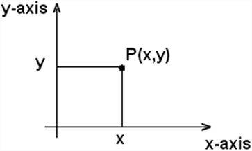
Charts often have axestwo perpendicular lines that allow the user to refer to the values of the coordinates (x, y) for each data point P(x, y), as shown in Figure . The horizontal line usually represents the x axis, and the vertical line, the y axis.
Figure 1-1.
A two-dimensional chart
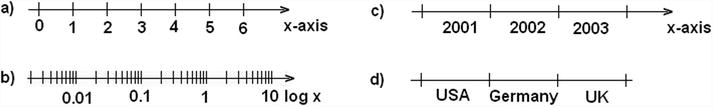
A scale is defined on each axis. The scale can be either numerical or categorical. Each axis is divided into segments corresponding to the particular range of values represented by the scale. The boundaries between one segment and the next are called ticks. Each tick reports the value of the scale associated with that axis. Generally, call these tick labels.
Figure shows four axes with different scales. Axes a and b have numerical scales, with a being a linear scale, and b, a logarithmic scale. Axes c and d have categorical scales, with c being ordinal and therefore following an ascending order, whereas d is only a sequence of categories without any particular order.
Figure 1-2.
Four axes with different scales
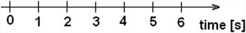
Along with each axis, it is good practice to display a label briefly describing the dimension represented; these are called axis labels. If the scale is numerical, the label should show the units of measure in brackets. For instance, if you had an x axis reporting the timing for a set of data, you might write time as an axis label, with the second unit (in this case, seconds) in square brackets as [s] (see Figure ).
Figure 1-3.
An axis label
In the drawing area displaying the chart, a line grid may be included to aid in the visual alignment of data. Figure shows a grid for a chart with a linear time scale on the x axis and a logarithmic scale on the y axis.
Figure 1-4.
A chart with two different scales
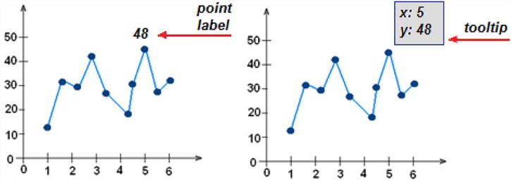
You have seen how data can be represented symbolically. However, text labels can also be used to highlight specific data points. Point labels provide values in a chart right at the corresponding points in a chart, whereas tool tips are small frames that appear dynamically, when you pass the mouse over a given point. These two types of labels are shown in Figure .
Figure 1-5.
The point label and the tooltip of a data point
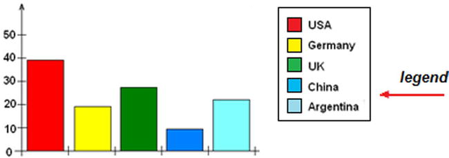
Data are often grouped in several series, and in order to represent these in the same chart, they must be distinguishable. The most common approach is to assign a different color to each series. In other cases, for example, with line charts, the line stroke (dashed, dotted, and so on) can also be used to distinguish different series. Once you have established a sequence of colors (or strokes), it is necessary to add a table demonstrating the correspondence between colors and groups. This table is called the legend and is shown in Figure .


![Scott Murray [Scott Murray] - Interactive Data Visualization for the Web, 2nd Edition](/uploads/posts/book/120518/thumbs/scott-murray-scott-murray-interactive-data.jpg)