Scott Murray [Scott Murray] - Interactive Data Visualization for the Web, 2nd Edition
Here you can read online Scott Murray [Scott Murray] - Interactive Data Visualization for the Web, 2nd Edition full text of the book (entire story) in english for free. Download pdf and epub, get meaning, cover and reviews about this ebook. year: 2017, publisher: O’Reilly Media, Inc., genre: Politics. Description of the work, (preface) as well as reviews are available. Best literature library LitArk.com created for fans of good reading and offers a wide selection of genres:
Romance novel
Science fiction
Adventure
Detective
Science
History
Home and family
Prose
Art
Politics
Computer
Non-fiction
Religion
Business
Children
Humor
Choose a favorite category and find really read worthwhile books. Enjoy immersion in the world of imagination, feel the emotions of the characters or learn something new for yourself, make an fascinating discovery.
![Scott Murray [Scott Murray] Interactive Data Visualization for the Web, 2nd Edition](https://litark.com/uploads/posts/book/120518/scott-murray-scott-murray-interactive-data.jpg)
- Book:Interactive Data Visualization for the Web, 2nd Edition
- Author:
- Publisher:O’Reilly Media, Inc.
- Genre:
- Year:2017
- Rating:5 / 5
- Favourites:Add to favourites
- Your mark:
Interactive Data Visualization for the Web, 2nd Edition: summary, description and annotation
We offer to read an annotation, description, summary or preface (depends on what the author of the book "Interactive Data Visualization for the Web, 2nd Edition" wrote himself). If you haven't found the necessary information about the book — write in the comments, we will try to find it.
Create and publish your own interactive data visualization projects on the webeven if you have little or no experience with data visualization or web development. Its inspiring and fun with this friendly, accessible, and practical hands-on introduction. This fully updated and expanded second edition takes you through the fundamental concepts and methods of D3, the most powerful JavaScript library for expressing data visually in a web browser.
Ideal for designers with no coding experience, reporters exploring data journalism, and anyone who wants to visualize and share data, this step-by-step guide will also help you expand your web programming skills by teaching you the basics of HTML, CSS, JavaScript, and SVG.
- Learn D3 4.xthe latest D3 versionwith downloadable code and over 140 examples
- Create bar charts, scatter plots, pie charts, stacked bar charts, and force-directed graphs
- Use smooth, animated transitions to show changes in your data
- Introduce interactivity to help users explore your data
- Create custom geographic maps with panning, zooming, labels, and tooltips
- Walk through the creation of a complete visualization project, from start to finish
- Explore inspiring case studies with nine accomplished designers talking about their D3-based projects
Scott Murray [Scott Murray]: author's other books
Who wrote Interactive Data Visualization for the Web, 2nd Edition? Find out the surname, the name of the author of the book and a list of all author's works by series.


Interactive Data Visualization for the Web, 2nd Edition — read online for free the complete book (whole text) full work
Below is the text of the book, divided by pages. System saving the place of the last page read, allows you to conveniently read the book "Interactive Data Visualization for the Web, 2nd Edition" online for free, without having to search again every time where you left off. Put a bookmark, and you can go to the page where you finished reading at any time.
Font size:
Interval:
Bookmark:
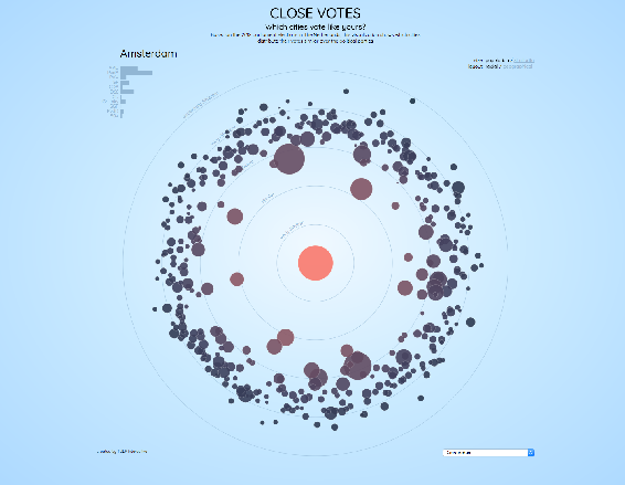
You made it to the end of the book! If you find yourself needing inspiration at any point along your D3 path, I hope youll explore this collection of interviews with well-established practitioners. Each one focused on a single project, presented here because it illustrates some novel or compelling use of D3. Taken together, these projects demonstrate a wide range of possibilities. The people behind them are brilliant, kind, curious, and fascinating.
- September 2012
- http://tulpinteractive.com/close-votes/
- Jan Willem Tulp
- tulpinteractive.com
- @JanWillemTulp
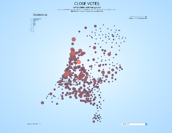
Scott:I love this project, both conceptually and aesthetically. The headline question leads viewers to explore the content through a personalized lens. You could have said 2012 Elections Results, but instead you ask Which cities vote like yours? What triggered this personal project?
Jan Willem: I had the idea for this project when I was at a conference in Switzerland. Something the speaker mentioned gave me a primarily visual idea of showing election results. I dont remember what the speaker was actually talking about, but at least it gave me an idea which I wrote down immediately, as a sketch.
But besides an idea for a visual representation, it was also just my personal interest to answer the question: Which city votes like my city? You may have some ideas, but maybe you can find out more if you have the data, see some unexpected patterns, or patterns that confirm your assumptions.
And what was the response to this project?
The response was quite huge. I dont have exact numbers, but I have received quite a bit of feedback from people, people who played with it for half an hour during work, and so on. Ive heard that teachers use it as an example in GIS education to show that a geographical map is not always the best solution. And even last week it was mentioned during a meeting I was in. So, overall I think it has had a relatively large impact, if people are still talking about it.
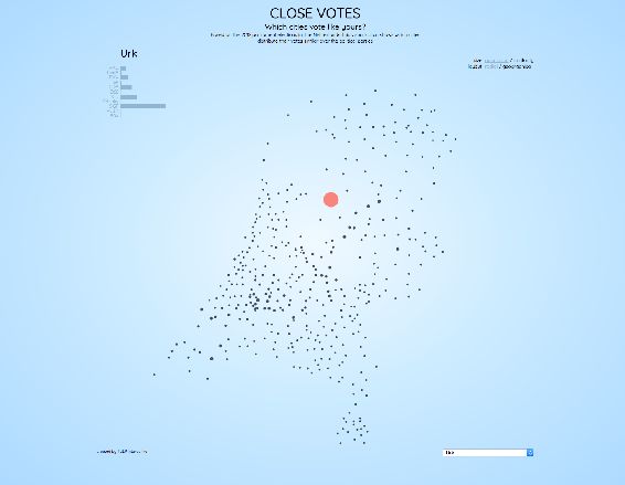
What I love most about this is how I, as someone ignorant of Dutch politics, can identify similarities and dissimilarities. It is fun to explore, even without any real understanding of the meaning behind the data, such as what each political party stands for. For example, Urk! Ive never been to Urk, but, wow, it is clear that it really votes its own way!
Yes, that is also something I think is a very strong aspect of this project. There is a lot to explore: you can click on every single city in the Netherlands to see what the pattern is (and both radially and geographically), and at the same time, in many cases you do see patterns, but in some you dont see patterns. So, my belief is that this is something that invites users to explore and to play with it. Its easy to interact with, just clicking, and at the same time you can do your own discovery and find some very strong patterns.
And if you do know something about Dutch politics, or some other aspects of the Netherlands, you do recognize those, too. For instance, you can clearly recognize the Bible belt, which apparently votes in a similar way. And also cities known as rich cities in the Netherlands clearly have a distinctive voting pattern.
D3 had not been around long in 2012, but you were already working with it. I think you even wrote the very first tutorial I ever saw about D3. So why did you choose D3 for this project?
I think its part of my personality to be interested in some of the latest technological developments in general. So, I like to keep up, and try new things. At the same time, D3 was not really an unexpected choice for me. I had been working with Protovis before D3, which is more or less the predecessor of D3. And at that time I was also in contact with Mike Bostock, the creator of D3, as I was using it even before it was officially released. I guess I was a kind of test case for him, and some of the examples you can still see on the D3 website were actually answers to questions I had which he often answered with an example. And a final reason is that a library such as D3, which uses SVG, is very suitable for a project like this.
The aesthetics of this piece are spot-on. There are no browser defaults; it doesnt feel like it was made with D3 or any specific tool. How are your visual design and coding processes integrated? Or are they one and the same?
For me, during the process its more or less the same thing. I am constantly switching between code and design (and data, too). And its a kind of strange and indirect way of designing, because youre not drawing directly on paper or somethingyoure looking at your design, and then going back to a text editor to change some functions or numbers. But in a sense, its constantly tweaking the design. Therefore its usually quite hard for me to tell clients what Ill be creating at the beginning of the project; because of all the tweaks and changes, I may end up somewhere completely different. This is sometimes hard for clients, because if you pay for something, you also would like to know what you get for it. But this freedom to play around and to tweak is something I always need, as it will guarantee the best results. So my design and coding are very much integrated. Im constantly looking for things that may be improved, that dont work well and should be changed, and that need to have subtle adjustments.
Subtle interactions help reinforce the concept throughout, such as the thin black bars indicating an areas party results that appear when you mouse over a circle. How do you decide what elements to include, and what not to?
When there are some requirements up front, you have some guidance on what to include and what not to include. In this case, its a personal project where only I decide what to include and what not to. I did keep in the back of my mind that this was something for a general audience that may visit the visualization quickly and then move on. So, in general, it should not be too complex to understand or interact with. At the same time, you also try to engage people so that they do stick around. Therefore, its really a matter of finding a balance. And one thing I always remember is a quote from Martin Wattenberg: if you are playing with your visualization more than you are writing code, then you know youre on the right track. [See A Conversation with Jeff Heer, Martin Wattenberg, and Fernanda Vigas, ACM Queue, Volume 8, Issue 3, March 23, 2010.] Another hint that you may be on the right track is if you begin to see patterns. And I guess for the engaging part, I think that if you find some kind of balance between having to do a little work to find something, but the reward is good (such as discovering an interesting pattern), then people may stick around.
Was there anything you wanted to include in this project, but didnt?
Font size:
Interval:
Bookmark:
Similar books «Interactive Data Visualization for the Web, 2nd Edition»
Look at similar books to Interactive Data Visualization for the Web, 2nd Edition. We have selected literature similar in name and meaning in the hope of providing readers with more options to find new, interesting, not yet read works.
Discussion, reviews of the book Interactive Data Visualization for the Web, 2nd Edition and just readers' own opinions. Leave your comments, write what you think about the work, its meaning or the main characters. Specify what exactly you liked and what you didn't like, and why you think so.