Ethan Marcotte - Responsive Web Design
Here you can read online Ethan Marcotte - Responsive Web Design full text of the book (entire story) in english for free. Download pdf and epub, get meaning, cover and reviews about this ebook. year: 2011, publisher: A Book Apart, genre: Computer. Description of the work, (preface) as well as reviews are available. Best literature library LitArk.com created for fans of good reading and offers a wide selection of genres:
Romance novel
Science fiction
Adventure
Detective
Science
History
Home and family
Prose
Art
Politics
Computer
Non-fiction
Religion
Business
Children
Humor
Choose a favorite category and find really read worthwhile books. Enjoy immersion in the world of imagination, feel the emotions of the characters or learn something new for yourself, make an fascinating discovery.
- Book:Responsive Web Design
- Author:
- Publisher:A Book Apart
- Genre:
- Year:2011
- Rating:4 / 5
- Favourites:Add to favourites
- Your mark:
Responsive Web Design: summary, description and annotation
We offer to read an annotation, description, summary or preface (depends on what the author of the book "Responsive Web Design" wrote himself). If you haven't found the necessary information about the book — write in the comments, we will try to find it.
Ethan Marcotte: author's other books
Who wrote Responsive Web Design? Find out the surname, the name of the author of the book and a list of all author's works by series.
![Ethan Ham [Ethan Ham] - Tabletop Game Design for Video Game Designers](/uploads/posts/book/119417/thumbs/ethan-ham-ethan-ham-tabletop-game-design-for.jpg)


Responsive Web Design — read online for free the complete book (whole text) full work
Below is the text of the book, divided by pages. System saving the place of the last page read, allows you to conveniently read the book "Responsive Web Design" online for free, without having to search again every time where you left off. Put a bookmark, and you can go to the page where you finished reading at any time.
Font size:
Interval:
Bookmark:
Language has magical properties. The word glamourwhich was originally a synonym for magic or spell-castinghas its origins in the word grammar. Of all the capabilities of language, the act of naming is the most magical and powerful of all.
The short history of web design has already shown us the transformative power of language. Jeffrey Zeldman gave us the term web standards to rally behind. Jesse James Garrett changed the nature of interaction on the web by minting the word Ajax.
When Ethan Marcotte coined the term responsive web design he conjured up something special. The technologies existed already: fluid grids, flexible images, and media queries. But Ethan united these techniques under a single banner, and in so doing changed the way we think about web design.
Ethan has a way with words. He is, of course, the perfect person to write a book on responsive web design. But he has done one better than that: he has written the book on responsive web design.
If youre hoping for a collection of tricks and tips for adding a little bit of superficial flair to the websites that you build, then keep looking, my friend. This little beauty operates at a deeper level.
When youve finished reading this book (and that wont take very long) take note of how you approach your next project. Its possible that you wont even notice the mind-altering powers of Ethans words, delivered, as they are, in his light-hearted, entertaining, sometimes downright hilarious style; but I guarantee that your work will benefit from the prestidigitation he is about to perform on your neural pathways.
Ethan Marcotte is a magician. Prepare to be spellbound.
Jeremy Keith
Copyright 2011 by Ethan Marcotte
All rights reserved
Publisher: Jeffrey Zeldman
Designer: Jason Santa Maria
Editor: Mandy Brown
Technical Editor: Dan Cederholm
Copyeditor: Krista Stevens
Compositor: Neil Egan
ISBN 978-0-9844425-8-4
A Book Apart
New York, New York
http://abookapart.com
Something there is that doesnt love a wall...
Robert Frost , Mending Wall
As I begin writing this book , I realize I cant guarantee youll read these words on a printed page, holding a tiny paperback in your hands. Maybe youre sitting at your desk with an electronic copy of the book up on your screen. Perhaps youre on your morning commute, tapping through pages on your phone, or swiping along on a tablet. Or maybe you dont even see these words as I do: maybe your computer is simply reading this book aloud.
Ultimately, I know so little about you. I dont know how youre reading this. I cant.
Publishing has finally inherited one of the webs central characteristics: flexibility. Book designer and publisher Craig Mod believes that his industry is quickly entering a post-artifact phase (http://bkaprt.com/rwd/1/), that the digital age is revising our definition of what constitutes a book.
Of course, web designers have been grappling with this for some time. In fact, our profession has never had an artifact of its own. At the end of the day, there isnt any thing produced by designing for the web, no tangible objects to hold, to cherish, to pass along to our children. But despite the oh-so-ethereal nature of our work, the vocabulary we use to talk about it is anything but: masthead, whitespace, leading, even the much-derided fold. Each of those words is directly inherited from print design: just taken down from the shelf, dusted off, and re-applied to our new, digital medium.
Some of that recycling is perfectly natural. Were creatures of habit, after all: as soon as we move into a new city, or start a new job, were mapping previous experiences onto the new, more foreign one, using them to gradually orient ourselves. And since the web is a young medium, its only natural to borrow some terms from what we know: graphic design provides us with a rich history that spans centuries, and wed be remiss not to use its language to help shape our industry.
But our debt to print goes much deeper than language. In fact, theres another concept weve borrowed, one we might not acknowledge all that often: the canvas ( FIG 1.1 ).
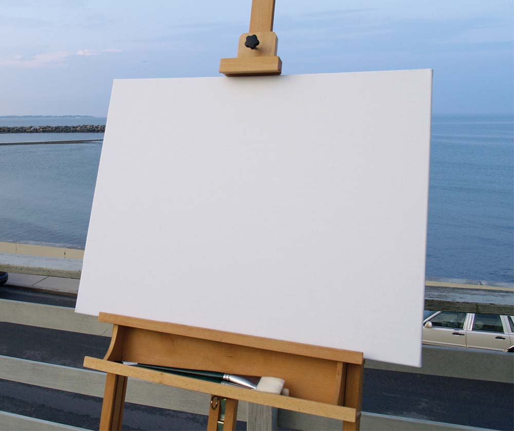
FIG 1.1 : The canvas, even a blank one, provides a boundary for an artists work. (Photo by Cara StHilaire: http://bkaprt.com/rwd/2/)
In every other creative medium, the artist begins her work by selecting a canvas. A painter chooses a sheet of paper or fabric to work on; a sculptor might select a block of stone from a quarry. Regardless of the medium, choosing a canvas is a powerful, creative act: before the first brush stroke, before striking the chisel, the canvas gives the art a dimension and shape, a width and a height, establishing a boundary for the work yet to come.
On the web, we try to mimic this process. We even call it the same thing: we create a canvas in our favorite image editor, a blank document with a width and height, with dimension and shape. The problem with this approach is that were one step removed from our actual canvas: the browser window, and all of its inconsistencies and imperfections ( FIG 1.2 ). Because lets face it: once theyre published online, our designs are immediately at the mercy of the people who view themto their font settings, to the color of their display, to the shape and size of their browser window.
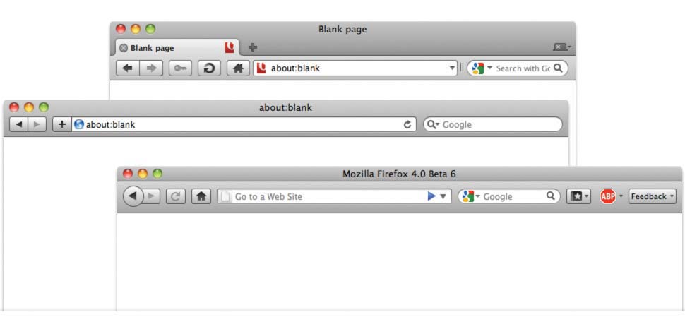
FIG 1.2 : The browser window, our true canvas. (For better or worse.)
So in the face of all that uncertainty, that flexibility, we begin by establishing constraints: we set our type in pixels, or create fixed-width layouts that assume a minimum screen resolution. Establishing those constraints is a bit like selecting a canvasthey give us known parameters to work from, certainties that help quarantine our work from the webs inherent flexibility.
But the best thingand often, the worst thingabout the web is that it defies easy definition. If I was feeling especially bitter, Id even go so far as to say it revels in its ability to shrug off whatever constraints we place around it. And the parameters we place on our designs are no different: theyre easily broken. If a browser drops even slightly below our expected minimum width ( FIG 1.3 ), a sites visitor might find her reading experience is altered by a horizontal scrollbar and clipped content. But our businesses and clients could be affected as well ( FIG 1.4 ): by relying on a minimum screen resolution, the placement of critical links or elements can be incredibly fragile, clipped by a viewport that obeys the users preferences, not ours.
FIG 1.3 : Deviating slightly from our ideal parameters can negatively impact the user
FIG 1.4 : or our businesses and clients. (Whats a reg, you ask? Thats the Register Now link, hidden from view.)
Over a decade ago, John Allsopp wrote A Dao of Web Design (http://bkaprt.com/rwd/3/), an article that, if you havent read it, you should absolutely check out now. (Seriously. Ill wait.) Its easily my favorite essay about designing for the web, and its just as relevant today as it was when it was first written. John argues that
Font size:
Interval:
Bookmark:
Similar books «Responsive Web Design»
Look at similar books to Responsive Web Design. We have selected literature similar in name and meaning in the hope of providing readers with more options to find new, interesting, not yet read works.
Discussion, reviews of the book Responsive Web Design and just readers' own opinions. Leave your comments, write what you think about the work, its meaning or the main characters. Specify what exactly you liked and what you didn't like, and why you think so.