Deyan Sudjic - B is for Bauhaus, Y is for YouTube: Designing the Modern World from A to Z
Here you can read online Deyan Sudjic - B is for Bauhaus, Y is for YouTube: Designing the Modern World from A to Z full text of the book (entire story) in english for free. Download pdf and epub, get meaning, cover and reviews about this ebook. year: 2015, publisher: Rizzoli Ex Libris, genre: Detective and thriller. Description of the work, (preface) as well as reviews are available. Best literature library LitArk.com created for fans of good reading and offers a wide selection of genres:
Romance novel
Science fiction
Adventure
Detective
Science
History
Home and family
Prose
Art
Politics
Computer
Non-fiction
Religion
Business
Children
Humor
Choose a favorite category and find really read worthwhile books. Enjoy immersion in the world of imagination, feel the emotions of the characters or learn something new for yourself, make an fascinating discovery.

- Book:B is for Bauhaus, Y is for YouTube: Designing the Modern World from A to Z
- Author:
- Publisher:Rizzoli Ex Libris
- Genre:
- Year:2015
- Rating:3 / 5
- Favourites:Add to favourites
- Your mark:
B is for Bauhaus, Y is for YouTube: Designing the Modern World from A to Z: summary, description and annotation
We offer to read an annotation, description, summary or preface (depends on what the author of the book "B is for Bauhaus, Y is for YouTube: Designing the Modern World from A to Z" wrote himself). If you haven't found the necessary information about the book — write in the comments, we will try to find it.
Deyan Sudjic: author's other books
Who wrote B is for Bauhaus, Y is for YouTube: Designing the Modern World from A to Z? Find out the surname, the name of the author of the book and a list of all author's works by series.


B is for Bauhaus, Y is for YouTube: Designing the Modern World from A to Z — read online for free the complete book (whole text) full work
Below is the text of the book, divided by pages. System saving the place of the last page read, allows you to conveniently read the book "B is for Bauhaus, Y is for YouTube: Designing the Modern World from A to Z" online for free, without having to search again every time where you left off. Put a bookmark, and you can go to the page where you finished reading at any time.
Font size:
Interval:
Bookmark:
First published in hardcover in the United States of America in 2015 by Rizzoli Ex Libris, an imprint of
Rizzoli International Publications, Inc.
300 Park Avenue South
New York, NY 10010
www.rizzoliusa.com
First published in Great Britain by Particular Books, an imprint of Penguin Books Ltd, 2014
Copyright Deyan Sudjic, 2014
This ebook edition 2015 Deyan Sudjic
All rights reserved. No part of this publication may be reproduced, stored in a retrieval system, or transmitted in any form or by any means, electronic, mechanical, photocopying, recording, or otherwise, without prior consent of the publishers.
ISBN-13: 978-0-8478-4552-1
v3.1
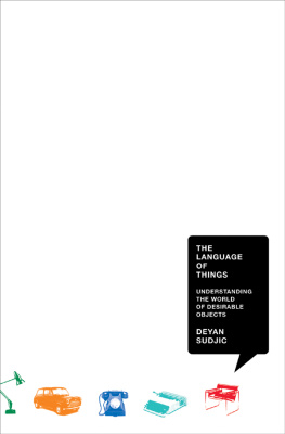
The book is far from dead. The tactile values of ink on paper, of carefully designed covers, of lavish typography and production quality retain their appeal in a world which is still charmed by the analogue, despite the triumph of the digital. But I am not so sure about the dictionary, which does indeed look as if its print format is moribund. Seven years ago, at just about the time I became the director of the Design Museum in London, I signed a contract with my current British publisher to do two books. The first, titled the Language of Things, came relatively easily. It gave me the chance to explore the various messages, from gender to politics, that design can express. Book two was more of a problem. The commission was to deliver a massive 250,000-word conventional dictionary of design.
It was daunting, and it took a while to get started by hiring an assistant to get into the research. But a couple of years later my publishers managing director called me:
People have stopped buying dictionaries, he said. There is this thing called Wikipedia. Of course you can keep the advance, and if you really want to, go ahead and do a dictionary. But really, you might think about something else.
And there it was: the dictionary had become the first victim of the digital explosion in publishing.
B is for Bauhaus, Y is for YouTube is what finally emerged from that hiatus. And it isnt a dictionary. The dictionary once gave the appearance of objectivity; but few dictionaries have been read for pleasure. B is for Bauhaus takes the apparently banal format of an alphabetically ordered A-to-Z to structure a series of essays that explores what are, at least for me, some of the essential ideas that underpin the meanings of contemporary design and architecture.
Its also a chance to use my own experiences reading Reyner Banham for the first time as a schoolboy in West London, starting Blueprint magazine with Peter Murray and Simon Esterson in many of those essays. I remembered the day I saw Wally Olins and Michael Wolff capture the essence of branding when they mocked up a bottle of aspirin in a typographic style associated with whisky, and vice versa. I reflected on my first job at the Sunday Times, writing the obituary of my formidably talented predecessor Ian Nairn, and at the fickleness with which critical reputations are treated.
It allowed me to explore the concept of authenticity from the moment I was seduced into buying a vintage Korean Warera US Army parka. Not because it was a chance to revisit the youth that I never had as a Vespa-riding mod, even though I grew up in the same west London suburb as The Who, but because in its apparent rejection of the obvious seductions of consumerism, the parka with its narrative label in the place of a brand, its impressive brass zip, complete with six-inch fabric cord, designed to be manipulated by hands protected from the cold by gloves had the charms of authenticity. It is the quality that all designers value and pursue, and through their endless exploration of it, make its very presence impossible. Designs pursuit of authenticity, in fact, makes designers into endlessly inventive fakers.
Proceeding through the alphabet, this book does indeed touch upon B is for Bauhaus, but as much through an exploration of the significance of a massive exhibition catalogue for the Bauhaus show I saw in London as a schoolboy as through an objective appraisal of the movement. I am equally fascinated by the significance of collection, of the squalor of car interiors, and the impact of a Qwerty keyboard on my approach to writing.
This is a book that reflects my life over the last thirty years as a critic and a curator, and is written from the vantage point of the Design Museum. There is no better place to look at the constantly fluctuating, endlessly fascinating world of design.
I have a green fishtail parka that I bought in a shop on a backstreet by a canal in Milan. It was hanging on a rack, alongside a couple of elderly flying suits, a selection of brand-new khaki vests, and some second-hand cargo pants. It is the coat sometimes called the snorkel because it comes with a built-in fur-trimmed hood that the American army wore to the Korean War. I wanted it because the cuffs are held in place by strips of webbing and slightly chipped green buttons, because it has a detachable rust-coloured quilted nylon lining, and because it has a complicated stock number with a narrative description of the garment, and its function instead of a makers brand name on the label.
The fact that it had been worn by at least one previous owner, and probably several others, before me did not detract from its charm. It has a heavy brass zip and popper studs, details that are too costly to have been specified by any but a military user free of the usual budget constraints of retailing.
I grew up in the same west London suburb that produced the Who, but I was not a mod. I wear my parka now, not because I feel nostalgic about teenage memories of the mirror-decked Vespa that I never had, but because every time I pull the zip with the six-inch-long green braided cord, designed to be used in conditions that would be unendur-ably cold without gloves, I have a sense of the thoughtfulness that went into every detail. The parka seems like a garment beyond fashion, yet it is a category that has clearly taken a conspicuous place in the language of fashion. The parka is far removed from its Inuit origins and its subsequent military incarnation, so much so that it now carries multiple mutually contradictory meanings. It is both authentic and self-conscious, the sign of a youthful hipster, and an ageing museum director.
I wear it to the embarrassment of my family, who find it a little unseemly. I wear it because it seems somehow real. But for all I know, the authenticity that attracted me in the first place could have been lovingly and inventively faked.
Authenticity is a word that makes no promises about performance. It might not necessarily involve beauty, but it does suggest an irresistible combination of sincerity with authority. In the world of mass-produced objects, these are highly desirable qualities. Even if they are slippery and hard to define, grasping them is essential to an understanding of the nature of design.
Authenticity is a guarantee that an object really is what it purports to be. The more authentic it is, the more secure we can feel about its price, if not its value. But when factories make large numbers of identical objects over long periods of time, a gap opens up between what might be called the original and the authentic. Sometimes authenticity is understood as the degree to which an artefact succeeds in replicating the bloom of the factory-fresh perfection that a mass-produced object has when it is new, but which it quickly loses in use. In other contexts, authenticity is measured by the degree to which the physical remains of an object have survived, no matter how decayed they have become. Along with patina, holy relics acquire a sense of sanctity over time. The decayed remains of an ancient chair are regarded as more authentic than a polished but fake whole. Authenticity can have mutually contradictory definitions. It can be found in the making of a faithful replica of what an object once was, or in the careful maintenance of what that object has become as the result of the passing of time.
Font size:
Interval:
Bookmark:
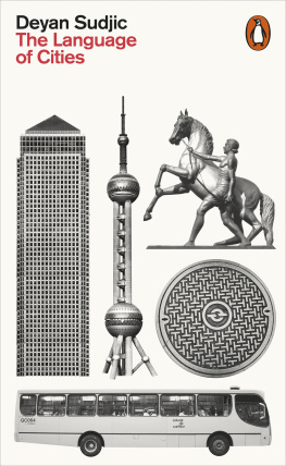
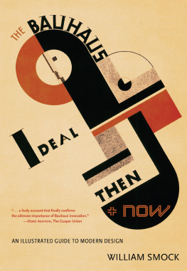
Similar books «B is for Bauhaus, Y is for YouTube: Designing the Modern World from A to Z»
Look at similar books to B is for Bauhaus, Y is for YouTube: Designing the Modern World from A to Z. We have selected literature similar in name and meaning in the hope of providing readers with more options to find new, interesting, not yet read works.
Discussion, reviews of the book B is for Bauhaus, Y is for YouTube: Designing the Modern World from A to Z and just readers' own opinions. Leave your comments, write what you think about the work, its meaning or the main characters. Specify what exactly you liked and what you didn't like, and why you think so.