Dozens of compelling anecdotes are clearly told in this eye-opening book, which is utterly convincing in its central idea that we are surrounded by fonts and influenced by their subtle message. A delightful, brain-expanding book Mail on Sunday
Garfields great strength is his storytelling comprises dozens of lovely vignettes, anecdotes utterly compelling Independent on Sunday
Just My Type is a font fanatics dream Wired
Bouncy well-informed and wittily designed an engaging book Guardian
Engrossing Ive long been a fan of Garfields popular touch, but he also writes knowledgeably about the minutiae of printing and layout for this books many pleasures he should, at least, have a typeface named after him Evening Standard
Garfield is careful to tickle as much as he teaches if you have ever looked at the drop-down menu in Word and wondered what a Garamond is, or whats meant to be new about Times New Roman, Garfield will be just your type Daily Telegraph
A ton of fascinating stuff you never knew about fonts a friendly and informative book packed with nuggets that are way more relevant to your cool young life than you might realise riveting Dazed and Confused
Light-hearted but comprehensive, from rather odious typefaces, such as the hair  , to the ubiquitous Helvetica, each font is given a rundown. Garfield says hes unable to walk past a sign until he has identified the typeface. Now, neither can we Monocle
A celebration of our way with words Observer
Garfield is extremely knowledgeable about type history while ignoring the politics and egos the tone is often funny and always entertaining thoroughly enjoyable Financial Times
A punchy and entertaining overview of typography Garfields intriguing book can send you online to look more deeply, typographically speaking, into the character issue Irish Times
Just My Type is the kind of book that makes you look at the world differently. Indeed, it can induce a mild obsessive compulsive disorder like a master sommelier, Garfield has a wonderful capacity to convey the little hints and barely registered associations which different fonts impart an ingenious book Scotsman
SIMON GARFIELD is the author of twelve acclaimed books of non-fiction including Mauve, The Error World and The Nations Favourite . His edited diaries from the Mass Observation Archive Our Hidden Lives, We are at War and Private Battles provided unique insights into the Second World War and its aftermath, and his study of Aids in Britain, The End of Innocence , won the Somerset Maugham prize. He lives in London and St Ives, Cornwall. He currently has a soft spot for Mrs Eaves and  .
.
Simon Garfield

By the same author
The End of Innocence
The Wrestling
The Nations Favourite
Mauve
The Last Journey of William Huskisson
Our Hidden Lives
We are at War
Private Battles
The Error World
Mini
Exposure
www.simongarfield.com
To Ben and Jake
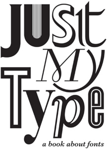
JUST MY TYPE
A BOOK ABOUT FONTS
2010, 2011 Simon Garfield.
All rights reserved. No part of this book may be reproduced in any form without permission from the publisher except for the quotation of brief passages in reviews.
The main chapters of this book are typeset in Sabon MT 11/15pt. Sabon, a traditional serif font, was developed in the 1960s by Jan Tschichold, a Leipzig based designer. Its story is told on p 251. Interspersed with the chapters are a series of FontBreaks, which are set in Univers 45 Light 9.5/15pt, except for their initial paragraphs, which appear in the font under discussion. Univers is a Swiss font, designed in 1957, the same year as its compatriot, Helvetica. Their story is told in Chapter Nine: What is it about the Swiss? But, being a book about fonts, Just My Type also samples more than 200 other fonts, from Albertus to  .
.
Design, layout and font wrangling by James Alexander of Jade Design ( www.jadedesign.co.uk ).
This paperback edition published in 2011
First published in 2010 by Profile Books, 3A Exmouth House Pine Street, Exmouth Market London, EC1R OJH
Printed and bound in Great Britain by Clays, Bungay, Suffolk
The paper this book is printed on is certified by the 1996 Forest Stewardship Council A.C. (FSC). It is ancient-forest friendly. The printer holds FSC chain of custody SGS-COC-2061

352pp
A catalogue record for this book is available from the British Library.
ISBN 978-1846683022
eISBN 978-1847652928
In Budapest, surgeons operated on printers apprentice Gyoergyi Szabo, 17, who, brooding over the loss of a sweetheart, had set her name in type and swallowed the type.
Time magazine, 28 December 1936
Contents
Introduction

O n 12th June 2005, a fifty-year-old man stood up in front of a crowd of students at Stanford University and spoke of his campus days at a lesser institution, Reed College in Portland, Oregon. Throughout the campus, he remembered, every poster, every label on every drawer, was beautifully hand calligraphed. Because I had dropped out and didnt have to take the normal classes, I decided to take a calligraphy class to learn how to do this. I learned about serif and sans serif typefaces, about varying the amount of space between different letter combinations, about what makes great typography great. It was beautiful, historical, artistically subtle in a way that science cant capture, and I found it fascinating.
At the time, the student drop-out believed that nothing he had learned would find a practical application in his life. But things changed. Ten years after college, that man, by the name of Steve Jobs, designed his first Macintosh computer, a machine that came with something unprecedented a wide choice of fonts. As well as including familiar types such as Times New Roman and Helvetica, Jobs introduced several new designs, and had evidently taken some care in their appearance and names. They were called after cities he loved such as Chicago and Toronto. He wanted each of them to be as distinct and beautiful as the calligraphy he had encountered a decade before, and at least two of the fonts, Venice and Los Angeles, had a handwritten look to them.
It was the beginning of something a seismic shift in our everyday relationship with letters and with type. An innovation that, within a decade or so, would place the word font previously a piece of technical language limited to the design and printing trade in the vocabulary of every computer user.
You cant easily find Jobss original typefaces these days, which may be just as well: they are coarsely pixelated and cumbersome to manipulate. But the ability to change fonts at all seemed like technology from another planet. Before the Macintosh of 1984, primitive computers offered up one dull face, and good luck trying to italicize it. But now there was a choice of alphabets that did their best to recreate something we were used to from the real world. The chief among them was 
Next page




 , to the ubiquitous Helvetica, each font is given a rundown. Garfield says hes unable to walk past a sign until he has identified the typeface. Now, neither can we Monocle
 .
.

 .
.