Stephen Coles - The anatomy of type: A graphic guide to 100 typefaces
Here you can read online Stephen Coles - The anatomy of type: A graphic guide to 100 typefaces full text of the book (entire story) in english for free. Download pdf and epub, get meaning, cover and reviews about this ebook. year: 2012, publisher: Harper Design, genre: Children. Description of the work, (preface) as well as reviews are available. Best literature library LitArk.com created for fans of good reading and offers a wide selection of genres:
Romance novel
Science fiction
Adventure
Detective
Science
History
Home and family
Prose
Art
Politics
Computer
Non-fiction
Religion
Business
Children
Humor
Choose a favorite category and find really read worthwhile books. Enjoy immersion in the world of imagination, feel the emotions of the characters or learn something new for yourself, make an fascinating discovery.

- Book:The anatomy of type: A graphic guide to 100 typefaces
- Author:
- Publisher:Harper Design
- Genre:
- Year:2012
- Rating:3 / 5
- Favourites:Add to favourites
- Your mark:
The anatomy of type: A graphic guide to 100 typefaces: summary, description and annotation
We offer to read an annotation, description, summary or preface (depends on what the author of the book "The anatomy of type: A graphic guide to 100 typefaces" wrote himself). If you haven't found the necessary information about the book — write in the comments, we will try to find it.
Stephen Coles: author's other books
Who wrote The anatomy of type: A graphic guide to 100 typefaces? Find out the surname, the name of the author of the book and a list of all author's works by series.


The anatomy of type: A graphic guide to 100 typefaces — read online for free the complete book (whole text) full work
Below is the text of the book, divided by pages. System saving the place of the last page read, allows you to conveniently read the book "The anatomy of type: A graphic guide to 100 typefaces" online for free, without having to search again every time where you left off. Put a bookmark, and you can go to the page where you finished reading at any time.
Font size:
Interval:
Bookmark:

T HE A NATOMY OF T YPE
A G RAPHIC G UIDE TO 100 T YPEFACES
Copyright 2012 by Quid Publishing.
All rights reserved under International and Pan-American Copyright Conventions. By payment of the required fees, you have been granted the non-exclusive, non-transferable right to access and read the text of this ebook on-screen. No part of this text may be reproduced, transmitted, down-loaded, decompiled, reverse engineered, or stored in or introduced into any information storage and retrieval system, in any form or by any means, whether electronic or mechanical, now known or hereinafter invented, without the express written permission of HarperCollins ebooks.
First published in 2012 by
Harper Design
An Imprint of HarperCollins Publishers
10 East 53rd Street
New York, NY 10022
Tel: (212) 207-7000
Fax: (212) 207 7654
Library of Congress Cataloging-in-Publication Data is available upon request.
ISBN 978-0-06-220312-0
Conceived, designed, and produced by
Quid Publishing Ltd.
Level 4 Sheridan House
114 Western Road
Hove BN3 1DD
England
First printing, 2012
EPub Edition DECEMBER 2012 ISBN 9780062203113

The bigger a group gets, the lower its intellectual common denominator falls. The average taste of a group is definitely worse than that of any individual member. One can always see this at board presentations, where the propensity to make decisions is affected by the group size. If a group discussion had a color, it would be beige.
If that group had to pick a typeface, it would be Arial a face whose astonishing prevalence is largely due to its astonishing prevalence. We like best what we see most, which describes a type designers dilemma: a new typeface has to look like all the others after all, an a has to look like an a but it has to also have something more. Gimmicks dont work, as they wear off quickly, and basing a whole alphabet on one idea also doesnt fly. This is painfully apparent, for example, in a page set in Avant Garde Gothic, whose geometric shapes separate characters from each other rather than combine them into words. The flow of the letters is important: they have to be modest in each others company so we can read line after line of them. Details that stick out at large sizes may become invisible as the type gets smaller, but they can add warmth, texture, and, yes, character. Type adds the sound to the tunes other people write.
As most users of type are unaware of the fact that type designers even exist, they take it for granted that fonts live on their computers, having got there by some technical intervention or other. For those people, selecting the right typeface is easy: just pull down the menu in your favorite application and click on one of the many popular names that come up. The more familiar these names look, the less likely you are to make a mistake. For those who are a little more interested in what actually makes a typeface useful, even appropriate, advice is easily had from the columns of so-called specialist magazines and websites. But their advice is commonly safe and staid. Security means hiding among the crowd.
If you want to go beyond the beige choices, you need objective criteria that can make finding the right typeface for a project not only likely, but fun. Stephen Coles is one of those people who, like myself, suffers from Typomania that incurable, but non-lethal, disease which makes you read type specimens instead of popular literature. Stephen also has a typographic memory: he not only remembers what he has seen in those specimens be they books or websites but he also recalls the names of thousands of typefaces and can point anybody who asks to the proper reference point. Scary, I know, but useful for those who really want and need to go beyond what that drop-down menu offers at first sight.
If you know the difference between a font and a typeface, you need this book. If you dont, you need it even more.
Erik Spiekermann
This book is all about looking at letters. Not just any letters, but the sets of letters that are designed together, in a systematic and harmonious way, to form a typeface.
What gives a typeface its personality? Why does one font appear bigger or clearer or darker or warmer than another? The answers to these questions can often be found by simply looking more closely at the letters themselves.
The performance of a Text typeface is best judged by viewing it and using it at its intended size in a passage of text. But just as typography (the use of type) is all about fussing over the details, the details of the typefaces themselves really do matter. Lets put it another way: a chef doesnt need to grow her own vegetables or raise her own cattle, but she can benefit from knowing how the ingredients were made.
When we enlarge a word or phrase that contains a typefaces most distinctive glyphs, we unearth all sorts of information about what makes that typeface tick. We discover how the space inside and between letters is as important as the strokes of the letters themselves, and how the shape of one letter affects the shape of the others. We learn that seemingly minor attributes can affect the personality of the typeface as a whole, and we can surmise the decisions a type designer made to improve the economy, legibility, or originality of the design.
Once this knowledge is acquired, it becomes a valuable and instantly accessible piece of a type users skill set. Graphic designers who can scrutinize and describe types nuances are better equipped to pick the right tool for the job and discuss those choices with colleagues and clients.
In the following pages, youll find visual and interpretive descriptions of 100 typefaces. The selections were made with an emphasis on versatility and practical use. There are certainly more popular typefaces out there, or those with a more historically significant background, but each of the families represented here is relevant and useful in contemporary design. There is a mix of classics, based on metal typefaces dating back as far as 500 years, alongside newer releases that are either thoughtful reinterpretations of the classics or completely original designs. A glossary is included on page 9 to help you with some of the most frequently used terms.
While the focus is on Text type, there are also Display faces for setting large and grabbing attention. These were not chosen as mere novelties, but rather for their flexibility of use in a wide variety of settings.
The selections represent a wide range of foundries and designers from around the world, and every typeface was vetted for quality and design integrity. They are organized in a pragmatic way, sorted in groups that borrow some aspects from traditional, history-based classifications but without relying too heavily on dated dogma. Typefaces with similar visual characteristics are placed near each other, making it easy to compare designs and seek alternatives.
1. Typeface name
The typeface is the design of a full family of fonts. Variants, such as optical sizes (Display/Text), are noted where necessary below each sample. Digital formats (such as Pro and Std) are omitted because they generally specify a font products character set, not the design of the typeface.
Font size:
Interval:
Bookmark:
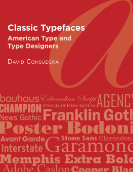
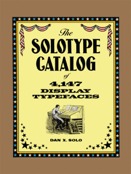
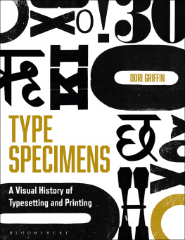
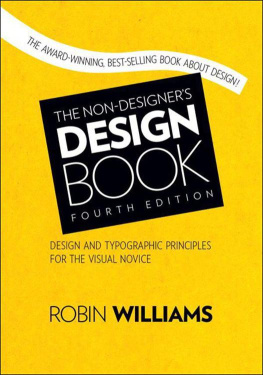
Similar books «The anatomy of type: A graphic guide to 100 typefaces»
Look at similar books to The anatomy of type: A graphic guide to 100 typefaces. We have selected literature similar in name and meaning in the hope of providing readers with more options to find new, interesting, not yet read works.
Discussion, reviews of the book The anatomy of type: A graphic guide to 100 typefaces and just readers' own opinions. Leave your comments, write what you think about the work, its meaning or the main characters. Specify what exactly you liked and what you didn't like, and why you think so.