Acknowledgments
This book comes with both thanks and apologies. It took a little longer than wed anticipated to wrap
things upokay, perhaps a lot longer. A huge thank-you to our trusted editor, Eric Himmel, who has been
an active collaborator and a superb counsel, and therefore has our deepest respect.
At Abrams, we would also like to thank Lisa Silverman, Rob Sternitzky, Zachary Greenwald,
Eli Mock, Sarah Masterson Hally, and Anet Sirna-Bruder.
Our thanks to our friends, colleagues, and families for their patience and assistance in working
through lifes inevitable speed bumps. We owe you time to binge-watch some series together, as well
as our overwhelming gratitude and a nice meal out.
Special thanks to the great Louise Fili, of course. And we tip our hat to Joe Newton, who took on
a tremendous amount of work and helped organize, design, and document what was turning into a
bottomless pit of letterforms, typefaces, and artwork. Joes tasty custom type specimens have made our
many, many pages extra-special.
Thank you to Noel Nez-Caba and Rena Sokolow for their tireless research and to Matt Iacovelli
and Martina Santos for jumping in to hunt, scan, and massage design elements (not massage the
authors, to be clear).
And as always, thanks to our employers at the School of Visual Arts, President David Rhodes and
Executive Vice President Anthony P. Rhodes. Youve always allowed us to carve out space for our book
projects over our many years at the college. We couldnt do it without you.
STEVEN HELLER and GAIL ANDERSON
Editor: Eric Himmel
Designer: Anderson Newton Design
Production Manager: Sarah Masterson Hally
Library of Congress Control Number: 2020931028
ISBN: 978-1-4197-3805-0
eISBN: 978-1-64700-169-8
Copyright Steven Heller and Gail Anderson
Cover 2021 Abrams
Published in 2021 by Abrams, an imprint of ABRAMS. All rights
reserved. No portion of this book may be reproduced, stored in
a retrieval system, or transmitted in any form or by any means,
mechanical, electronic, photocopying, recording, or otherwise,
without written permission from the publisher.
Abrams books are available at special discounts when
purchased in quantity for premiums and promotions as
well as fundraising or educational use. Special editions
can also be created to specification. For details, contact
specialsales@abramsbooks.com or the address below.
Abrams
is a registered trademark of Harry N. Abrams, Inc.
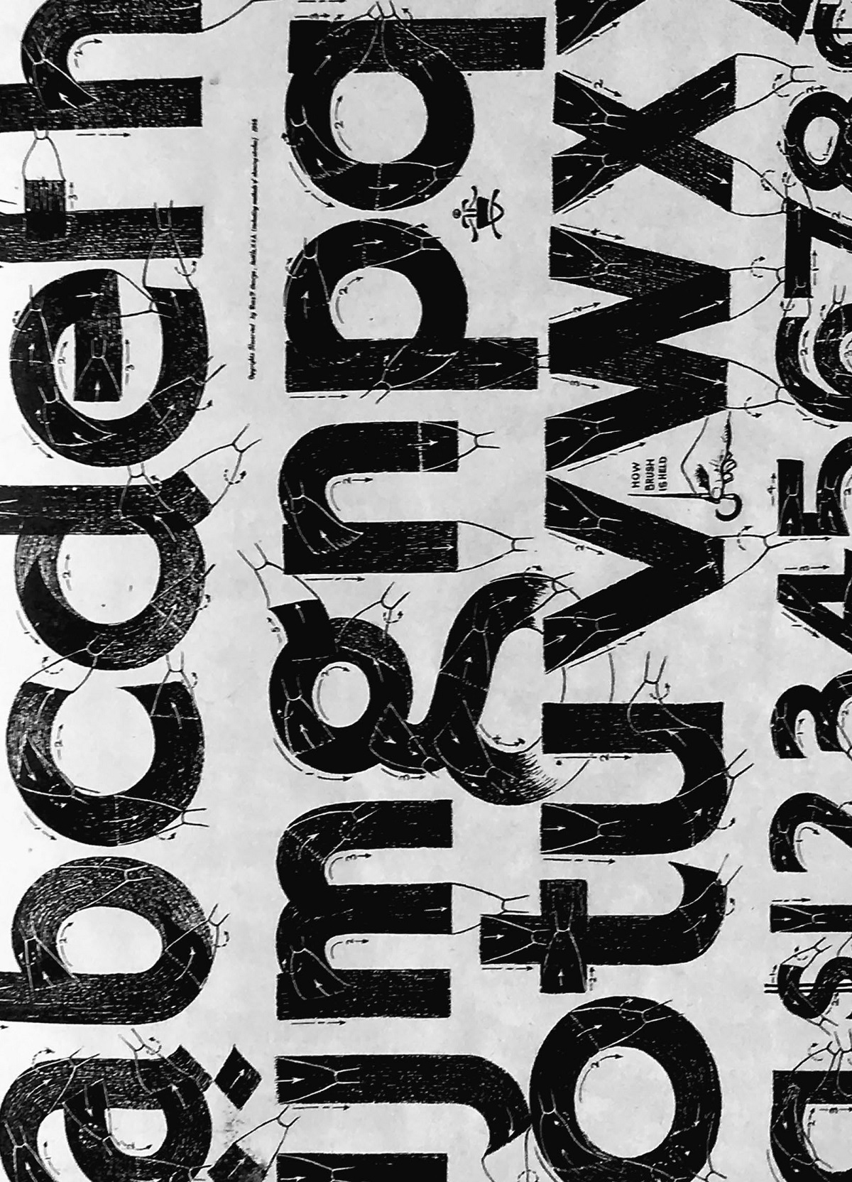
(Opposite)
If you use a brush that will make a sharp
clean line where the strokes start and
terminate, designer Ross F. George
wrote of this Speedball single stroke
Gothic, you will not find it necessary to
add the finishing strokes to these letters.
TITLE
Speedball Text Book: Lettering and
Poster Design for Pen and Brush
TYPEFACE
Rapid Brush Sho Card
DESIGNER
Ross F. George
CLIENT
C. Howard Hunt Pen Company of
Camden, New Jersey
YEAR
1941
ABRAMS The Art of Books
195 Broadway, New York, NY 10007
abramsbooks.com

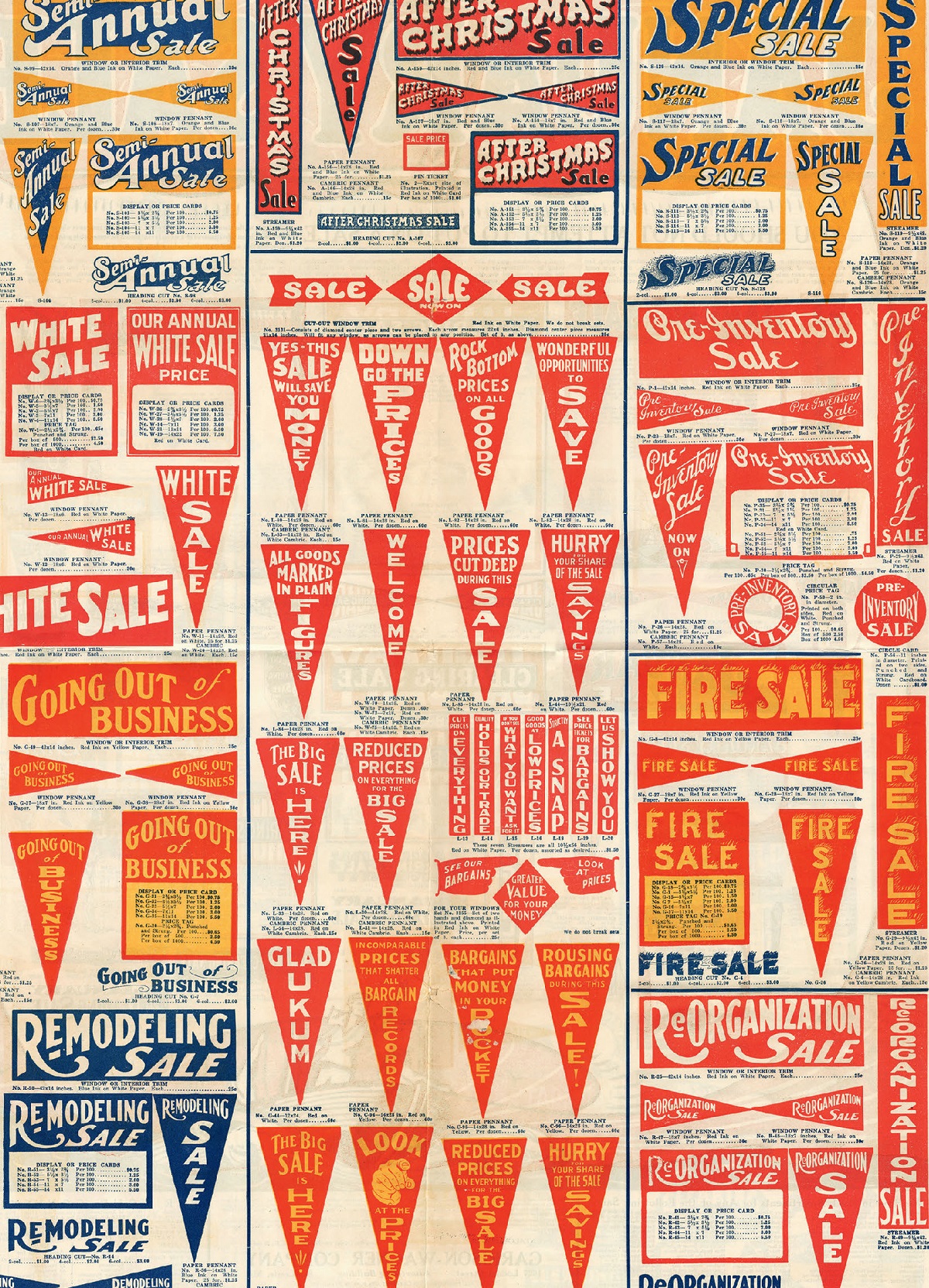
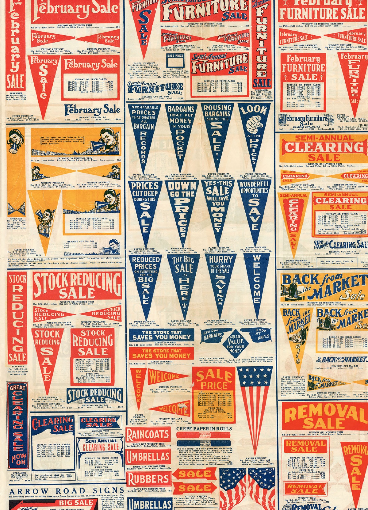
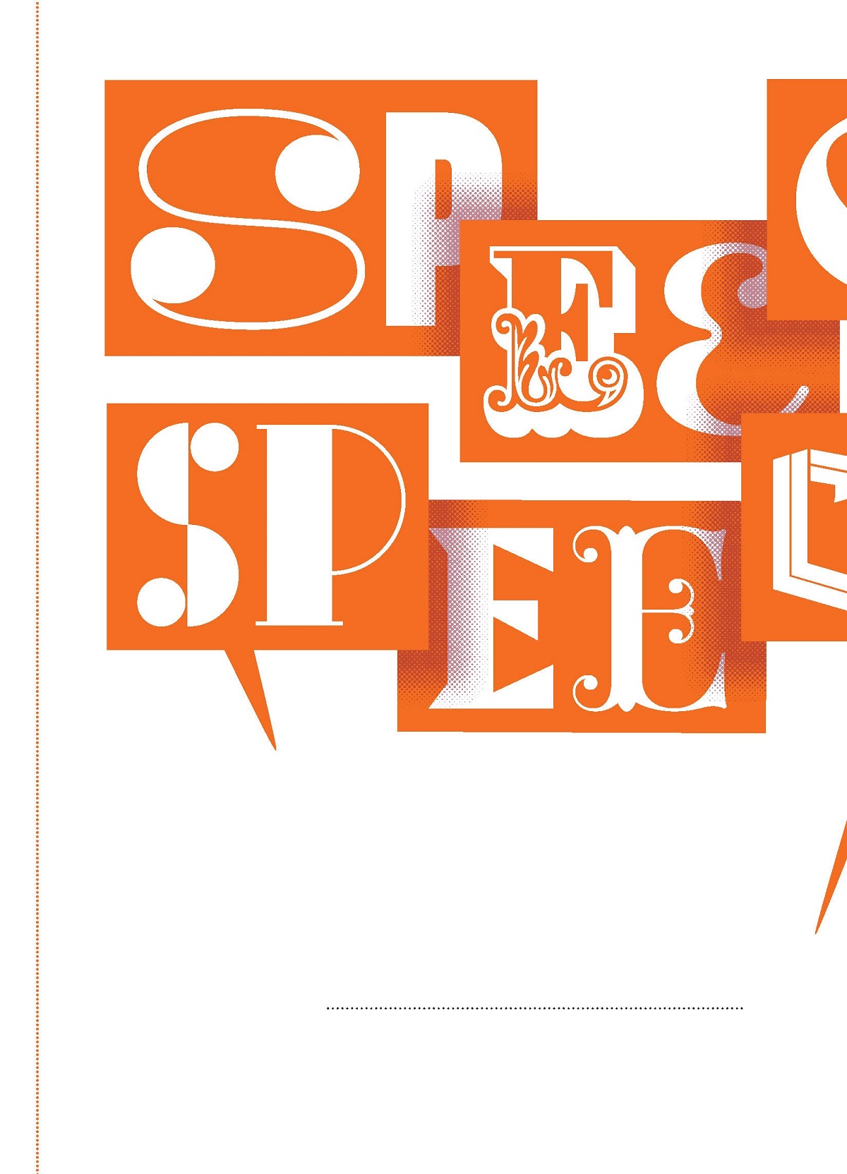
(Previous) Stock cuts from the Garrison-Wagner Company of St.
Louis, Missouri (circa 1924), include price tags, paper streamers,
pennants, and circle cards, all designed to create standout
advertising. Fire Sale is truly smoking hot.
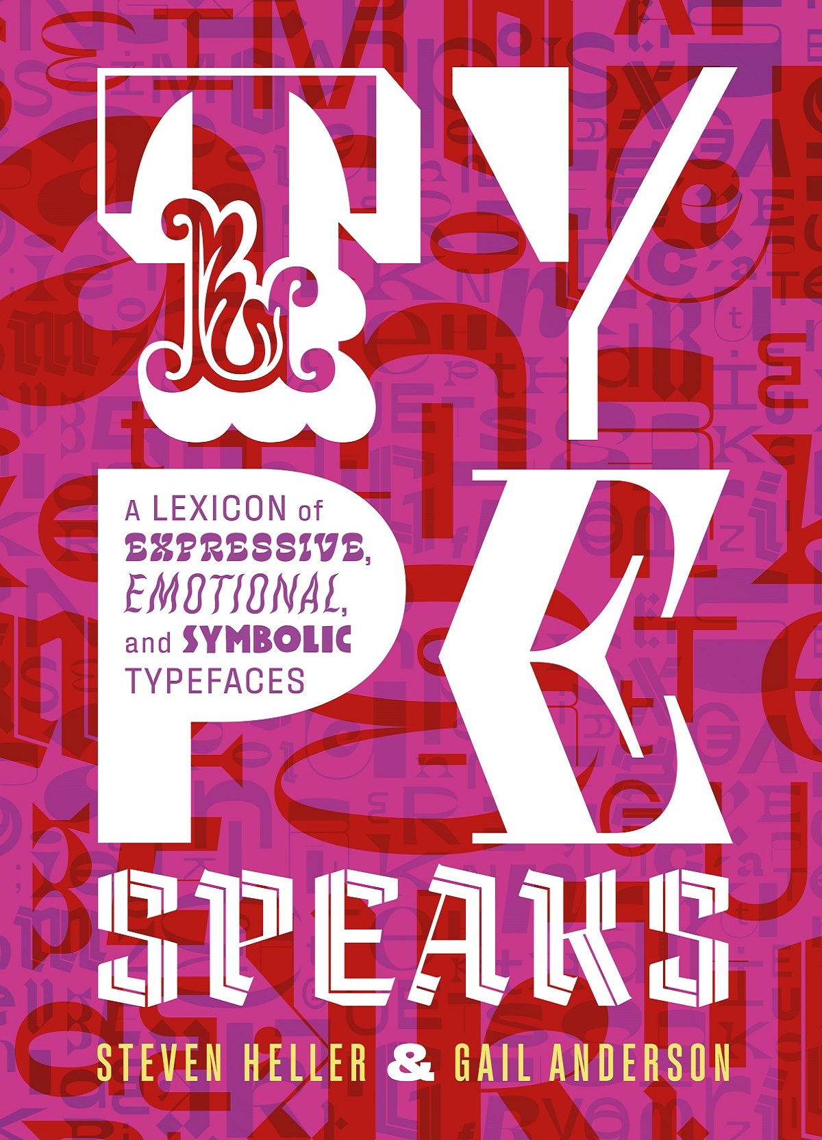
TYPE IS TO GRAPHIC DESIGN what speech is to ver-
bal communication. It can be as soft as a whisper
or as loud as a roar, lugubrious or happy, common
or elite, reserved or passionate. Languages, for the
most part, are not a problem, either: Most alpha-
bets are made into type. You name it and there is a
typeface for itor at least custom letterforms that
can be made to serve the needs of any rhetoric.
Type
Speaks

DESIGN TRAITS:
FEAR > ANGER > HAPPY > SAD/SORROWFUL > NOSTALGIC > SPIRITUAL
A typeface is voice, type style (italic, bold,
slab, with or without serifs) is accent, and typog-
raphy is locution.
Since the emergence in the fifteenth century
of variations in type styles, typefaces have signaled
certain covert and overt messages to readers;
consensus has developed regarding both personal
and public perceptions in relation to printed
matter. The more widely that type and lettering
styles are shared, the more embedded in everyday
expression they become. It is generally agreed, for
example, that italic type suggests an aside or prcis,
while roman type conveys the primary content.
(Italic can also indicate foreign words, unspoken
thoughts, or spoken dialogue.) In the early periods
of classical type designwhen typefaces were
based on ancient inscriptions and calligraphic
scriptsthe goal was simple: to project a message
in the clearest and most readable way possible.
Without a wide range of typefaces, there was
scant opportunity for nuanced choices, but there
