Cover

A Pocket Guide to Combining Typefaces
by Tim Brown
Published in 2013 by Five Simple Steps
Studio Two, The Coach House
Stanwell Road
Penarth
CF64 3EU
United Kingdom
On the web: fivesimplesteps.com
and: http://nicewebtype.com/
Please send errors to
Publisher: Five Simple Steps
Editor: Stephen Coles
Copy Editor: Owen Gregory
Production Manager: Jo Brewer
Art Director: Nick Boulton
Designer: Nick Boulton, Colin Kersley
Copyright 2013 Tim Brown
All rights reserved. No part of this publication may be reproduced or transmitted in any form or by any means, electronic or mechanical, including photocopy, recording or any information storage and retrieval system, without prior permission in writing from the publisher.
ISBN: 978-1-907828-17-1
A catalogue record of this book is available from the British Library.
Why combine typefaces?
Why would anyone bother using more than one typeface?
Designers can, and often do, use a single variation of one typeface (for example, Proxima Nova Regular) for entire projects. This is a common exercise in Typography 101 classes because it helps students understand typesetting options and limitations, and its a popular aesthetic among professionals who are in a hurry, trying to be plain, or trying to be careful. Even sticking with a single typeface (for example, the complete Proxima Nova family) provides a multitude of possibilities, particularly if that face offers many weights, widths and styles.
The act of bringing different typefaces together to convey a message is challenging, inspiring and fun. And it gets the job donefinding good type combinations can give form to our emotional goals and serve the practical needs of our compositions in ways that sticking with a single typeface cannot. Plus, learning to combine typefaces is one of the best investments a designer can make: it teaches you how to be selective, patient and reasonable about design decisions.
But combining typefaces is also hard work. It takes practice, and it takes the wisdom that comes with practice. It takes knowledge about type, context and culture. Successful combinations are partly a matter of good taste, which comes with experience but is tough to develop. And finding typefaces that work well together often takes more time than we (or our managers, or our spouses!) think it should.
It can be quite frustrating, but thats a good thing. Hard work is good for the soul, and striving for a palette of typefaces that is appropriate for a given project is a rewarding exercise. By trying, we grow knowledgeable; and by having tried, we grow wise. With practice, we can combine typefaces more intuitively and with better results.
As a rule, impeccable taste springs partly from inborn sensitivity: from feeling. But feelings remain rather unproductive unless they can inspire a secure judgment. Feelings have to mature into knowledge about the consequences of formal decisions. For this reason, there are no born masters of typography, but self-education may lead in time to mastery.
Jan Tschichold,
The Form of the Book: Essays on the Morality of Good DesignThis Pocket Guide will give you a framework for successful practice, lead you to founts of knowledge, and help you judge the work you see, including your own work. The first two chapters are brief bits of background information. The second two chapters are full of practical advice, and the final chapter is a critique of found type combinations.
A few quick disclaimers: Im only familiar with typesetting English text, so my advice may be insufficient if youre setting text in another language. Im also a web designer at heart, so my perspective on typography as a whole is centered on the principle of progressive enhancementthat a text itself is fundamentally more important than our suggestions about how it should be typeset. Lastly, I am part of the Typekit team at Adobe, so I have more experience with typefaces available via our service than I do with other typefaces. My writing and examples will reflect these things.
Lets get started!
Chapter 1
Type
Combining typefaces is a heck of a lot easier if you know a few things about type and typography. This handful of principles and resources is a great way to get to know any typeface: research its designer; anatomy; family; classification; and the jobs it does best.
Designers
Typefaces are made by people called type designers, and any typeface worth using has an invisible back story of love and labour. Type designers call their businesses type foundries in homage to the crafts history in metal casting, but this term also conveys the hard work and concentration involved in making type. Usually, a type foundry comprises just a few people. The better you know these folks, the better youll know their type.

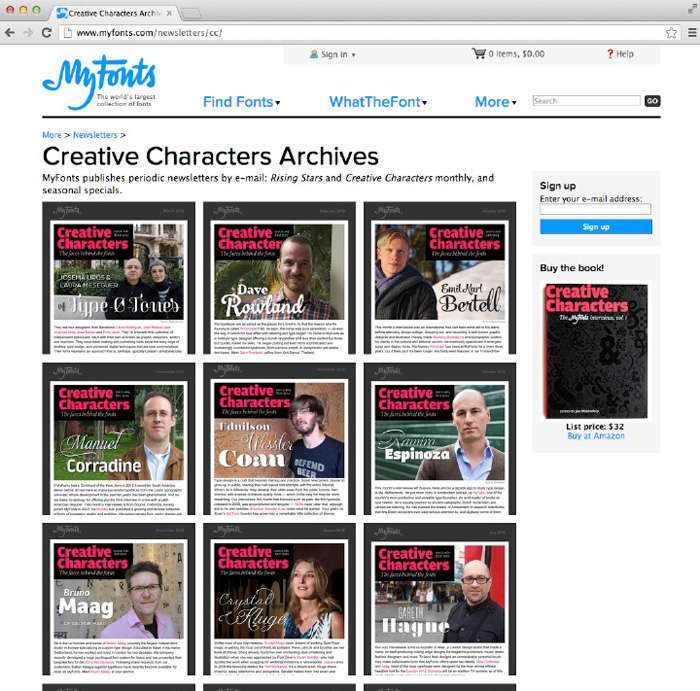
MyFonts Creative Characters newsletter directory.
Since 2007, MyFonts has interviewed type designers about their lives and work in a series of newsletters called Creative Characters. Some of these interviews are also available in physical book form. Another book worth checking out is Alexander Lawsons classic Anatomy of a Typeface, which profiles more than thirty typefaces individual histories, including information about their designers.
Anatomy
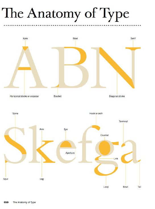
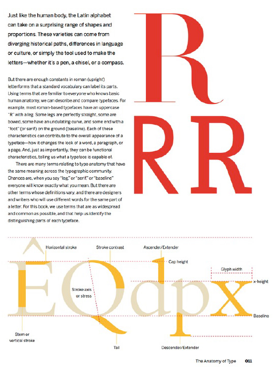
Parts of typefaces have names. Knowing how to describe the forms and features of a typeface helps you identify it, notice relationships between it and other fonts, articulate your criticism, associate adjectives with the face, and zoom in on small details (great for identifying graphic harmonymore on that in chapter 4).


Parts of typefaces and their names, from The Anatomy of Type, pp1011.
FontShop and Typedia have nice glossaries, but actually drawing letters is the best way to learn typeface anatomy. Check out Erik van Bloklands TypeCooker, or the type basics section of Underwares typeworkshop.com, and try sketching. If you can find a copy of Lettering for Advertising by Mortimer Leach, pick it up. These resources will explain why parts of typefaces look the way they do based on the tools or methods used to draw them.

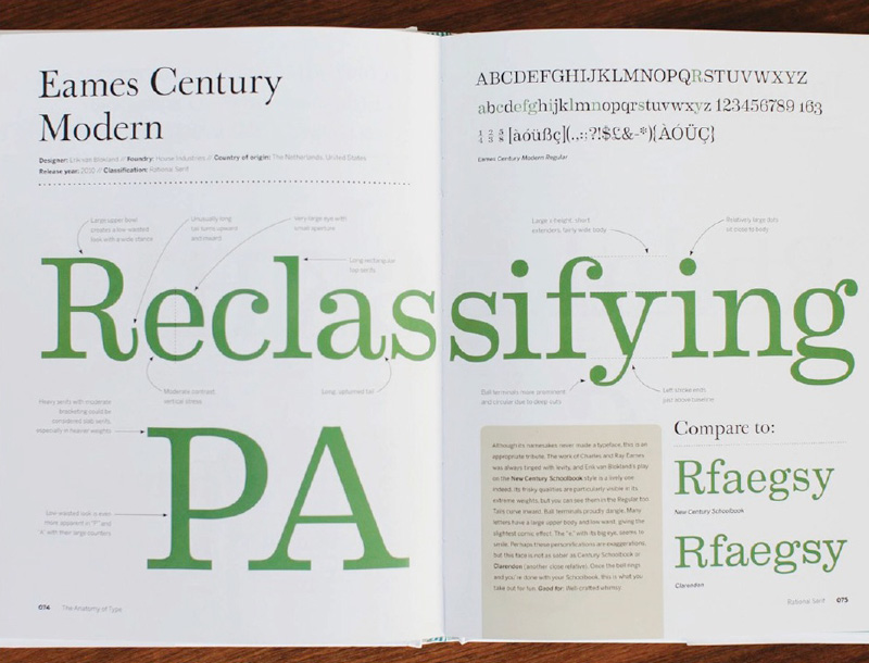
Stephen Coles examines Eames Century Modern in The Anatomy of Type, pp7475.
It also pays to compare a variety of different typefaces features to one another. Stephen Coles The Anatomy of Type examines one hundred typefaces, pointing out their idiosyncrasies, contrasting them with similar typefaces, and adding a few words about each one. Pound for pound, one of the sharpest and most useful type books around.
Families
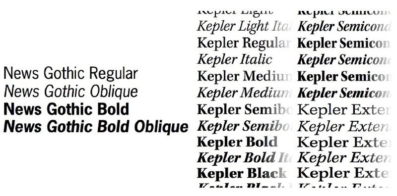
Typefaces with more than one style are called type families. Small families may include just a few variations, while large families can cover an enormous range of styles.

On the left, four styles of News Gothic; on the right, twenty-four styles of Kepler.

