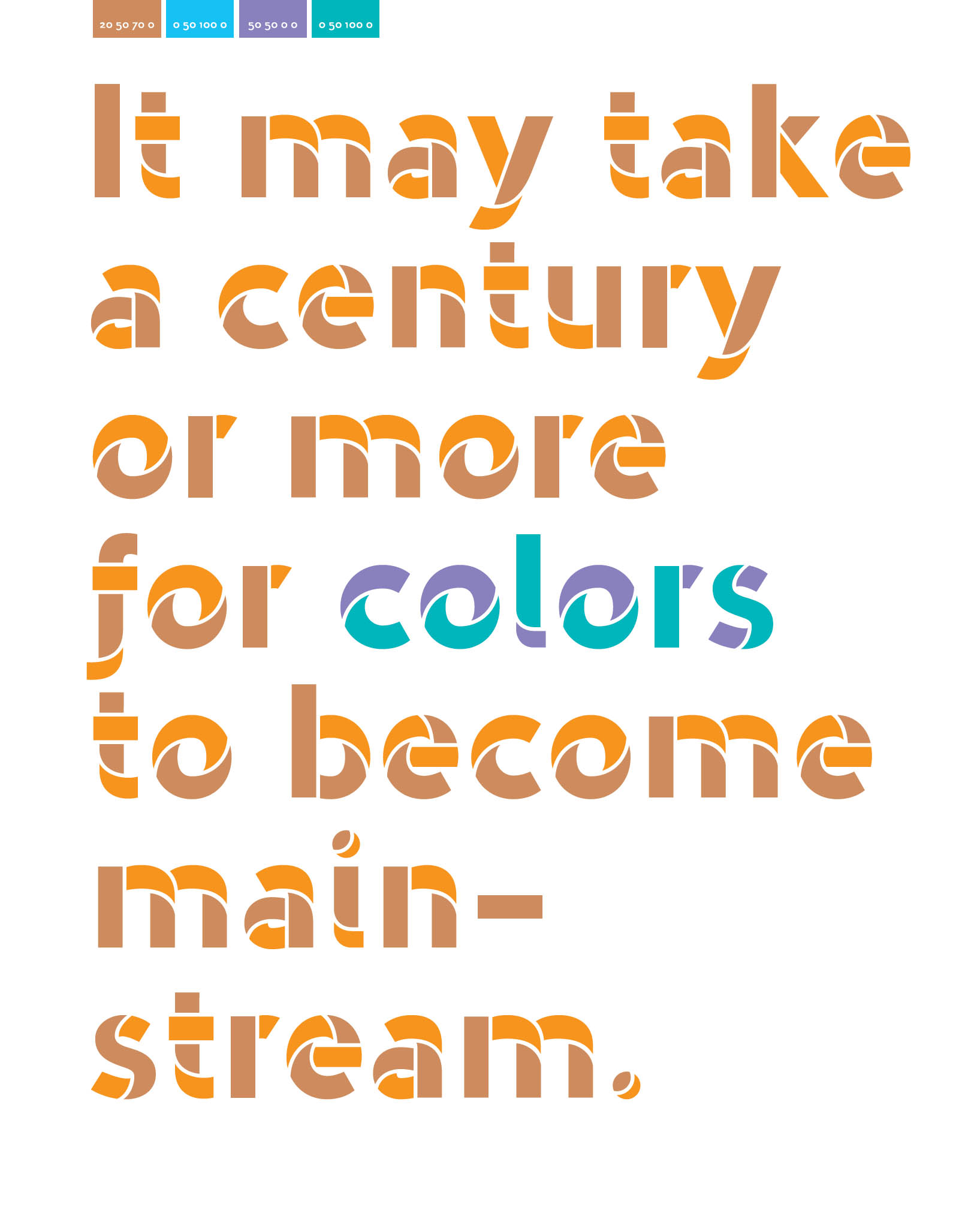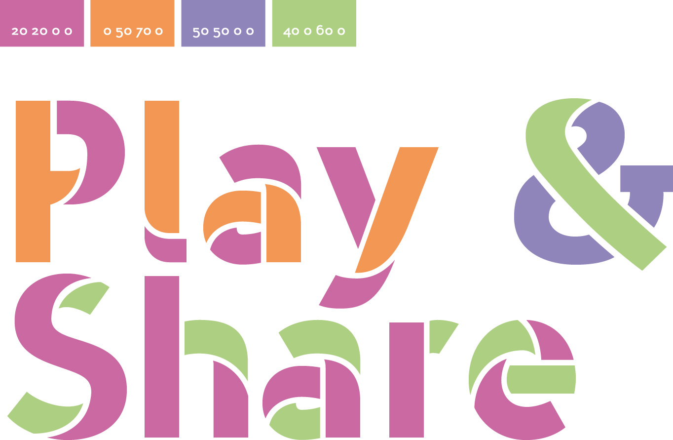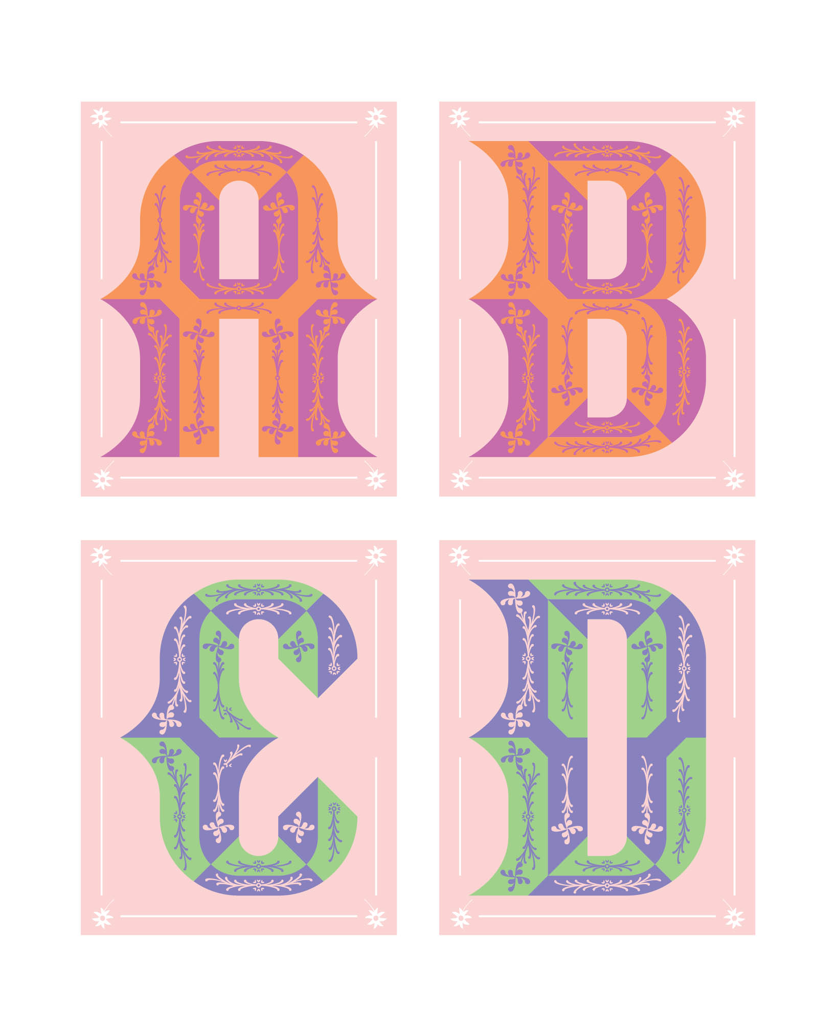
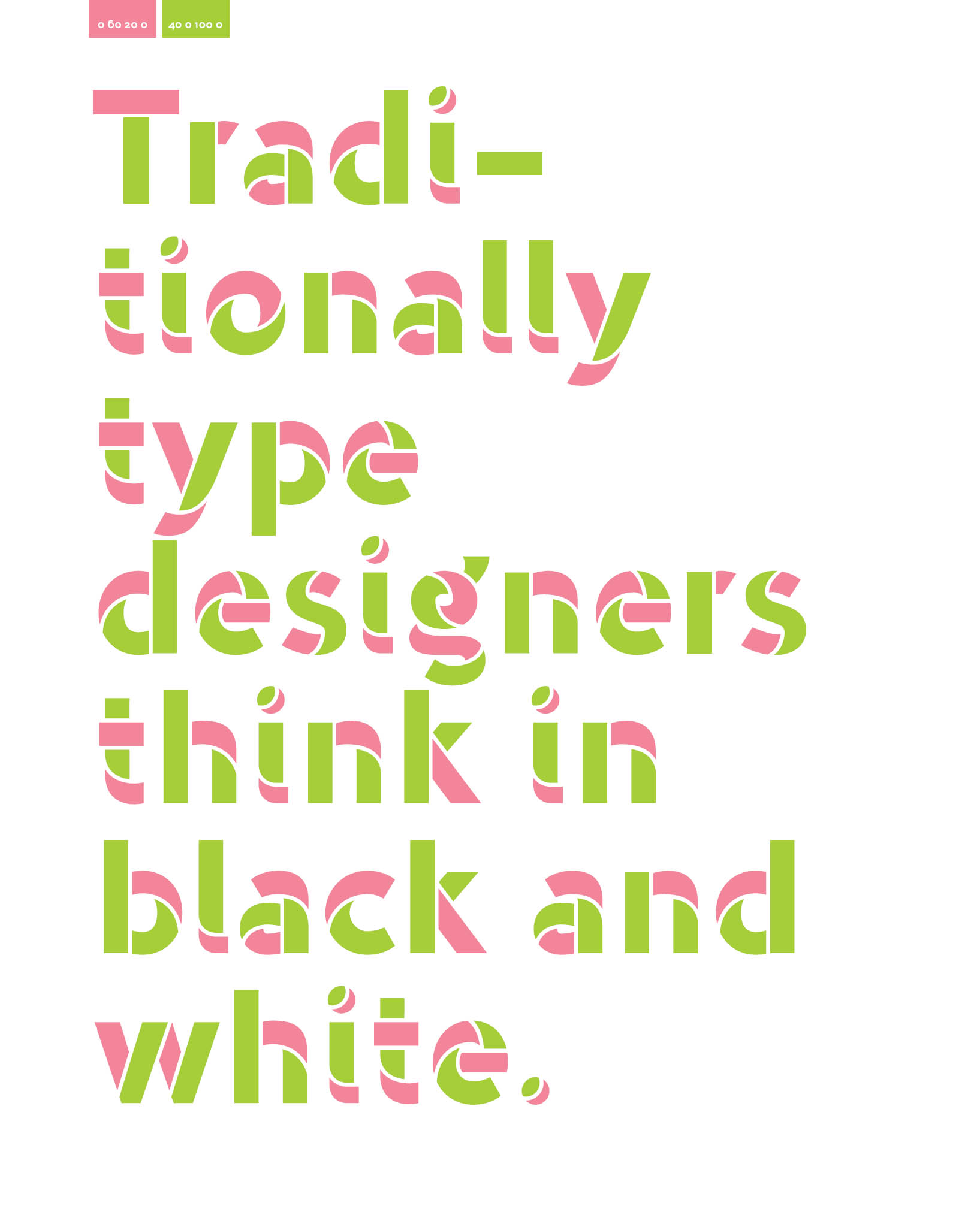

The color swatches depict the colors from which the individual typographic illustrations in this book are composed. These are listed at the top of every page. For each color field, the CMYK values are given, in the order C, M, Y, and K (cyan, magenta, yellow, and black).
 ome time ago, I asked myself the question: Why do typeface designers think only in black and white? Why are we content with a platform that, visually speaking, does not venture beyond such starkly contrasting forms? Why? This question prompted a series of research projects, investigations, and designs, the results of which are summarized in this book.
The world around us is composed entirely of colors. Colors can bite, entice, or embellish. Colors can warn us of dangerous situations or lead us through airports and train stations. Color organizes our everyday life and the traffic in it: red is for stop, green is for go!
Hollywood rarely produces black-and-white films anymore, and your television, computer, tablet, and smartphone all present images primarily in color. Color is a staple of almost all fine and applied arts. Hardly anyone feels the time flying by in a museum that exhibits nothing but black-and-white paintings. Or imagine an interior designed exclusively in black-and-white floors, walls, and furniture. In other words, color is omnipresent in our lives. Much of our daily communication on our smartphones is expressed with emojis, those chromatic symbols that can make words in messages redundant. Since the arrival of Unicode Version 8.0 in 2015, emojis with human characteristics can even be presented in different skin colors. In order not to increase the number of emojis exponentially, a new font technology has been developed that has various color layers. This technique can also be applied to any normal typeface design. The multicultural emojis are, so to speak, the parents of multicolored typefaces!
Incidentally, there is a history of attempts to combine color and typeface design. A well-known example dates from the fifteenth century, when movable-type printing was invented. Johann Fust and Peter Schffer, former associates of Johannes Gutenberg, achieved very appealing results in their attempt to create a system of multicolored initial letters. Unfortunately, because the printing process required to achieve this was too complicated and labor-intensive, they abandoned the project after printing the first book.
Thanks to the printing processes at our disposal today, there is nothing standing in the way of working with multicolored letters. The web also takes full advantage of the new possibilities offered by multicolored fonts. The path to a colorful future in typography is thus paved. This book is an invitation to all those who wish to engage with this novel approach to type design or to use it in their design work.
In closing, I would like to emphasize that in this book I only show and describe how I make my own typefaces; it reflects my personal ideas and visions on type and typography. There are certainly many type designers who would resolutely oppose my views. I encourage you to read with the same critical engagement: feel free to disagree vehemently! I aim to spark a lively debate about the legibility and usefulness of multicolored typefaces.
I look forward to a discussion about how we can develop multicolored typefaces and make them better accepted by readers, designers, developers, and engineers. It may be that another hundred years will pass before we get this far. It may be that another century will pass until color is the new bold. Until then, I invite you to use colorwithout typographic blinkers. Enjoying typefaces means, first and foremost, looking closely. There is time to read later. In this sense, I wish you much pleasure in viewing and reading this book.
Mark van Wageningen, Amsterdam 2019

This book is organized into different sections that guide you, step by step, through the process of designing multicolored typefaces. With the guidance of both words and images, you will learn which approaches and concepts you can use to begin designing your first multicolored font. You will consider a single letter, then a word, and finally an entire paragraph. You will discover the countless possibilities that await you in the intermingling of typography and color. The first sections explore different types of multicolored typeface design: those that embellish, those that deconstruct, or those that rely on a combination of both approaches.
These sections are followed by a short guide to typeface design that will help you design a multicolored font. The last section shows how color and typography work together to become a powerful tool for the graphic designer. The use of multicolored fonts can open up a whole world of new possibilities. This is true for creatives who work predominantly in print media, as well as for digital designers (e.g., design for the web). In addition to teaching tools, this book provides an overview of the Typewood project, a case study in which a multicolored font, designed on a computer, was transformed for use with a centuries-old printing technique: letterpress printing.
This book is for anyone interested in type and color. Whether you are an experienced designer, a typographer, or still a student, this book invites you to enrich your typographic designs by experimenting with color. The intersection of color and typeface design is an area that is still largely unexplored. This book aims to initiate the first exploratory steps of a fascinating journey of discovery into this field. I invite you, the reader, to accompany me and other readers on this journey. Together, we can give a significant creative boost to the development of multicolored fonts. Share your thoughts, ideas, fonts, color experiments, and letter and character sketches with the following hashtags on social media: #typecolor and #colorfonts .


Next page






 ome time ago, I asked myself the question: Why do typeface designers think only in black and white? Why are we content with a platform that, visually speaking, does not venture beyond such starkly contrasting forms? Why? This question prompted a series of research projects, investigations, and designs, the results of which are summarized in this book.