Emil Björklund - CSS Mastery, Third Edition
Here you can read online Emil Björklund - CSS Mastery, Third Edition full text of the book (entire story) in english for free. Download pdf and epub, get meaning, cover and reviews about this ebook. year: 2016, publisher: Apress, genre: Home and family. Description of the work, (preface) as well as reviews are available. Best literature library LitArk.com created for fans of good reading and offers a wide selection of genres:
Romance novel
Science fiction
Adventure
Detective
Science
History
Home and family
Prose
Art
Politics
Computer
Non-fiction
Religion
Business
Children
Humor
Choose a favorite category and find really read worthwhile books. Enjoy immersion in the world of imagination, feel the emotions of the characters or learn something new for yourself, make an fascinating discovery.
- Book:CSS Mastery, Third Edition
- Author:
- Publisher:Apress
- Genre:
- Year:2016
- Rating:5 / 5
- Favourites:Add to favourites
- Your mark:
CSS Mastery, Third Edition: summary, description and annotation
We offer to read an annotation, description, summary or preface (depends on what the author of the book "CSS Mastery, Third Edition" wrote himself). If you haven't found the necessary information about the book — write in the comments, we will try to find it.
Fully updated to the latest CSS modules, make the journey to CSS mastery as simple and painless as possible. This book dives into advanced aspects of CSS-based design, such as responsive design, modular CSS, and CSS typography. Through a series of easy-to-follow tutorials, you will learn practical CSS techniques you can immediately start using in your daily work.
CSS Mastery: Advanced Web Standards Solutions is your indispensable guide to cutting-edge CSS developmentthis book demystifies the secrets of CSS. While CSS is a relatively simple technology to learn, it is a difficult one to master. When you first start developing sites using CSS, you will come across all kinds of infuriating browser bugs and inconsistencies. It sometimes feels like there are a million and one different techniques to master, spread across a bewildering array of websites. The range of possibilities seems endless and makes for a steep and daunting learning curve.
While most books concentrate on basic skills, this one is different, assuming that you already know the basics and why you should be using CSS in your work, and concentrating mainly on advanced techniques. This new edition covers all of the CSS fundamentals such as the importance of meaningful markup, how to structure and maintain your code, and how the CSS layout model really works.
This new edition contains:
- New examples and updated browser support information
- Full coverage of modular CSS and responsive design
- Essential information on CSS typography and layout control
What Youll Learn
- Discover the best practice concepts in CSS design
- Master the most important (and tricky) parts of CSS
- Identify and fix the most common CSS problems
- Deal with the most common bugs
- See the latest information on CSS features and support
Who This Book Is For
Intermediate and advanced web designers and developers. It offers a quick recap of the main points of CSS, while dispelling some common myths, but then moves forward to delve into the higher-level aspects of CSS. It contains fully up-to-date information throughout, and acts as a one-stop-shop for current CSS best practices.
Emil Björklund: author's other books
Who wrote CSS Mastery, Third Edition? Find out the surname, the name of the author of the book and a list of all author's works by series.


CSS Mastery, Third Edition — read online for free the complete book (whole text) full work
Below is the text of the book, divided by pages. System saving the place of the last page read, allows you to conveniently read the book "CSS Mastery, Third Edition" online for free, without having to search again every time where you left off. Put a bookmark, and you can go to the page where you finished reading at any time.
Font size:
Interval:
Bookmark:
Andy Budd and Emil Bjorklund 2016
Andy Budd and Emil Bjrklund , CSS Mastery , 10.1007/978-1-4302-5864-3_10
Andy Budd 1 and Emil Bjrklund 2
(1) Brighton, UK
(2) Malmo, Sweden
This chapter is all about moving things aroundeither through space, with transforms, or through time, using animations and transitions. Often, these two families of properties work together.
Transformation is a different concept from moving things with positioning or other layout properties. In fact, transforming an object doesnt affect the layout of the page at all. You can rotate, skew, translate, and scale elements, even in 3D!
Animating elements can be done with the CSS Animation properties. Transitions are a simplified flavor of animations. When you only have an on-off state (like with hovering over an element), transitions are there to automate the process.
Taken together, these properties give you lots of ways to breathe life into your pages. As an added bonus, they also have really good performance.
In this chapter, we will go through the following:
Two-dimensional transformations: translating, scaling, rotating, and skewing
Simple and advanced transition effects
What you can and cant transition
Keyframe animations and the animation properties
Three-dimensional transformations and perspective
CSS transforms allow us to move things around in space, while CSS transitions and CSS keyframe animations control how elements can change over time.
Even if those two aspects are somewhat unrelated, transforms, transitions, and keyframe animations are often lumped together conceptually. This is because they are so regularly used to complement each other. When animating something, you are changing its appearance up to 60 times per second. Transforms allow you to describe certain kinds of changes to appearance in a way that the browser can very efficiently calculate.
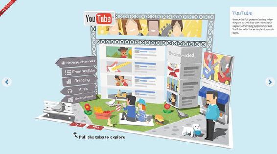
Transitions and keyframe animations allow you to animate those changes in a smart way. As such, these features go together hand in glove. The end result gives us the capability to do things like the animated 3D pop-up book Google created (see Figure ).
Since the examples in this chapter quite literally have a lot of moving parts, its hard to describe them on the pages of a book. We strongly recommend you try out the examples in a browser while reading, to understand whats going on. A lot of the time, JavaScript is used for interactivitywe wont go into the specifics of how the scripts work, but the examples include JS files for you to explore as well.
The specifications for transforms, transitions, and keyframe animations are still being worked on. Despite this, most of these features are pretty well supported across commonly used browsers, notable exceptions being Internet Explorer 8 and Opera Mini. IE9 only supports the 2D subset of transforms using the -ms- prefix, and does not support keyframe animations or transitions. Transforms, transitions and keyframe animations all require the -webkit- prefix to work in various versions of WebKit- and Blink-based browsers. The -moz- prefix is only needed if you need to cover old versions of Firefox.
CSS transforms allow you to shift the rendering of an element on the page by translating, rotating, skewing, or scaling it. In addition, you can add a third dimension into the mix! In this section, well start with the 2D transformations, and move on to 3D later. Figure gives an overview of what the 2D transforms do.
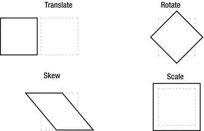
In technical terms, transformations change the coordinate system of the element as it appears on the page. One way of looking at transformations is to view them as distortion fields. Any pixel that belongs to the rendering of the transformed element is caught in the distortion field and gets teleported to a new position or size on the page. The element still remains where it was originally positioned on the page, but the resulting image of the element is transformed.
Imagine that you have a 100100-pixel element with a class name of box showing on the page. The position of the element can be affected by margins, positioning, sizes of other elements in the flow of the page, and so forth. Regardless of how it ended up where it did, we can describe the position of the box by using coordinates within the viewportfor example, 200 pixels from the top of the page and 200 pixels from the left. This is the viewport coordinate system.
In the page, there is a 100100-pixel space reserved for the element as it normally renders. Now lets imagine we were to transform the element by rotating it 45 degrees:
.box {transform: rotate(45deg);}Applying a transformation to an element creates what is known as a local coordinate systemfor the space where the element was originally placed. The local coordinate system is the distortion field, displacing the pixels of the element.
Since elements are represented as rectangles on the page, its perhaps easiest to think about what happens to the four points at the corners of the box. The Firefox developer tools have a nice visualization of this when inspecting an element. In the Rules panel of the inspector, hover over the transform rule to see the resulting transformation (see Figure ).
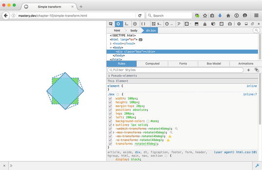
The page still retains its 100100-pixel gap where the box used to be, but any point belonging to the box is now transformed by the distortion field.
It is important to understand this technial background when applying transformations to elements in addition to other properties that affect their place on the page. What happens when we apply margin-top: 20px to the transformed div? Does the corner pointing upward now end up 20 pixels from the top of the original position? No: the whole local coordinate system of anything belonging to the box is rotated, including the margin, as shown in Figure .
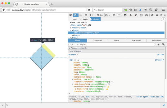
Its also important to note that the rotated appearance in no way interferes with the layout of the rest of the page as it would appear without the transformation. If we rotate the box a full 90 degrees so that the top margin is visually poking out to the right, it doesnt push on any elements that may be sitting to the right of the box.
Font size:
Interval:
Bookmark:
Similar books «CSS Mastery, Third Edition»
Look at similar books to CSS Mastery, Third Edition. We have selected literature similar in name and meaning in the hope of providing readers with more options to find new, interesting, not yet read works.
Discussion, reviews of the book CSS Mastery, Third Edition and just readers' own opinions. Leave your comments, write what you think about the work, its meaning or the main characters. Specify what exactly you liked and what you didn't like, and why you think so.