ACKNOWLEDGMENTS
Its a standard thing to thank ones editors, but wed like to say something different. Weve been just amazed by all the people at C&T Publishing. In addition to our wonderful editors, Susanne Woods (acquisitions editor) and Lynn Koolish (developmental editor), weve been so impressed with everyone else weve dealt with at C&T. Kristy Zacharias, our book designer, has been so enthusiastic about our work, and we are grateful that she designed a book that shows our quilts to their best advantage. The marketing people, the publicity people, the people who ship our books, and of course Amy Marson, the publisher, work hard to make us look good and create opportunities for us. We are truly grateful for their energy and intellect.
We also feel lucky to be able to work with our photographer, Jim White. Jims attention to detail and lighting is evident in the styled shots in this book, and we are grateful for his expertise.
Mickey Sweeney and Thom Barthelmess, along with their respective sweet dogs, were gracious enough to let us take over their beautiful homes for our photo shoots. We are indebted to them for their generosity and support.
Our fabulously talented intern, Jane Arvis, a student at Dominican University, is a whiz at both sewing and graphic design. In addition to cutting countless yards of fabric and piecing some of the quilts in this book, Jane also helped with yardage calculations and color variations in the pattern section. We are grateful that Dominican University made it possible for Jane to work with us.
Thanks also to the always hardworking Sandra Vega, who has been particularly helpful with cutting and preparing kits. In the midst of this book and a myriad of other projects, Sandy has been a calm and reliable presence.
Our daughter, Sophie, has become a great helper in our studio in addition to being a delightful energy in our lives. Sophie also generously lent us her pink bedroom for the Sweet Talk photo shoot. Thanks, Sophie!

INTRODUCTION
We love color, but we love the visual relationships among colors even more. At workshops we teach, we sometimes ask students to choose their least favorite color; then we watch in fascination as they come to love that same color when its in a palette with other colors. Developing palettes with which to make beautiful quilts does not require fancy gizmos or prescribed formulas. It takes a basic understanding of color theory and a bit of focus when buying fabric. Our hope is that with this collection of quilts, you will begin to see color in a new way and grow in your understanding and appreciation of color in the process.
Making transparency quilts requires time to think about color in a new way.
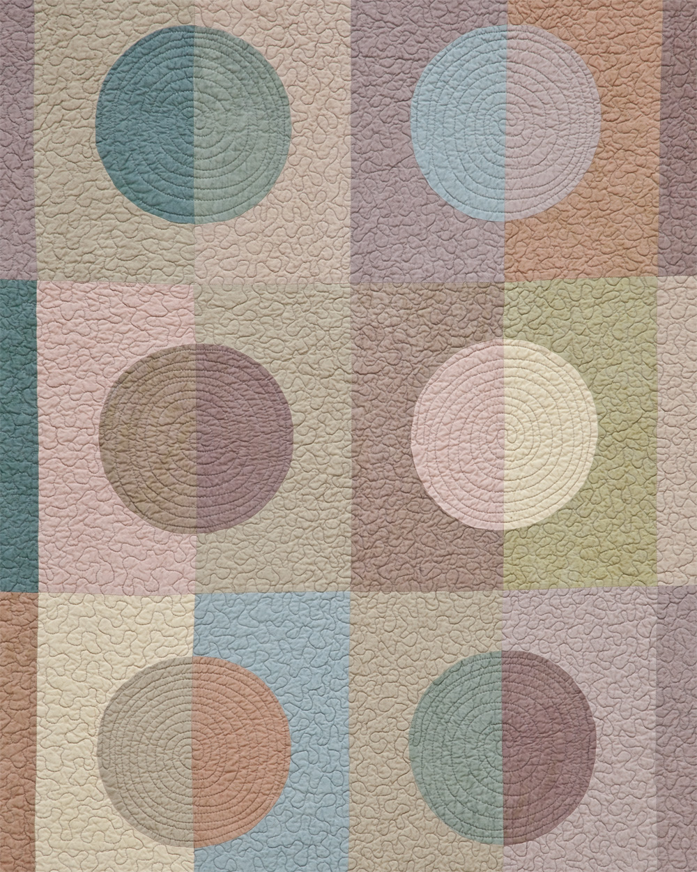
Many quilters associate quilting with individual blocks. They love a particular block pattern, so they make a lot of blocks from that pattern and sew them together to make a quilt top. We have always had a different method of designing. We focus less on the individual blocks than on the relationships among all the pieces of the quilt. Youll notice that some of the quilts in the book use block construction and others dont. Going back and forth between design, color theory, and construction is endlessly fascinating to us. It was through this interest that we began creating designs with pieces that, when viewed as a whole, give the illusion that one color is overlaid on another. We refer to these quilts collectively as transparency quilts.
In architecture, interior design, and product design in the past half century, there has been a focus on making materials seem lighter and more airy. Houses that used to be constructed from stone and wood can now be built as glass boxes that appear to float on the landscape. Televisions that used to be massive pieces of furniture are now thin enough to hold in the palm of your hand.
Similarly, the color options for quilting textiles were extremely limited until the mid-twentieth century. Advances in printing technology and textile production have given twenty-first-century quilters color choices unimaginable to previous generations of quiltmakers. Without such wide varieties of fabric available, we would never have been able to conceive of transparency quilts.
Making transparency quilts requires time to think about color in a new way. We hope this book will help you refine your understanding of color theory and give you a new perspective on how some of your favorite fabrics might be used in a new way. We also hope that you might rethink some of your assumptions about fabrics that may appear to lack potential but in fact can play an essential role in achieving the effect of transparency. Mostly, we hope this book will inspire you to take a little time to play with color options before you start your next project, because every project is an opportunity to learn something new.


UNDERSTANDING COLOR
The beauty of the concept of transparency is that it is not just a technique for a certain style of quiltmaking. Whether you love modern or traditional quilts, scrappy or understated palettes, theres a pattern that will work for the fabrics that you love to use.
To be able to select the fabrics that will achieve the look of transparency, youll need to understand the basics of color theory.
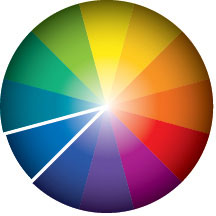
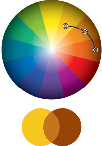
HUE is the technical term for color. A hue can be used to describe a group of colors, such as blues. On the color wheel above, the hues appear on the spokes.

VALUE describes the lightness or darkness of a hue. Understanding value is critical to being able to select the right fabrics for transparencies. The lightest value of each hue is at the center of the color wheel; the darkest value is at the outer edge. Weve divided the color wheel above into light, medium, and dark values of each hue.

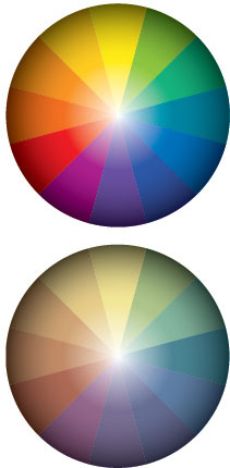
SATURATION is another way to describe the brightness of a hue. A saturated hue might be described as a bright blue while a less saturated blue might be called a dusty blue or a gray blue. The top color wheel shows saturated color in a value range from lights to darks. The bottom color wheel shows the same hues desaturated.

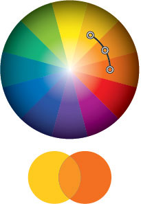
It is easiest to create believable transparencies by using fabrics of adjacent hues with similar values and saturations.

Successful transparencies can also be achieved with small differences in value and saturation.

What most often causes a transparency to fail is having one saturation or value that is far more intense, darker, or lighter than the others.

