PUBLISHER: Amy Marson CREATIVE DIRECTOR: Gailen Runge ART DIRECTOR / COVER DESIGNER: Kristy Zacharias EDITOR: Deb Rowden TECHNICAL EDITORS: Alison M. Schmidt and Susan Hendrickson BOOK DESIGNER: April Mostek PRODUCTION COORDINATORS: Jessica Jenkins and Jenny Davis PRODUCTION EDITOR: Joanna Burgarino ILLUSTRATORS: Amanda Murphy and Jessica Jenkins PHOTO ASSISTANT: Mary Peyton Peppo PHOTOGRAPHY by Diane Pedersen and Nissa Brehmer of C&T Publishing, Inc., unless otherwise noted Published by Stash Books, an imprint of C&T Publishing, Inc., P.O. Box 1456, Lafayette, CA 94549 I would like to thank ... the countless generations of quilters who have made the world a more beautiful place.  Acknowledgments Im not creative. Ive heard that from quilters countless times in classes I have both taught and taken.
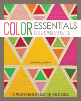
It simply isnt true. Quilters are some of the most creative people I have ever met. Whats more, many quilters have an instinctual feel for how to work with color that they have learned from working with fabricoften without even realizing it. Color EssentialsCrisp & Vibrant Quilts is about releasing the joy of the creative process to produce a handcrafted, truly unique work of artpossibly something you might have imagined as being beyond your ability to create. If you are a beginning quilter, Color EssentialsCrisp & Vibrant Quilts will help you learn the basic principles of working with combinations of different hues. Color EssentialsCrisp & Vibrant Quilts comes fast on the heels of my first book, Modern Holiday, and again Id like to thank Amy Marson, my editors Deb Rowden and Alison Schmidt, my designer April Mostek, and the wonderful staff at C&T Publishing for being so supportive of this book and the modern quilting community in general. Color EssentialsCrisp & Vibrant Quilts comes fast on the heels of my first book, Modern Holiday, and again Id like to thank Amy Marson, my editors Deb Rowden and Alison Schmidt, my designer April Mostek, and the wonderful staff at C&T Publishing for being so supportive of this book and the modern quilting community in general.
Robert Kaufman was my other special partner in this project. The companys wide range of solids and commitment to providing charm packs, roll-ups, and fat quarter bundles in varied hues make producing these projects in an infinite number of uniquely different color palettes both convenient and affordable. In fact, the Kona Sunrise and Sunset palettes were created specifically for this book. Both quilt shops and individuals will appreciate the fact that the projects can be produced with precuts plus a little added yardage for sashing, borders, and binding. Most projects are sewn in either the Sunrise, Sunset, or Bright palette, and in many projects I show examples of multiple palettes. The Pastel palette is also an option.
For large projects, digital mock-ups of four alternative palettes are also shown, to give you an idea of other color possibilities. As with the projects in Modern Holiday, all the projects presented in this book were sewn on a Bernina 580e, a wonderful sewing and embroidery machine with the unsurpassed stitch quality for which Bernina is known. Special thanks to Bernina of America and to Drusilla Munnell and the staff of Sew Much Fun, my local Bernina dealer and quilt shop in Lowell, North Carolina, who have provided enthusiastic support for all my creative endeavors in this industry. Aurifil, Sulky, the Warm Company, and Clover Needlecraft all provided their great products for these projects. You can find specifics about what I used in the project instructions and can reference company information in the Supplies/Source List section (). Finally, Id like to thank Deborah Norris of Deborahs Quilting in Gastonia, North Carolina.
Her free-form longarm work adds a special touch to projects, and you can see the details of that work especially well on these quilts made from solids. I find her quilting inspirational and I hope you do too. So lets get started experimenting with design and color through fabric ... A RAINBOW of Possibilities Unlock the mysteries of color with fabric!  Color, Color, Glorious Color! For many quilters, there is nothing more exciting than a pile of brightly colored fabrics. There are so many hues and an almost infinite number of ways to combine them! Freeing yourself of any preconceived notions about color allows you to discover different combinations and really push the creative envelope. Yet the unlimited possibilities can also be intimidating at times.
This book seeks to address these issues. As much as I love prints, I have always admired the graphic quality of antique quilts comprised of solids. The Amish were particularly adept at producing quilts with simple yet dynamic graphic qualities. Experimenting with solids results in a deep understanding of how color functions. It is my hope that you will be inspired to experiment with some of these projects and apply the knowledge and confidence you gain to future projects. We are so lucky to have the wide variety of fabrics that are available today.
In fact, it is the beautiful range of hues available that inspired Color EssentialsCrisp & Vibrant Quilts. I have worked closely with Robert Kaufman Fabrics to develop precut packages of fabric that allow you to experiment with color and produce projects that are affordable, individual, and beautiful. Lets Get Started ... Most quilters are familiar with the color wheel and its three primary colors of red, yellow, and blue, with the secondary colors of green, violet, and orange nestled in between. Tertiary colors comprise primary colors mixed with secondary colors. All the pure colors featured on a color wheel are referred to as hues.
Adding white to a hue produces a tint; adding black produces a shade. Colors directly across the color wheel from each other are referred to as complementary. (Interestingly, the darker colors we see in nature are usually reproduced by adding a touch of a complementary color to a specific hue, rather than by adding black.) Complementary colors can produce very lively and dynamic designs. Colors next to each other on the color wheel are referred to as analogous. Analogous palettes can be quite beautiful and restful. This color wheel is uniqueit shows how the available Kona palettes fit into the range of possible colors.
Look for more information on Kona palettes on . 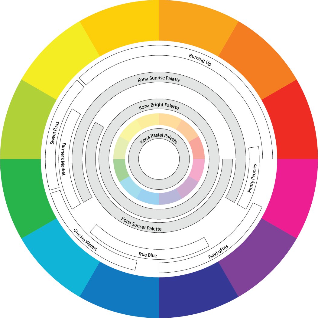 The color wheel and its Kona equivalents Color Schemes One way to start thinking about the possibilities of a quilts design is to consider a color palette that you might like to work with. Perhaps you would like to work with a warm palette of yellows, oranges, and maybe even a touch of pink or green?
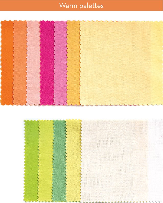
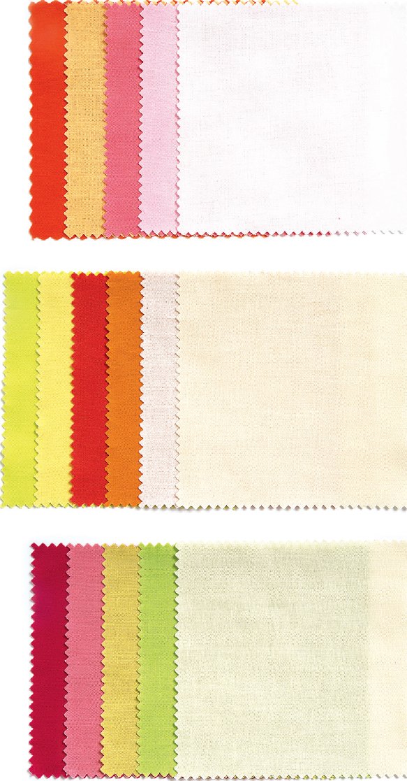 Or perhaps a cool palette might be more to your taste, with soft blues and cool purples? Note how pink and green tones can work with either a cool or warm palette. Colors arent always strictly warm or cool; it is how they work in combination with other colors that defines them. By choosing a light background that matches the general color scheme, you can create a soft look, as in
Next page




 Acknowledgments Im not creative. Ive heard that from quilters countless times in classes I have both taught and taken.
 Color, Color, Glorious Color! For many quilters, there is nothing more exciting than a pile of brightly colored fabrics. There are so many hues and an almost infinite number of ways to combine them! Freeing yourself of any preconceived notions about color allows you to discover different combinations and really push the creative envelope. Yet the unlimited possibilities can also be intimidating at times.
 The color wheel and its Kona equivalents Color Schemes One way to start thinking about the possibilities of a quilts design is to consider a color palette that you might like to work with. Perhaps you would like to work with a warm palette of yellows, oranges, and maybe even a touch of pink or green?
 Or perhaps a cool palette might be more to your taste, with soft blues and cool purples? Note how pink and green tones can work with either a cool or warm palette. Colors arent always strictly warm or cool; it is how they work in combination with other colors that defines them. By choosing a light background that matches the general color scheme, you can create a soft look, as in