Editor: Rebecca Kaplan
Designer: Jenny Volvovski
Production Manager: Denise LaCongo
Library of Congress Control Number: 2014942738
ISBN: 978-1-4197-1583-9
Text and photographs copyright 2015 Emily Schuman, except for the images listed on
Cover photography by Phoebe Dean
Published in 2015 by Abrams Image, an imprint of ABRAMS. All rights reserved. No portion of this book may be reproduced, stored in a retrieval system, or transmitted in any form or by any means, mechanical, electronic, photocopying, recording, or otherwise, without written permission from the publisher.
Abrams Image books are available at special discounts when purchased in quantity for premiums and promotions as well as fundraising or educational use. Special editions can also be created to specification. For details, contact specialsales@abramsbooks.com or the address below.

115 West 18th Street
New York, NY 10011
www.abramsbooks.com


Contents

THROUGHOUT MY LIFE, Ive walked the fine line of being a homebodynot quite reclusive, but just happiest when Im curled up on the sofa at home. This is no surprise, really, because Ive always believed that your home is one of the clearest reflections of who you are. If I didnt find it to be far-and-away the most comfortable place to be, something must be wrong.
That feeling of home isnt about the big gestures eitherthe curtains, the rugs, the side chairs, and couchesits about the well-loved books on the shelves, the tray for collecting keys on the table by the door, the smell of a familiar, much-loved dinner wafting out of the kitchen.
Im an incredibly nostalgic person; and I have very fond memories of the house that I grew up in. I visit my parents all the time and am always secretly thrilled that nothing ever changes: Theres no need to reset, or learn a new way. I still sit on the same stool at the kitchen counter while my dad cooks, marvel at the fog that rolls in each evening, and never tire of the James Taylor albums weve listened to countless times. It is wonderfully predictable, and it is home.
Growing up, my parents entertained all the timeas an only child, theyd let me pull a chair up to the table with their friends. Ultimately, I would fall asleep to the low hum of conversation. It wasnt just the music they played or the food they served, it was also about the people my parents invited in. It was a wonderfully complete world.
When my husband, Geoffrey, and I bought our first house late last year and set about assembling our first real home, the only thing we hoped to achieve was that same level of thoughtful and considered comfort. Sure, we hoped that our house would be beautiful, but more than that, we hoped that it would be our favorite place to be. This meant that while we could finally invest in a sofa that was the length and depth that wed always wanted, we couldnt obsess when one of our three beloved cats decided to take her claws to it; we wouldnt ban red wine from our dinner parties; we wouldnt fixate over the imperfections of our flea market finds.
Our home is all about balance: No single aesthetic overrides the space (its a mix of modern, vintage, and rustic), and no room skews too feminine or too masculine. We wanted a home that was serene and calm, but still playfulmuch like the outfits I wear, our home is classic with a bit of an edge... its not precious and its not too predictable. Were not trying to break new groundinstead weve focused solely on elevating the every day.
If youve spent time reading my blog, then youll know that we love to have people overfor game nights, for themed parties, and for casual dinners. We tend to believe that an evening is successful when at least half of our guests have kicked off their shoes and are sitting around the coffee table on the floor (after all, that means that at least your rug is cozy). The success of our parties is the litmus test for us on whether weve created a home thats as warm and inviting as we intended.
When I sat down to figure out what this book about home should be, I knew I wanted to document the care and decision-making that went into every room. But I also knew that I couldnt do it without devoting at least half of the pages to entertainingafter all, whats the point in pouring your heart into your house if you dont get to share it with the people you love most.
Welcome to my happy place.


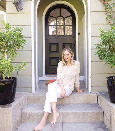
OUR HOUSE WAS BUILT IN 1916, and the original front door was still intact when we bought it, though it was painted an awkward color. Because we wanted to make a statementand we wanted our home to feel unified and considered from the startwe painted the door a glossy black to tie in other elements of the house, including the fireplace, then we placed flanking kumquat trees on either side of the doormat in black, glossy planters. This makes up for the fact that our house does not have a proper entryway, per sein fact, the front door opens onto a wide expanse that houses our living room on the right, our dining room on the left, and a view of the corner of our kitchen. Weirdly, even though L.A. is the land of perfect weather and the need for a coat closet and a place to stash wet shoes and umbrellas isnt exactly pressing, the lack of an entry hall or mudroom is actually kind of complicating. We really wanted to create a moment to mark the beginning of the house without blocking the flow of the space, either visually or physically. And, we wanted a place to stash the essentials.
Ultimately, when it came down to it, we had to reexamine what we considered to be essential and to counteract any tendencies to stash shoes and bags or procrastinate over opening our mail. Immediately to the left of the door, we placed a skinny little console table, a mirror (who wants to step out in the real world without checking their teeth for leftover lunch or stray lipstick?), and a ceramic dish that we got on our honeymoon in Italy. Its less than what we would have likedand less than we thought we could live withbut its actually been a helpful exercise in restraint.
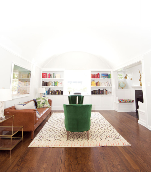
We brought the same sense of utility and economy to our living areas: a more formal seating area and fireplace nook near the door and a TV room thats adjacent to the kitchen. The former is a little bit more done, while the TV room is marked by what is perhaps the worlds most quicksand-like sofa (Geoffrey likes to joke that once Im down, Im out).
It took us a while to arrive at the right floor plans for both, since we wanted to turn both spaces into areas that we would actually use: Our house is not particularly large, and we dont have the luxury of only-for-special-occasions rooms, nor did we want those lifeless, dust-collecting zones in our home. We really wanted to maximize every square inch.
Next page
