Color
A Photographers Guide to Directing the Eye, Creating Visual Depth, and Conveying Emotion
Jerod Foster
COLOR: A Photographers Guide to Directing the Eye, Creating Visual Depth, and Conveying Emotion
Jerod Foster
Peachpit Press
www.peachpit.com
To report errors, please send a note to
Peachpit Press is a division of Pearson Education
Copyright 2014 Jerod Foster
Senior Editor: Susan Rimerman
Senior Production Editor: Lisa Brazieal
Developmental/Copy Editor: Peggy Nauts
Proofreader: Bethany Stough
Indexer: Emily Glossbrenner
Interior Design and Composition: Kim Scott/Bumpy Design
Cover Design: Charlene Will
Cover Image: Jerod Foster
Notice of Rights
All rights reserved. No part of this book may be reproduced or transmitted in any form by any means, electronic, mechanical, photocopying, recording, or otherwise, without the prior written permission of the publisher. For information on getting permission for reprints and excerpts, contact .
Notice of Liability
The information in this book is distributed on an As Is basis, without warranty. While every precaution has been taken in the preparation of the book, neither the author nor Peachpit shall have any liability to any person or entity with respect to any loss or damage caused or alleged to be caused directly or indirectly by the instructions contained in this book or by the computer software and hardware products described in it.
Trademarks
Many of the designations used by manufacturers and sellers to distinguish their products are claimed as trademarks. Where those designations appear in this book, and Peachpit was aware of a trademark claim, the designations appear as requested by the owner of the trademark. All other product names and services identified throughout this book are used in editorial fashion only and for the benefit of such companies with no intention of infringement of the trademark. No such use, or the use of any trade name, is intended to convey endorsement or other affiliation with this book.
ISBN-13: 978-0-321-93528-1
ISBN-10: 0-321-93528-4
9 8 7 6 5 4 3 2 1
Printed and bound in the United States of America
To my wife and hero, Amanda Waters Foster.
I love you and all the color you bring to my life!
Acknowledgments
A great number of people come together to produce a book like this, and for each of them, Im truly thankful!
Specifically, I would like to thank Ted Waitt for commissioning this project. Our conversations over breakfast at Photoshop World brought it to life. Thanks to Susan Rimerman for once again guiding the writing and construction of the content in the direction needed. Thanks also to copy editor Peggy Nauts and proofreader Bethany Stough, who continually make my jumble of words not only readable but much more eloquent than this Texan can express.
Many thanks to the design team of Charlene Charles Will and Kim Scott, who, in following their normal protocol, have created a great-looking book. Thanks to Lisa Brazieal for making all these images look their best alongside the words.
Many thanks also go to others at Peachpit for their work in marketing my books for the past couple of years, including Scott Cowlin, Sara Jane Todd, and publisher Nancy Aldrich-Ruenzel. To the people at Peachpit I have worked with and met over the years, thank you for your friendship, most of all.
Im very fortunate to not only be a photographer but to also teach photography at Texas Tech University. Thank you especially to the faculty of the College of Media and Communication, and specifically to Dean Jerry Hudson, Ph.D., Dean David Perlmutter, Ph.D., and Todd Chambers, Ph.D., for your continued support in my pursuit of my professional and academic interests.
I most certainly could not have put this project together without the support of those closest to me. I cant thank enough my lovely wife, Amanda, and my ever-curious daughter, Eva, for their patience and comical relief during this process. Thanks also to my parents, Jay and Marsha, for their devotion to my work throughout my life.
To all those I have missed, please know that your support over the years is inspiring and Im grateful for it. Thank you.
Contents
Introduction
Growing up, I was in love with magazines. I suppose it was the combination of high-quality writing and imagery, the glossy pages, and the booklike heft of the publications. Like many photographers-to-be, I was drawn to the storytelling qualities of National Geographic , but the yellow-bordered publication wasnt the first to catch my eye. Im not afraid to admit that the magazine that attracted me as a youngster was the one and only Popular Mechanics . I fondly remember visiting my grandparents ranch in central Texas, running out to the car shed, and pulling multiple back issues from a dusty shelfissues that may have sat there for a couple of years before I got to them. I would spend hours looking at the diagrams and the images, occasionally reading a feature on a vehicle manufacturing facility or a how-to piece on building the perfect shop desk. For an eight-year-old who was into airplanes, classic cars, and inventions, it was the perfect magazine. I was (am still) a bit nerdy, to be honest.

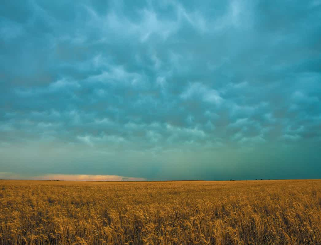
ISO 50, 1 sec., f/11, 17mm lens
One thing I picked up early on from my influences and mentors was to pay attention to unique color, such as this electric-blue thunderstorm moving over a West Texas wheat field.
However, I also remember the magazine having very colorful and exciting covers. To this day, when Im asked about my attraction to magazine photography, I have to say that I was influenced by the eye-grabbing color of Popular Mechanics covers. Over the years, my appreciation for color in photographs, cinema, and design has only grown, and its no wonder why.
As the following text highlights, color is a big deal. It always has been, and it always will be. I was fortunate early on in my photography career to have the chance to build some close relationships with photographers known for their ability to capture outstanding light and the resulting color. Photographers like Wyman Meinzer and Earl Nottingham, to name a couple, were very influential in how I actually looked at light and the colors it created, how colors played out compositionally in a frame, and especially how they emotionally affected viewers. Their work, along with others, showed me just how powerful color might be in my own work.
This book, Color , originated in the classroom. Even though I recognized the power of color in photography and sought it in my work, I never felt like I was giving it its due in the introductory photography courses I teach at Texas Tech University. We discussed what color means, but I largely relied on the students studying of other photographers work and our discussions on great light to inform them about seeing color. I eventually decided that color had to become a more important piece of the photography pie we were creating in those early courses. And so, it did. Taking cues from visual and color theory, as well as from personal experiences and conversations with other photographers and editors, I began to lecture on color in depth, from both mechanical and interpretive perspectives. In creating these lectures, I started to fully realize just how essential of a component color was to my own photography and how I used it in conjunction with other techniques and facets of image making. I wanted my students to see color around them and learn how to take advantage of it, using it to create interesting, storytelling images.


