Kyran Dale - Data Visualization on the Web with Python and Javascript, 2nd Edition
Here you can read online Kyran Dale - Data Visualization on the Web with Python and Javascript, 2nd Edition full text of the book (entire story) in english for free. Download pdf and epub, get meaning, cover and reviews about this ebook. year: 2022, publisher: OReilly Media, Inc., genre: Home and family. Description of the work, (preface) as well as reviews are available. Best literature library LitArk.com created for fans of good reading and offers a wide selection of genres:
Romance novel
Science fiction
Adventure
Detective
Science
History
Home and family
Prose
Art
Politics
Computer
Non-fiction
Religion
Business
Children
Humor
Choose a favorite category and find really read worthwhile books. Enjoy immersion in the world of imagination, feel the emotions of the characters or learn something new for yourself, make an fascinating discovery.
- Book:Data Visualization on the Web with Python and Javascript, 2nd Edition
- Author:
- Publisher:OReilly Media, Inc.
- Genre:
- Year:2022
- Rating:4 / 5
- Favourites:Add to favourites
- Your mark:
- 80
- 1
- 2
- 3
- 4
- 5
Data Visualization on the Web with Python and Javascript, 2nd Edition: summary, description and annotation
We offer to read an annotation, description, summary or preface (depends on what the author of the book "Data Visualization on the Web with Python and Javascript, 2nd Edition" wrote himself). If you haven't found the necessary information about the book — write in the comments, we will try to find it.
Kyran Dale: author's other books
Who wrote Data Visualization on the Web with Python and Javascript, 2nd Edition? Find out the surname, the name of the author of the book and a list of all author's works by series.
Data Visualization on the Web with Python and Javascript, 2nd Edition — read online for free the complete book (whole text) full work
Below is the text of the book, divided by pages. System saving the place of the last page read, allows you to conveniently read the book "Data Visualization on the Web with Python and Javascript, 2nd Edition" online for free, without having to search again every time where you left off. Put a bookmark, and you can go to the page where you finished reading at any time.
Font size:
Interval:
Bookmark:
by Kyran Dale
Copyright 2023 Kyran Dale Limited. All rights reserved.
Published by OReilly Media, Inc. , 1005 Gravenstein Highway North, Sebastopol, CA 95472.
OReilly books may be purchased for educational, business, or sales promotional use. Online editions are also available for most titles (http://oreilly.com). For more information, contact our corporate/institutional sales department: 800-998-9938 or corporate@oreilly.com .
- Acquisitions Editor: Michelle Smith
- Development Editor: Shira Evans
- Production Editor: Greg Hyman
- Interior Designer: David Futato
- Cover Designer: Karen Montgomery
- Illustrator: Kate Dullea
- July 2016: First Edition
- December 2022: Second Edition
- 2021-09-29: First Release
See http://oreilly.com/catalog/errata.csp?isbn=9781098111878 for release details.
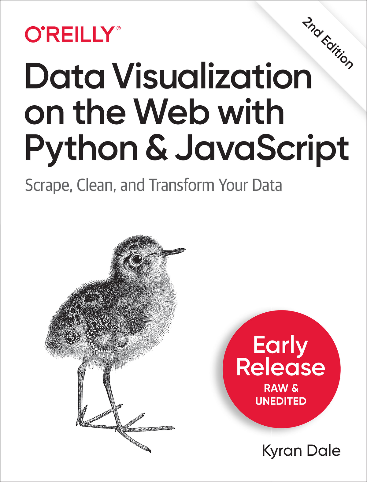
The OReilly logo is a registered trademark of OReilly Media, Inc. Data Visualization on the Web with Python and JavaScript, the cover image, and related trade dress are trademarks of OReilly Media, Inc.
While the publisher and the author have used good faith efforts to ensure that the information and instructions contained in this work are accurate, the publisher and the author disclaim all responsibility for errors or omissions, including without limitation responsibility for damages resulting from the use of or reliance on this work. Use of the information and instructions contained in this work is at your own risk. If any code samples or other technology this work contains or describes is subject to open source licenses or the intellectual property rights of others, it is your responsibility to ensure that your use thereof complies with such licenses and/or rights.
978-1-098-11180-9
With Early Release ebooks, you get books in their earliest formthe authors raw and unedited content as they writeso you can take advantage of these technologies long before the official release of these titles.
This will be the 10th chapter of the final book.
If you have comments about how we might improve the content and/or examples in this book, or if you notice missing material within this chapter, please reach out to the editor at .
As a data visualizer, one of the best ways to come to grips with your data is to visualize it interactively, using the full range of charts and plots that have evolved to summarize and refine datasets. Conventionally, the fruits of this exploratory phase are then presented as static figures, but increasingly they are used to construct more engaging interactive web-based charts, such as the cool D3 visualizations you have probably seen (one of which well be building in [Link to Come]).
Pythons Matplotlib and its family of extensions (such as the statistically focused Seaborn) form a mature and very customizable plotting ecosystem. Matplotlib plots can be used interactively by IPython (the Qt and Notebook versions), providing a very powerful and intuitive way of finding interesting nuggets in your data. In this chapter well introduce Matplotlib and one of its great extensions, Seaborn.
Matplotlib can be more than a little confusing, especially if you start randomly sampling examples online. The main complicating factor is that there are two main ways to create plots, which are similar enough to be confused but different enough to lead to a lot of frustrating errors. The first way uses a global state machine to interact directly with Matplotlibs pyplot module. The second, object-oriented approach uses the more familiar notion of figure and axes classes to provide a programmatic alternative. Ill clarify their differences in the sections ahead, but as a rough rule of thumb, if youre working interactively with single plots, pyplots global state is a convenient shortcut. For all other occasions, it makes sense to explicitly declare your figures and axes using the object-oriented approach.
We will be using a Jupyter notebook for our interactive visualization. Use the following command to start a session:
$ jupyter notebookYou can then use one of the
%matplotlib [qt | osx | wx ...]To get inline graphics in the Notebook or Qt console, you can use the inline directive. Note that with inline plots, you cant amend them after creation, unlike the standalone Matplotlib window:
Whether you are using Matplotlib interactively or in Python programs, youll use similar imports:
importnumpyasnpimportpandasaspdimportmatplotlib.pyplotaspltYou will find many examples of Matplotlib using pylab. Pylab is a convenience module that bulk-imports matplotlib.pyplot (for plotting) and NumPy in a single namespace. Pylab is pretty much deprecated now, but even were it not, Id still recommend avoiding this namespace and merging and importing pyplot and numpy explicitly.
While NumPy and Pandas are not mandatory, Matplotlib is designed to play well with them, handling NumPy arrays and, by association, Pandas Series.
The ability to create inline plots is key to enjoyable interaction with Matplotlib, and we achieve this in IPython with the following magic injunction:
In [0]: %matplotlib inlineYour Matplotlib plots will now be inserted into your IPython workflow. This works with Qt and Notebook versions. In the Notebooks, the plots are incorporated into the active cell.
In inline mode, after an IPython cell or (multi-line) input has been run, the drawing context is flushed. This means you cannot change the plot from a previous cell or input using the gcf (get current figure) method but have to repeat all the plot commands with any additions or amendments in a new input/cell.
This is intended for use in interactive data exploration and is best when you are creating simple plots, usually containing single figures. pyplot is convenient and many of the examples youll see use it, but for more complex plotting Matplotlibs object-oriented API (which well see shortly) comes into its own. Before demoing use of the global plot, lets create some random data to display, courtesy of Pandas useful period_range method:
fromdatetimeimportdatetimex=pd.period_range(datetime.now(),periods=200,freq='d')Creates a Pandas datetime index with 200 day (d) elements, starting from the current time (datetime.now()).
Converts datetime index to Python datetimes.
Creates three 200-element random arrays summed along the 0 axis.
Font size:
Interval:
Bookmark:
Similar books «Data Visualization on the Web with Python and Javascript, 2nd Edition»
Look at similar books to Data Visualization on the Web with Python and Javascript, 2nd Edition. We have selected literature similar in name and meaning in the hope of providing readers with more options to find new, interesting, not yet read works.
Discussion, reviews of the book Data Visualization on the Web with Python and Javascript, 2nd Edition and just readers' own opinions. Leave your comments, write what you think about the work, its meaning or the main characters. Specify what exactly you liked and what you didn't like, and why you think so.

