• Complain

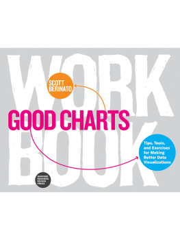
Scott Berinato - Good Charts: The HBR Guide to Making Smarter, More Persuasive Data Visualizations

Here you can read online Scott Berinato - Good Charts: The HBR Guide to Making Smarter, More Persuasive Data Visualizations full text of the book (entire story) in english for free. Download pdf and epub, get meaning, cover and reviews about this ebook. year: 2016, publisher: Harvard Business Review Press, genre: Home and family. Description of the work, (preface) as well as reviews are available. Best literature library LitArk.com created for fans of good reading and offers a wide selection of genres:

Romance novel Science fiction Adventure Detective Science History Home and family Prose Art Politics Computer Non-fiction Religion Business Children Humor

Choose a favorite category and find really read worthwhile books. Enjoy immersion in the world of imagination, feel the emotions of the characters or learn something new for yourself, make an fascinating discovery.

Scott Berinato Good Charts: The HBR Guide to Making Smarter, More Persuasive Data Visualizations
  • Book:
    Good Charts: The HBR Guide to Making Smarter, More Persuasive Data Visualizations
  • Author:
  • Publisher:
    Harvard Business Review Press
  • Genre:
  • Year:
    2016
  • Rating:
    3 / 5
  • Favourites:
    Add to favourites
  • Your mark:
    • 60
    • 1
    • 2
    • 3
    • 4
    • 5

Good Charts: The HBR Guide to Making Smarter, More Persuasive Data Visualizations: summary, description and annotation

We offer to read an annotation, description, summary or preface (depends on what the author of the book "Good Charts: The HBR Guide to Making Smarter, More Persuasive Data Visualizations" wrote himself). If you haven't found the necessary information about the book — write in the comments, we will try to find it.

Datavizthe new language of business
A good visualization can communicate the nature and potential impact of information and ideas more powerfully than any other form of communication.
For a long time dataviz was left to specialistsdata scientists and professional designers. No longer. A new generation of tools and massive amounts of available data make it easy for anyone to create visualizations that communicate ideas far more effectively than generic spreadsheet charts ever could.
Whats more, building good charts is quickly becoming a need-to-have skill for managers. If youre not doing it, other managers are, and theyre getting noticed for it and getting credit for contributing to your companys success.
In Good Charts, dataviz maven Scott Berinato provides an essential guide to how visualization works and how to use this new language to impress and persuade. Dataviz today is where spreadsheets and word processors were in the early 1980son the cusp of changing how we work. Berinato lays out a system for thinking visually and building better charts through a process of talking, sketching, and prototyping.
This book is much more than a set of static rules for making visualizations. It taps into both well-established and cutting-edge research in visual perception and neuroscience, as well as the emerging field of visualization science, to explore why good charts (and bad ones) create feelings behind our eyes. Along the way, Berinato also includes many engaging vignettes of dataviz pros, illustrating the ideas in practice.
Good Charts will help you turn plain, uninspiring charts that merely present information into smart, effective visualizations that powerfully convey ideas.
Good Chartsplays the role of a helpful data visualization manual to turn to when you are starting a data visualization project or stuck on a specific data visualization problem.
VIEW magazine

Scott Berinato: author's other books


Who wrote Good Charts: The HBR Guide to Making Smarter, More Persuasive Data Visualizations? Find out the surname, the name of the author of the book and a list of all author's works by series.

Good Charts: The HBR Guide to Making Smarter, More Persuasive Data Visualizations — read online for free the complete book (whole text) full work

Below is the text of the book, divided by pages. System saving the place of the last page read, allows you to conveniently read the book "Good Charts: The HBR Guide to Making Smarter, More Persuasive Data Visualizations" online for free, without having to search again every time where you left off. Put a bookmark, and you can go to the page where you finished reading at any time.

Light

Font size:

Reset

Interval:

Bookmark:

Make

GOOD
CHARTS

A NOTE ON THE EBOOK EDITION

This ebook edition of GOOD CHARTS: THE HBR GUIDE TO MAKING SMARTER, MORE PERSUASIVE DATA VISUALIZTIONS displays best on a color e-reader with Original or Publisher Font selected, using the Scrolling View option if it is available on your device.

HBR Press Quantity Sales Discounts

Harvard Business Review Press titles are available at significant quantity discounts. Special editions, including books with corporate logos, customized covers, and letters from the company or CEO printed in the front matter, as well as excerpts of existing books, can also be created in large quantities for special needs.

For details and discount information for both print and ebook formats, contact , tel. 800-988-0886, or www.hbr.org/bulksales.

Copyright 2016 Harvard Business School Publishing Corporation
All rights reserved

No part of this publication may be reproduced, stored in or introduced into a retrieval system, or transmitted, in any form, or by any means (electronic, mechanical, photocopying, recording, or otherwise), without the prior permission of the publisher. Requests for permission should be directed to , or mailed to Permissions, Harvard Business School Publishing, 60 Harvard Way, Boston, Massachusetts 02163.

The web addresses referenced in this book were live and correct at the time of the books publication but may be subject to change.

Library of Congress Cataloging-in-Publication Data

Names: Berinato, Scott, author.

Title: Good charts : the HBR guide to making smarter, more persuasive data visualizations / by Scott Berinato.

Description: Boston, Massachusetts : Harvard Business Review Press, [2016]

Identifiers: LCCN 2015046676 (print) | LCCN 2016002607 (ebook) | ISBN 9781633690707 (paperback) | ISBN 9781633690714 ( )

Subjects: LCSH: Business presentationsCharts, diagrams, etc. | Visual communication. | Communication in management. | BISAC: BUSINESS & ECONOMICS / Business Communication / Meetings & Presentations. | BUSINESS & ECONOMICS / Business Communication / General. | BUSINESS & ECONOMICS / Strategic Planning.

Classification: LCC HF5718.22 .B475 2016 (print) | LCC HF5718.22 (ebook) | DDC 658.4/52dc23

LC record available at http://lccn.loc.gov/2015046676

ISBN: 978-1-63369-070-7
eISBN: 978-1-63369-071-4

CONTENTS INTRODUCTION A NEW LANGUAGE AND A NECESSARY CRAFT for there is - photo 1

CONTENTS

INTRODUCTION

A NEW LANGUAGE AND A NECESSARY CRAFT

... for there is nothing either good or bad, but thinking makes it so.

Shakespeare

IN A WORLD governed by data, in knowledge economies where ideas are currency, visualization has emerged as our shared language. Charts, graphs, maps, diagramseven animated GIFs and emojisall transcend text, spoken languages, and cultures to help people understand one another and connect. This visual language is used everywhere in the world, every day.

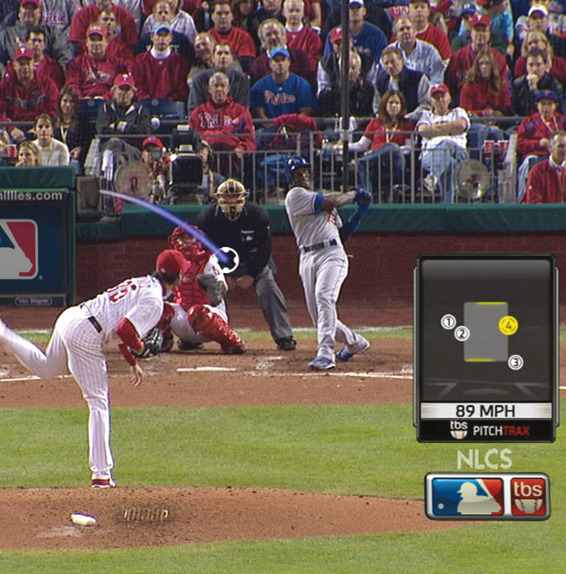
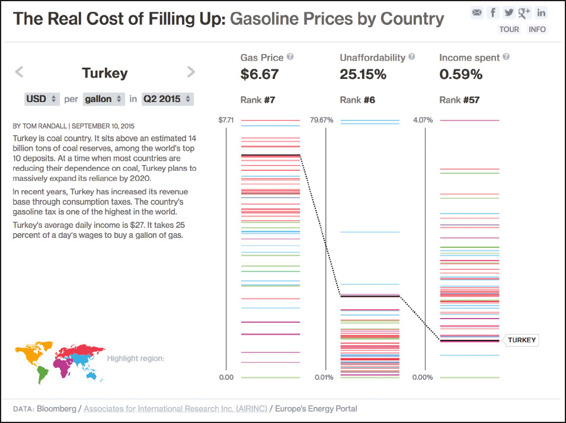
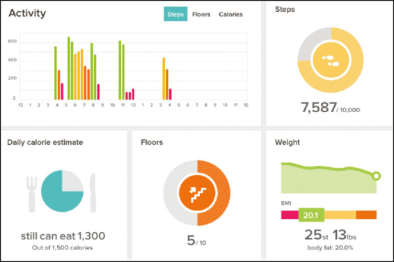
Dashboard maps in cars help commuters avoid the thick red lines of heavy traffic and find the kelly green routes where traffic is light. Weather apps use iconography and rolling trend lines to make forecasts accessible at a glance. Fitness-tracking apps default to simple charts that show steps taken, sleep patterns, eating habits, and more. Utility company bills include charts so consumers can see how their energy use compares with their neighbors. Newspapers, magazines, and websites all use visualization to attract audiences and tell complex stories. The social web teems with data visualizationssome practical, some terrible, some rich with insight, some simply fun to look atall vying to go viral. Sports broadcasts superimpose visual data on live action, from first-down lines on a football field to more sophisticated pitch-sequence diagrams and spray charts that show a baseballs trajectory and expose pitching and hitting trends.

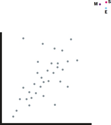
Data visualization is everywhere from live sports to the news to fitness apps - photo 2

Data visualization is everywhere from live sports to the news to fitness apps - photo 3

Data visualization is everywhere from live sports to the news to fitness apps - photo 4

Data visualization is everywhere, from live sports to the news to fitness apps.

You may not notice all the ways in which dataviz has seeped into your daily life, but you have come to expect it. Even if you think you cant speak this language, you hear it and understand it every day.

Its time to learn to speak it, too. Just as the consumerization of technology adoption and the widespread use of social media changed business, the ubiquity of dataviz in our lives is driving demand for good charts in unit meetings, sales presentations, customer research reports, performance reviews, entrepreneurs pitches, and all the way up to the boardroom. Increasingly, when an executive sees a line chart thats been spit out of Excel and pasted into a presentation, she wonders why it doesnt look more like the simple, beautiful charts on her fitness-tracker app. When a manager spends time trying to parse pie charts and donut charts and multiple trend lines on a company dashboard, he wonders why they dont look as nice or feel as easily understood as his weather app.

BUSINESSS NEW LINGUA FRANCA

Speaking this new language requires us to adopt a new way of thinking visual thinking that is evolving quickly in business. Making good charts isnt a special or a nice-to-have skill anymore; its a must-have skill. If all you ever do is click a button in Excel or Google Charts to generate a basic chart from some data set, you can be sure that some of your colleagues are doing more and getting noticed for it. No company today would hire a manager who cant negotiate the basics of a spreadsheet; no company tomorrow will hire one who cant think visually and produce good charts.

Dataviz has become an imperative for competitive companies. Those that dont have a critical mass of managers capable of thinking visually will lag behind the ones that do. Vincent Lebunetel is the vice president of innovation at Carlson Wagonlit Travel, which invests in hiring and training information designers. He says that business managers and leaders who cant create clear visualizations are just less valuable: If youre not able to make your message simple and accessible, you probably dont own your topic well enough. And visualization is probably the best way to help people grasp information efficiently.

After a group at Accenture Technology Labs produced visualizations of NBA team shooting patterns that went viral, its consultants started asking the group for help producing charts that would produce a similar visceral reaction in their own clients. So Accenture built an online and in-person visual literacy curriculum for them. The VLC has been so effective internally that Accenture is making the curriculum a client service and developing a visualization career track for its consultants.

Daryl Morey, the general manager of the NBAs Houston Rockets, puts it plainly: Everyone in our business knows they need to visualize data, but its easy to do it poorly. We invest in it. Were excited if we can use it right while they use it wrong.

So whats right, and whats wrong?

WHATS A GOOD CHART?

The rise of visualization has generated numerous opinions about how to do it rightand harsh judgment of charts that get it wrong. Missing from most attempts to establish rules are an overarching view of what it means to think visually and a framework and repeatable process for constructing good charts.

Next page
Light

Font size:

Reset

Interval:

Bookmark:

Make

Similar books «Good Charts: The HBR Guide to Making Smarter, More Persuasive Data Visualizations»

Look at similar books to Good Charts: The HBR Guide to Making Smarter, More Persuasive Data Visualizations. We have selected literature similar in name and meaning in the hope of providing readers with more options to find new, interesting, not yet read works.


Reviews about «Good Charts: The HBR Guide to Making Smarter, More Persuasive Data Visualizations»

Discussion, reviews of the book Good Charts: The HBR Guide to Making Smarter, More Persuasive Data Visualizations and just readers' own opinions. Leave your comments, write what you think about the work, its meaning or the main characters. Specify what exactly you liked and what you didn't like, and why you think so.