It is common knowledge that nothing may be judged for its exterior appearance, that the content is more important than the container and that a good product does not need a good packaging so that the client recognizes its excellent qualities. Beyond the clich which we have been bombarded with since our youth, when we used to press our noses against the window display of our first known toy store, this peculiar belief reveals a conception of reality, a vital philosophy if you prefer, that denies its human nature. It is the philosophy that has led us to this absurd aesthetic elitism that defends atonal music, windowless houses like antinuclear bunkers, subjective and incoherent literature, abstract art and other similar masochistic pleasures. The first teaching that can be extracted from this philosophy is what deals with aesthetics and what is pleasant as well as rational, needs to give way to the bizarre, disturbing and irrational. One might have in mind at this very moment a specific example of nonsensical design that fits this definition: a sofa that resembles more of an Iron Lady than a warm and soft object able to accommodate a body; a pair of shoes that seem to be designed for the claws of a platypus rather than for the feet of a human being; or, getting to the subject, a tag, work of some fanatic religious Order of Horrendous Minimalism. The second teaching of this philosophy is that people and things enjoy a magic essence or soul that cannot be detected by means of external signs or pure aesthetics.
So, lets focus on objective elements. This explains the need for (very expensive) experts in art, in politics and in psychology who unravel for us, unfortunate mortals, what we should buy, see, listen or vote. So now you know: before you purchase a book just by reading the synopsis, the authors biography and the graphics on the cover, read it. Beginning to end. Right there and then. In the bookstore (watch for the shop clerk; the kids will get dinner ready).
Then, only then you should buy it. But if you dont have time to read all the books in the store, hire an expert. In fact, if anyone has invested a few hours of their life in designing packaging or tags for a particular product, it is possible (not certain but possible) that a proportionally similar number of hours could have been spent into the actual product. Similarly, someone who has neglected the design of the container might have also neglected that of the content. Those who are in favor of not judging by the cover will say that anyone with some knowledge about human psychology could spend a few hours on the design of the container and none to the product knowing that it is likely that all will go well thanks to our tendency to trust exterior appearances. The truth is that the probability that someone dedicates 10 hours on the container of the product and just one on its particular design is irrelevant compared with the probability that someone who has spent 10 hours thinking on the container will also spend 10 hours, if not more, to its content.
This means that the label counts. This book features more than 300 tags and bags designed by some of the best brands and international design agencies of our time. The text has been divided into three chapters: Bags, tags and labels. Tag should be understood as any identifying or promotional element in paper, plastic, fabric or other material that provides information about the content, the origin, the composition or the use of an object to which it is attached. I understand tags as any graphic design which purpose is that mentioned above, regardless of whether it adopts the form of an object separated from the product or it has been printed on the packaging. In the chapter on labels, I have included all those identifying or promotional elements that have not been glued or stitched on the product, but rather hang from it by means of ribbons, strings, chains or any other similar solutions.
The difference, in any case, is purely theoretical, given that in common practice a plain sticker glued to a particular product given as a present to a client could serve as a label for the brand, whether it swings or not. In the back of the book, I have included a directory with the names, the websites and contact information of the more than 60 designers and design agencies included in the volume. I have also included the contact information of the brands that have their own design department.
Whether they are made of paper, plastic, cardboard or fabric, the bags included in this chapter are representations of the latest trends in the graphic design field and achieve to perfection the double commitment for which they were created: First, to appear as visually attractive as the product they contain. Secondly, to become an object of desire in and of themselves, mobile advertising panels which the consumers will carry around the streets of their city. Then they inadvertently get transformed into the brands best commercials.
The GYG typography created by The Creative Method, the contrast between the black and white photographs and the yellow logo and the texts in Spanish reinforce the feeling of being in Mexico and provide the brand with authenticity. 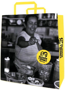 To-go bag with yellow handles. Design by Tony Ibbotson, Andy Yanto and Mayra Minobe of The Creative Method for the fast food Mexican brand Guzman y Gomez.
 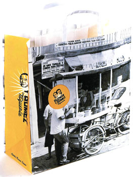 Bag with white handles by The Creative Method for Guzman y Gomez. The sticker to close the to-go paper bags from Guzman y Gomez symbolizes the Mexico sun.
 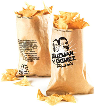 Paper bag for nachos by Tony Ibbotson, Andy Yanto and Mayra Minobe of The Creative Method for Guzman y Gomez.
 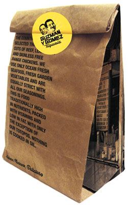 To-go bag and closing sticker designed by The Creative Method for Guzman y Gomez.
  To-go bag and closing sticker designed by The Creative Method for Guzman y Gomez.
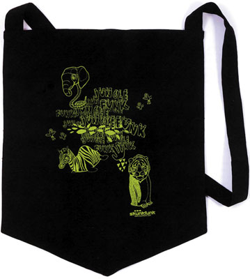
In summer 2005, the six lines of the French brand KanaBeach were reorganized into three: Biologik (natural materials), Circus (urban fashion) and Elegant (night). The three bags on this page have been designed as promotional elements of the three lines. 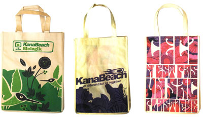 Promotional fabric bags designed by KanaBeach.
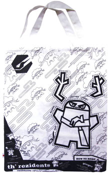
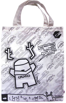
 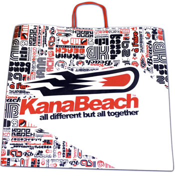 Paper bag by KanaBeach. Available in two different sizes at the brands stores. Th Rezidents is the name of a line of 13 characters designed for the Japanese brand of urban fashion Ooito Japan.
The character printed on the bag can be cut out and made into a rag doll. The instructions are printed on the bag. 


 Whether they are made of paper, plastic, cardboard or fabric, the bags included in this chapter are representations of the latest trends in the graphic design field and achieve to perfection the double commitment for which they were created: First, to appear as visually attractive as the product they contain. Secondly, to become an object of desire in and of themselves, mobile advertising panels which the consumers will carry around the streets of their city. Then they inadvertently get transformed into the brands best commercials.
  To-go bag with yellow handles. Design by Tony Ibbotson, Andy Yanto and Mayra Minobe of The Creative Method for the fast food Mexican brand Guzman y Gomez.
  Bag with white handles by The Creative Method for Guzman y Gomez. The sticker to close the to-go paper bags from Guzman y Gomez symbolizes the Mexico sun.
  Paper bag for nachos by Tony Ibbotson, Andy Yanto and Mayra Minobe of The Creative Method for Guzman y Gomez.
  To-go bag and closing sticker designed by The Creative Method for Guzman y Gomez.
  Promotional fabric bags designed by KanaBeach.
  Paper bag by KanaBeach. Available in two different sizes at the brands stores. Th Rezidents is the name of a line of 13 characters designed for the Japanese brand of urban fashion Ooito Japan.