 Laurence King Publishing Ltd 361373 City Road London EC1V 1LR United Kingdom Tel: + 44 20 7841 6900 Fax: + 44 20 7841 6910 e-mail: www.laurenceking.com text and design 2012 Roger Fawcett-Tang This book was produced by Laurence King Publishing Ltd, London Roger Fawcett-Tang has asserted his right under the Copyright, Designs and Patent Act 1988 to be identified as the Author of this Work. All rights reserved. No part of this publication may be reproduced or transmitted in any form or by any means, electronic or mechanical, including photocopy, recording or any information storage and retrieval system, without prior permission in writing from the publisher. A catalogue record for this book is available from the British Library ISBN: 978-1-78067-003-4 Design: Roger Fawcett-Tang, Struktur Design Printed in China For Malcolm, the king of numbers DN 777
Addition
Data
Order
Chronology
Abstraction
Form
Multiplication
SubtractionAppendix
Rules+Detailing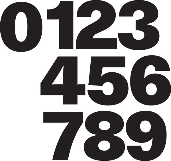 0123456789 these ten digits have a universal appeal among designers; they are multilingual, universally understood, varied in form, highly adaptable and yet still instantly recognizable since each of the ten characters has its own strong and unique identity. Numbers in Graphic Design focuses on how graphic designers tackle the ordering of number-heavy information, from timetables to annual reports and other data-rich documents through to highly creative and playful typographic experiments exploring the most abstract notion of numeric information. Addition showcases a variety of timelines both within exhibition graphics and on the printed page, and how a timeframe can help to organize variable data such as illustrations, objects, interactive media and the written word. Data looks at a wide variety of information graphics. Data looks at a wide variety of information graphics.
While numbers are not always the hero of design, they do form the foundations and structure of all the illustrated design systems. Order features timetables for bus, train and tram networks plus a wide variety of events listings and schedules, highlighting both the day-to-day practicals of clear tabulated typography and the more expressive solutions. Chronology focuses on time: from calendars and diaries to watches and various screen-based solutions to charting and expressing the passage of seconds, minutes and hours. Abstraction reveals a variety of creative directions in which numerals can be expressed, and how far the typographic forms can be pushed while still mantaining the essence of the character. Vernacular typographic solutions show numeric forms found in the everyday. Multiplication navigates its way around signage and wayfinding systems within architecture, and also illustrates super-sized numbers on the printed page, adding a sense of epic scale to both structure and content. Multiplication navigates its way around signage and wayfinding systems within architecture, and also illustrates super-sized numbers on the printed page, adding a sense of epic scale to both structure and content.
Finally, Subtraction looks at how far the number can be simplified while mantaining legibility doing much more with far less. When recently asked me what my favourite number was, I replied it depends on the font; I love all ten of them. Numbers have a great power to convey highly detailed information in a clear and logical manner be it complex timetables or annual reports. They can also help navigate you around a building or the pages of a book. AdditionTimelinesCounting methods 01.1.1 Timelines: Three-dimensional realization A three-dimensional timeline extends the length of the gallery for an exhibition on the history of Formula One racing. Each decade is marked out in huge lettering on the floor with the relevant cars positioned according to their place along the timeline.
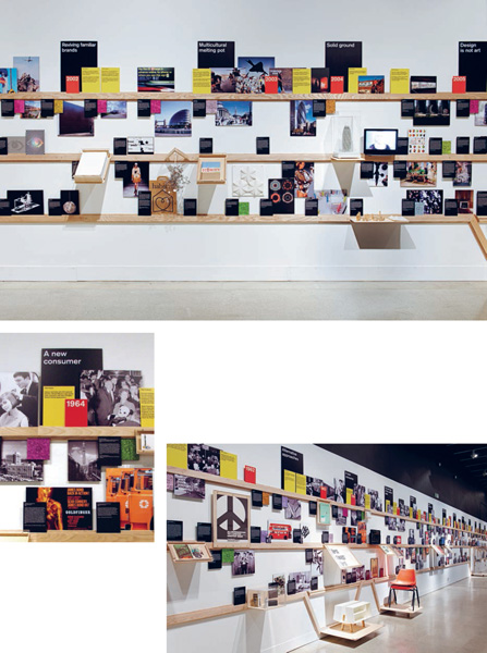
The wall contains information panels and artefacts such as race programmes and tickets from historical Formula One events. 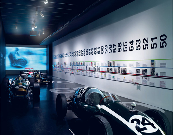 Studio Myerscough Formula One Design Museum, London Touring exhibition 01.1.1 Timelines: Three-dimensional realization In a move away from the conventional use of adhesive vinyl lettering applied to the gallery wall, the Super Contemporary exhibition uses three wooden rails to form the structure of the timeline. A groove in the edge of each rail allows information cards, images and artefacts to be propped up along the length of the timeline. The top rail includes larger black information panels with thematic titles together with smaller red year markers. In a break from the usual, purely linear nature of a timeline, larger items of furniture are accommodated into the line as the wooden rail extends down to ground level with larger wooden platforms.
 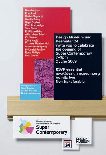 Bibliothque Super Contemporary Design Museum, London
  01.1.2Timelines: Interaction For WerkStadt Dialog, conventional exhibition timeline panels are combined with an interactive screen-based element.
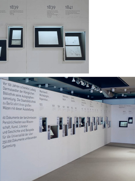
The screen runs along the length of the glass-covered information panels and triggers videobased sequences as it moves over the appropriate part of the display. The screen-based interface mirrors the design and layout of the static display graphics. 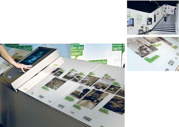 L2M3 Kommunikationsdesign WerkStadt Dialog Mercedes-Benz, Daimler AG 01.1.3Timelines: Windows The grid formed by the white exhibition panels in Great Moments of a Patron helps organize the different levels of information printed on the surface. An understated monochromatic look is achieved through the use of light weight sans serif typography, which is complemented by the inclusion of the signatures of key historical figures printed in a pale grey. The minimal design of the exhibition is enlivened by the inclusion of windows that feature various written artefacts. The protruding frames of these display boxes feature black-and-white portraits of the historical figures.
As the portraits are printed on the sides of the frames, they are visible only when the exhibition is viewed from an angle and do not distract when visitors look directly at the display windows. 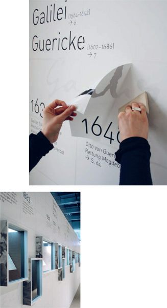 L2M3 Kommunikationsdesign Great Moments of a Patron Staatsbibliothek, Berlin
Next page



 Laurence King Publishing Ltd 361373 City Road London EC1V 1LR United Kingdom Tel: + 44 20 7841 6900 Fax: + 44 20 7841 6910 e-mail: www.laurenceking.com text and design 2012 Roger Fawcett-Tang This book was produced by Laurence King Publishing Ltd, London Roger Fawcett-Tang has asserted his right under the Copyright, Designs and Patent Act 1988 to be identified as the Author of this Work. All rights reserved. No part of this publication may be reproduced or transmitted in any form or by any means, electronic or mechanical, including photocopy, recording or any information storage and retrieval system, without prior permission in writing from the publisher. A catalogue record for this book is available from the British Library ISBN: 978-1-78067-003-4 Design: Roger Fawcett-Tang, Struktur Design Printed in China For Malcolm, the king of numbers DN 777
 0123456789 these ten digits have a universal appeal among designers; they are multilingual, universally understood, varied in form, highly adaptable and yet still instantly recognizable since each of the ten characters has its own strong and unique identity. Numbers in Graphic Design focuses on how graphic designers tackle the ordering of number-heavy information, from timetables to annual reports and other data-rich documents through to highly creative and playful typographic experiments exploring the most abstract notion of numeric information. Addition showcases a variety of timelines both within exhibition graphics and on the printed page, and how a timeframe can help to organize variable data such as illustrations, objects, interactive media and the written word. Data looks at a wide variety of information graphics. Data looks at a wide variety of information graphics.
 01.1.1 Timelines: Three-dimensional realization A three-dimensional timeline extends the length of the gallery for an exhibition on the history of Formula One racing. Each decade is marked out in huge lettering on the floor with the relevant cars positioned according to their place along the timeline.
 Studio Myerscough Formula One Design Museum, London Touring exhibition 01.1.1 Timelines: Three-dimensional realization In a move away from the conventional use of adhesive vinyl lettering applied to the gallery wall, the Super Contemporary exhibition uses three wooden rails to form the structure of the timeline. A groove in the edge of each rail allows information cards, images and artefacts to be propped up along the length of the timeline. The top rail includes larger black information panels with thematic titles together with smaller red year markers. In a break from the usual, purely linear nature of a timeline, larger items of furniture are accommodated into the line as the wooden rail extends down to ground level with larger wooden platforms.
  Bibliothque Super Contemporary Design Museum, London
  01.1.2Timelines: Interaction For WerkStadt Dialog, conventional exhibition timeline panels are combined with an interactive screen-based element.
 L2M3 Kommunikationsdesign WerkStadt Dialog Mercedes-Benz, Daimler AG 01.1.3Timelines: Windows The grid formed by the white exhibition panels in Great Moments of a Patron helps organize the different levels of information printed on the surface. An understated monochromatic look is achieved through the use of light weight sans serif typography, which is complemented by the inclusion of the signatures of key historical figures printed in a pale grey. The minimal design of the exhibition is enlivened by the inclusion of windows that feature various written artefacts. The protruding frames of these display boxes feature black-and-white portraits of the historical figures.
 L2M3 Kommunikationsdesign Great Moments of a Patron Staatsbibliothek, Berlin