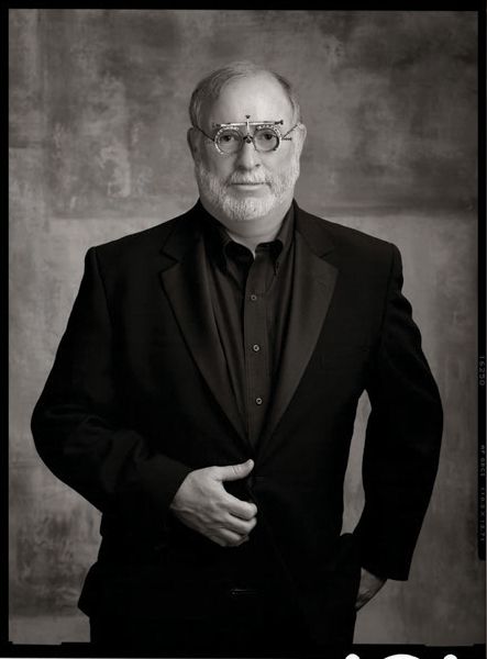
About the Author
Tim Kelly is a portrait artist and a true master of photography, as well as a Craftsman Photographer and Fellow of the American Society of Photographers. Inducted for life into the Cameracraftsman of America and the International Society of Portrait Artists, Tim has been one of Eastman Kodaks leading mentors to the profession for twenty five years and holds an Imaging Excellence Degree, PPA National Award, SEPPA and Epcot Awards, an unrivaled three-time Gallery Elite, over two dozen Kodak Gallery Awards, a Photokina Award, and many hundreds more honors.
Copyright 2015 by Tim Kelly.
All rights reserved.
All photographs by the author unless otherwise noted.
Published by:
Amherst Media, Inc.
P.O. Box 586
Buffalo, N.Y. 14226
Fax: 716-874-4508
www.AmherstMedia.com
Publisher: Craig Alesse
Senior Editor/Production Manager: Michelle Perkins
Editors: Barbara A. Lynch-Johnt, Harvey Goldstein, Beth Alesse
Associate Publisher: Kate Neaverth
Editorial Assistance from: Carey A. Miller, Sally Jarzab, John S. Loder
Business Manager: Adam Richards
Warehouse and Fulfillment Manager: Roger Singo
ISBN-13: 978-1-60895-846-7
Library of Congress Control Number: 2014944602
10 9 8 7 6 5 4 3 2 1
No part of this publication may be reproduced, stored, or transmitted in any form or by any means, electronic, mechanical, photocopied, recorded or otherwise, without prior written consent from the publisher.
Notice of Disclaimer: The information contained in this book is based on the authors experience and opinions. The author and publisher will not be held liable for the use or misuse of the information in this book.
Check out Amherst Medias blogs at: http://portrait-photographer.blogspot.com/
http://weddingphotographer-amherstmedia.blogspot.com/
Contents


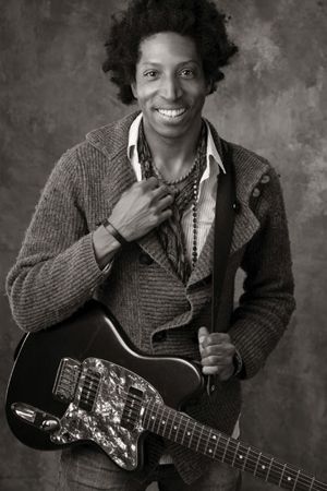
I photographed this up-and-coming recording artist for his new CD using Kodak 45 sheet and Polaroid film. Many of my sessions include film in addition to mostly digital images.
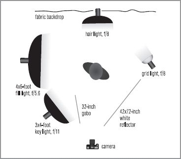
The lighting consisted of two Photogenic lights in Larson softboxes (a 34- and a 46-foot), both on the main light side. I also added a passive reflector on the opposite side (to camera right). I use Larson pop-ups, but I prefer the old Dean Collins PVC style, which is a 4272-inch white panel on legs, as my main reflector and I added a kicker light up high. My backdrops are mostly the same from left to right, so I put my own hot spot where I want it to bealmost always on the shadow side of the subject.


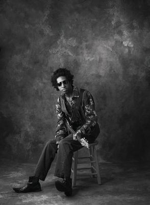
Additional images from the same session.
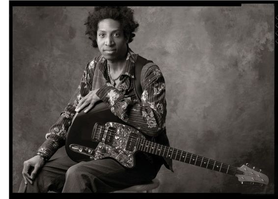
In the image on the facing page, the neck of the guitar is in the lower right quadrant, while the subject is left of center. I compose for whatever format I am looking to fill, whether it is square or rectangle. Notice that the key elements in this shot form a triangle. The image begins with his hand in the lower left, easily moving to his face, keeping the guitar subdued by its directionality. By placing the guitar on a diagonal, I allowed the viewer to go right to his face and travel out, using the long neck as the bottom of a pyramid. After all, the photo is about him, not the guitar. Everything I do is intentional, which includes his expression and the careful manipulation of his hands. Although it looks natural, everything is very posed.
This is accomplished only with lighting and designed to have the viewer look where I want them to look.


Being old school, I get it in the camera and never resort to Ill fix it later in Photoshop. Everything has to be balanced. Notice the tonality of the stool. Having the stool and its value against the adjacent background of the same value makes the stool almost disappear. This is accomplished only with lighting and designed to have the viewer look where I want them to look without distraction. If the stool had been jet black or white, your eye would have been drawn to it.

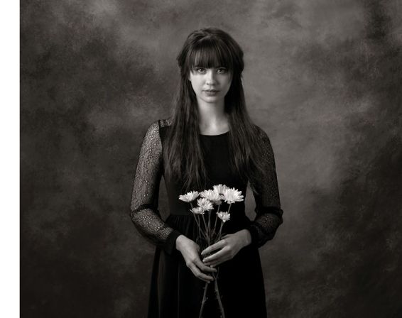
The image on the facing page is a simple yet elegant, three-quarter-length portrait of a young woman. This stands out from many portraits because of the stillness and almost stagnant, centered compositionface square to the camera, strong lighting, strong texture, and it has a mood indicative of what I like to achieve in my sessions. There is great eye contact with the subject and her Mona Lisa expression. This is a good representation of my minimalist style.
The lighting for this image (facing page) is similar to that used in section 1 (Man and His Guitar). I positioned two Photogenic lights in Larson softboxes (a 34- and a 46-foot) together on the left side and a passive reflector on the opposite side. Most appreciate this image for its simplicity and fidelity of tone; it is a testimonial to light and shadow and represents what I do every day.

A different look from the same session.

I select the background that I feel will work with the subjects attire, hair color, and flesh tonewhether I am photographing in black & white or color.
Backgrounds are important to me. I have numerous backgrounds; many of them are muslins by David Maheu. I select the background that I feel will work with the subjects attire, hair color, and flesh tonewhether I am photographing in black & white or color. Backgrounds should add to the image but are still meant to be nondescript. I like the backgrounds to speak softly, to support my lighting, and to enhance what I am trying to accomplish.
Each portrait has X amount of spaceand every bit of that space should have information. High-key white or black-backgrounded portraits waste too much storytelling potential. One of the important aspects of the portrait is that there will always be a place for the eye to rest in every portion of that image.


Next page
