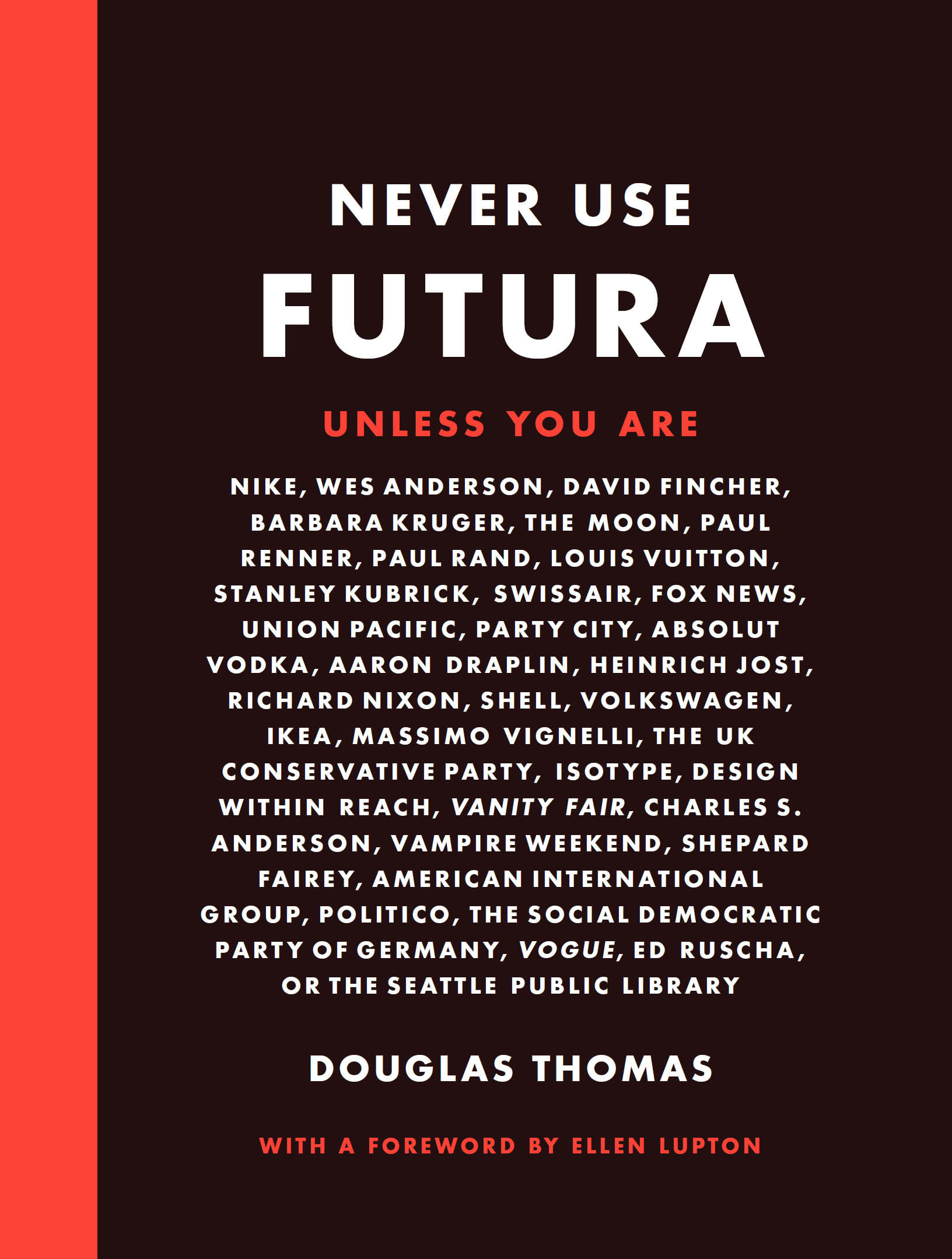
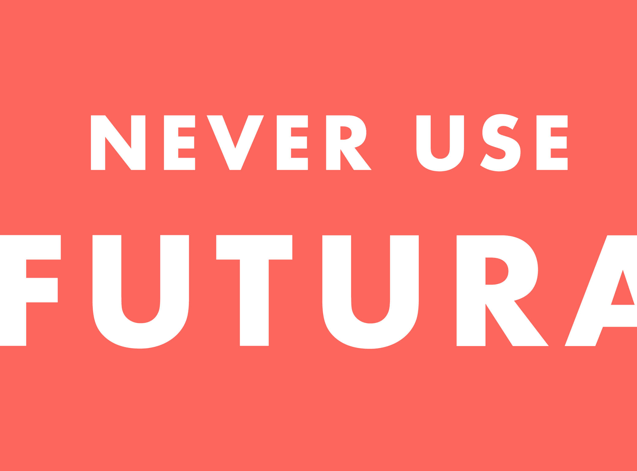
Douglas Thomas - Never Use Futura
Here you can read online Douglas Thomas - Never Use Futura full text of the book (entire story) in english for free. Download pdf and epub, get meaning, cover and reviews about this ebook. year: 2017, publisher: Princeton Architectural Press, genre: Politics. Description of the work, (preface) as well as reviews are available. Best literature library LitArk.com created for fans of good reading and offers a wide selection of genres:
Romance novel
Science fiction
Adventure
Detective
Science
History
Home and family
Prose
Art
Politics
Computer
Non-fiction
Religion
Business
Children
Humor
Choose a favorite category and find really read worthwhile books. Enjoy immersion in the world of imagination, feel the emotions of the characters or learn something new for yourself, make an fascinating discovery.

- Book:Never Use Futura
- Author:
- Publisher:Princeton Architectural Press
- Genre:
- Year:2017
- Rating:3 / 5
- Favourites:Add to favourites
- Your mark:
Never Use Futura: summary, description and annotation
We offer to read an annotation, description, summary or preface (depends on what the author of the book "Never Use Futura" wrote himself). If you haven't found the necessary information about the book — write in the comments, we will try to find it.
Douglas Thomas: author's other books
Who wrote Never Use Futura? Find out the surname, the name of the author of the book and a list of all author's works by series.


Never Use Futura — read online for free the complete book (whole text) full work
Below is the text of the book, divided by pages. System saving the place of the last page read, allows you to conveniently read the book "Never Use Futura" online for free, without having to search again every time where you left off. Put a bookmark, and you can go to the page where you finished reading at any time.
Font size:
Interval:
Bookmark:
FOR RUTH
PUBLISHED BY
Princeton Architectural Press
A McEvoy Group company
37 East 7th Street, New York, NY 10003
202 Warren Street, Hudson, New York 12534
Visit our website at www.papress.com
2017 Douglas Thomas
Foreword Ellen Lupton, 2017
All rights reserved
ISBN 978-1-61689-572-3 (paperback)
ISBN 978-1-61689-666-9 (epub, mobi)
No part of this book may be used or reproduced in any manner without written permission from the publisher, except in the context of reviews.
Every reasonable attempt has been made to identify owners of copyright. Errors or omissions will be corrected in subsequent editions.
EDITOR DESIGNER
Barbara Darko Douglas Thomas
SPECIAL THANKS TO
Janet Behning, Nolan Boomer, Nicola Brower, Abby Bussel, Tom Cho, Benjamin English, Jenny Florence, Jan Cigliano Hartman, Susan Hershberg, Lia Hunt, Mia Johnson, Valerie Kamen, Simone Kaplan-Senchak, Jennifer Lippert, Kristy Maier, Sara McKay, Eliana Miller, Wes Seeley, Rob Shaeffer, Sara Stemen, Paul Wagner, and Joseph Weston of Princeton Architectural Press
Kevin C. Lippert, publisher
Library of Congress Cataloging-in-Publication Data is available from the publisher upon request.
Foreword by Ellen Lupton
Introduction
How Futura helped pioneer the advance of modernism
Why youve never truly used Futura unless your name is Erik Spiekermann
The politics of Futura, from Communists to Conservatives and everyone in between
From post offices to the Mercury program, Futura was the official typeface of the American Century
Why David Carson was wrong and Massimo Vignelli was right (again)
$10,000 handbags and high-end design
On nostalgia and the zeitgeist of contemporary typography
Tailored typefaces and corporate storytelling
Epilogue
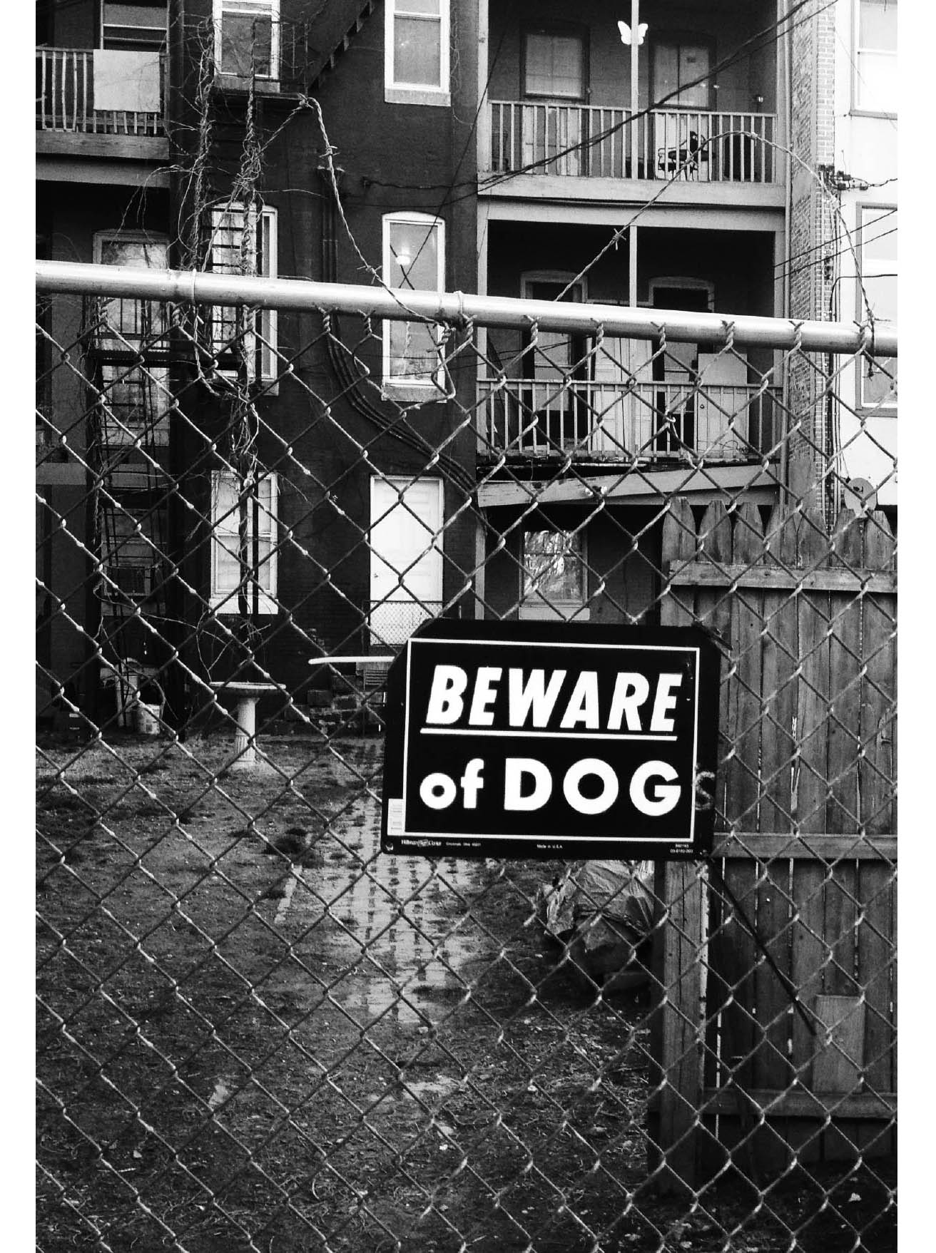
Beware of Dog sign, in Futura, in Bolton Hill, Baltimore, 2016
SOME PEOPLE JUST DONT GET IT. They dont get that every typeface has its own DNA , its own voice, and its own hidden history of intrigue and excess. Some people dont get that you can express your love for something by showing how hopelessly tired and overused it is. This is a book for people who get it. This is a book for type snobs.
Douglas Thomas is the most charming, generous, open-minded type snob I have ever met. Not all type snobs are like that. If you are one and youre reading this book, you are probably not as charming as Doug. Yes, youre an erudite observer of kerning pairs and bracketed serifs. You know the difference between asterisks, asterisms, and asteroids, but you dont know that interrobangs have no place in polite conversation. Doug, on the other hand, knows how to get normal people to think about type. He draws you in with subjects of general interest, such as the hidden links between Nazi politics, Richard Nixon, and the moon landing. (No, its not a paranoid conspiracy. Its Futura!)
Be warned: a book is a dangerous thing. A young woman approached me after a lecture recently to say that my book Thinking with Type was the first book she had ever really understood. I smiled warmly and shook her hand, yet despair clouded my heart. Was it the first book about type she had ever understood, or the first book on any subject? Introduced through the innocuous pages of a college textbook, typography will soon stalk you everywhere. You cease to find solace and sustenance at the supermarket; instead, you puzzle over the diamond-shaped tittles that dot the is of the Triscuit logo. Passing by an ice-cream shop with a sign set in Papyrus and Comic Sans, you wander inside and order two scoops of dog poop. One day you step off the edge of the subway platform wondering whether the words STAND BEHIND THE YELLOW LINE are set in Akzidenz Grotesk or Helvetica.
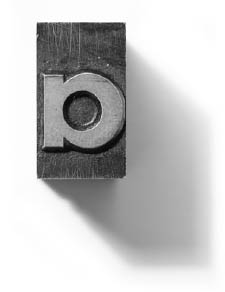
When you read this book by Doug, matters will get even worse. Never Use Futura will immerse you in the fluid mechanics of typographic influence. Once a typeface enters the veins of society, there is no escape. Futura seeped into every corner of modern life by exploiting the forces of technology and commerce, taste and convenience, meaning and metaphor. Futura is a specific historical artifact, authored by the German designer Paul Renner in the 1920s, but it is also an idea, a concept about geometric construction that has inspired mindless clones and copies, as well as original designs infused with their own identity and authorship.
If you are a newcomer to typography, you might glance at the title of this book and wonder, Isnt there a movie about that? No! Make no mistake: Futura played a far bigger role in the history of twentieth-century designand the history of the twentieth century in generalthan any other typeface, including one overplayed diva who debuted in Switzerland in 1957. Futura is the most enduring typographic act of its time, shaping the drama of design, advertising, and public communication for decades to come. It remains very much on view today. Youll see live performances every day at the post office, at the mall, and in countless student design projects, where its round Os and pointy Ms and Vs make it go-to fodder for abstract type compositions and expressive word marks. (Doug discovered that such student projects date back to the 1930s, when aspiring modernists drafted their own variants of Futura in order to master the arts of advertising layout and headline lettering.)
How did Douglas Thomas become such a kind, pleasant, socially well-adjusted type snob? He studied design in the outstanding BFA program at Brigham Young University in Provo, Utah, where he sometimes used Futura. He went on to earn an MA in history at the University of Chicago, where he conducted primary research on the reception of Futura (and Helvetica) in the United States. In Chicago he honed his skills as a historian, spending long hours at the Regenstein and Newberry Libraries exploring obscure trade journals about the midcentury type industry. He earned his MFA in graphic design at Maryland Institute College of Art ( MICA ), where I was proud to work with him as graduate faculty and an adviser on this project. Doug knew when he arrived at MICA in 2014 that he wanted to write a cultural biography of Futura.
Employing his rigor as a historian and his eye as a designer, he used approachable prose and a lovingly curated collection of visual artifacts to tell fascinating stories about the social life of type.
Behold! Be bold! Be light, narrow, or extra condensed! The thing about type snobs is that the stuff we love is everywhere. You dont need to visit a distant vineyard or an upscale restaurant to delight in the subtleties of counters, bowls, and finials. Typography is right here at the bus station and the big-box storethe muggles just havent noticed yet. Have no fear of x-heights! The brother- and sisterhood of type snobs welcomes you with our not-so-secret handshake.
Next pageFont size:
Interval:
Bookmark:
Similar books «Never Use Futura»
Look at similar books to Never Use Futura. We have selected literature similar in name and meaning in the hope of providing readers with more options to find new, interesting, not yet read works.
Discussion, reviews of the book Never Use Futura and just readers' own opinions. Leave your comments, write what you think about the work, its meaning or the main characters. Specify what exactly you liked and what you didn't like, and why you think so.