Alberto Cairo - How Charts Lie
Here you can read online Alberto Cairo - How Charts Lie full text of the book (entire story) in english for free. Download pdf and epub, get meaning, cover and reviews about this ebook. year: 2019, publisher: W. W. Norton & Company, genre: Politics. Description of the work, (preface) as well as reviews are available. Best literature library LitArk.com created for fans of good reading and offers a wide selection of genres:
Romance novel
Science fiction
Adventure
Detective
Science
History
Home and family
Prose
Art
Politics
Computer
Non-fiction
Religion
Business
Children
Humor
Choose a favorite category and find really read worthwhile books. Enjoy immersion in the world of imagination, feel the emotions of the characters or learn something new for yourself, make an fascinating discovery.

- Book:How Charts Lie
- Author:
- Publisher:W. W. Norton & Company
- Genre:
- Year:2019
- Rating:5 / 5
- Favourites:Add to favourites
- Your mark:
How Charts Lie: summary, description and annotation
We offer to read an annotation, description, summary or preface (depends on what the author of the book "How Charts Lie" wrote himself). If you haven't found the necessary information about the book — write in the comments, we will try to find it.
A leading data visualization expert explores the negativeand positiveinfluences that charts have on our perception of truth.
Weve all heard that a picture is worth a thousand words, but what if we dont understand what were looking at? Social media has made charts, infographics, and diagrams ubiquitousand easier to share than ever. We associate charts with science and reason; the flashy visuals are both appealing and persuasive. Pie charts, maps, bar and line graphs, and scatter plots (to name a few) can better inform us, revealing patterns and trends hidden behind the numbers we encounter in our lives. In short, good charts make us smarterif we know how to read them.
However, they can also lead us astray. Charts lie in a variety of waysdisplaying incomplete or inaccurate data, suggesting misleading patterns, and concealing uncertaintyor are frequently misunderstood, such as the confusing cone of...
Alberto Cairo: author's other books
Who wrote How Charts Lie? Find out the surname, the name of the author of the book and a list of all author's works by series.


How Charts Lie — read online for free the complete book (whole text) full work
Below is the text of the book, divided by pages. System saving the place of the last page read, allows you to conveniently read the book "How Charts Lie" online for free, without having to search again every time where you left off. Put a bookmark, and you can go to the page where you finished reading at any time.
Font size:
Interval:
Bookmark:
ALSO BY ALBERTO CAIRO
The Functional Art
The Truthful Art
How
Charts
Lie ![]()
Getting Smarter about
Visual Information
Alberto Cairo
W. W. NORTON & COMPANY
Independent Publishers Since 1923
Copyright 2019 by Alberto Cairo
All rights reserved
First Edition
For information about permission to reproduce selections from this book, write to Permissions, W. W. Norton & Company, Inc., 500 Fifth Avenue, New York, NY 10110
For information about special discounts for bulk purchases, please contact W. W. Norton Special Sales at specialsales@wwnorton.com or 800-233-4830
Jacket design by Pete Garceau
Book design by Daniel Lagin
Production manager: Lauren Abbate
Library of Congress Cataloging-in-Publication Data is available
ISBN 978-1-324-00156-0
ISBN 978-1-324-00157-7 (Ebook)
W. W. Norton & Company, Inc., 500 Fifth Avenue, New York, N.Y. 10110
www.wwnorton.com
W. W. Norton & Company Ltd., 15 Carlisle Street, London W1D 3BS
The world cannot be understood without numbers.
And it cannot be understood with numbers alone.
HANS ROSLING, FACTFULNESS (2018)
Freedom depends upon citizens who are able to make a distinction between what is true and what they want to hear. Authoritarianism arrives not because people say that they want it, but because they lose the ability to distinguish between facts and desires.
TIMOTHY SNYDER , THE ROAD TO UNFREEDOM (2018)
To my parents
Contents
T his is a book about how the many chartstables, graphs, maps, diagramswe see every day through TV, newspapers, social media, textbooks, or advertising deceive us.
Weve all heard the old idiom A picture is worth a thousand words. My hope is that youll soon stop using it unless you append it with this: if you know how to read it. Even common charts such as maps and bar graphs can be ambiguous or, worse, incomprehensible.
This is worrying because numbers are very persuasive, and so are charts, because we associate them with science and reason. Numbers and charts look and feel objective, precise, and, as a consequence, seductive and convincing.
Politicians, marketers, and advertisers throw numbers and charts at us with no expectation of our delving into them: the average family will save $100 a month thanks to this tax cut; the unemployment rate is at 4.5%, a historic low, thanks to our stimulus package; 59% of Americans disapprove of the presidents performance; 9 out of 10 dentists recommend our toothpaste; theres a 20% chance of rain today; eating more chocolate may help you win the Nobel Prize.
The moment we turn on the TV, open a newspaper, or visit our favorite social media network, we are bombarded with flashy charts. If you have a job, your performance has likely been measured and shown through graphics. You may have designed them yourself to insert into slides for a class or business presentation. Some authors with a taste for the hyperbolic even talk about a tyranny of numbers and a tyranny of metrics, referring to the pervasiveness of measurement. As people in contemporary societies, we are easily seduced by our numbers and by the charts that represent them.
Chartseven those not designed with ill intentcan mislead us. However, they can also tell us the truth. Well-designed charts are empowering. They enable conversations. They imbue us with X-ray vision, allowing us to peek through the complexity of large amounts of data. Charts are often the best way to reveal patterns and trends hidden behind the numbers we encounter in our lives.
Good charts make us smarter.
But before that happens, we need to get used to perusing them with attention and care. Instead of just looking at charts, as if they were mere illustrations, we must learn to read them and interpret them correctly.
Heres how to become a better chart reader.
How Charts Lie
O n April 27, 2017, President Donald J. Trump sat with Reuters journalists Stephen J. Adler, Jeff Mason, and Steve Holland to discuss his accomplishments in his first 100 days in office. While talking about China and its president, Xi Jinping, Trump paused and handed the three visitors copies of a 2016 electoral map:
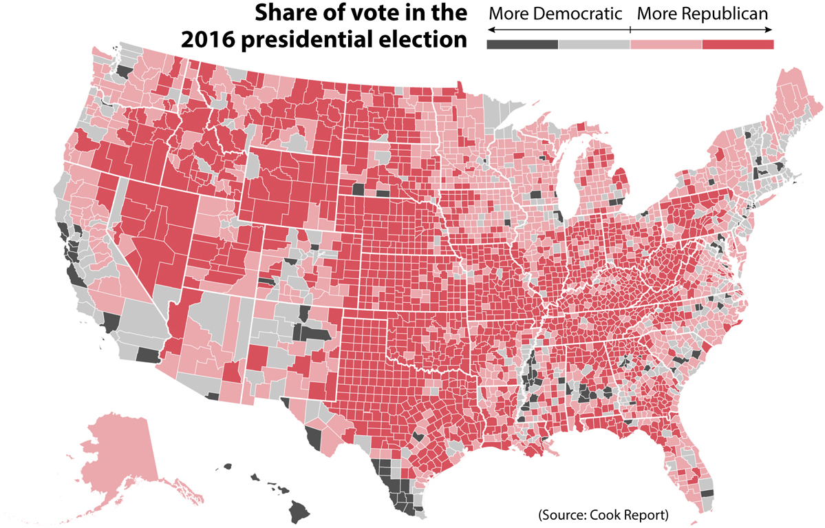
The president then said, Here, you can take that, thats the final map of the numbers. Its pretty good, right? The red is obviously us.
When I read the interview, I thought that it was understandable President Trump was so fond of that map. He won the 2016 election despite most forecasts, which gave him between 1% and 33% chances of succeeding; a Republican establishment that distrusted him; a bare-bones campaign that was often in disarray; and numerous controversial remarks about women, minorities, the U.S. intelligence services, and even veterans. Many pundits and politicians predicted Trumps demise. They were proved wrong. He seized the presidency against all odds.
However, being victorious isnt an excuse to promote misleading visuals. When presented alone and devoid of context, this map can be misleading.
The map appeared in many other places during 2017. According to The Hill, White House staffers had a large, framed copy of it hanging in the West Wing. The map was also regularly touted by conservative media organizations, such as Fox News, Breitbart, and InfoWars, among others. Right-wing social media personality Jack Posobiec put it on the cover of his book, Citizens for Trump , which looks similar to this:
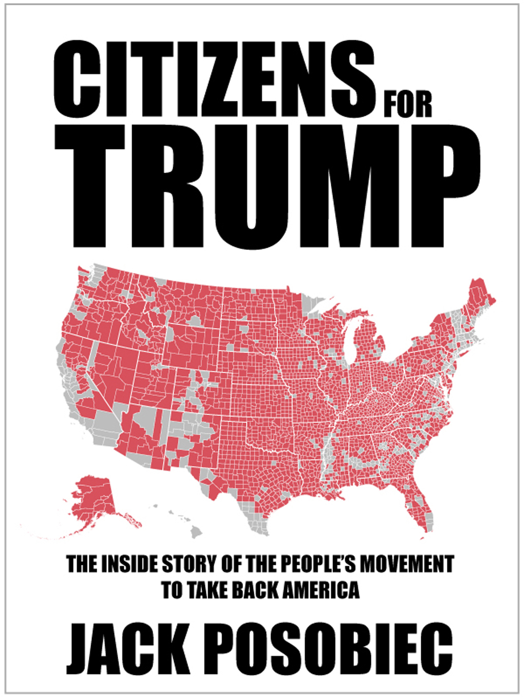
Ive spent the last two decades making charts and teaching others how to design them. Im convinced that anyoneincluding you, readercan learn how to read and even create good graphics, so Im usually happy to offer my free and constructive advice to whoever wants to take it. When I saw Posobiecs book on social media, I suggested that he needed to change either the title or the map, as the map doesnt show what the book title says.
The map is misleading because its being used to represent the citizens who voted for each candidate, but it doesnt. Rather, it represents territory . I suggested that Posobiec either change the graphic on the cover of his book to better support the title and subtitle, or change the title to Counties for Trump , as that is what the map truly shows. He ignored my advice.
Try to estimate the proportion of each color, red (Republican) and grey (Democratic). Roughly, 80% of the maps surface is red and 20% is grey. The map suggests a triumph by a landslide, but Trumps victory wasnt a landslide at all. The popular votePosobiecs citizenswas split nearly in half:
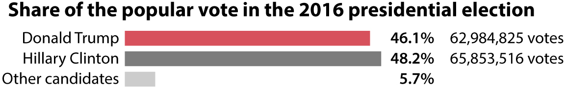
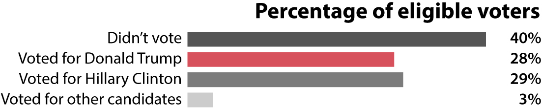
We could be even pickier and point out that turnout in the election was around 60%; more than 40% of eligible voters didnt show up at the polls. If we do a chart of all eligible voters , well see that the citizens who voted for each of the major candidates were a bit less than a third of the total:
Font size:
Interval:
Bookmark:
Similar books «How Charts Lie»
Look at similar books to How Charts Lie. We have selected literature similar in name and meaning in the hope of providing readers with more options to find new, interesting, not yet read works.
Discussion, reviews of the book How Charts Lie and just readers' own opinions. Leave your comments, write what you think about the work, its meaning or the main characters. Specify what exactly you liked and what you didn't like, and why you think so.