Publisher: Amy Marson
Creative Director: Gailen Runge
Art Director: Kristy Zacharias
Editor: Liz Aneloski
Technical Editors: Nanette S. Zeller and Gailen Runge
Cover Designer: April Mostek
Book Designer: Christina Jarumay Fox
Production Coordinator: Rue Flaherty
Production Editor: Alice Mace Nakanishi
Illustrator: Jenny Davis
Photo Assistant: Mary Peyton Peppo
Style photography by Nissa Brehmer and instructional photography by Diane Pedersen, unless otherwise noted
Published by C&T Publishing, Inc., P.O. Box 1456, Lafayette, CA 94549


I would like to thank the following fabric companies for their generosity in providing many of the fabrics used in this book. Please look for their gorgeous fabric selections at your local fabric store:
Alexander Henry
Andover Fabrics
Dear Stella Fabrics
Michael Miller Fabrics
P&B Textiles
Robert Kaufman Co.
Timeless Treasure Fabric
Westminster Fabrics/FreeSpirit
In addition, I would like to thank the team at C&T for their assistance and guidance throughout the preparation of this book, and the following people for the use of their beautiful photographs as inspiration for some of the art quilts contained in this book:
Linda Beach
Aaron Epstein
Lin Hsin-Chen
Sue Freebern
Steve McCurry/Magnum Photos

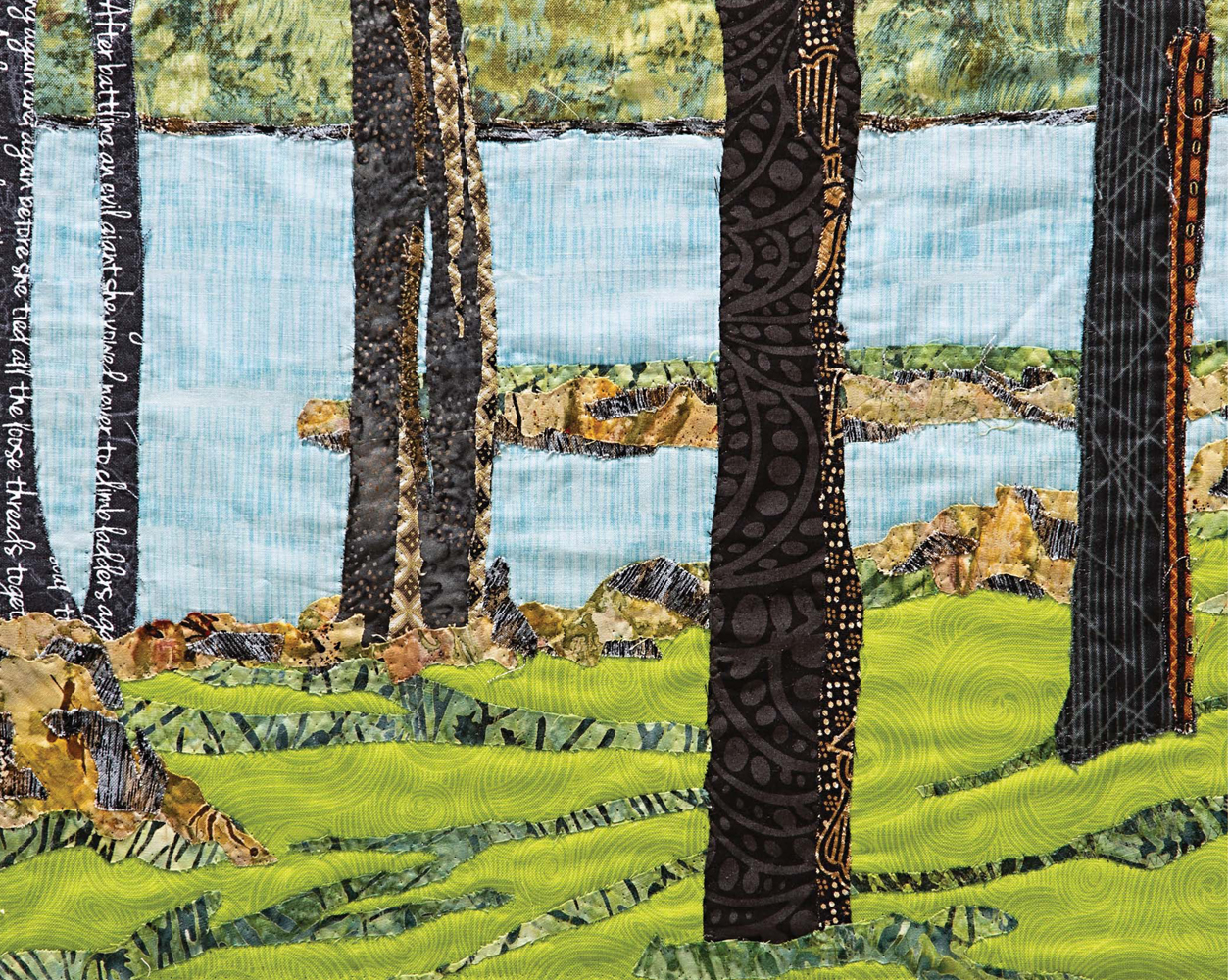
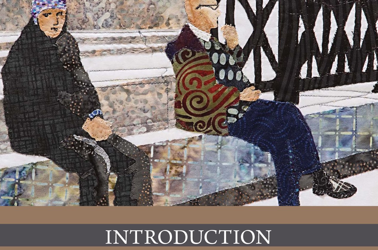
I like to describe what I do as fabric collage. For many years, photographs have been the starting point for my art quilts. I love translating a photo into fabric, adding layers of complexity using color and pattern. Starting with a photo frees me from having to figure out the proportions, the perspective, and where the light and shadows will be. All the information I need is there for me, and when in doubtthose times when my brain says, No, that wouldnt look like thatmy eyes know for sure. That is why I always tell my students, Use your eyes, not your brain. The photoand the working pattern you make from itare your road map to a successful art quilt.
I start by making a pattern from the photo using a computer and printing the pattern in the full size of my final art quilt. I trace each section onto freezer paper, lay it on the fabric, press, and cut. Putting the art quilt together is like fitting pieces into a puzzleor painting by number. When everything is in place, I sew the pieces, and my masterpiece is done.
This book has been separated into three sections. In the first section, you will learn about color, value, and print scale. I will teach you how to use color to achieve the look you want, without being a slave to the color wheel, which most people find so frustrating. You will learn the importance of value and how to collect fabrics that will serve you well as you make art quilts on your own.
In the second section, we will make an art quilt together, step by step. It is just like being at one of my workshops, but in your own home.
Finally, the last section of the book will give you easy and practical ways to approach common elements in art quiltselements like trees and water, and tricks to do faces in fabric. I will show you how to create each of these elements using one fabric, two fabrics, or three or more fabrics for an explosion of color and pattern. After you know how to do this, you will have the tools to confidently turn any photo into an art quilt.


All You Need to Know about Color
Throw away that color wheel; here is all you need to know about color.
Color is one of the most important building blocks in designing an art quilt. Color can set the tone of your work, evoke a mood, create depth and distance, and establish a focal point. This is true not just for quilts but for clothing, home decoratinganywhere color is used. The world is filled with colors, and each and every one elicits a feeling in humans. Understanding how will allow you to use color as a tool to achieve the feeling you want in your art quilt.
I dont use a color wheelI dont even own one. You do not need to own one, use one, or think about one. Instead, learning the makeup of colors will help you to understand their impact and their relationships to each other, so you can make good color decisions while you work.
A color wheel simply arranges colors in order between the primaries and opposite their complements. The problem with using a color wheel is that it shows you solid colorsusually in only one value. The color wheel becomes very confusing when you try to use it to look for fabrics. Learning the makeup of the color you are considering is more effective in knowing how to use it. Eventually, with practice, this becomes second nature and you will know instantly what you need in order to achieve the look you want.
Color Basics
Let us start with the basics. There are three primary colors. You have certainly heard this before, but what exactly does it mean? It is simple. There are only three colors from which all other colors are made.
The three primary colors are red, blue, and yellow. If you come to understand these three colors, you will come to understand the recipes used for the creation of all other colors, and how and why they relate to each other.

You may be thinking that black and white are also primary colors. Technically, they are not colors at allblack is the absence of all color and white is the presence of all color. Practically, when black is added to any color, the color gets darker. The more black you add, the darker the color. This is called a shade.
When white is added to any color, it gets lighter. The more white you add, the lighter the color. This is called a tint. (To be honest, these are not terms you need to know to understand how to use color for the results you want, but it will either impress your friends at your next dinner party or stop the conversation altogetherprobably the latter.)
Think about paint. If you have a dab of red paint and add a little white, it becomes dark pink; a little more white and the pink gets lighter. Keep adding white to the red, and the pink will get lighter and lighter until it is almost white.
The same is true of black. Add a bit of black paint to your red and it becomes a darker red. The more black paint you add, the darker the red becomes until it is almost black itself. When you add both black and white, the resulting color appears dusty or more subdued.
So lets begin by looking at the three primary colors: red, blue, and yellow.
Name: RED
Recipe: Red is one of the three primary colors.
Personality: Bold, fiery, passionate
Plays well with: Oranges and purples
Opposite: Green
Temperature: Hot

Next page
