Basile Baudez - Inessential Colors: Architecture on Paper in Early Modern Europe
Here you can read online Basile Baudez - Inessential Colors: Architecture on Paper in Early Modern Europe full text of the book (entire story) in english for free. Download pdf and epub, get meaning, cover and reviews about this ebook. year: 2021, publisher: Princeton University Press, genre: Romance novel. Description of the work, (preface) as well as reviews are available. Best literature library LitArk.com created for fans of good reading and offers a wide selection of genres:
Romance novel
Science fiction
Adventure
Detective
Science
History
Home and family
Prose
Art
Politics
Computer
Non-fiction
Religion
Business
Children
Humor
Choose a favorite category and find really read worthwhile books. Enjoy immersion in the world of imagination, feel the emotions of the characters or learn something new for yourself, make an fascinating discovery.

- Book:Inessential Colors: Architecture on Paper in Early Modern Europe
- Author:
- Publisher:Princeton University Press
- Genre:
- Year:2021
- Rating:5 / 5
- Favourites:Add to favourites
- Your mark:
Inessential Colors: Architecture on Paper in Early Modern Europe: summary, description and annotation
We offer to read an annotation, description, summary or preface (depends on what the author of the book "Inessential Colors: Architecture on Paper in Early Modern Europe" wrote himself). If you haven't found the necessary information about the book — write in the comments, we will try to find it.
Today, architectural plans and drawings are always signposted with colors: pink for poch, or exterior walls, yellow for certain interior elements, and blue for details and ornament. How and why did this practice begin? The craft of architectural drawing-plans, sections, and details-was originally developed during the Italian Renaissance under the influence of engravers. The results were correspondingly monochromatic, relying on representation through line and perspective. But in the 1800s, an influx of painters-turned-architects in Holland and Germany brought color into their designs. This innovation eventually spread throughout Europe, inspiring French architectural engineers to adopt a common color system in order to more clearly communicate their designs across the kingdom, and giving architects another tool with which to impress academic juries and the public. In this book, author Basile Baudez argues that color was not an essential feature of architectural drawing until European architects adopted a precise system of representation in response to political and artistic rivalry between countries, as well as the needs of public exhibitions. He shows that French engineers learned to use color from the Dutch colleagues they worked with and then fought against during the Dutch War (1672-78), demonstrating that a color-based system was published in French manuals for military engineers and used by royal architects, and that architects who wanted to compete with paintings for the publics attention needed to use the familiar language of color. This history reveals that color came to have three functions: to imitate architectural materials, to establish concise representational conventions that could span large geographic distances, and to seduce the public, including tourists. The book will feature a large number of fascinating, previously unpublished archival drawings, and will contribute to growing interest in the origins and professionalization of architecture, as well as the history of drawing as a medium
Basile Baudez: author's other books
Who wrote Inessential Colors: Architecture on Paper in Early Modern Europe? Find out the surname, the name of the author of the book and a list of all author's works by series.


Inessential Colors: Architecture on Paper in Early Modern Europe — read online for free the complete book (whole text) full work
Below is the text of the book, divided by pages. System saving the place of the last page read, allows you to conveniently read the book "Inessential Colors: Architecture on Paper in Early Modern Europe" online for free, without having to search again every time where you left off. Put a bookmark, and you can go to the page where you finished reading at any time.
Font size:
Interval:
Bookmark:
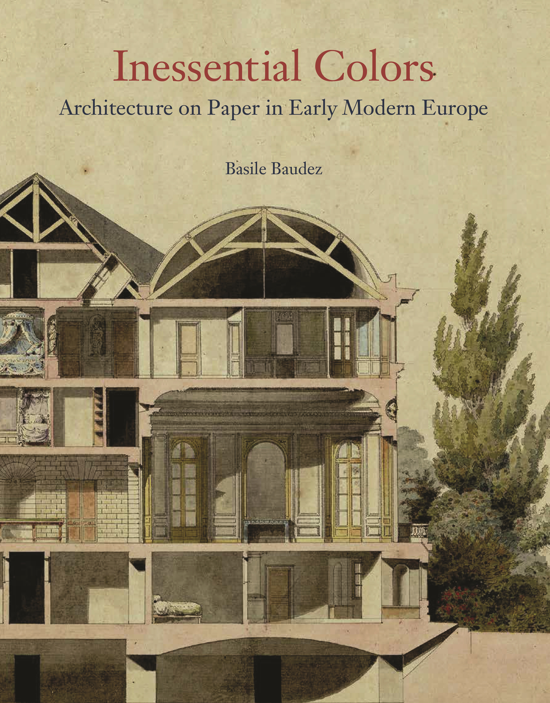
Inessential Colors
Inessential Colors
ARCHITECTURE ON PAPER IN EARLY MODERN EUROPE
Basile Baudez
PRINCETON UNIVERSITY PRESS
PRINCETON AND OXFORD
Copyright 2021 by Princeton University Press
Princeton University Press is committed to the protection of copyright and the intellectual property our authors entrust to us. Copyright promotes the progress and integrity of knowledge. Thank you for supporting free speech and the global exchange of ideas by purchasing an authorized edition of this book. If you wish to reproduce or distribute any part of it in any form, please obtain permission.
Requests for permission to reproduce material from this work should be sent to
Published by Princeton University Press, 41 William Street, Princeton, New Jersey 08540 In the United Kingdom: Princeton University Press, 6 Oxford Street, Woodstock, Oxfordshire OX20 1TR press.princeton.edu
Jacket illustration: Pierre-Adrien Pris, section of the Chteau of Colmoulins, ca. 1782. Black ink and colored washes on paper, 25.8 36.2 cm. Bibliothque Municipale, Besanon, Collection Pierre-Adrien Pris, vol. 484, no. 65. Bibliothque Municipale de Besanon.
Illustration on
Frontispiece (): Eustache Le Sueur, Saint Bruno Examining a Drawing of the Baths of Diocletian, Site of the Future Charterhouse of Rome, 16451648. Oil on canvas, 162 x 114 cm. Muse du Louvre, Paris. RMN-Grand Palais/Art Resource, NY
All Rights Reserved
Library of Congress Cataloging-in-Publication Data
Names: Baudez, Basile, 1974- author.
Title: Inessential colors : architecture on paper in early modern Europe / Basile Baudez.
Description: Princeton : Princeton University Press, [2021] | Includes bibliographical references and index. Identi fi ers: LCCN 2020049897 | ISBN 9780691213569 (hardback)
Subjects: LCSH: Color in art. | Architectural drawingEuropeHistory.
Classi fi cation: LCC NA2705 .B38 2021 | DDC 720.28/4dc23
LC record available at https://lccn.loc.gov/2020049897
British Library Cataloging-in-Publication Data is available
ISBN (e-book) 9780691233154
Version 1.0
This publication is made possible in part from the Barr Ferree Foundation Fund for Publications, Department of Art and Archaeology, Princeton University
For David
- 13
- 13
- 21
- 31
- 32
- 52
- 79
- 80
- 100
- 118
- 147
- 149
- 165
- 190
- 207
- 219
- 221
- 224
- 226
- 229
- 231
- 232
- 234
- 237
- 241
- 256
- 271
- 278
Inessential Colors
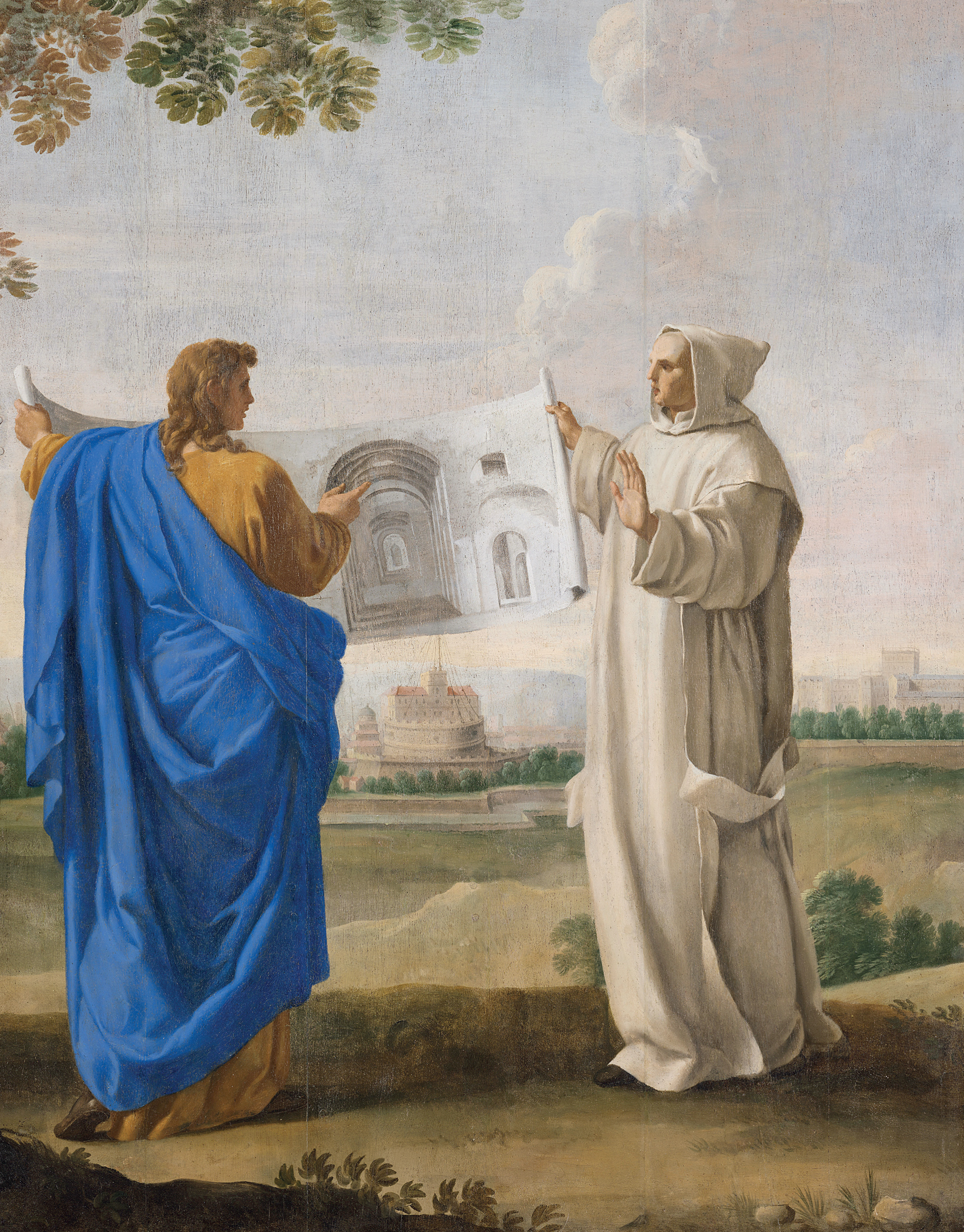
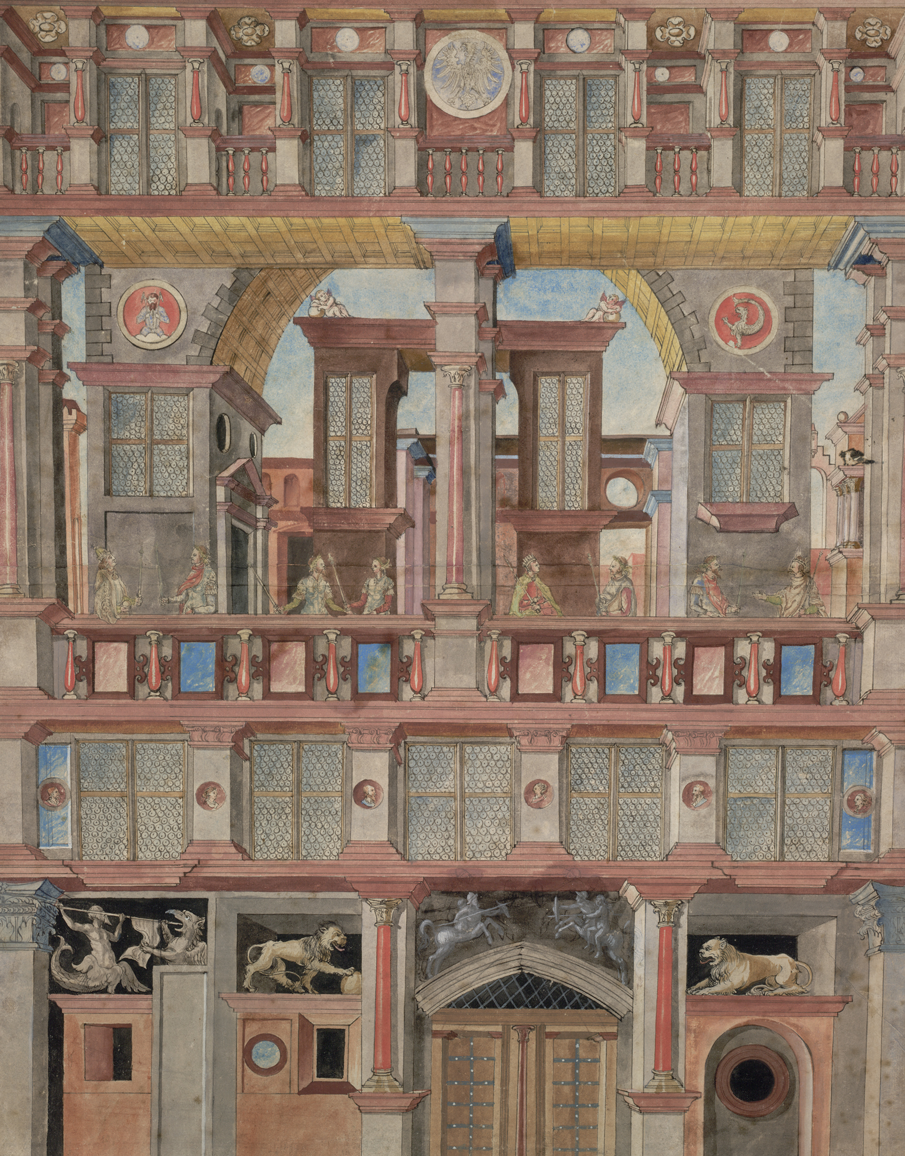
A large drawing links an angelic fi gure draped in brilliant blue allantica and Saint Bruno (frontispiece).)? Why show a variety of colors when they are not essential to architectural drawings? This study investigates the reasons for and ways in which color was used, exceptionally, in the representation of architecture. An examination of these two paintings suggests paths toward an understanding of the roles assigned to pigments. The reds of Castel SantAngelos roof tiles and of the roses in Tessiers painting recreate the colors of objects that we perceive visually: they were meant to imitate nature. The gray washes of the baths vaults, the pink color in the plan, and the colored outlines of the continents on the globe bear no relation to visible reality: they act as signs, which are legible thanks to a convention understood by artist and spectator. Finally, the pink and blue of the drawing of the forti fi cations echo the colors of the flowers and of the book leaning against the wall: the painter employed these colors to balance his composition; to produce harmony and beauty in order to create an affective relationship between the spectator and his painting. Imitation, convention, affect: these three ways of using color constitute the reasons for and modalities of the introduction of color into the monochrome world of architectural representation.
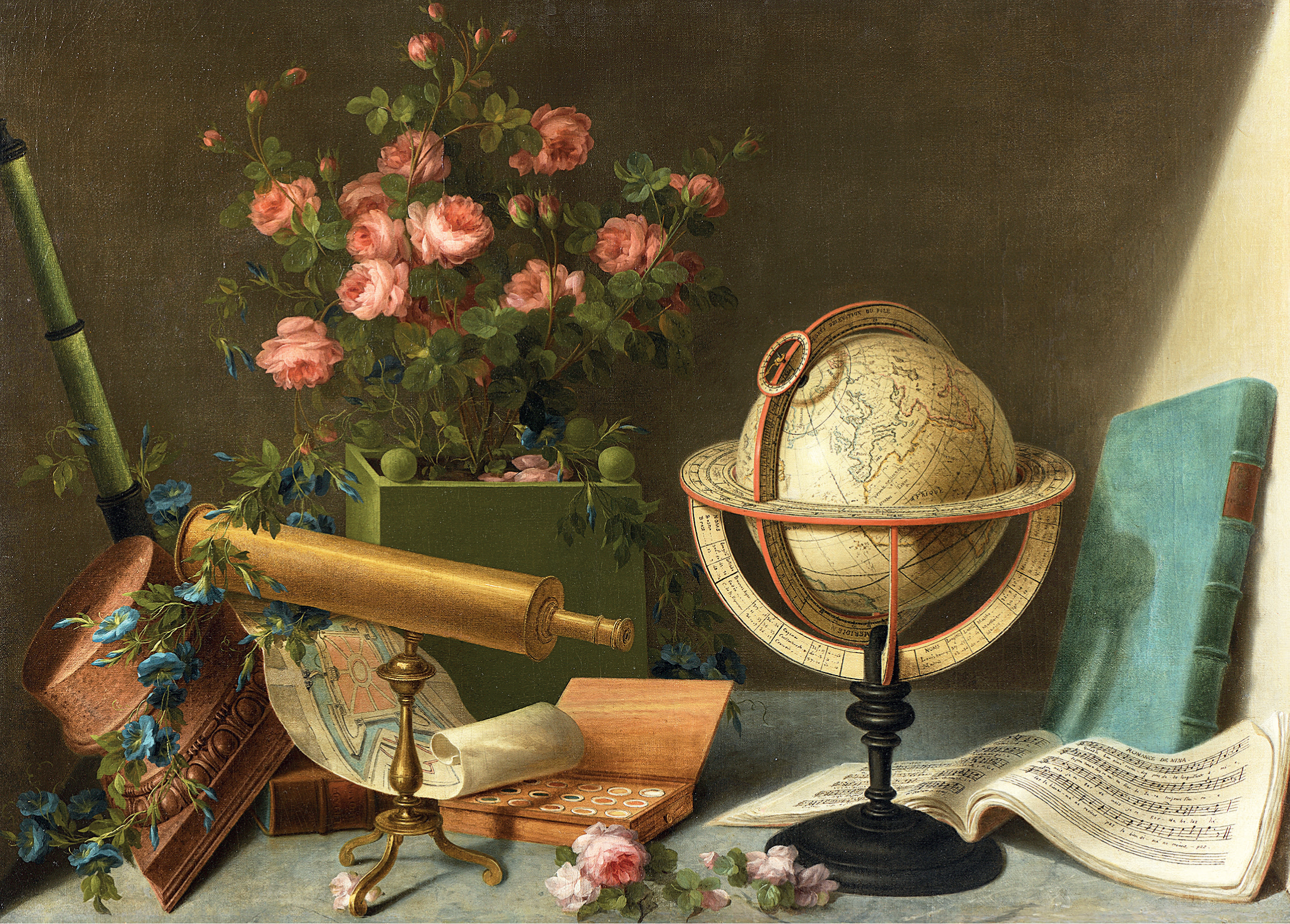
Louis Tessier, Arts and Sciences. Oil on canvas, 84 116.5 cm. Galerie Michel Descours, Paris.
Although references to monochromy and the absence of color correspond to no scienti fi c reality, the reader understands them, just as the early modern spectator clearly distinguished between a drawing in gray or brown grisaille and a sheet washed in blue, green, red, or yellow. Black, which today we consider a color, was not thought of as such from the period marking the beginning of this study until the late eighteenth century, with the emergence of Romanticism. Yet it seems more interesting to imagine that architectural drawing evolved not only in tandem with the development of architectural styles, but also autonomously, with its own history and in continual dialogue with other, related arts and disciplines.
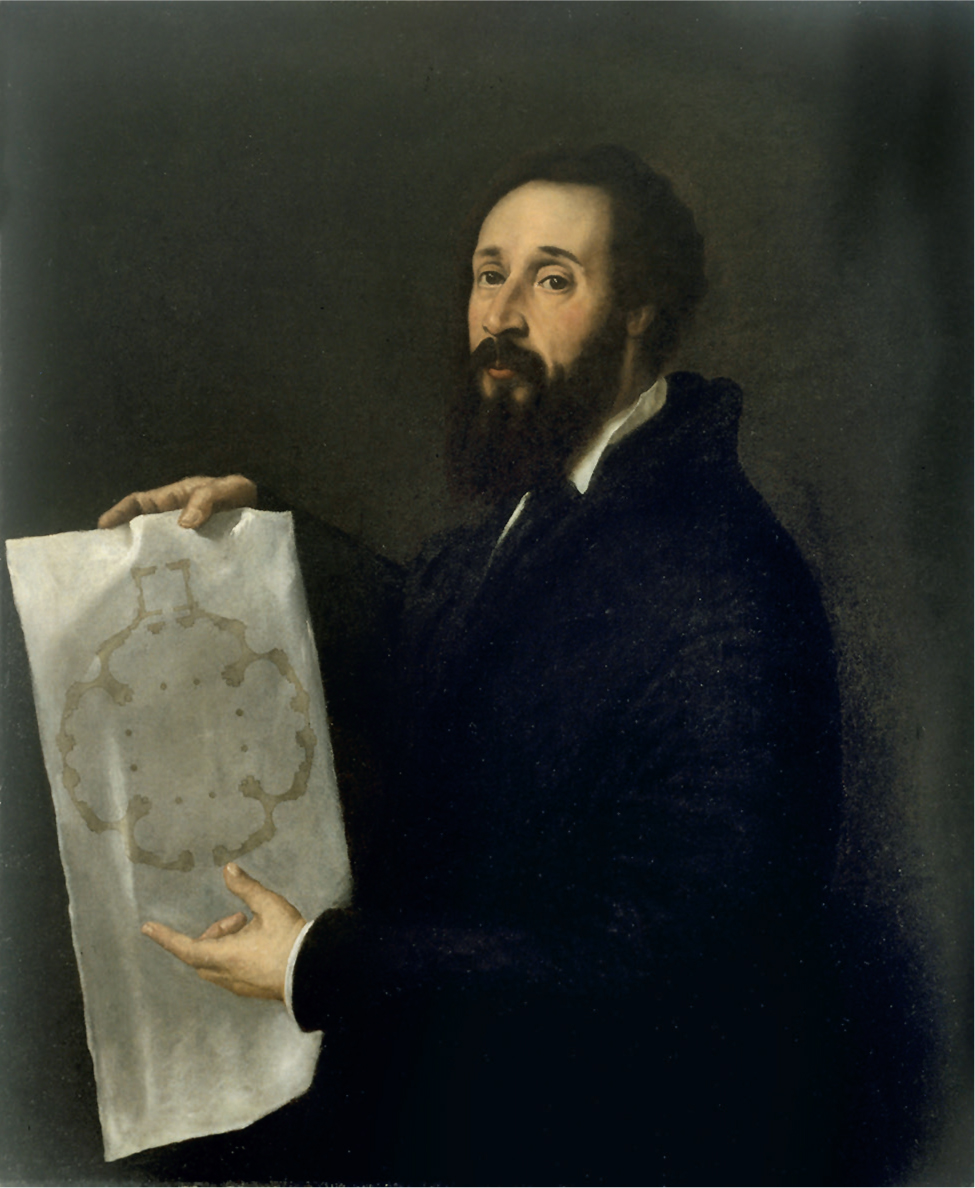
Titian, Portrait of Giulio Romano, ca. 1536. Oil on canvas, 101 86 cm. Museo Civico di Palazzo Te, Mantua.
The drawings and engravings discussed in this book are primarily concerned with the fi guration of an architectural object that was built, was intended to be built, or could have been built. Following the architect and theorist Jean-Paul Jungmann, I retain a distinction between representational images intended as documentationvehicles of informationproduced, among others, by architects, and pictorial images, made expressly to be read and perceived in an aesthetic mode, such as landscape drawings that might include buildings, fantasias and capricci (even when drawn by architects) or paintings of vedute, vistas, landscapes, ftes, and architecture executed by artists.
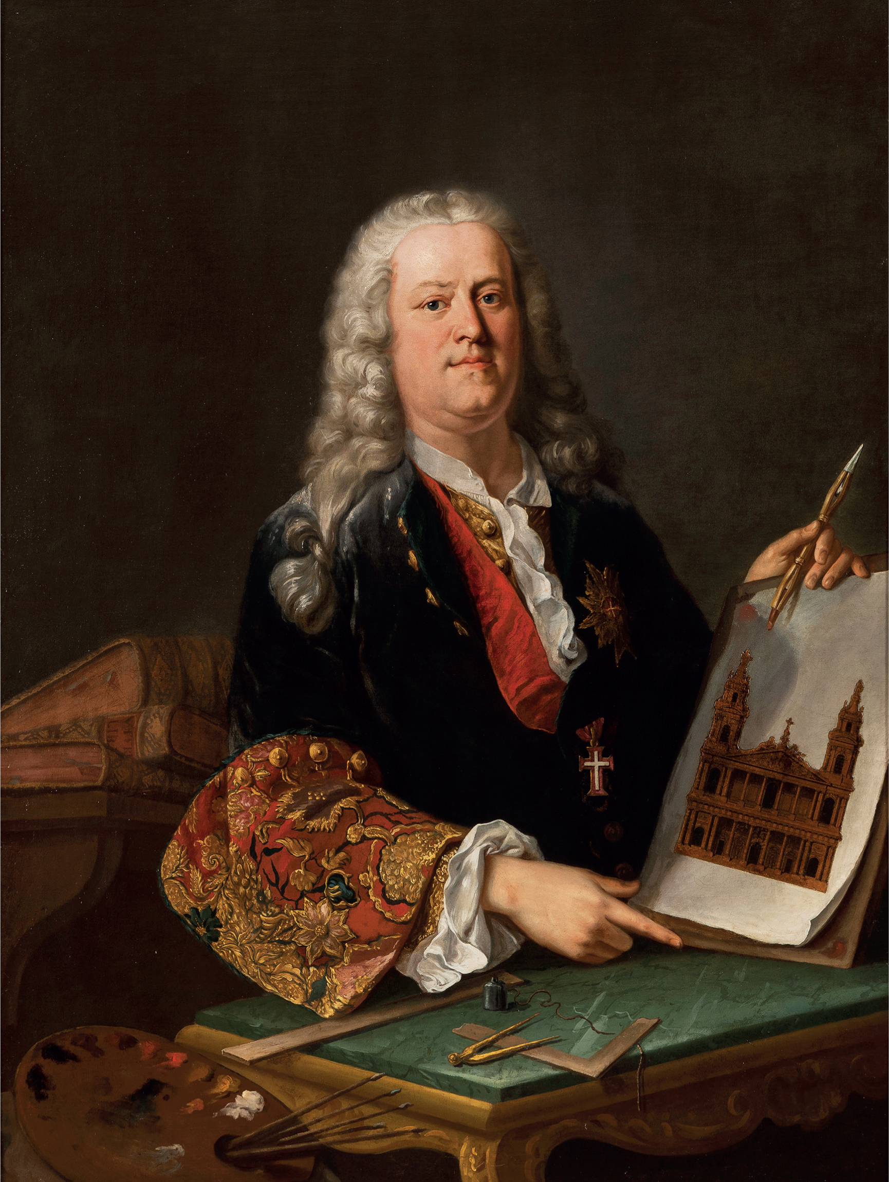
Giovanni Niccol Servandoni (attrib.), Self Portrait, ca. 1730. Oil on canvas, 130 97 cm. Muse National des Chteaux de Versailles et de Trianon.
In the fourth century BCE, Aristotle countered the earlier Platonic bias against the imitation of nature, mimesis, by arguing for its pleasures, while in his Poetics he laid the foundation for a theoretical distinction between drawing and color. In that respect, architectural drawings are unlike those of painters; they do integrate color as a sign, as a convention, and not simply as a means of imitation or affect.
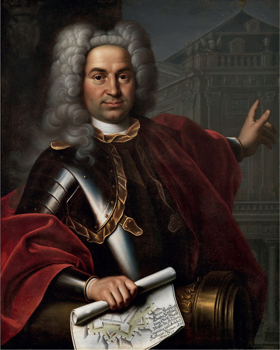
Markus Friedrich Kleinert, Portrait of Balthasar Neumann, 1727. Oil on canvas, 95 76 cm. Mainfrnkisches Museum, Wrzburg.
The representation of architecture shuttles between two poles, the imitation of visible nature and the use of conventions that can convey the information necessary for the object to be understood in mathematical terms. We should recall, however, that even in painting the doctrine of imitationmimesis, as formulated by Aristotle, which shaped all Western thought on the nature of artistic activityis open to question. When the art historian Ernst Gombrich addressed the long mimetic tradition, he proposed a symbolic theory of pictures, according to which the artist does not hold up a mirror to nature, but tries out pictorial arrangements intended to make illusions of reality more effective. It aids in classifying, distinguishing, associating, contrasting, and hierarchizing. We will see that, as regards architecture on paper, this axiom was certainly true for part of its history, when French military engineers were codifying the conventional usage of color, but this interpretation is less convincing with regard to architects in the second half of the eighteenth century, when colors capacity for affect acquired a new importance. Thus, the reasons for employing color shuttled between taxonomy and aesthetics, depending on whether architects were adopting the graphic language of engineers or that of painters; but color would never fully replace monochrome drawing in its essential function of transmitting measurable information.
Font size:
Interval:
Bookmark:
Similar books «Inessential Colors: Architecture on Paper in Early Modern Europe»
Look at similar books to Inessential Colors: Architecture on Paper in Early Modern Europe. We have selected literature similar in name and meaning in the hope of providing readers with more options to find new, interesting, not yet read works.
Discussion, reviews of the book Inessential Colors: Architecture on Paper in Early Modern Europe and just readers' own opinions. Leave your comments, write what you think about the work, its meaning or the main characters. Specify what exactly you liked and what you didn't like, and why you think so.